As winter fades and nature awakens with vibrant blooms and gentle warmth, there’s no better time to infuse your kitchen with the refreshing spirit of spring. The kitchen, often considered the heart of the home, deserves a seasonal transformation that celebrates renewal, growth, and the delightful energy that spring brings. From soft pastel palettes to fresh botanical accents, spring kitchen decor offers endless possibilities to create a space that feels both invigorating and welcoming. Whether you’re drawn to the gentle charm of cottage-style aesthetics or the clean lines of modern design, incorporating spring elements into your kitchen can dramatically enhance both its visual appeal and the overall atmosphere of your home.
Thoughtful interior design goes beyond mere aesthetics—it’s about creating functional spaces that inspire daily living and reflect your personal style. The kitchen, where meals are prepared, families gather, and memories are made, benefits immensely from seasonal updates that keep the space feeling fresh and current. Spring decor brings with it an inherent sense of optimism and lightness, qualities that can transform even the most utilitarian kitchen into a sanctuary of culinary creativity and domestic joy.
This comprehensive guide explores twenty distinct approaches to spring kitchen decor, each offering unique perspectives on how to capture the essence of the season. From pastel-painted cabinets and botanical displays to fresh herb gardens and floral-inspired textiles, these concepts cater to diverse tastes and kitchen styles. Whether you have a spacious farmhouse kitchen or a compact urban cooking space, you’ll discover practical ideas and design inspiration that can be adapted to suit your specific needs and preferences, creating a kitchen environment that truly celebrates the beauty and promise of spring.
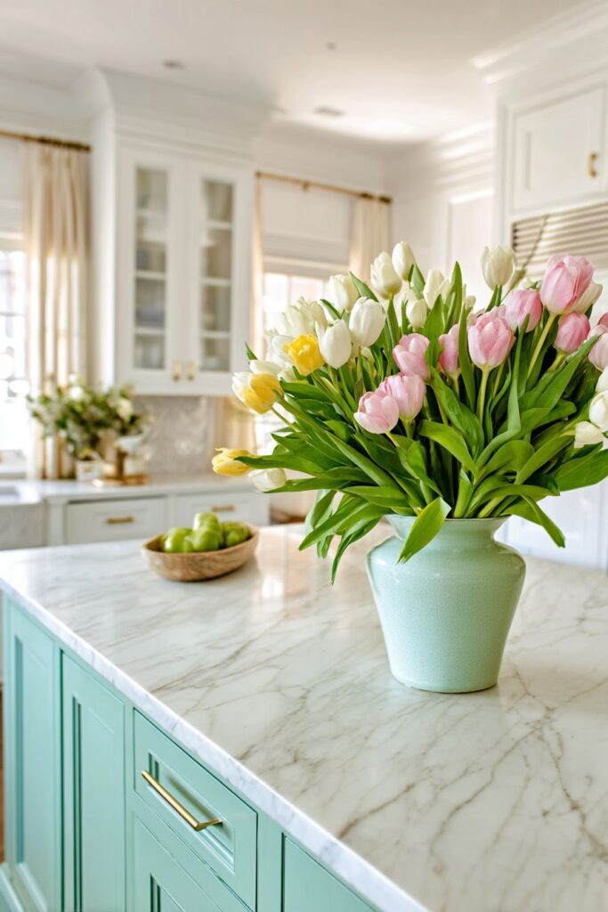
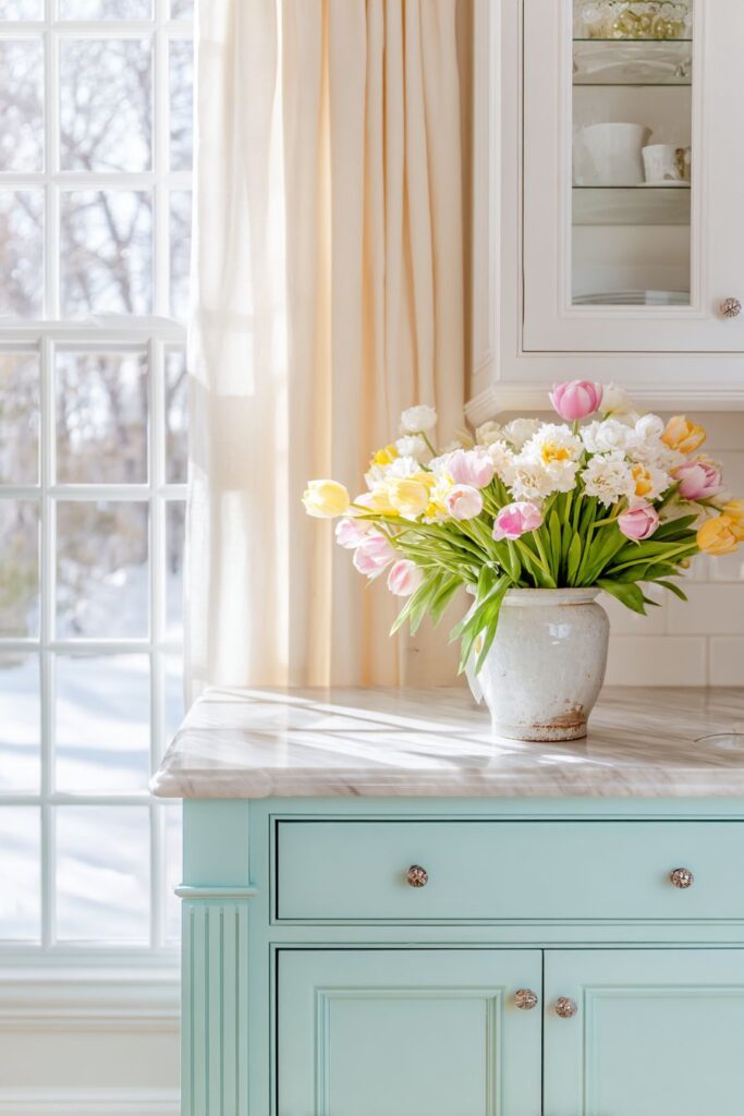
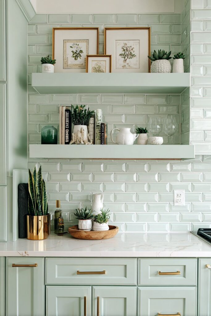
1. Pastel Perfection with Mint Green Accents
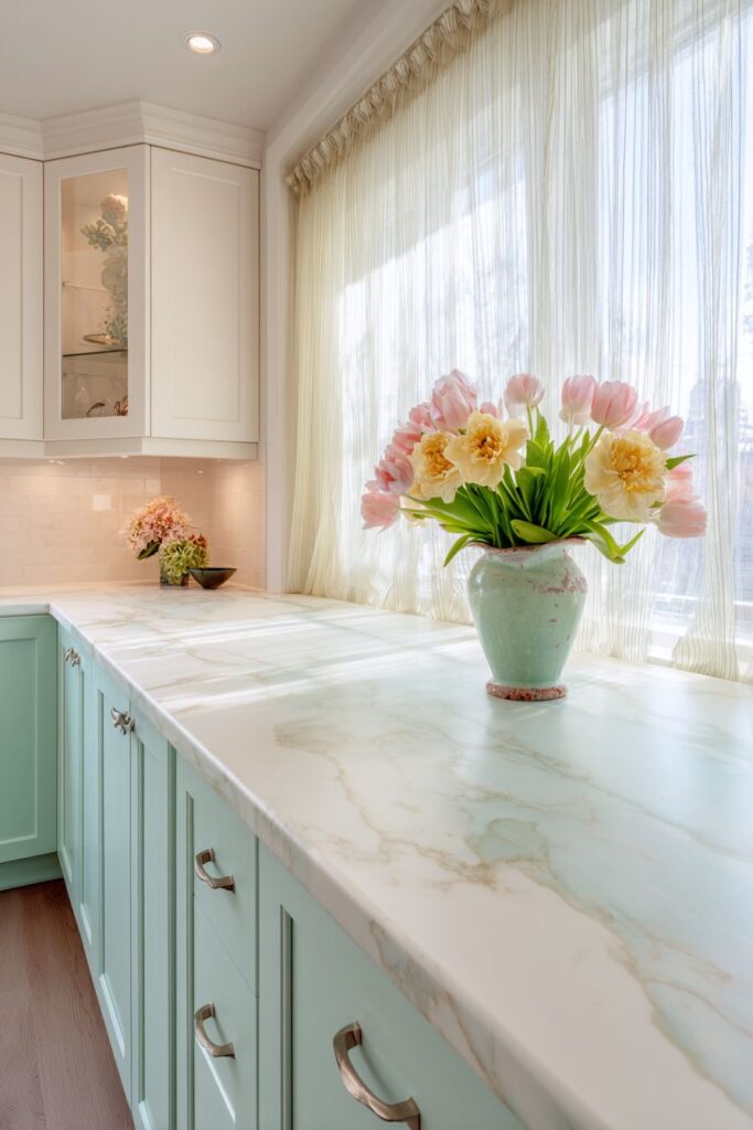
Step into a kitchen where the gentle whisper of spring colors creates an atmosphere of serene sophistication. The foundation of this design lies in crisp white cabinetry that serves as a pristine canvas, while mint green lower cabinet doors introduce just the right touch of color without overwhelming the space. This subtle infusion of pastel creates visual interest at eye level, drawing attention to the thoughtfully designed storage while maintaining an overall sense of airiness and light. The marble countertop, with its natural veining and cool surface, provides both practical functionality and elegant beauty, serving as the perfect stage for seasonal displays.
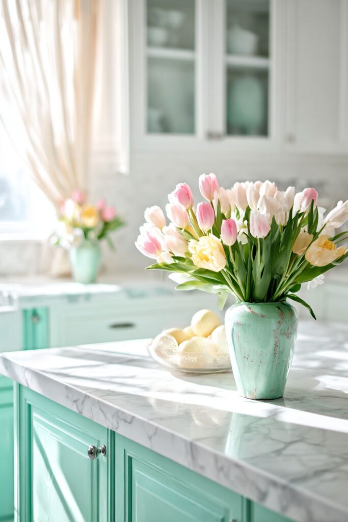
Fresh florals become the stars of this springtime scene, with ceramic vases cradling tulips and daffodils in soft pink and yellow hues that echo the awakening garden outside. These blooms aren’t merely decorative—they bring life, fragrance, and a connection to nature directly into the cooking space. The gentle colors of the flowers complement the mint green cabinetry without competing for attention, creating a harmonious palette that feels both curated and effortlessly natural. Sheer linen cafe curtains in pale yellow filter the morning light, transforming harsh sunbeams into a soft, golden glow that bathes the entire kitchen in warmth. These window treatments serve a dual purpose: providing privacy when needed while allowing maximum natural light to flood the space during the day.
The magic of this design lies in its ability to feel both refreshing and timeless. The wide-angle perspective captures how each element works together to create an airy atmosphere where cooking becomes a pleasure rather than a chore. The soft diffused lighting highlights the delicate spring color palette, revealing the subtle variations in tone and texture that make the space feel layered and interesting. Natural materials throughout—from the linen curtains to the ceramic vase and marble surfaces—ensure that the kitchen feels grounded and authentic rather than overly styled or artificial.
Key design tips for achieving this look:
- Select mint green in a soft, muted tone rather than a bright or saturated shade to maintain sophistication
- Use white as your dominant color to keep the space feeling light and open, introducing pastels as accents
- Choose natural stone countertops for their timeless appeal and practical durability
- Incorporate fresh flowers weekly to maintain the connection to the season and keep the space feeling alive
- Opt for sheer window treatments that maximize natural light while providing softness and texture
- Layer different shades of white and cream to add depth without introducing more color
2. Organic Open Shelving Display
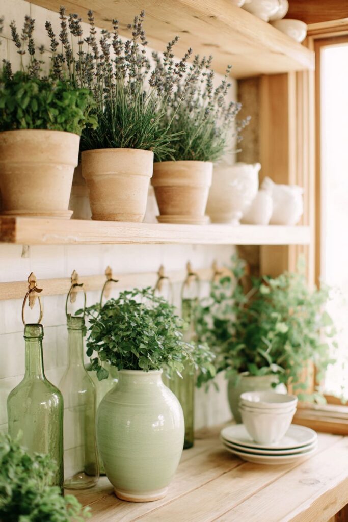
Open wooden shelving transforms kitchen storage into an artful display that celebrates both functionality and seasonal beauty. Light oak finish shelving provides warmth and natural character, creating the perfect backdrop for a carefully curated collection that blends everyday essentials with spring-inspired accents. The white porcelain dishes arranged across these shelves aren’t just practical dinnerware—they become sculptural elements that catch and reflect light, their clean lines and pristine surfaces creating visual rhythm across the horizontal planes. Interspersed among these dishes, small potted herbs in terracotta containers introduce living elements that serve triple duty: they’re beautiful to look at, fragrant additions to the space, and practical ingredients ready for harvest during meal preparation.
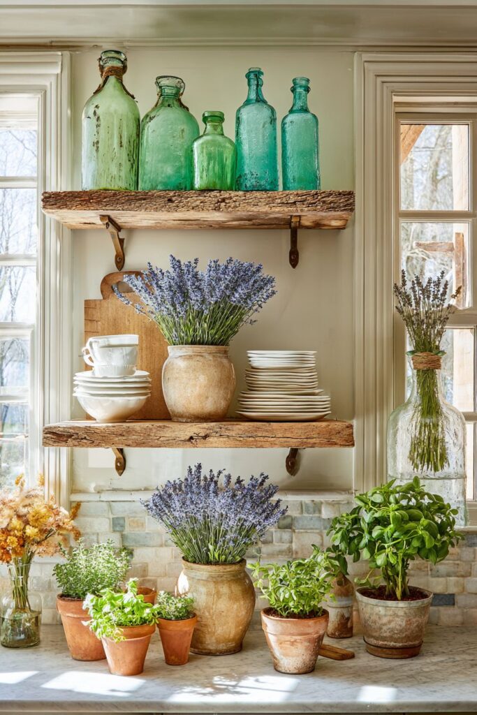
The sensory experience of this kitchen extends beyond the visual. Fresh lavender bundles hanging from brass hooks release their calming fragrance into the air, while their silvery-purple stems add vertical interest and movement to the composition. These dried botanicals represent the bridge between garden and kitchen, bringing the outdoors inside in a way that feels both intentional and organic. A collection of vintage glass bottles in soft green tones captures natural light, creating small moments of sparkle and color that draw the eye across the shelving landscape. These bottles, perhaps collected over time from antique markets or inherited from family, add personality and history to the space while their translucent quality allows light to play through them, creating subtle shadows and highlights throughout the day.
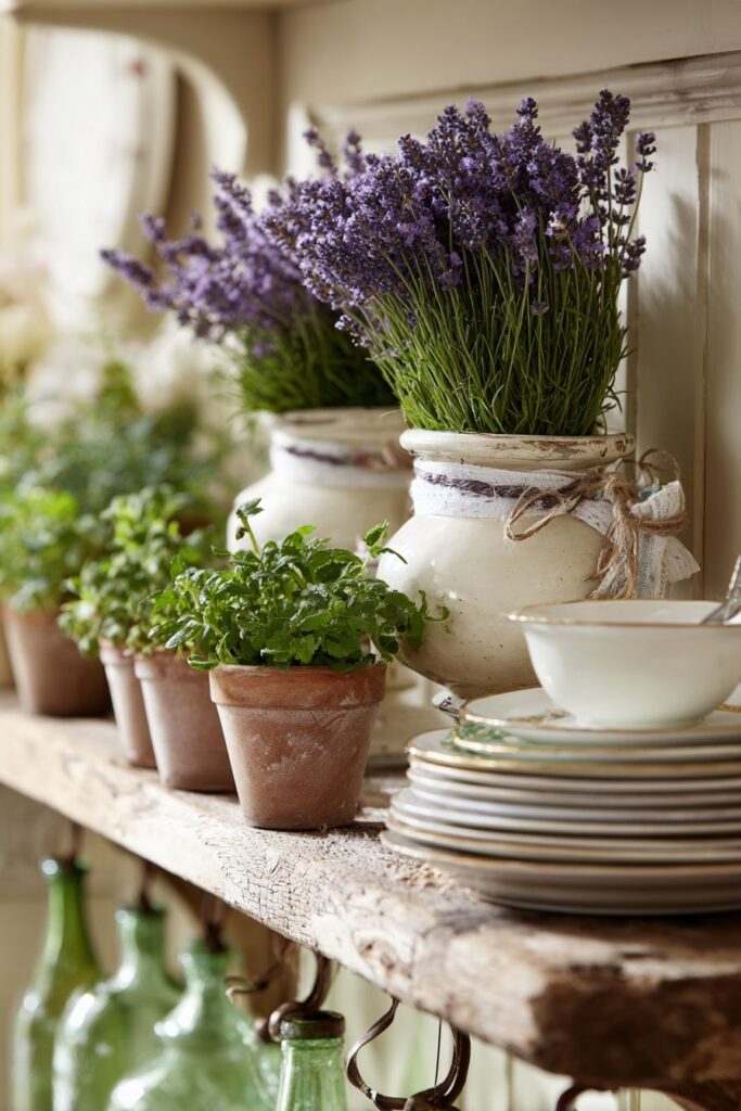
Professional interior photography techniques reveal how balanced exposure emphasizes the organic textures present in this design scheme. The grain of the oak wood, the slightly rough surface of terracotta pots, the smooth glaze of porcelain, and the wavy imperfections in vintage glass—each texture tells its own story while contributing to a cohesive whole. Gentle shadows enhance the seasonal freshness of the arrangement, preventing the display from appearing flat or one-dimensional. The key to this design’s success lies in its apparent casualness; while clearly thoughtful, it avoids looking overly precious or staged, maintaining the welcoming accessibility that makes a kitchen feel like a place for living rather than just looking.
Key design tips for creating organic shelving displays:
- Choose open shelving in natural wood tones to add warmth and texture to the kitchen
- Mix functional items like dishes with decorative elements to create purposeful displays
- Use odd numbers when grouping items for more visually appealing arrangements
- Incorporate living plants or fresh herbs for vitality and practical kitchen use
- Select vintage or collected items that tell a story and add personal character
- Leave some breathing room on shelves—not every inch needs to be filled
- Update seasonal elements like herbs and hanging botanicals regularly to keep the display fresh
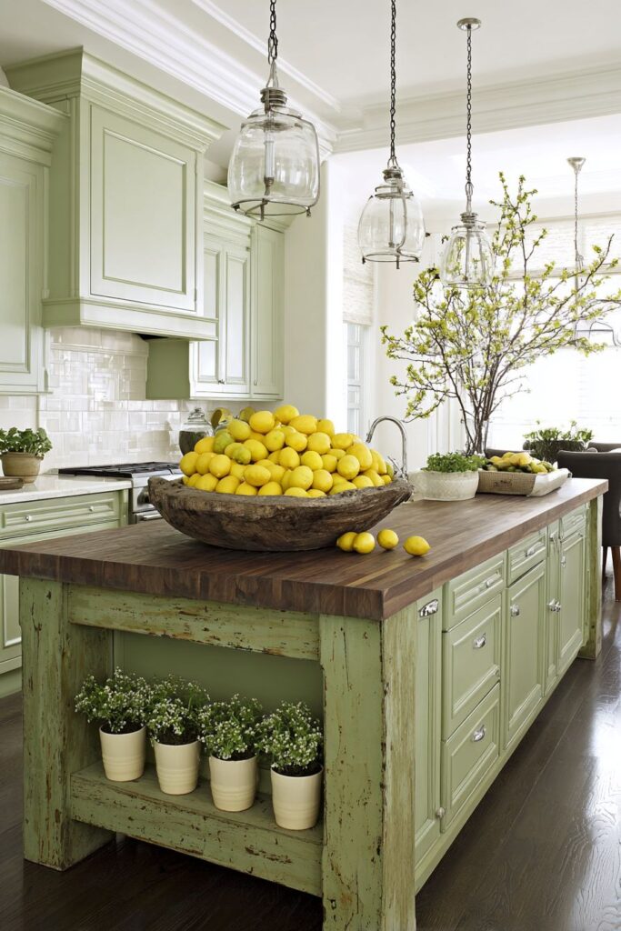
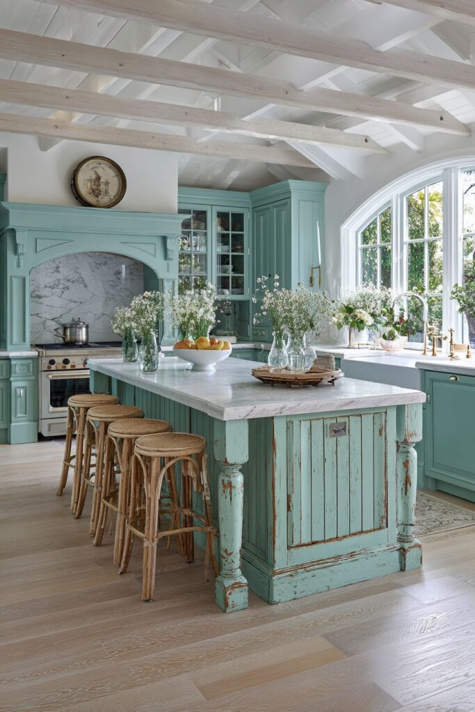
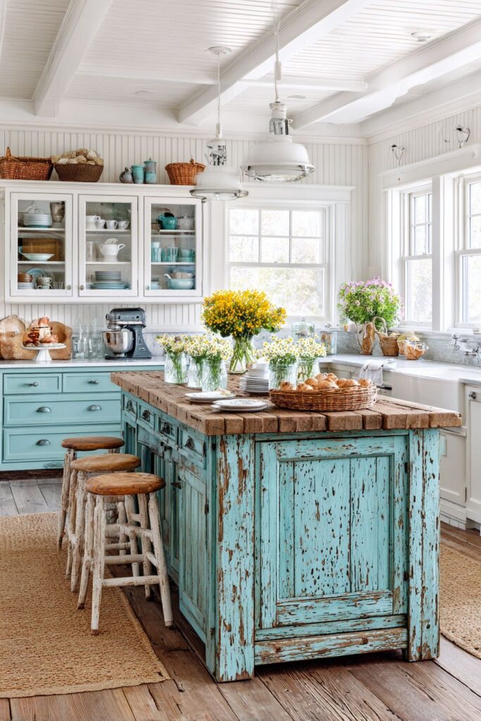
3. Sage Green Farmhouse Island Centerpiece
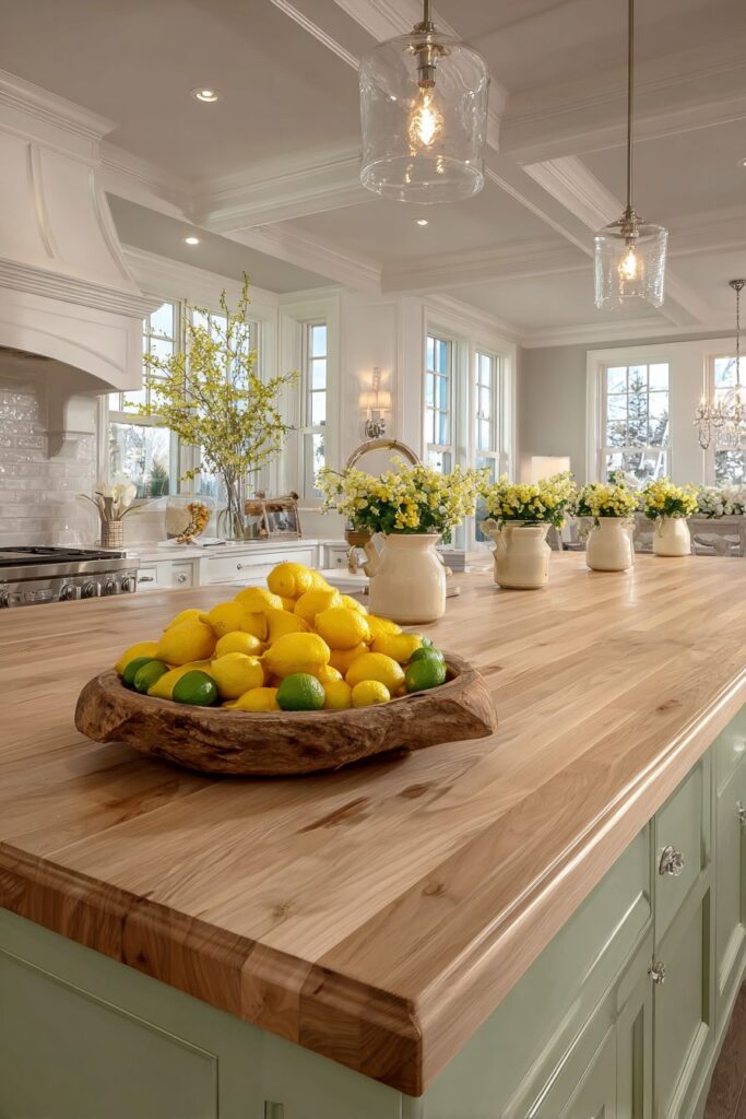
The kitchen island, often the functional workhorse of the culinary space, receives a spring transformation through the application of soft sage green paint and natural wood elements. This large farmhouse-style island becomes the literal and visual center of the kitchen, commanding attention through its generous proportions and thoughtful design. The sage green hue chosen for the painted base strikes a perfect balance—it’s colorful enough to make a statement yet subtle enough to work harmoniously with a variety of other tones and materials. The butcher block countertop crowning the island introduces rich honey tones and visible wood grain that adds warmth and organic texture, creating a tactile surface that invites touch and use.
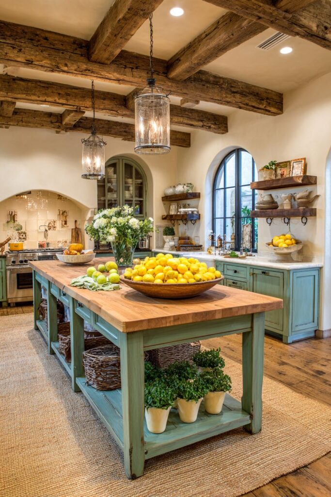
Seasonal styling elevates this practical piece of furniture into a showcase of spring abundance. A rustic wooden bowl, perhaps sourced from a local artisan or discovered at a flea market, overflows with fresh lemons and limes whose vibrant citrus hues bring energy and freshness to the composition. These fruits aren’t merely decorative—they’re ingredients waiting to brighten a recipe, their presence suggesting the kind of fresh, light cooking that characterizes spring cuisine. Small potted primrose plants in cream-colored ceramic pots line one side of the island, their cheerful blooms in shades of yellow, pink, and coral adding spots of color at a lower height, creating visual interest at multiple levels. The cream pots provide neutral contrast that allows the flower colors to shine while maintaining a cohesive, collected look.
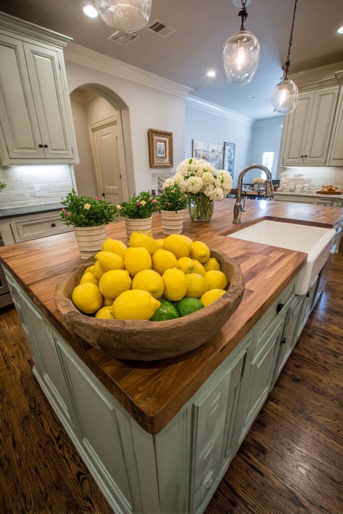
Natural light plays a crucial role in this design, with overhead pendant fixtures creating warm highlights on the wood grain of the butcher block surface. The interplay of light and shadow across the island reveals the depth and dimension of the materials used, from the painted sage green base to the natural variations in the wooden bowl and countertop. The wide-angle capture shows how this substantial island maintains its practical functionality—providing ample workspace for meal preparation, casual dining, and gathering—while serving as a beautiful focal point that anchors the entire kitchen in spring freshness. The combination of painted and natural wood finishes demonstrates how mixing materials can create richness and complexity in design without requiring a large palette of colors.
Key design tips for styling a farmhouse island:
- Paint the island base in a muted green tone for spring without going too bold
- Choose butcher block or natural wood countertops for warmth and practical durability
- Display fresh fruits in wooden bowls to add color, texture, and the promise of fresh cooking
- Use potted flowering plants rather than cut flowers for longer-lasting seasonal appeal
- Select cream or neutral-colored pots to let the plant blooms provide the color impact
- Ensure adequate lighting above the island to highlight materials and create ambiance
- Keep one side clear for practical workspace while styling the other side seasonally
- Consider the island from all angles—it’s typically viewed from multiple sides in an open kitchen
4. Blush Pink Breakfast Nook Intimacy
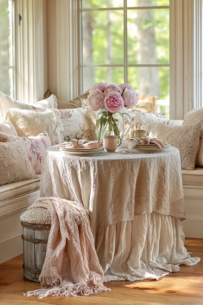
Creating an intimate dining experience within the kitchen space requires attention to scale, comfort, and atmospheric details. This cozy breakfast nook centers around a round pedestal table, a shape that naturally encourages conversation and connection by eliminating the hierarchical positioning of traditional rectangular tables. The natural linen tablecloth in pale blush pink introduces soft color while maintaining an effortless, organic feel—the slight texture and natural wrinkles of linen add authenticity and warmth that synthetic fabrics simply cannot achieve. This fabric choice creates a foundation that feels special enough for leisurely weekend breakfasts yet casual enough for everyday morning coffee.
The centerpiece demands attention without overwhelming the intimate scale of the space. Fresh cut peonies, those quintessential spring blooms beloved for their lush, romantic layers of petals, overflow from a clear glass pitcher that allows their stems to remain visible, connecting the flowers to their natural origins. The transparency of the glass vessel keeps the arrangement feeling light and unobtrusive despite the visual weight of the full blooms. Delicate floral-patterned cotton napkins echo the natural beauty of the centerpiece while introducing additional pattern and texture to the table setting. These small textile details demonstrate how thoughtful layering can create richness without clutter, with each element contributing to the overall spring narrative.
Cushioned bench seating upholstered in soft cream fabric transforms a simple dining spot into a cozy retreat where one might linger over morning coffee or afternoon tea. Textured throw pillows in complementary tones add comfort while introducing additional tactile interest and opportunities for seasonal pattern or color. The golden hour natural lighting streaming through nearby windows bathes the entire scene in warm, honeyed tones that make everything look more beautiful and inviting. This quality of light, captured through careful interior design photography, reveals how time of day and natural illumination can transform a space, creating moments of exceptional beauty within ordinary domestic settings. The overall effect is one of gentle luxury—a space that feels special and considered without appearing formal or unapproachable.
Key design tips for breakfast nook styling:
- Choose round tables for small dining areas to maximize space and encourage intimacy
- Use natural linen tablecloths in soft colors for texture and relaxed elegance
- Select seasonal flowers like peonies that make a statement without requiring elaborate arrangements
- Keep centerpieces low enough to see across the table for comfortable conversation
- Layer textiles through napkins, tablecloths, and cushions for warmth and comfort
- Opt for built-in or bench seating to maximize space efficiency in smaller nooks
- Add throw pillows for comfort and easy seasonal color updates
- Position seating to take advantage of natural light from windows
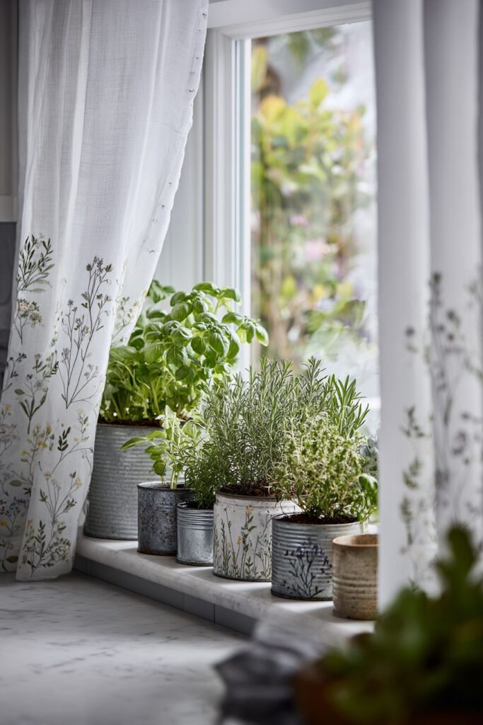
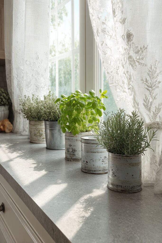
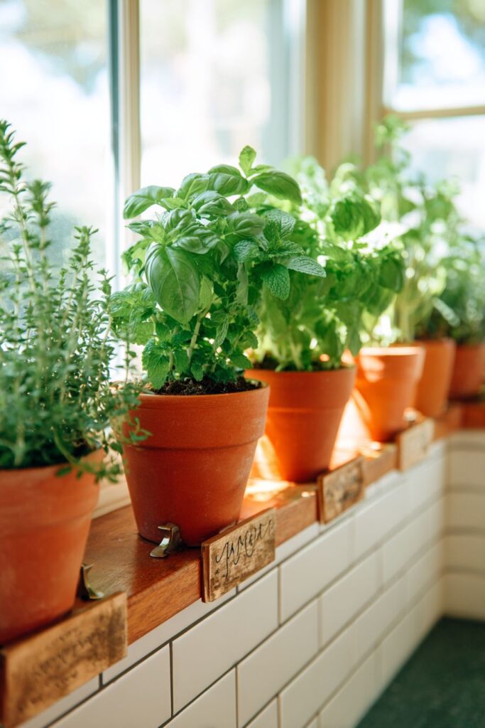
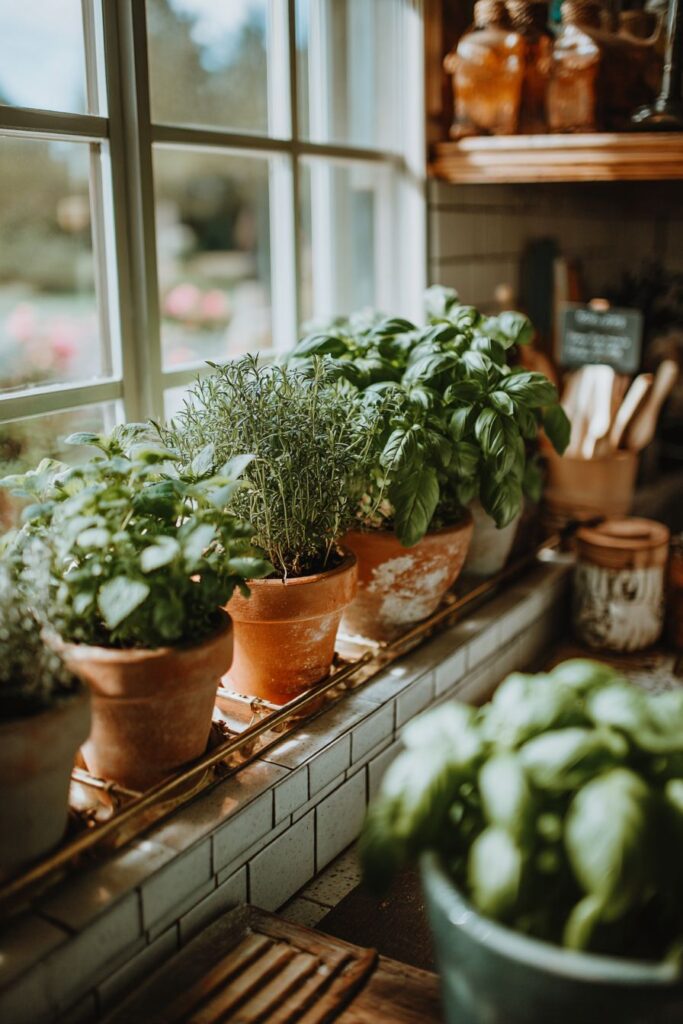
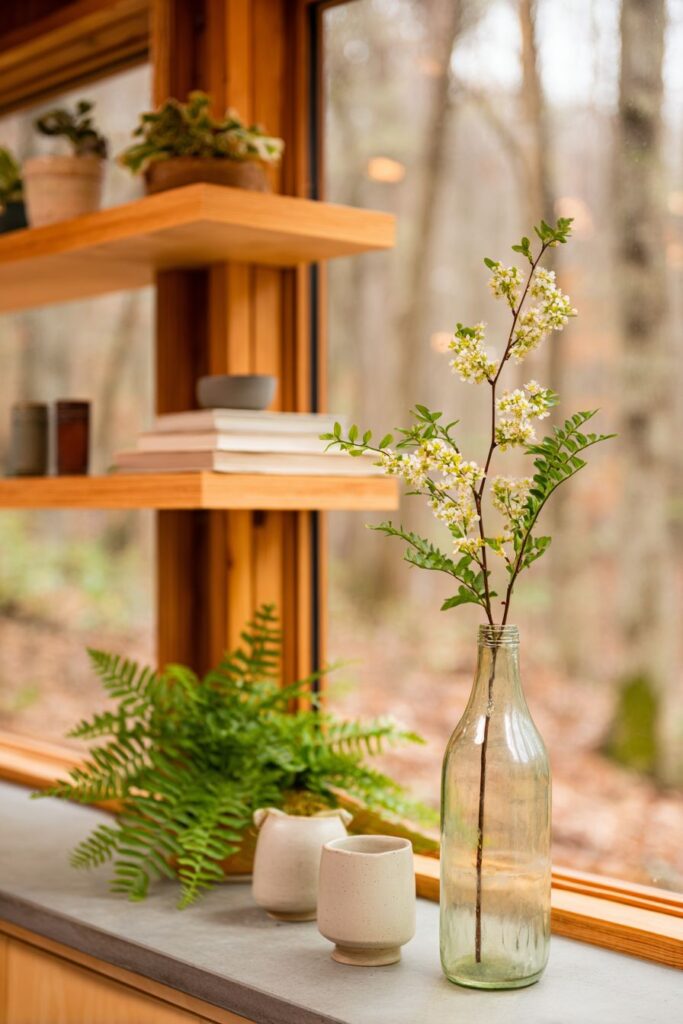
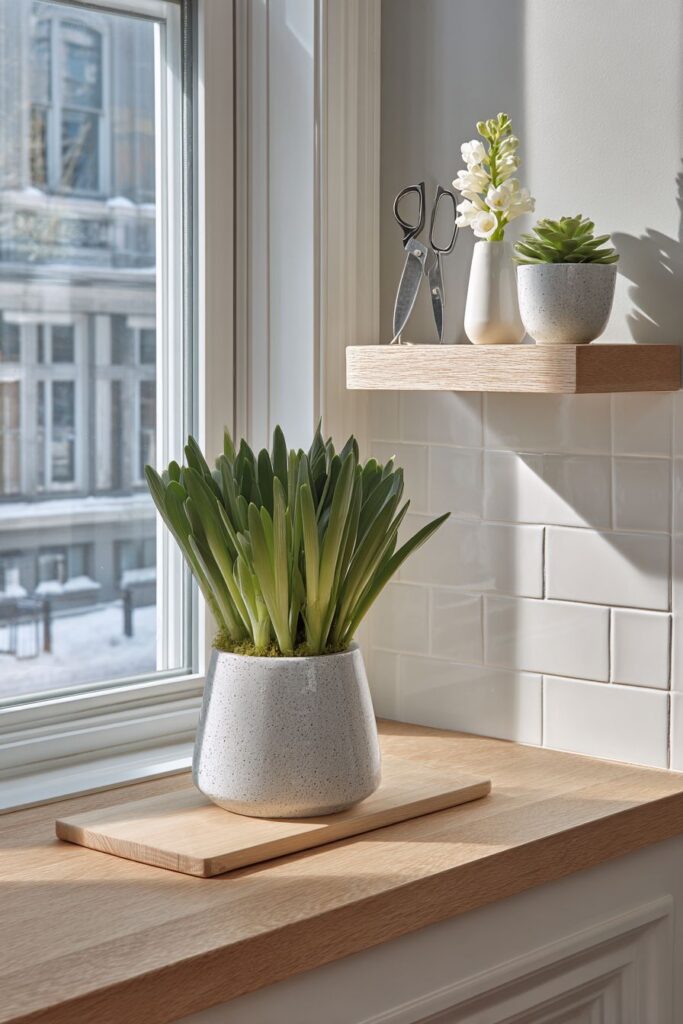
5. Kitchen Window Herb Garden Sanctuary
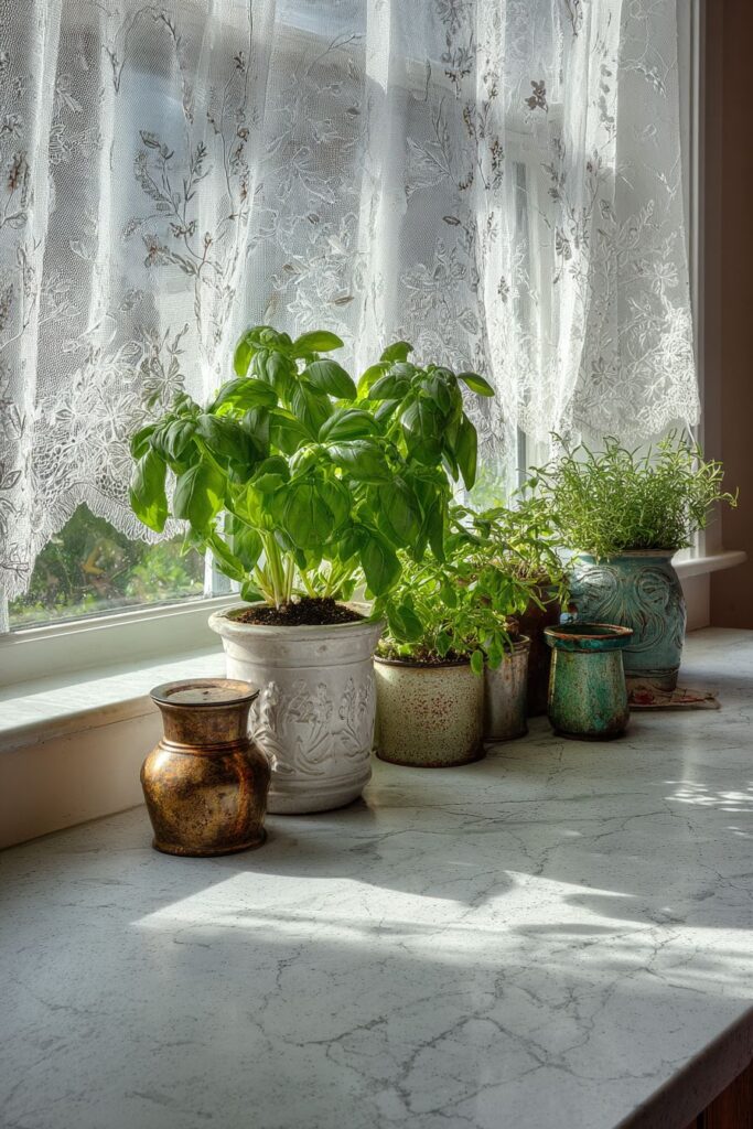
The kitchen window sill, often an underutilized space, transforms into a thriving herb garden that serves as both functional pantry and living artwork. Various herb plants—basil, thyme, rosemary, mint, and parsley—nestle in mismatched vintage tins and ceramic pots that tell stories of collection and curation over time. This deliberate lack of matching creates visual interest and personality that perfectly curated sets simply cannot achieve. The herbs themselves provide varying shades of green, from the bright, almost yellow-green of basil to the deeper, grayer tones of sage, creating a lush tapestry of living color right where they’re most needed for cooking.
Sheer white voile curtains with delicate embroidered botanical patterns frame this window garden, their translucent quality allowing soft morning light to filter through while adding another layer of botanical beauty through their decorative stitching. These curtains serve multiple purposes: they provide privacy without blocking light, they frame the herb display like artwork, and their embroidered details echo the living plants in front of them, creating thematic continuity. The surrounding countertop features light grey quartz with subtle veining, a modern material choice that provides a clean, low-maintenance backdrop for the more rustic, organic elements of the herb garden. This contrast between contemporary surfaces and vintage containers demonstrates how mixing design eras can create dynamic, interesting spaces.
Detail-focused interior photography captures the fresh green of the herbs against their varied containers, emphasizing how natural material textures—weathered metal, glazed ceramic, rough terracotta—add depth and character to even a small vignette. Proper exposure balances the bright window light with the interior space, preventing the herbs from becoming silhouettes while maintaining the luminous quality of natural sunlight streaming through the leaves. The practical brilliance of this design lies in its dual functionality: these aren’t just decorative plants but actual cooking ingredients, ready to be snipped and added to dishes. The accessibility of fresh herbs encourages their use, elevating everyday cooking while keeping the kitchen connected to natural growing cycles and seasonal rhythms.
Key design tips for window sill herb gardens:
- Select herbs you actually use in cooking to ensure they’re maintained and harvested regularly
- Mix container types—vintage tins, ceramic pots, terracotta—for visual interest
- Ensure adequate drainage in all containers to prevent root rot and plant death
- Choose sheer curtains that allow light penetration while adding softness and privacy
- Position herbs based on their light requirements, with sun-lovers in the brightest spots
- Rotate containers regularly to ensure even growth on all sides of the plants
- Use modern countertop materials as neutral backdrops for more eclectic displays
- Label herbs with small tags if you’re growing many varieties or entertaining guests who might want to identify them
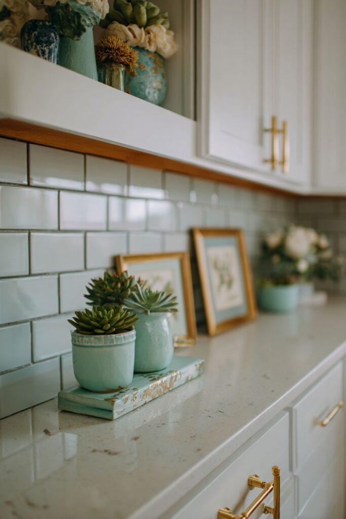
6. Subway Tile Sophistication with Spring Touches
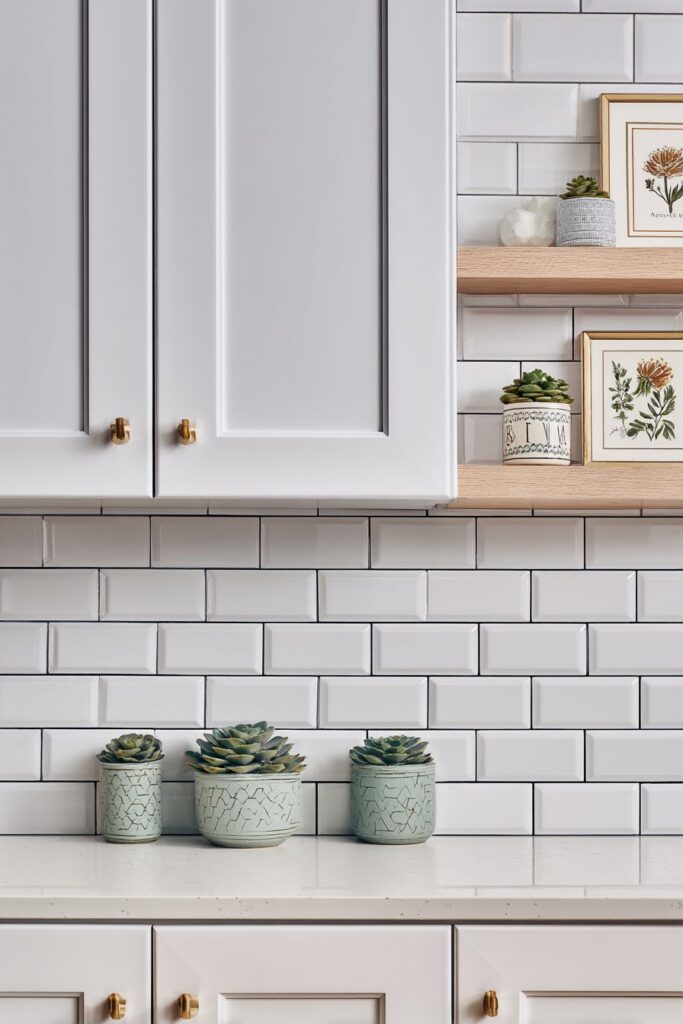
Classic white subway tile backsplash receives a contemporary update through the thoughtful application of light grey grout, a choice that adds subtle definition to each tile while maintaining a clean, bright aesthetic. This timeless backdrop provides the perfect foundation for seasonal displays that can change throughout the year without requiring permanent modifications to the kitchen structure. A floating shelf, seemingly suspended against the tiled surface, creates a display platform that draws the eye upward and makes use of often-wasted vertical space. The shelf’s minimal profile keeps the focus on what it holds rather than the hardware itself, creating a floating effect that feels modern and airy.
The spring-themed items arranged on this shelf demonstrate how small, carefully chosen accessories can make significant impact. Small succulents in mint green pots introduce living elements and a pop of color that complements rather than competes with the larger kitchen palette. Their compact size and minimal maintenance requirements make them ideal for kitchen environments where high humidity and temperature fluctuations might challenge more delicate plants. Vintage botanical prints in simple white frames bring artistic interest while reinforcing the natural theme, their pressed flower and plant imagery creating a bridge between indoor and outdoor spaces. The white frames echo the subway tile while allowing the prints themselves to provide the visual interest and subtle color.
Brushed gold cabinet hardware adds an unexpected touch of warmth to this predominantly cool-toned scheme. These metallic accents catch light and create small moments of sparkle and luxury that elevate the entire design. The composition, captured with professional interior photography techniques, reveals how decorative elements integrate naturally into the functional kitchen workspace. Even, natural lighting prevents harsh shadows or blown-out highlights, allowing viewers to appreciate the subtle interplay of textures—the glossy surface of subway tile, the matte finish of ceramic pots, the varied textures within the botanical prints, and the soft gleam of brushed metal. This design proves that spring decor doesn’t require extensive renovations or bold color choices; sometimes the most sophisticated approach involves restraint and careful curation.
Key design tips for subway tile spring styling:
- Use colored grout to add subtle interest to classic white subway tile
- Install floating shelves for displays that can be easily updated seasonally
- Choose small-scale plants like succulents for kitchen environments
- Frame botanical prints in simple, clean-lined frames that don’t compete for attention
- Coordinate metal finishes throughout the kitchen for a cohesive look
- Keep displays minimal on small shelves to avoid cluttered appearance
- Mix living plants with artwork for varied textures and visual interest
- Consider the sight lines from different areas of the kitchen when placing shelves and accessories
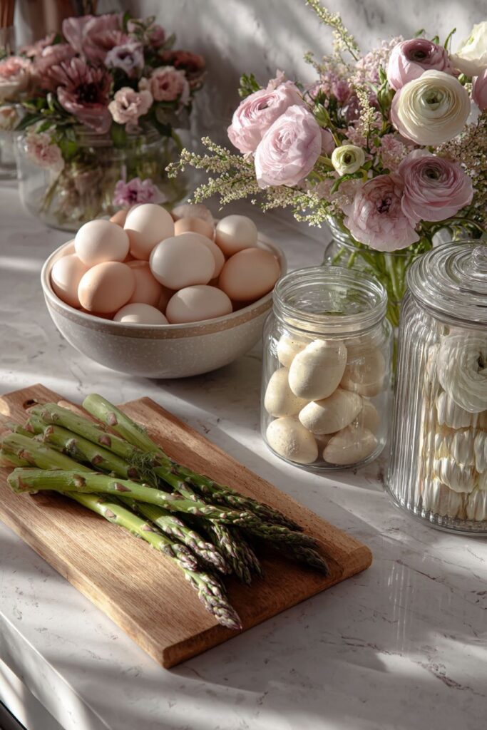
7. Countertop Harvest Display
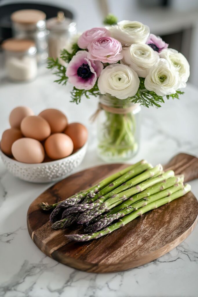
The kitchen countertop becomes a stage for celebrating spring’s edible bounty through a carefully curated collection of fresh ingredients and seasonal items. This approach to spring decor embraces the kitchen’s primary function—food preparation—while elevating everyday ingredients to artistic status. A wooden cutting board serves as both practical tool and display platform, its warm wood tones and natural grain providing organic beauty. Fresh asparagus, those slender green spears that herald spring’s arrival, rest upon the board in artful arrangement, their tips creating visual rhythm and their vibrant color announcing seasonal availability.
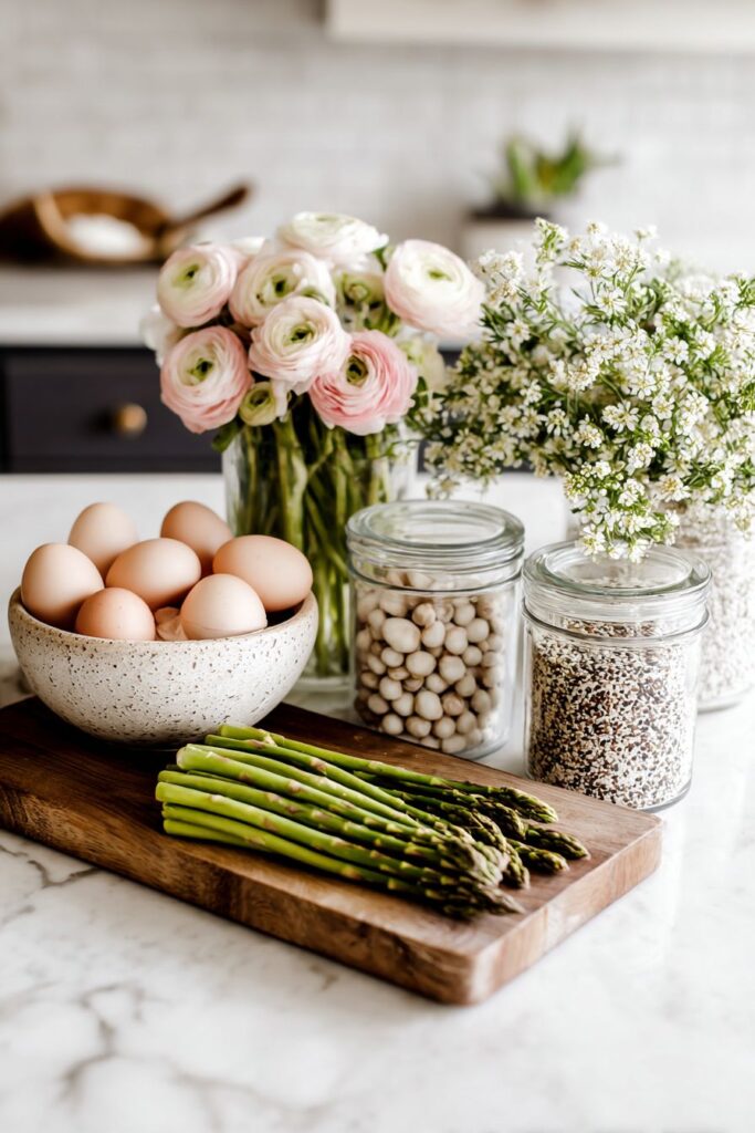
A ceramic bowl cradling farm-fresh eggs introduces additional layers of meaning and beauty to the composition. The eggs, with their varied tones from creamy white to light brown and perhaps even pale blue or green if from specialty breeds, represent both the practical ingredients of cooking and the renewal themes inherent in spring symbolism. Their smooth, oval forms provide geometric interest and their humble beauty reminds us that the simplest natural objects often possess the most profound aesthetic appeal. Glass canisters filled with spring blooms—ranunculus with their tightly packed petals and anemones with their dark centers surrounded by delicate petals—bring height and floral beauty to the arrangement while maintaining visibility through their transparent walls.
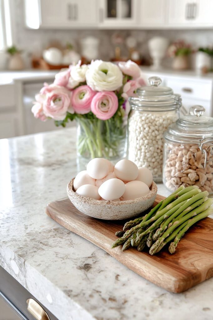
Pale marble countertops with subtle grey veining provide the perfect backdrop for this edible still life, their cool elegance and smooth surface creating contrast with the organic warmth of wood, the textural interest of vegetables, and the soft complexity of flowers. Soft diffused natural lighting creates realistic shadows that add dimension and depth to the arrangement, preventing it from appearing flat or overly staged. This lighting reveals the varied textures present—the slight ridges along asparagus spears, the smooth curve of eggshells, the papery quality of ranunculus petals, and the subtle variations in the marble’s veining. The genius of this approach lies in its accessibility; rather than requiring special purchases, it transforms everyday cooking ingredients into a celebration of seasonal abundance, reminding us that beauty and function need not be separate concerns in kitchen design.
Key design tips for countertop displays:
- Use natural wood cutting boards as both functional tools and display platforms
- Select seasonal produce in beautiful forms and colors—asparagus, artichokes, fresh herbs
- Display eggs in handsome bowls to celebrate their simple natural beauty
- Use glass containers for flowers to maintain visual lightness on countertops
- Choose flowers with good vase life that can withstand kitchen conditions
- Keep displays on one section of counter, leaving ample workspace for cooking
- Arrange items at varying heights for more dynamic, interesting compositions
- Ensure good natural lighting to show off the colors and textures of fresh ingredients
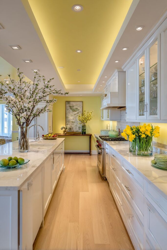
8. Cheerful Yellow Accent Wall Energy
Color psychology plays a powerful role in interior design, and nowhere is this more evident than in a galley kitchen featuring a pale yellow accent wall that infuses the entire space with sunshine and optimism. This bold yet approachable color choice transforms a potentially challenging narrow layout into a cheerful corridor of culinary activity. The yellow hue, carefully selected in a soft, pale tone rather than a saturated shade, provides warmth without overwhelming the space or making it feel smaller. Paired with white shaker-style cabinets, the classic door style with its recessed panel detail, the yellow wall creates visual interest and depth while the white cabinetry reflects light and maintains an overall sense of openness.
A narrow console table positioned against one wall demonstrates how even limited square footage can accommodate seasonal styling. This slim piece of furniture doesn’t impede traffic flow in the galley layout but provides valuable surface area for creating a spring vignette. A trio of glass vases, varied in height to create visual rhythm, holds cherry blossom branches and daffodils that bring the beauty of spring gardens indoors. The branches add organic, reaching forms that draw the eye upward, making the space feel taller, while the daffodils introduce additional yellow tones that echo and reinforce the wall color. This repetition of color creates cohesion and intentionality in the design.
Vinyl plank flooring in light oak contributes warmth and natural texture underfoot while providing the practical benefits of water resistance and easy maintenance crucial in kitchen environments. The light wood tone complements the fresh aesthetic without introducing competing warmth that might clash with the yellow walls. Wide-angle interior design photography captures how efficient use of space and thoughtful color choices can overcome the challenges of a galley layout. Soft overhead lighting, rather than harsh task lighting, enhances the cheerful spring atmosphere, creating an even, welcoming glow throughout the space. This design proves that spring kitchen decor can work in any configuration, even in smaller or more challenging layouts, when approached with creativity and attention to how color and light interact.
Key design tips for galley kitchen spring styling:
- Choose one accent wall in a spring color rather than painting all walls to avoid overwhelming small spaces
- Use pale, soft tones of yellow or other spring colors for warmth without intensity
- Select white or light cabinetry to reflect light and maintain openness in narrow spaces
- Opt for slim console tables or narrow floating shelves that don’t impede traffic flow
- Create vertical interest with branches and tall vessels to draw the eye upward
- Choose light wood flooring to add warmth without visual weight
- Use multiple light sources to eliminate shadows in long, narrow kitchens
- Keep color palette limited—two or three main colors maximum—for cohesion
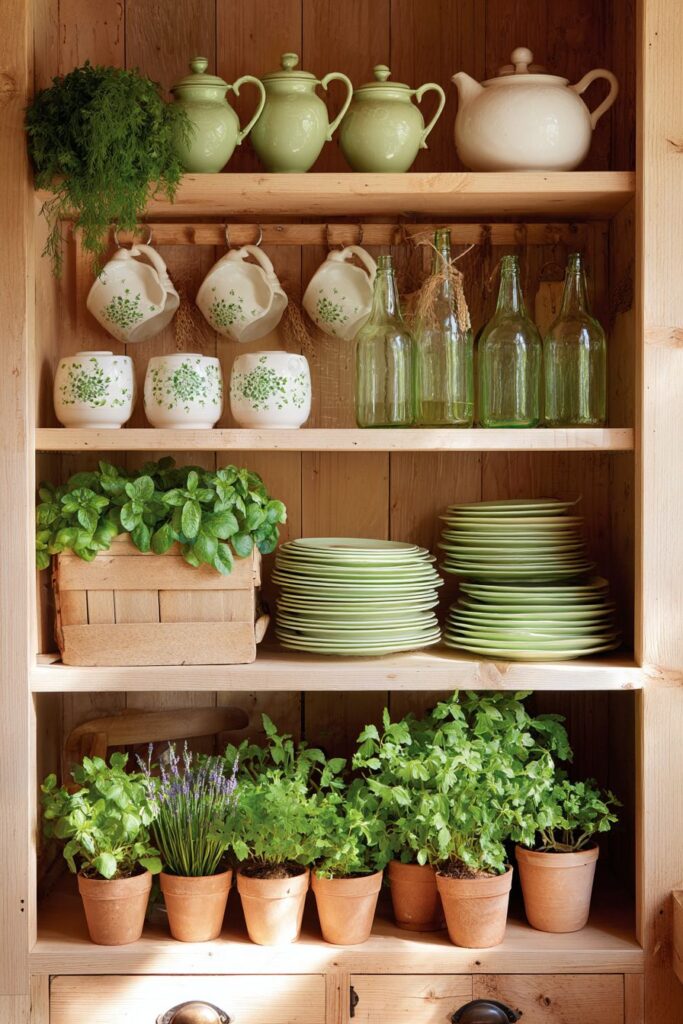
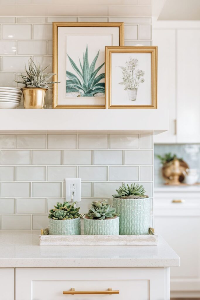
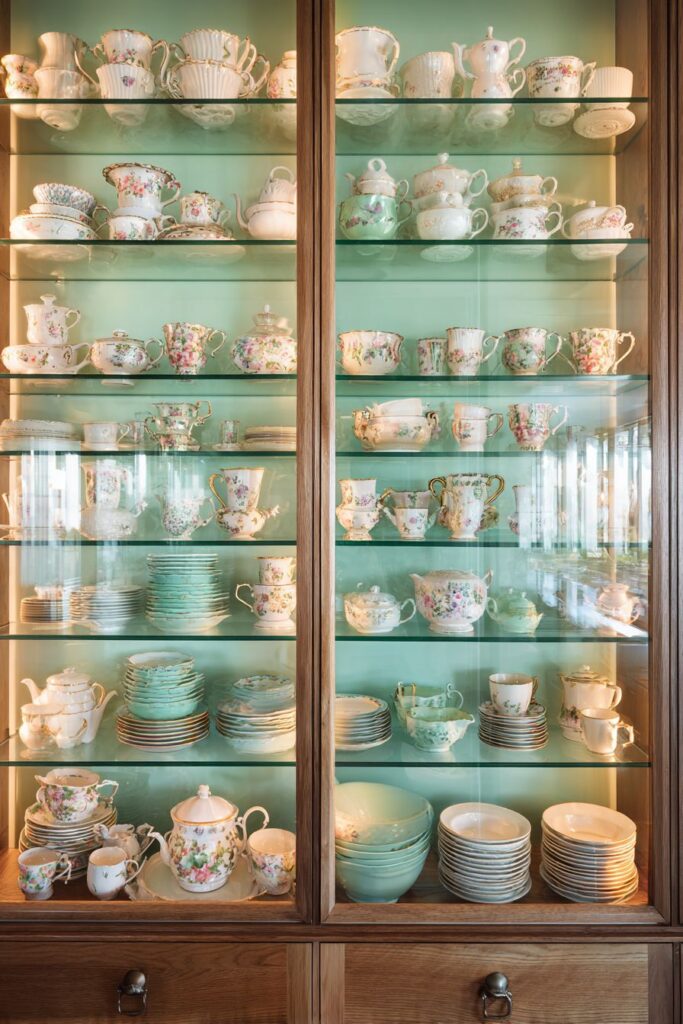
9. Glass-Front Cabinet Showcase
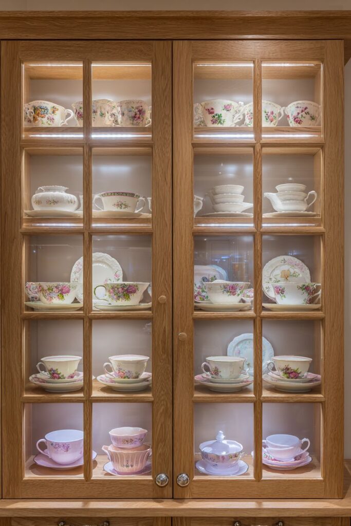
Glass-front upper cabinets transform functional storage into curated display, offering opportunities to showcase spring-themed collections while maintaining the practical organization essential in working kitchens. The transparent doors create visual depth, allowing the eye to travel beyond the surface plane of the cabinetry while reflecting light throughout the space. Inside, a carefully arranged collection of white and pastel dinnerware creates a serene, cohesive display that suggests careful curation rather than random accumulation. Vintage floral teacups, perhaps inherited from grandmothers or collected from antique shops, introduce delicate patterns and nostalgic charm that speaks to spring’s romantic aesthetics.
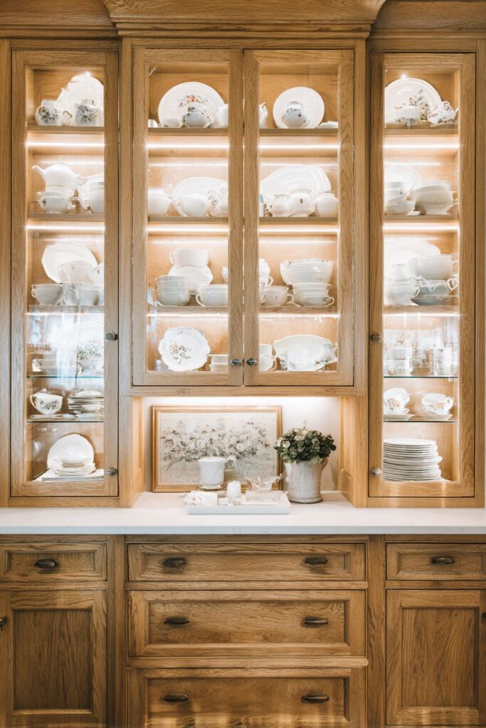
Interior cabinet lighting revolutionizes these displays, with small LED strip lights installed along shelves creating illumination that highlights the spring-themed contents while adding ambient lighting to the entire kitchen. This strategic lighting transforms the cabinets from simple storage into glowing showcases, particularly effective during evening hours when natural light fades. The gentle glow through glass doors creates warmth and visual interest, turning the cabinets themselves into design features. Natural wood lower cabinets in honey oak finish provide grounding weight and warmth at the base of the kitchen, creating balance with the lighter, more ethereal quality of the glass-front uppers.
Professional interior photography with balanced exposure reveals the thoughtful styling within the cabinets while maintaining focus on practical storage function. The images capture how attention to the interplay of light through glass creates depth and dimension, with reflections and transparency adding layers of visual complexity. This approach to spring kitchen decor demonstrates sophistication and restraint—rather than introducing seasonal elements through bold colors or temporary additions, it works with the kitchen’s existing architecture to create beauty through display and illumination. The white and pastel palette remains appropriate year-round while feeling particularly fresh and relevant during spring months, and the ability to see and access dishware actually encourages its use, making beautiful objects part of daily life rather than preserved but unused treasures.
Key design tips for glass cabinet displays:
- Organize items by color for visually cohesive displays—whites, pastels, or complementary tones
- Install LED strip lighting inside cabinets for illumination and ambiance
- Mix functional dinnerware with decorative pieces like vintage teacups or small vases
- Keep shelves organized and not overly crowded—leave some breathing room
- Use the rule of three or five when grouping items for most pleasing arrangements
- Choose lower cabinets in warm wood tones to ground lighter upper displays
- Clean glass fronts regularly to maintain clarity and showcase contents
- Rotate seasonal items in and out to keep displays fresh and relevant
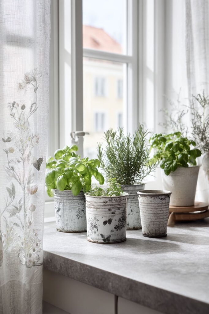
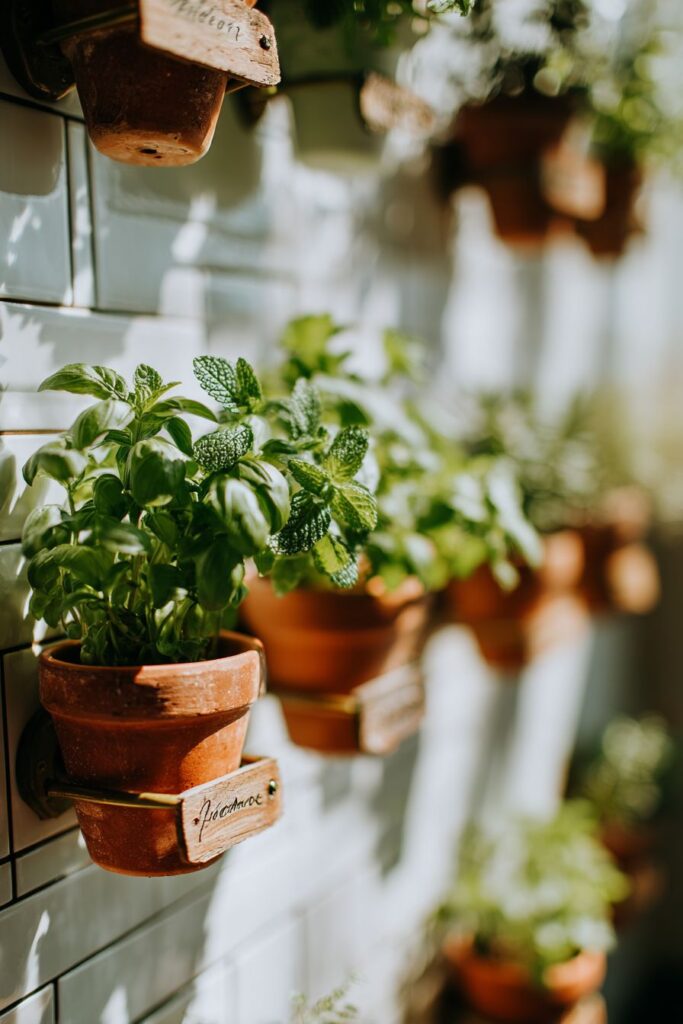
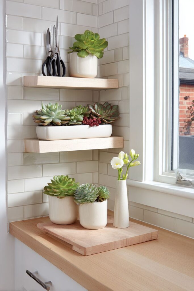
10. Vertical Herb Garden Wall Installation
Maximizing vertical space while celebrating spring’s growing energy, a wall-mounted herb garden transforms a subway tile backsplash into a living feature that engages multiple senses. Individual pots of basil, mint, and parsley mount directly onto the white tile surface using simple brass holders, creating a functional garden that rises from countertop level to eye height. This vertical arrangement makes efficient use of space while keeping fresh herbs immediately accessible during cooking, eliminating the need to step outside or reach into distant corners of the kitchen. Each terracotta pot brings its characteristic warm, earthy color and slightly porous texture that benefits herb root systems while contributing visual warmth to the predominantly white backdrop.
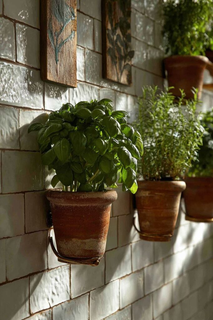
Simple brass holders provide both practical support and metallic accent, their warm golden tone catching light and adding small moments of gleam against the matte tile. Small plant markers in weathered wood identify each herb variety, their rustic appearance contributing to the organic, garden-inspired aesthetic while serving the practical purpose of identification—particularly helpful when multiple varieties of similar-looking herbs grow together. The weathered quality of the wood markers suggests age and use, adding character and preventing the display from appearing too new or carefully staged.
Natural light from a nearby window becomes crucial to this living wall’s success, providing the illumination necessary for healthy plant growth while creating beautiful visual effects. Detail shot interior photography captures how light highlights the texture of ceramic pots and the fresh, varied greens of herb leaves, with soft shadows adding depth and dimension. The arrangement demonstrates how kitchen design can blur boundaries between indoor and outdoor spaces, bringing the vitality and freshness of a garden directly into the cooking zone. This approach to spring decor offers ongoing rewards—the herbs grow and change, providing both visual interest and culinary enhancement, while the act of tending them creates a mindful connection to natural cycles and seasonal rhythms.
Key design tips for vertical herb gardens:
- Choose herbs with similar light and water requirements for ease of care
- Mount pots at heights convenient for regular watering and harvesting
- Use terracotta pots for their moisture-wicking properties and classic appearance
- Install near a window or supplemental grow lights for adequate illumination
- Select brass or copper holders for warmth; avoid chrome in herb garden settings
- Add wooden plant markers for both function and rustic charm
- Ensure backsplash is properly sealed before installing mounting hardware
- Start with easy-to-grow herbs like basil, mint, and parsley before attempting more challenging varieties
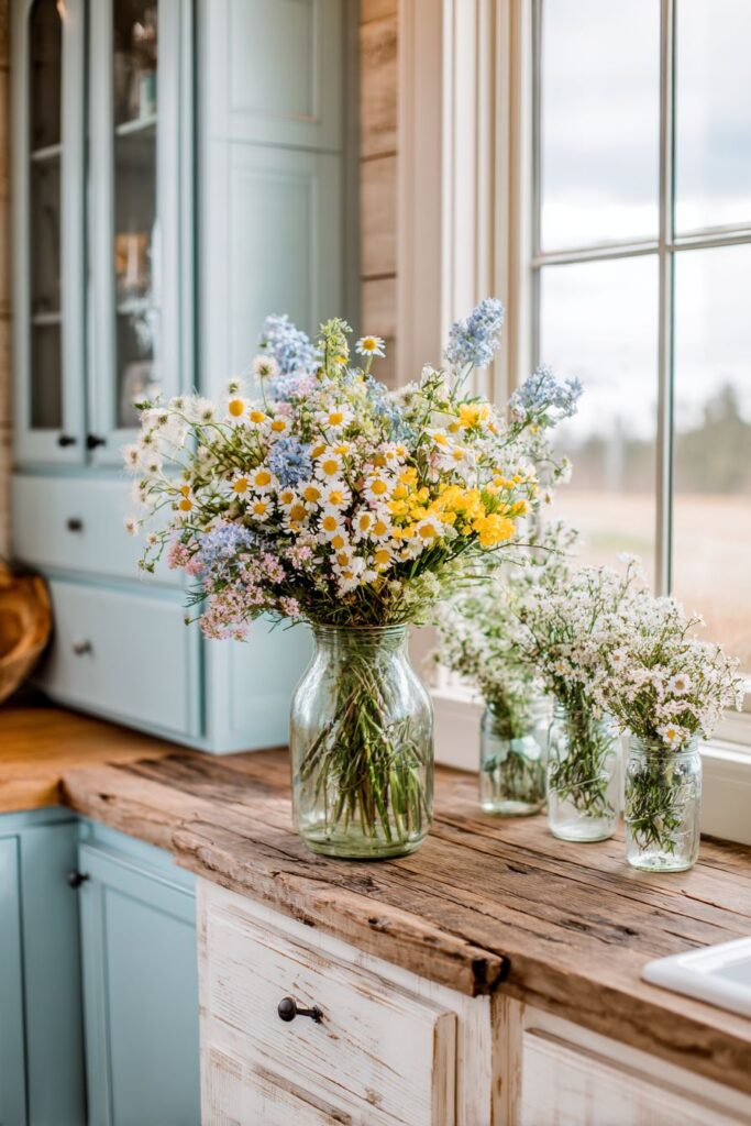
11. Cottage-Style Robin’s Egg Blue Charm
Immersing yourself in a cottage-style kitchen feels like stepping into a storybook, where robin’s egg blue lower cabinets create a foundation of soft, dreamy color that immediately establishes the space’s cheerful character. This particular shade of blue—neither too green nor too purple—captures the delicate hue of wild bird eggs found in spring nests, connecting the kitchen to natural wonders and seasonal renewal. White beadboard upper cabinets introduce textural interest through their vertical grooves while maintaining brightness and light-reflective qualities essential in creating an airy atmosphere. The combination of painted lower cabinets and white uppers creates visual balance, preventing the blue from overwhelming while ensuring it remains the star of the color story.
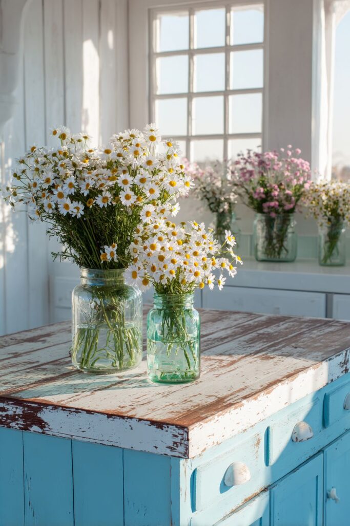
The kitchen island receives special treatment with a distressed white finish that suggests years of loving use and family gatherings. This intentionally aged appearance adds character and authenticity, preventing the space from feeling too precious or newly renovated. Topped with reclaimed wood, the island gains warmth and natural beauty through visible grain patterns, knots, and the subtle color variations that only genuine aged wood possesses. Mason jars lining the windowsill overflow with wildflowers—daisies with their innocent white petals and sunny yellow centers, baby’s breath creating delicate clouds of tiny white blooms. These casual arrangements in humble glass jars perfectly suit the cottage aesthetic, their unpretentious beauty celebrating simple pleasures and natural abundance.
Natural morning light floods through windows, creating that fresh, airy feeling that defines both spring and cottage style. The light reveals how pastel colors and vintage-inspired elements work together, with the robin’s egg blue appearing more vibrant in direct sunlight and softer in shadowed areas, creating dynamic visual interest throughout the day. Architectural digest style photography captures the charming blend of colors and textures, showing how cottage style succeeds through layering of comfortable, lived-in elements rather than formal perfection. This approach to spring kitchen decor embraces imperfection and personality, creating spaces that feel welcoming and authentic, where cooking and gathering happen in an atmosphere of relaxed beauty.
Key design tips for cottage-style spring kitchens:
- Choose soft pastels like robin’s egg blue, mint, or pale yellow for cabinet colors
- Mix painted and natural wood finishes for visual interest and warmth
- Embrace distressed or aged finishes that suggest history and character
- Use beadboard for texture without overwhelming pattern
- Display wildflowers in simple mason jars rather than formal arrangements
- Maximize natural light with minimal window treatments or sheer fabrics
- Select reclaimed or salvaged wood for countertops and island tops
- Layer white tones—warm whites, cool whites, creams—for depth
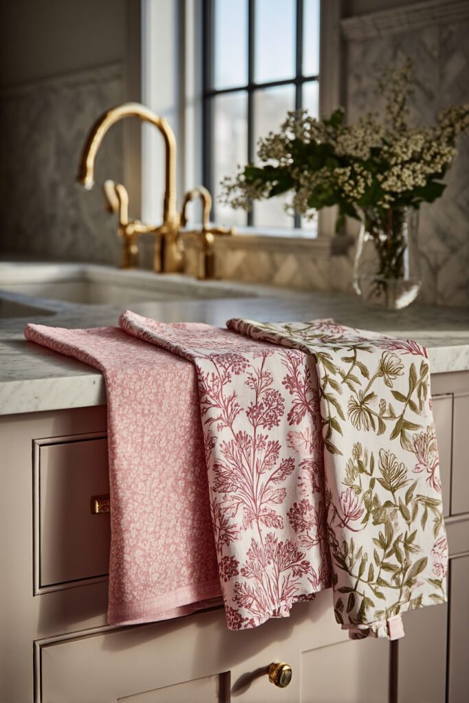
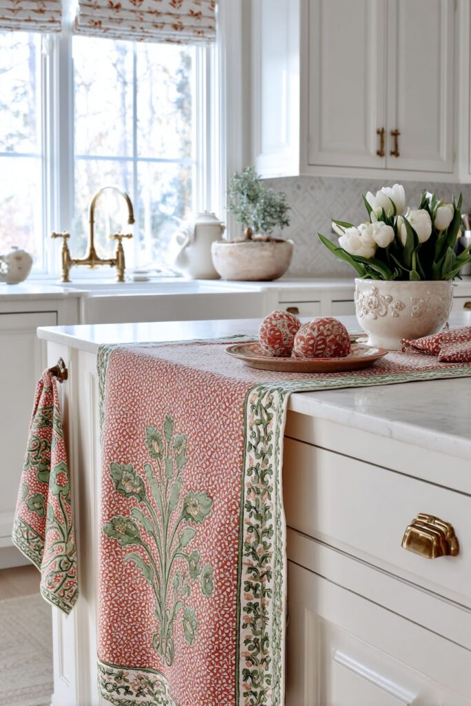
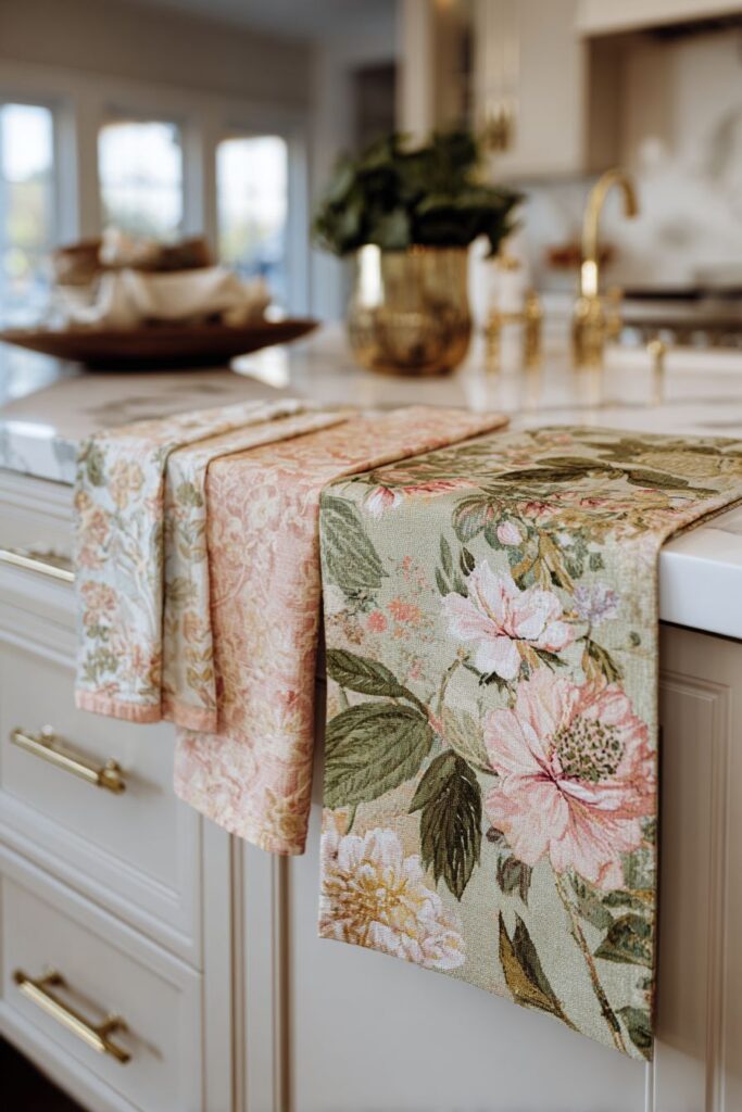
12. Coordinated Textile Spring Symphony
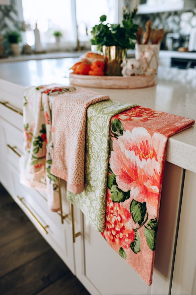
Textiles provide some of the easiest and most effective ways to introduce spring into kitchen decor, and this approach celebrates fabric as both functional necessity and design opportunity. A vintage-inspired floral runner stretches across the kitchen island, its soft coral and green botanical print introducing pattern and color while protecting the surface beneath. The runner’s design, reminiscent of vintage wallpapers or grandmother’s linens, brings nostalgic charm while its spring-appropriate colors feel fresh and current. Matching cotton tea towels hang from a brass rail, their coordinated patterns creating visual cohesion while remaining readily accessible for drying hands or dishes, demonstrating how practical items can serve decorative purposes without sacrificing functionality.
Potholders in complementary patterns rest on the countertop, their protective quilted construction evident in their dimensional appearance. These aren’t hidden away in drawers but displayed as part of the kitchen’s aesthetic story, their patterns echoing the runner and towels while their placement suggests readiness for use. The white quartz counter provides clean contrast, its pale, neutral surface allowing the textile patterns and colors to command attention without competing backgrounds or clashing undertones. This interplay between patterned textiles and neutral surfaces demonstrates sophisticated design thinking—knowing when to introduce pattern and when to provide visual rest.
Interior design photography with soft natural lighting emphasizes the fabric textures and delicate pattern details, revealing the slight natural wrinkles that prove these are real linens in actual use rather than pristine, untouchable showpieces. These wrinkles add authenticity and warmth, suggesting a kitchen where cooking actually happens and life is lived. The varying textures—smooth cotton, quilted padding, woven weaves—create tactile interest that makes the space feel welcoming and comfortable. Coordinating textiles throughout the kitchen creates a pulled-together, intentional look that’s surprisingly easy to achieve through careful selection and thoughtful placement, proving that spring decor doesn’t require extensive renovations when fabric can provide beautiful, changeable seasonal impact.
Key design tips for spring textile coordination:
- Select a primary pattern or print as your anchor, then coordinate other textiles to complement it
- Choose botanical or floral prints in spring-appropriate colors—soft corals, greens, yellows
- Mix pattern scales—pair larger prints with smaller coordinating patterns
- Use white or neutral countertops and surfaces to let textile patterns shine
- Display textiles rather than hiding them—hang towels on hooks or rails
- Embrace natural wrinkles in linens for authentic, lived-in appearance
- Layer different fabric types—cotton, linen, quilted pieces—for textural interest
- Change textiles seasonally for easy, affordable decor updates
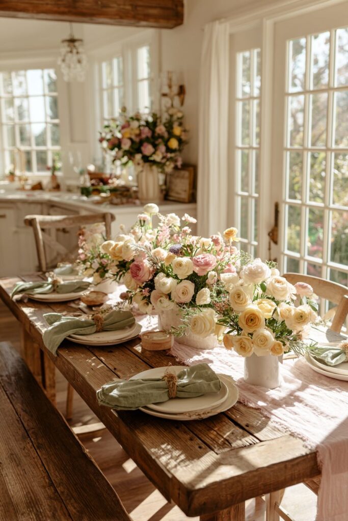
13. Statement Floral Arrangement Focal Point
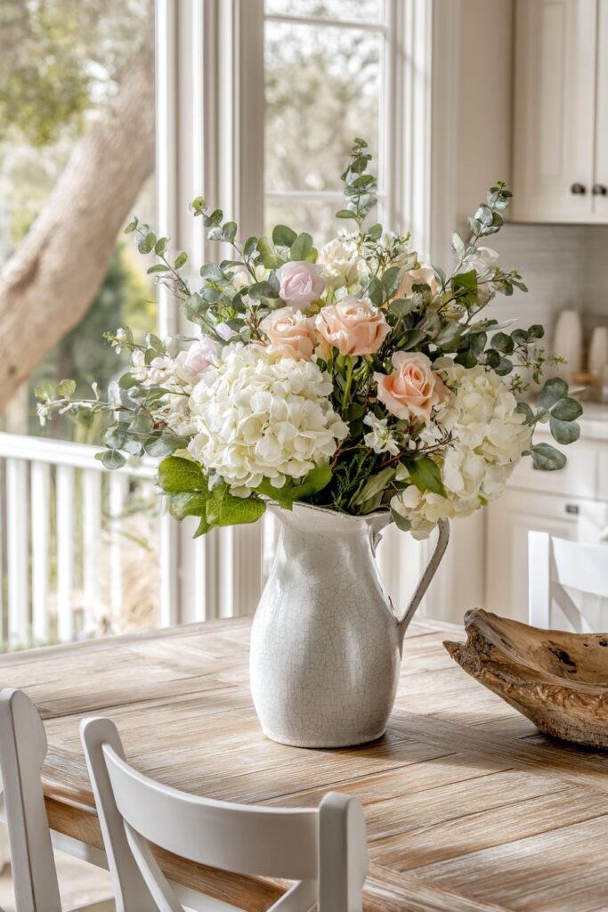
A large-scale floral arrangement commands attention and anchors the kitchen dining area, transforming a simple table into a celebration of spring’s floral abundance. White hydrangeas provide mass and structure with their large, spherical blooms composed of countless small florets, their pure white petals creating a cloud-like effect that serves as the foundation of the arrangement. Pale pink roses, perhaps garden roses with their many-petaled, fragrant blooms, introduce soft color and romantic elegance, their classic beauty universally appreciated and seasonally appropriate. Eucalyptus branches with their silvery-green leaves and graceful arching stems provide movement and textural contrast, their subtle fragrance adding another sensory dimension to the dining experience.
The ceramic pitcher holding this abundant arrangement features a crackle glaze finish, its network of fine lines adding character and visual interest to the vessel. This imperfect finish suggests artisanal craftsmanship and age, preventing the pitcher from appearing too perfect or commercial. The container’s substantial size accommodates the generous arrangement while its neutral tone allows the flowers to remain the focal point. The composition sits on a weathered wood table whose natural patina and subtle imperfections complement the organic beauty of the flowers. Simple white dining chairs surround the table, their clean lines and neutral color ensuring they support rather than compete with the floral centerpiece.
Wide-angle perspective photography captures the arrangement as the undeniable focal point of the dining area, showing how its scale and beauty draw the eye and set the tone for the entire space. Natural window light creates gentle highlights on petals and leaves, revealing their delicate structure and subtle color variations. The shadows cast by the arrangement add depth and dimension, preventing the scene from appearing flat or two-dimensional. This approach to spring kitchen decor recognizes that sometimes a single dramatic element can make more impact than multiple small touches, with the generous floral display speaking to spring’s abundance and natural beauty while creating an atmosphere of special occasion even for everyday meals.
Key design tips for statement arrangements:
- Choose a large-scale vessel that can accommodate abundant flowers without tipping
- Start with a base of larger blooms like hydrangeas for structure and volume
- Add roses or similar flowers for color and focal interest
- Include greenery like eucalyptus for movement and textural contrast
- Keep supporting elements simple—neutral table, simple chairs—to let flowers shine
- Position arrangements where they’ll be seen from multiple angles
- Use natural window light when possible to highlight flower beauty
- Consider the table’s use—keep arrangements low enough for conversation at dining tables, go taller for accent tables
- Refresh water daily and trim stems to extend the life of cut flowers
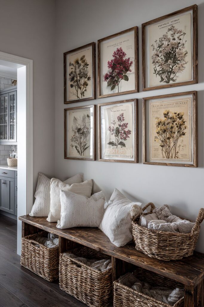
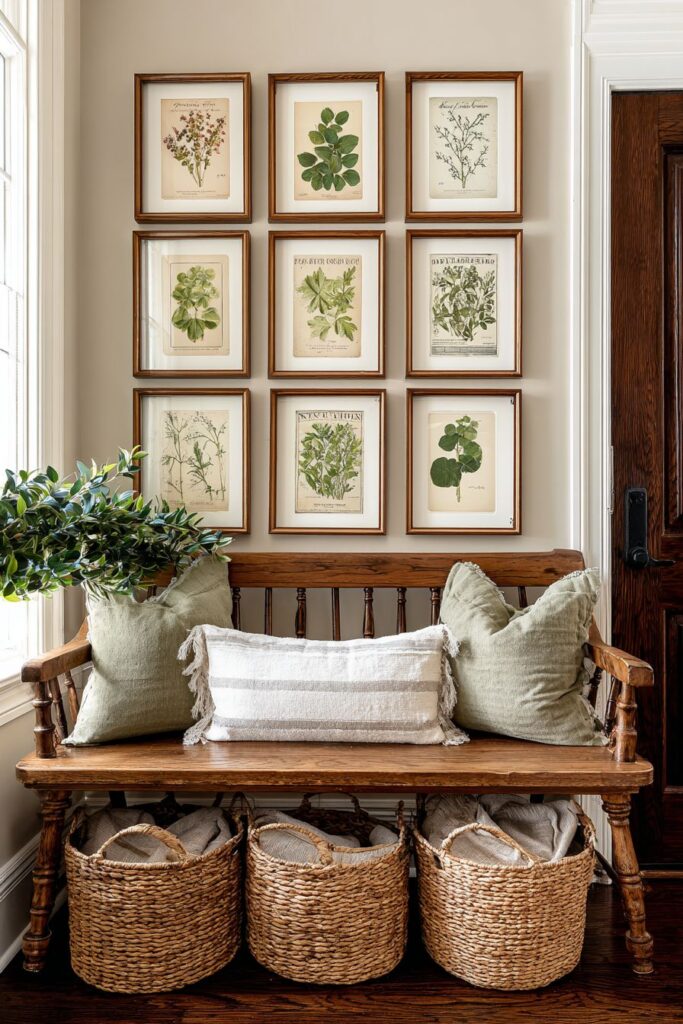
14. Botanical Wall Art Gallery
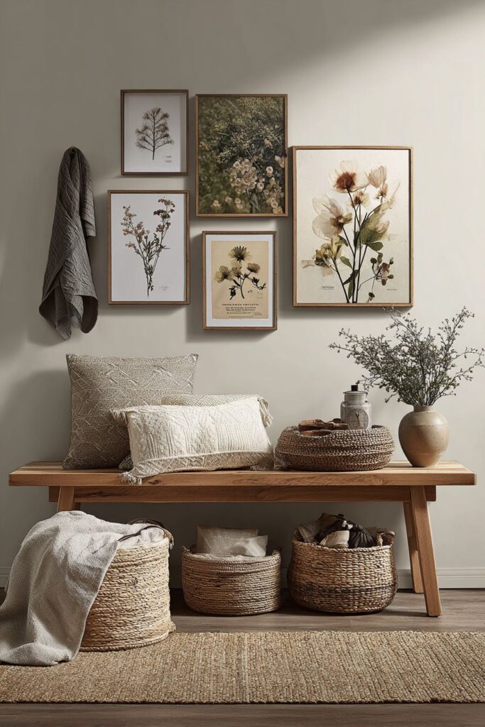
Vertical wall space offers valuable real estate for spring decor, and this approach transforms blank walls into gallery-style displays celebrating botanical beauty. Framed pressed flower prints showcase the delicate architecture of actual plant specimens, their preserved petals and leaves creating scientific illustration meets fine art. Vintage seed packet reproductions bring nostalgic charm and graphic interest, their aged typography and illustrated vegetables or flowers providing both visual appeal and gardening heritage. These elements arrange in a gallery wall configuration above a rustic wooden bench, the collection of frames creating a unified composition that feels curated yet collected over time rather than purchased as a matching set.
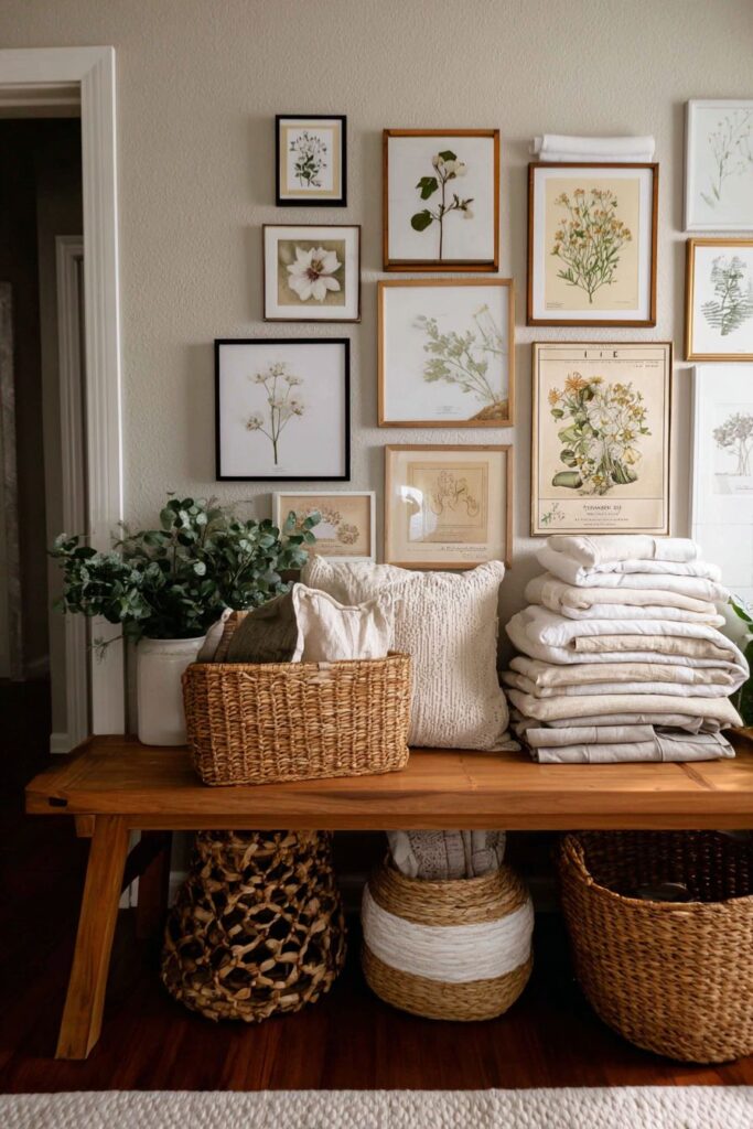
The bench beneath serves multiple functions, providing seating while offering storage through woven baskets tucked below. These baskets hold kitchen linens in soft neutral tones—dishtowels, napkins, tablecloths—keeping them accessible while maintaining tidy organization. The natural texture of woven materials adds warmth and organic appeal, their handcrafted quality complementing the botanical theme above. Light grey walls provide a subtle backdrop that allows the wall art to stand out without harsh contrast, their neutral tone working with virtually any frame finish or artwork color.
Professional interior photography balances the wall display composition with proper lighting that prevents glare on frame glass while showing texture details in both the artwork and the bench below. The arrangement demonstrates principles of gallery wall design—varied frame sizes creating visual interest, consistent mat colors or frame finishes providing cohesion, and strategic spacing allowing each piece to be appreciated individually while contributing to the overall composition. This layered approach to spring decor—combining wall art with functional furniture and practical storage—creates richness and depth, showing how even utilitarian spaces like kitchens can incorporate artistic elements that elevate daily living beyond mere function.
Key design tips for botanical gallery walls:
- Mix pressed flower prints with seed packets or botanical illustrations for variety
- Use consistent frame colors or mat colors to unify disparate artwork
- Arrange frames on the floor first to determine best layout before hanging
- Maintain consistent spacing between frames—typically 2-3 inches
- Anchor the display with furniture below, like a bench or console
- Choose light, neutral wall colors that don’t compete with artwork
- Use museum glass or non-glare glass in frames to minimize reflections
- Include functional storage below gallery walls in kitchens for practical beauty
- Update some pieces seasonally while keeping core collection year-round
15. Minimalist Modern Spring Light
Contemporary design aesthetics embrace restraint and thoughtful editing, and this open-concept kitchen demonstrates how spring decor can be subtle yet effective in modern spaces. Floor-to-ceiling windows serve as the primary design feature, flooding the space with abundant natural light that becomes the main decorative element. These expansive windows blur boundaries between interior and exterior, connecting the kitchen to gardens, sky, and changing weather patterns outside. White cabinetry maintains clean lines and reflects light throughout the space, its handleless design emphasizing sleek surfaces and modern sensibility. Light wood floating shelves provide minimal storage and display opportunities without visual weight, their natural material adding organic warmth to the predominantly white palette.
Spring touches appear with intentional minimalism—small potted ferns introduce living green elements without overwhelming the clean aesthetic, their delicate fronds adding natural movement and texture. A single branch of flowering quince in a simple glass bottle demonstrates the “less is more” philosophy, where one beautiful natural element receives focus and appreciation rather than competing with numerous decorative items. The flowering quince, with its delicate pink or coral blooms along bare branches, embodies spring’s essential promise—beauty emerging from simplicity. Pale grey concrete countertops add modern industrial character while maintaining the light, neutral palette, their smooth surface and subtle color providing contemporary sophistication.
Wide-angle lens photography emphasizes the spacious, light-filled environment, capturing how minimal spring touches can feel appropriate and sufficient when natural light and architectural elements do much of the decorative work. Balanced exposure maintains the clean, fresh aesthetic without blowing out windows or creating harsh shadows. This approach proves that spring kitchen decor need not involve extensive styling or abundant accessories—in modern design, sometimes the most powerful statement comes from restraint, allowing architecture, light, and a few carefully chosen natural elements to create seasonal atmosphere. The design respects both contemporary aesthetics and spring’s essence, finding harmony between minimalist principles and seasonal celebration.
Key design tips for minimalist spring design:
- Prioritize natural light through large windows or minimal window treatments
- Use white or very light cabinetry to reflect light and maintain openness
- Select one or two living plants rather than multiple arrangements
- Choose single-stem or single-branch floral displays for maximum impact with minimal fuss
- Incorporate light wood tones to add warmth without visual weight
- Keep countertops clear except for essential items and minimal seasonal touches
- Use floating shelves sparingly—display only what you love and use
- Embrace negative space as a design element, not something to fill
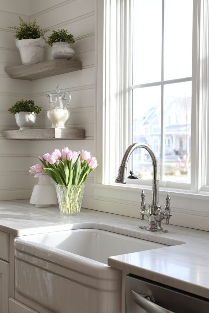
16. Vintage Farmhouse Sink Focal Point
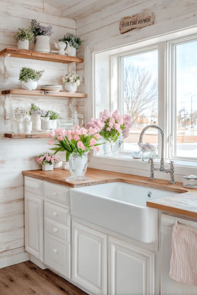
The kitchen sink, often overlooked in design considerations, becomes a charming focal point through the selection of vintage-inspired fixtures and thoughtful surrounding details. A vintage apron-front sink, also called a farmhouse sink, makes a statement with its exposed front panel and generous basin depth, both practical for serious cooking and beautiful in its traditional styling. The brushed nickel gooseneck faucet combines period-appropriate design with modern functionality, its graceful curve and substantial presence complementing the sink’s prominent position. Together, these elements create a washing-up area that feels like the kitchen’s functional heart.
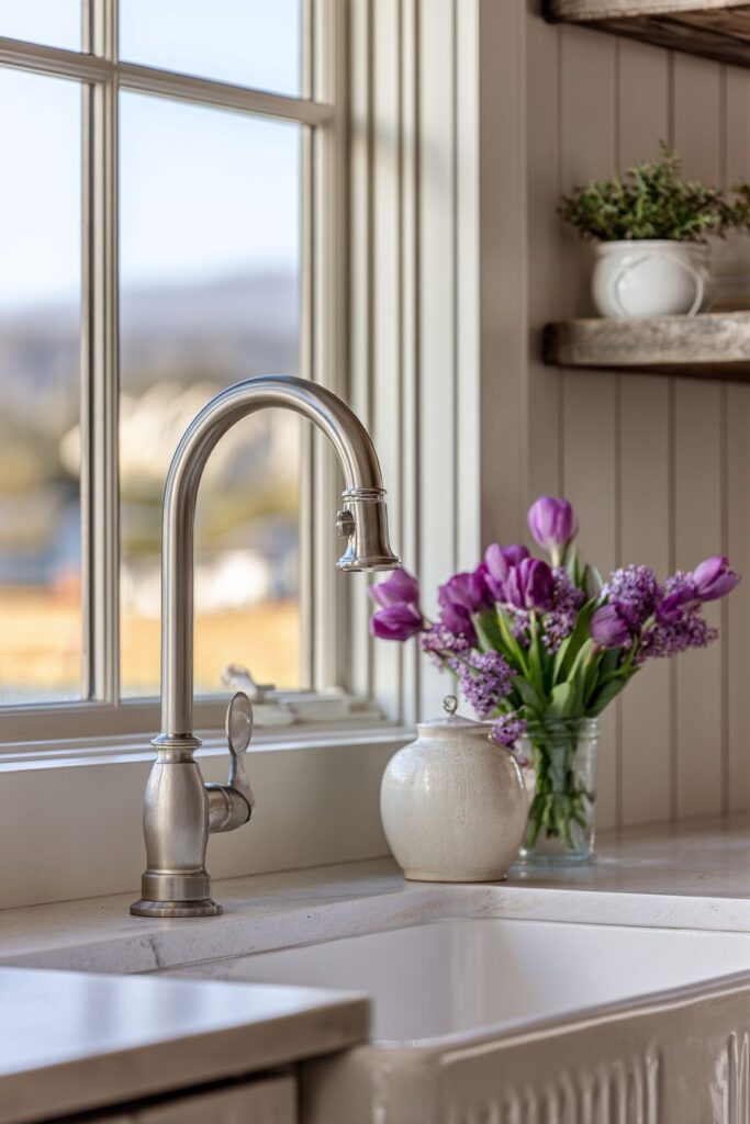
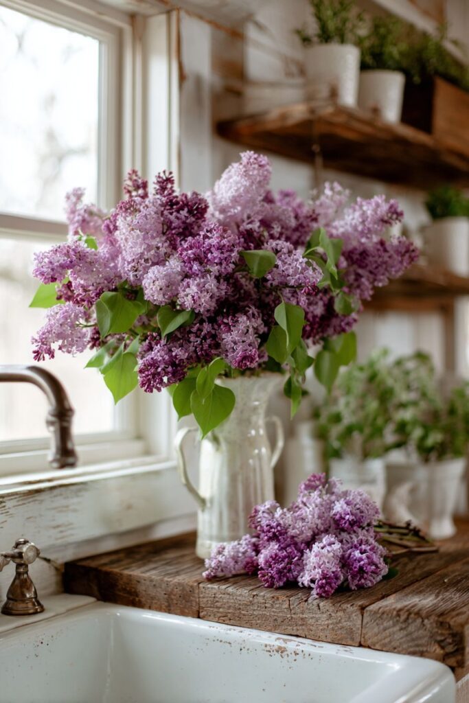
The windowsill above this sink arrangement transforms into a spring showcase, with milk glass vases displaying fresh cut lilacs and tulips. Milk glass, with its opaque white appearance and subtle surface variations, provides vintage charm while allowing flower stems to remain hidden, creating clean displays that emphasize blooms over mechanics. Lilacs bring their incomparable fragrance and clustered purple blooms, while tulips contribute their elegant form and variety of spring colors. These flowers aren’t merely decorative—positioned above the sink, they’re appreciated during dish washing and food preparation, making routine tasks more pleasant through beauty and fragrance.
Shiplap walls painted in warm white complement natural wood open shelving that holds white ironstone and small potted herbs, creating layers of texture and interest around the sink area. The horizontal lines of shiplap add architectural character without overwhelming, while the warm white paint ensures brightness. Natural wood shelving introduces organic material and display space, the white ironstone providing classic farmhouse aesthetic and the potted herbs offering practical ingredients within arm’s reach. Interior design photography captures this blend of vintage charm and spring freshness with soft natural lighting that highlights material authenticity and subtle color variations, revealing how thoughtful fixture selection and surrounding styling can transform a utilitarian area into a kitchen’s most charming feature.
Key design tips for farmhouse sink styling:
- Choose apron-front sinks in classic white for timeless farmhouse appeal
- Select faucets with traditional styling but modern internal mechanisms for reliability
- Use the windowsill above sink for seasonal floral displays in vintage vessels
- Display functional items like dishes and herbs on nearby open shelving
- Paint shiplap or beadboard walls in warm white rather than stark white
- Keep sink area clear of clutter to let fixtures and displays shine
- Incorporate natural wood elements to warm predominantly white schemes
- Place fragrant flowers like lilacs near the sink for aromatic enhancement during kitchen tasks
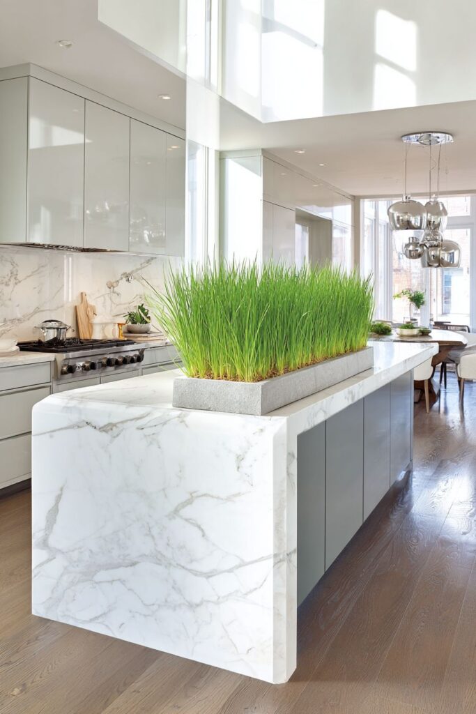
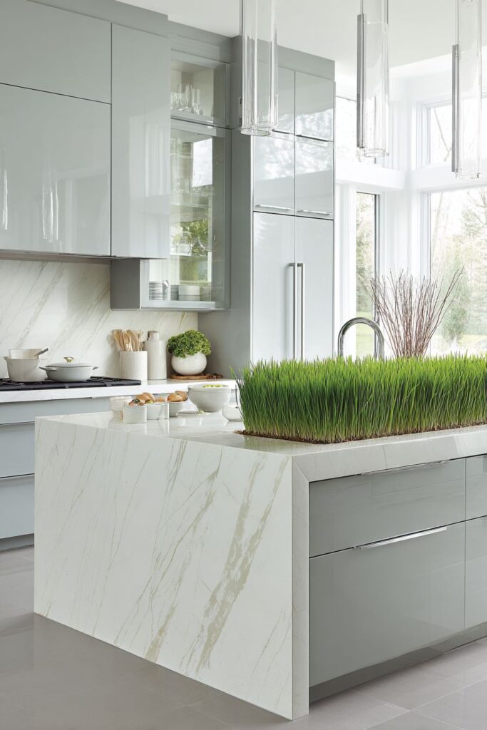
17. Contemporary Grey and Green Sophistication
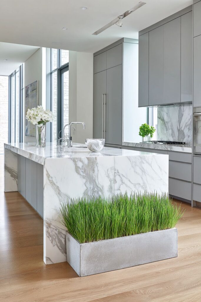
Modern kitchen design finds perfect expression in this contemporary space where soft dove grey handleless cabinets create seamless, minimalist surfaces that emphasize horizontal lines and uncluttered aesthetics. The absence of visible handles maintains clean facades while push-to-open mechanisms provide practical access, proving that function need not compromise form. A waterfall edge island showcases white marble with delicate grey veining, the continuous surface flowing from horizontal top down vertical edges in a dramatic gesture of material celebration. This waterfall detail demonstrates commitment to design excellence, allowing the natural beauty of marble to command attention through generous, uninterrupted application.
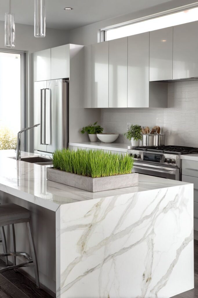
Spring enters this refined environment through a low rectangular concrete planter filled with wheatgrass, introducing vibrant living green in a container that matches the space’s modern sensibility. The wheatgrass, with its uniform blade-like shoots creating a miniature meadow, provides organic contrast to hard surfaces while maintaining the clean-lined aesthetic through its rectangular planter and even growth pattern. Chrome fixtures throughout the kitchen reflect natural light from clerestory windows—high windows positioned near the ceiling that flood the space with light while maintaining privacy and wall space for cabinetry. These reflective surfaces multiply available light, creating sparkle and visual interest through their mirror-like qualities.
Professional architectural photography captures the sleek lines and spring touches with balanced exposure that reveals the interplay of cool grey tones and organic green elements without losing subtle details in shadow or highlight. The images show how contemporary design accommodates seasonal expression through carefully chosen elements that respect the overall aesthetic while providing natural warmth and life. This approach demonstrates that spring kitchen decor transcends style boundaries—even the most modern, minimalist spaces can celebrate the season through thoughtful introduction of living elements and organic materials that honor both contemporary design principles and spring’s renewing energy.
Key design tips for contemporary spring styling:
- Choose handleless cabinets in soft neutral colors for modern minimalism
- Incorporate waterfall edges on islands for dramatic architectural moments
- Use geometric planters that match the space’s clean-lined aesthetic
- Plant wheatgrass or similar uniform plants for modern green displays
- Maximize natural light through clerestory windows or skylights
- Select chrome or polished finishes to reflect and multiply light
- Keep color palettes limited—greys, whites, with green as accent
- Embrace negative space and uncluttered surfaces as design features
18. Small Space Spring Efficiency
Compact urban kitchens present unique challenges and opportunities, requiring creative solutions that maximize limited space while maintaining style and seasonal celebration. Wall-mounted magnetic knife strips serve dual purposes—keeping essential tools accessible and organized while adding sleek, space-efficient storage that doesn’t consume precious counter area. Fresh herb scissors displayed on this strip introduce a spring touch through their practical purpose, ready to snip living herbs for cooking while their presence suggests garden-to-table freshness. Small floating corner shelves utilize often-wasted angular spaces, their minimal footprint providing display area for a single succulent in a white ceramic pot—proof that even tiny spots can contribute to overall design.
A slim vase holding a few stems of freesia demonstrates the power of restraint in small kitchens, where a large arrangement might overwhelm but a simple, elegant display adds beauty without bulk. Freesia, with their delicate trumpet-shaped blooms and sweet fragrance, pack significant sensory impact into minimal space. The narrow countertop accommodates this slender vase without sacrificing workspace, showing how spring can be celebrated even where square footage is limited. White subway tiles and light maple butcher block create a fresh backdrop through their classic combination of bright, reflective surfaces and warm wood tones, preventing the small space from feeling dark or cramped.
Detail-focused photography captures the thoughtful small-space spring styling that makes efficient use of every surface and vertical area. Natural light from a small window, maximized through lack of heavy window treatments and reflective surfaces, creates an airy atmosphere despite limited dimensions. This design approach proves that spring kitchen decor isn’t about scale but about intention—even the smallest urban kitchen can embrace seasonal beauty through strategic placement of carefully chosen elements that provide maximum impact with minimal spatial commitment. The key lies in editing ruthlessly, choosing quality over quantity, and finding creative storage and display solutions that work with rather than against spatial limitations.
Key design tips for small kitchen spring styling:
- Use vertical storage like magnetic strips to free up counter space
- Choose corner floating shelves to utilize often-wasted angular spaces
- Display single stems or minimal arrangements instead of large bouquets
- Select slim, narrow vases that fit compact counter areas
- Keep color palette light with white tiles and light wood tones
- Maximize natural light through minimal or sheer window treatments
- Edit ruthlessly—display only what you truly love and use
- Choose multi-functional items that serve both practical and decorative purposes
- Consider the scale of everything—smaller kitchens need smaller accessories
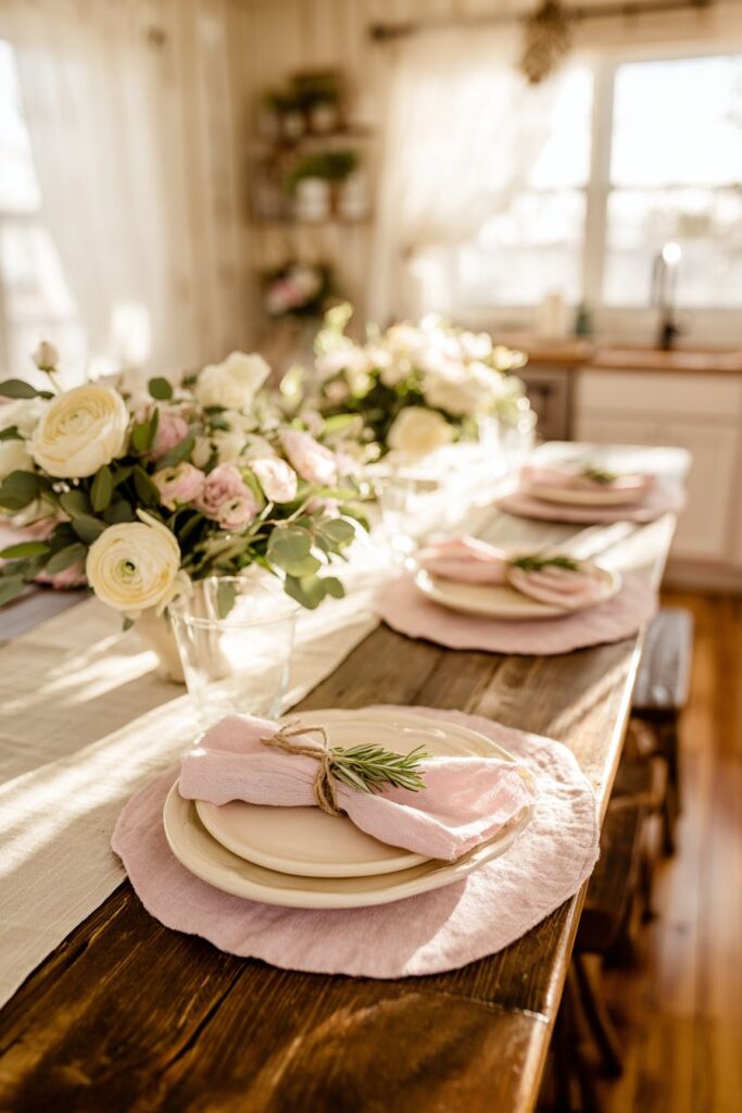
19. Spring Gathering Table Setting
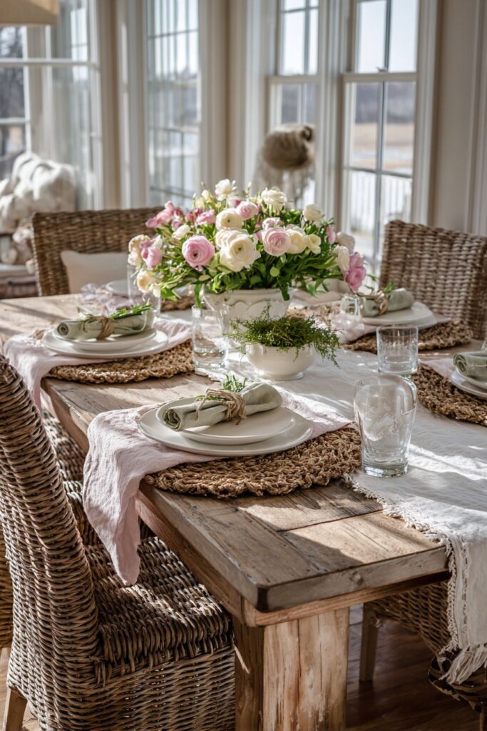
Setting a table for spring gatherings transforms functional dining furniture into an invitation for connection and celebration. The farmhouse table, with its generous proportions and sturdy construction, provides the foundation for a layered, thoughtful table setting that honors both spring’s aesthetic and the hospitality of shared meals. Pale pink linen placemats introduce soft color while their natural texture adds tactile interest and organic beauty—linen’s slight irregularities and tendency to wrinkle gracefully contribute authenticity that synthetic materials cannot match. Simple white stoneware plates provide clean, classic foundations that allow other elements to shine while their substantial weight and quality construction suggest meals of importance and care.
Fresh napkins in soft sage green, tied with twine and adorned with a sprig of rosemary, demonstrate how small details create memorable experiences. The napkins’ spring color connects to seasonal palettes while the rosemary sprig adds fragrance and visual interest, its needle-like leaves providing textural contrast. The humble twine speaks to rustic simplicity and natural materials, its organic fiber and visible texture contributing to the overall aesthetic of understated elegance. The centerpiece runs the table’s length rather than clustering at center—a low arrangement of ranunculus and garden roses in cream and blush tones creates visual continuity that encourages conversation while providing beauty at every seat.
Natural light interior photography captures the inviting table setting during golden hour, when warm, honeyed light streams through windows creating the most flattering illumination. This quality of light highlights the layered textures—linen’s weave, stoneware’s matte surface, napkin fabric, flower petals—while enhancing the spring color palette with amber warmth. The overall effect invites lingering over leisurely meals, suggesting that spring is best celebrated through gathering, sharing, and savoring both food and company in beautiful surroundings. This approach to table setting demonstrates that spring kitchen decor extends beyond fixed elements to include the ephemeral beauty of set tables and shared meals that create memories.
Key design tips for spring table settings:
- Layer different textures through placemats, napkins, and dinnerware
- Choose soft spring colors—blush, sage, pale yellow—in limited palette
- Use natural materials like linen, cotton, wood, and twine
- Create low, long centerpieces for dining tables to maintain conversation
- Add fresh herb sprigs to napkins for fragrance and natural beauty
- Select simple, classic dinnerware that showcases rather than competes with styling
- Photograph during golden hour for most beautiful documentation
- Include personal touches like handwritten place cards or herb favors for special gatherings
20. Winter-to-Spring Transitional Display
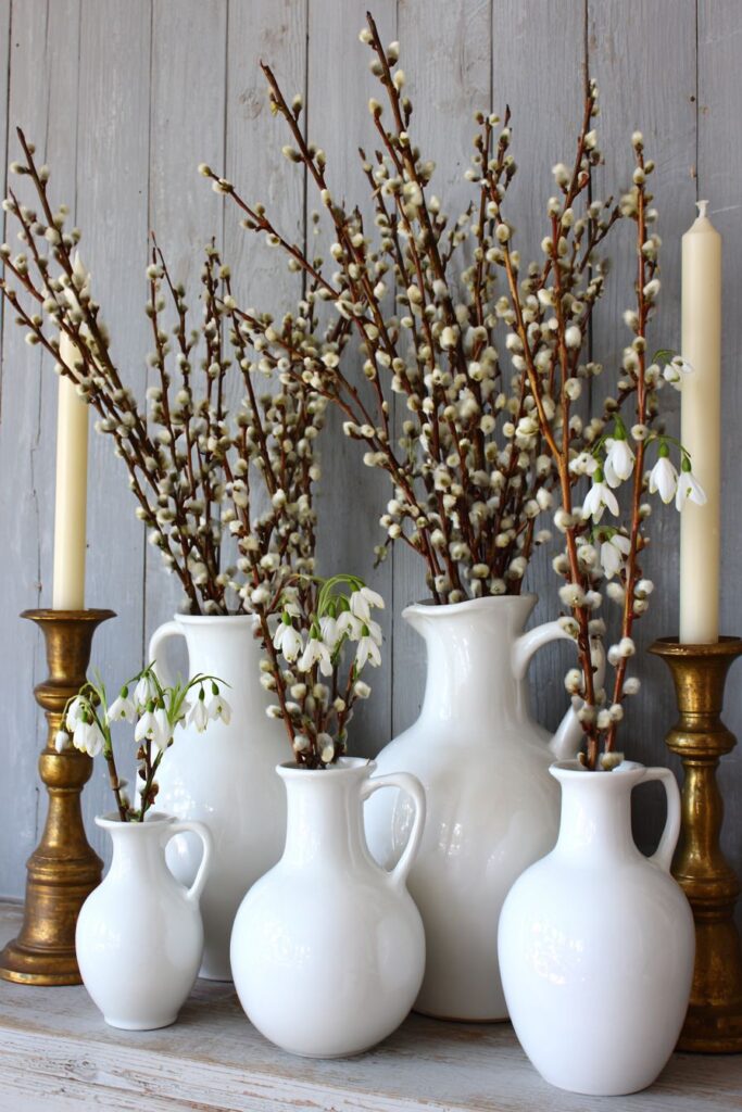
The seasonal transition from winter to spring offers unique decorative opportunities, and this kitchen mantel or shelf display celebrates the bridge between seasons through thoughtful element selection. White ceramic pitchers in varying heights create architectural interest through their different scales, their pristine surfaces and classic forms providing versatile vessels for seasonal displays. Filled with pussy willow branches—those fuzzy, silvery catkins that emerge in late winter—and early spring blooms like delicate snowdrops, the arrangement acknowledges both seasons simultaneously. This transitional approach feels honest and authentic, reflecting nature’s gradual shift rather than abrupt seasonal change.
The weathered wood backdrop with its soft grey-blue painted finish adds depth and character behind the arrangement. This surface shows signs of age and use—perhaps peeling paint, visible grain, or slight warping—that contribute authenticity and prevent the display from appearing too precious or newly staged. The grey-blue tone provides cool sophistication while suggesting winter’s lingering presence, creating perfect contrast for the white pitchers and pale botanical elements. Flanking the arrangement, simple brass candlesticks introduce warm metallic accents and vertical elements that frame the central display without competing for attention.
Soft diffused natural lighting creates an interior design photography aesthetic that emphasizes the delicate seasonal elements and natural material patina. The lighting reveals subtle details—the fuzzy texture of pussy willow catkins, the translucent quality of snowdrop petals, the variations in white among different ceramic pitchers, and the layered paint and weathering on the wooden backdrop. This approach to seasonal styling acknowledges that transitions deserve celebration too, that the movement from one season to another carries its own beauty and significance. The display suggests patience and appreciation for gradual change, qualities increasingly valuable in our fast-paced world, while providing a spring kitchen decoration that feels both current and timeless.
Key design tips for transitional seasonal displays:
- Use white or neutral vessels that work across multiple seasons
- Incorporate late-winter/early-spring elements like pussy willows and snowdrops
- Choose weathered or aged backdrops for character and authenticity
- Vary heights in grouped displays for visual interest
- Add metallic accents like brass for warmth and light reflection
- Embrace imperfection in both materials and arrangements
- Acknowledge seasonal transitions rather than abrupt changes
- Use soft, diffused lighting to emphasize delicate natural materials
Why These Spring Kitchen Designs Excel
These twenty spring kitchen decor concepts represent the best approaches to seasonal styling because they address fundamental design principles while celebrating spring’s unique character. Each concept demonstrates how spring kitchen decoration succeeds through thoughtful integration of color, texture, natural elements, and light—the essential components that transform ordinary kitchens into inspiring spaces. The designs span various styles from cottage charm to contemporary minimalism, proving that spring decor adapts to any aesthetic preference when approached with intention and creativity.
The excellence of these spring kitchen ideas lies in their practical applicability combined with visual appeal. Unlike purely decorative schemes that sacrifice function, these concepts enhance kitchen usability while creating beauty—herb gardens provide fresh cooking ingredients, organized displays on open shelving keep essentials accessible, and thoughtful table settings encourage gathering and hospitality. This dual functionality reflects sophisticated design thinking where beauty serves life rather than existing separately from it. The spring color palettes featured—soft pastels, fresh greens, and neutral foundations—create uplifting atmospheres that energize morning coffee routines and make cooking more pleasurable.
Material selection across these designs demonstrates expertise in creating authentic, lasting beauty. Natural materials like wood, linen, ceramic, marble, and terracotta appear repeatedly because they possess inherent beauty that synthetic alternatives cannot replicate. These materials age gracefully, developing patina and character over time rather than merely deteriorating. Fresh flowers and living plants introduce organic elements that change and grow, keeping spaces dynamic and connected to natural cycles. The emphasis on natural light—maximized through window treatments, reflective surfaces, and strategic color choices—shows understanding that the best lighting cannot be purchased but must be invited in and properly utilized.
The designs excel in their scalability and adaptability, offering inspiration for kitchens of all sizes and configurations. Compact urban kitchens find solutions in vertical herb gardens and minimal but impactful displays, while spacious open-concept spaces embrace larger-scale arrangements and architectural elements. This versatility ensures that regardless of kitchen size, layout, or existing style, homeowners can find applicable ideas that work within their specific constraints. The concepts demonstrate that spring kitchen decor isn’t about following rigid formulas but about understanding principles that can be adapted to individual circumstances.
Texture emerges as a critical element throughout these superior designs, with successful spaces layering multiple textures to create depth and interest. Smooth marble countertops contrast with rough terracotta pots, sleek cabinetry pairs with woven baskets, and glossy ceramic meets matte linen. This textural variety prevents spaces from appearing flat or monotonous while engaging multiple senses—the visual interest of varied surfaces invites touch and creates richer spatial experiences. Spring kitchen decor particularly benefits from textural layering because spring itself represents textural abundance in nature, from delicate flower petals to sturdy vegetable stems.
The integration of vintage and collected elements distinguishes these exceptional designs from generic seasonal decorating. Rather than relying solely on new purchases, the concepts incorporate inherited pieces, flea market finds, and items collected over time. This approach creates authentic, personal spaces with stories and history embedded in their styling. Vintage botanical prints, inherited teacups, reclaimed wood, and collected glass bottles add layers of meaning while preventing the disposable quality that plagues trend-driven decor. This thoughtful curation reflects sustainable design thinking and creates kitchens with genuine character.
Color theory application demonstrates why these spring kitchen designs succeed where others might fail. The concepts utilize spring colors—pastels, soft greens, warm whites—with restraint and purpose rather than overwhelming spaces with seasonal hues. Foundation colors remain largely neutral, allowing spring accents to make impact without permanent commitment. This strategic color use means that as seasons change, swapping out a few elements transitions the space without requiring complete redecoration. Understanding how colors interact, complement, and balance prevents the garish results that can occur when spring palettes are applied without sophistication.
The attention to lighting across all twenty concepts reveals professional-level design understanding. Natural light receives priority through window treatments, reflective surfaces, and strategic color choices that maximize available illumination. Artificial lighting supplements thoughtfully through pendant fixtures, cabinet lighting, and accent lights that enhance rather than overwhelm. The photography direction specified for each design—soft diffused light, golden hour warmth, balanced exposure—demonstrates that presentation matters and that the same space can appear entirely different depending on lighting conditions. This lighting consciousness ensures that spring freshness and color appear their best throughout the day.
Seasonal authenticity distinguishes these superior approaches from artificial or forced spring styling. The designs feature genuine spring elements—actual flowering branches, real herb gardens, fresh seasonal blooms—rather than synthetic substitutes. This commitment to authenticity creates spaces that engage multiple senses through fragrance, texture, and visual beauty while connecting kitchen inhabitants to actual seasonal rhythms. Growing herbs, arranging fresh flowers, and incorporating just-picked produce becomes part of the spring experience rather than mere decoration, enriching daily life while beautifying the space.
The concepts demonstrate sophisticated spatial understanding through their attention to scale, proportion, and sightlines. Large kitchens receive substantial elements like generous islands and statement arrangements that fill the space appropriately, while compact kitchens embrace edited displays and vertical solutions that enhance rather than crowd. Understanding how the eye moves through space, where focal points should exist, and how to create visual flow separates exceptional design from adequate decoration. These spring kitchen ideas succeed because they consider the entire spatial experience rather than focusing solely on individual decorative elements.
Finally, these designs excel because they balance trend awareness with timeless appeal. While clearly contemporary and current, the concepts avoid overly trendy elements that will quickly date. Classic materials, traditional techniques, and enduring design principles ensure that these spring kitchens will remain beautiful and relevant beyond a single season or year. This balance between fresh and timeless, contemporary and classic, allows homeowners to invest in spring decor that provides lasting value rather than requiring constant replacement. The best spring kitchen design ideas honor both the ephemeral nature of seasonal beauty and the desire for enduring quality in our homes.
Conclusion
Spring kitchen decor offers boundless opportunities to refresh and revitalize the heart of your home through thoughtful integration of color, texture, natural elements, and light. The twenty concepts explored in this comprehensive guide demonstrate that successful spring styling transcends specific trends or rigid formulas, instead embracing fundamental design principles adapted to individual spaces and preferences. From the gentle pastels of mint green cabinetry and blush linens to the vibrant life of herb gardens and fresh floral arrangements, spring elements transform kitchens into spaces that inspire creativity, encourage gathering, and celebrate the season’s renewing energy.
The key takeaways from these exceptional designs emphasize quality over quantity, authenticity over artifice, and functionality integrated with beauty. Natural materials like wood, stone, ceramic, and linen provide foundations that age gracefully while fresh botanicals—whether potted herbs, cut flowers, or flowering branches—connect interior spaces to the natural world’s seasonal rhythms. Lighting, both natural and artificial, emerges as crucial to successful spring styling, with maximized daylight and thoughtful fixtures enhancing colors and textures while creating atmospheric warmth. Textural layering through varied materials and surfaces adds depth and sensory richness that elevates spaces beyond mere visual appeal.
Whether your kitchen style leans toward cottage charm, modern minimalism, farmhouse warmth, or contemporary sophistication, spring offers decorative possibilities that enhance rather than contradict your existing aesthetic. The scalability of these ideas ensures that compact urban kitchens and spacious open-concept spaces alike can embrace seasonal beauty through carefully chosen elements and strategic placement. Most importantly, these concepts remind us that the best kitchen decor serves life—making cooking more pleasurable, gathering more welcoming, and daily routines more beautiful. As you consider which spring elements to incorporate into your own kitchen, remember that the most successful spaces reflect personal style while celebrating the optimism, freshness, and renewal that define this beloved season. Experiment with these ideas, adapt them to your unique space, and discover how spring’s transformative energy can turn your kitchen into a place of inspiration, connection, and enduring beauty.
"As an Amazon Associate, I earn from qualifying purchases."