Color is the silent architect of any living room, shaping emotions, defining style, and creating an atmosphere that reflects your personality. A rich living room doesn’t happen by accident—it’s the result of thoughtful color choices that work together to create depth, warmth, and sophistication. While many homeowners focus on furniture and accessories, the color palette forms the foundation that makes everything else shine.
Understanding why certain colors create a sense of richness requires knowledge of color theory, light interaction, and psychological impact. Deep jewel tones, warm neutrals, and strategic accent colors don’t just look expensive—they create layers of visual interest that make spaces feel curated and intentional. Whether you’re drawn to moody charcoals, sumptuous burgundies, or elegant navy blues, each color choice contributes to the overall luxurious ambiance you’re creating.
This article explores the specific colors that interior designers use to create rich, sophisticated living rooms and explains the science and artistry behind these choices. You’ll discover how to combine colors effectively, understand their psychological effects, and learn practical application techniques that transform ordinary spaces into extraordinary retreats.
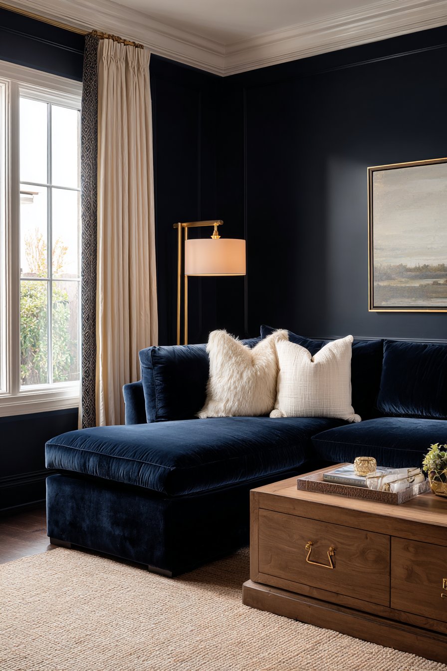
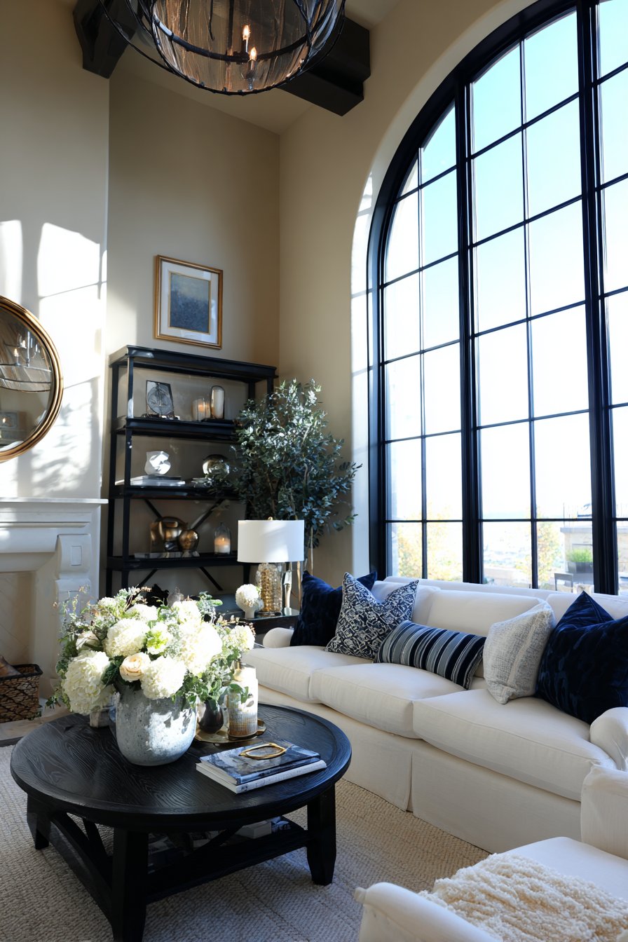
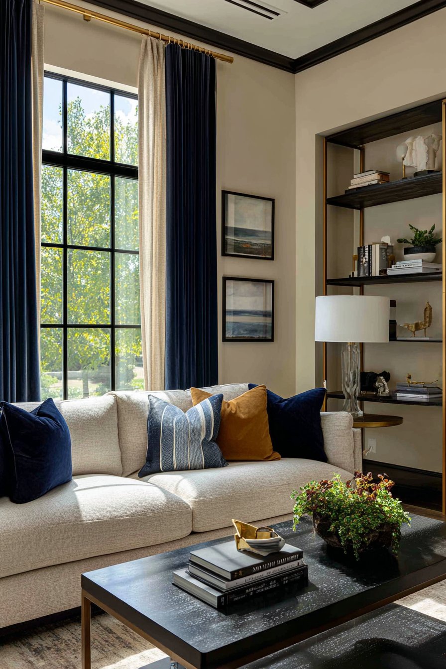
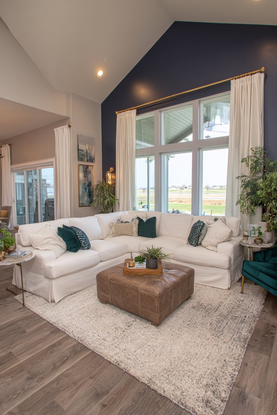
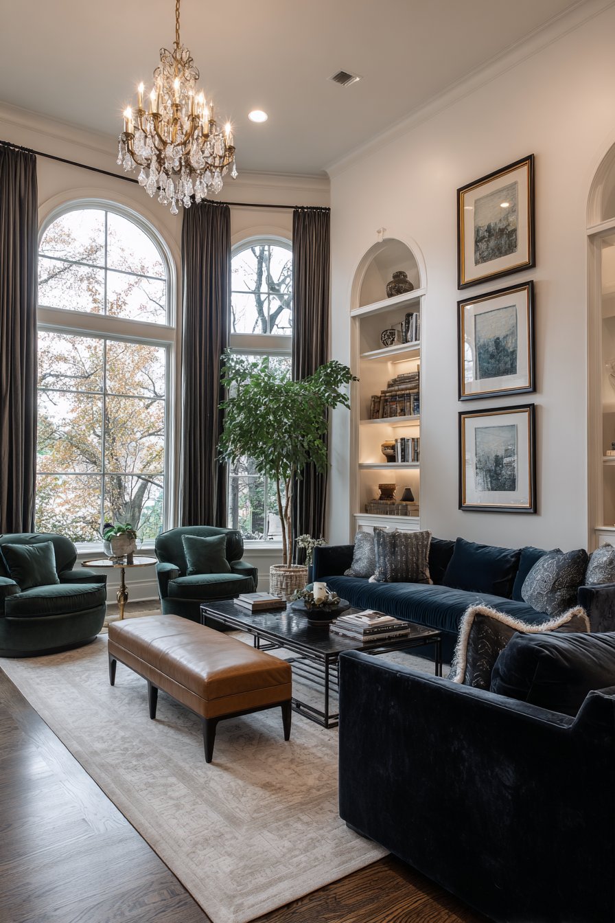
1. Deep Navy Blue Creates Timeless Sophistication
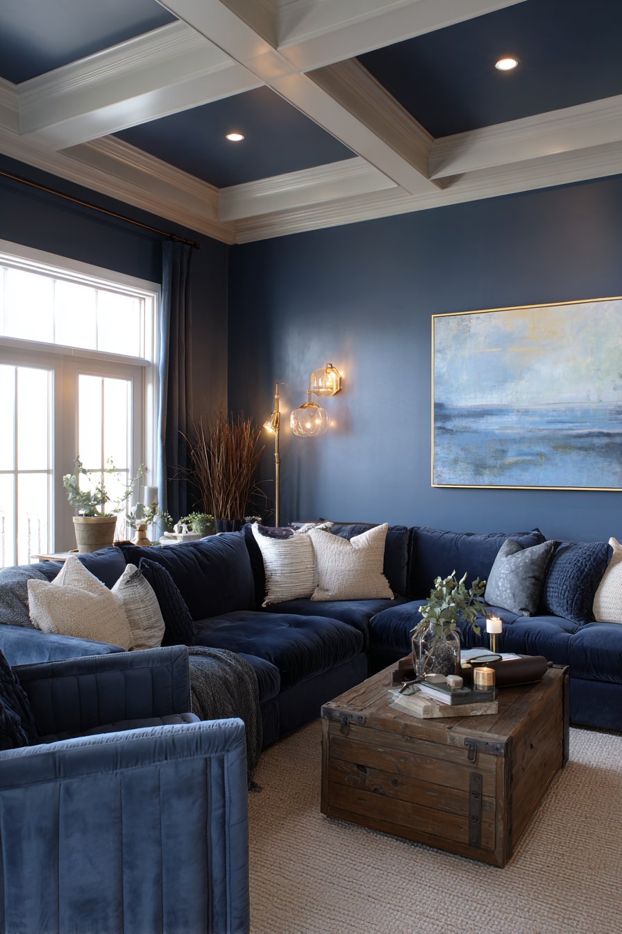
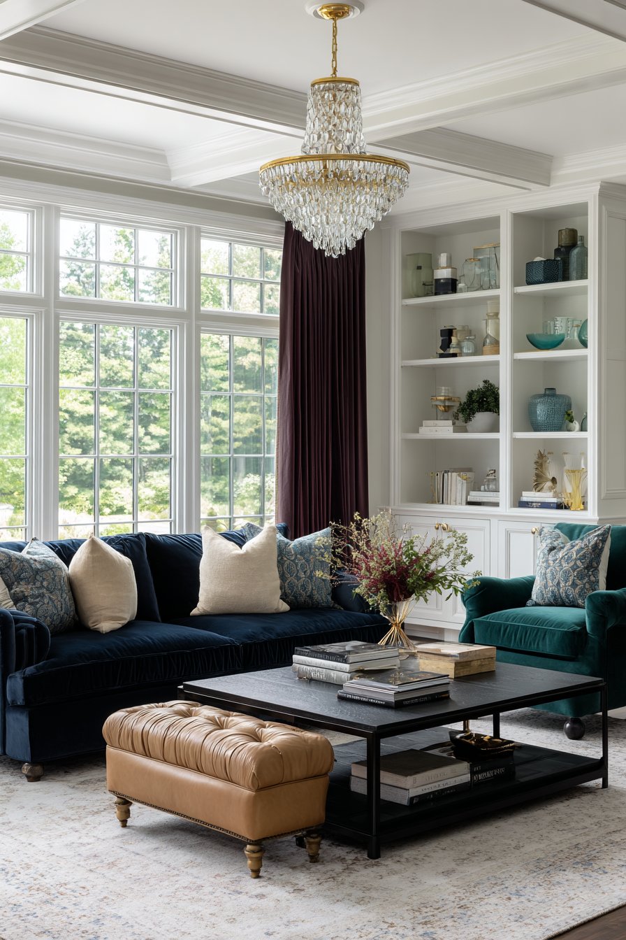
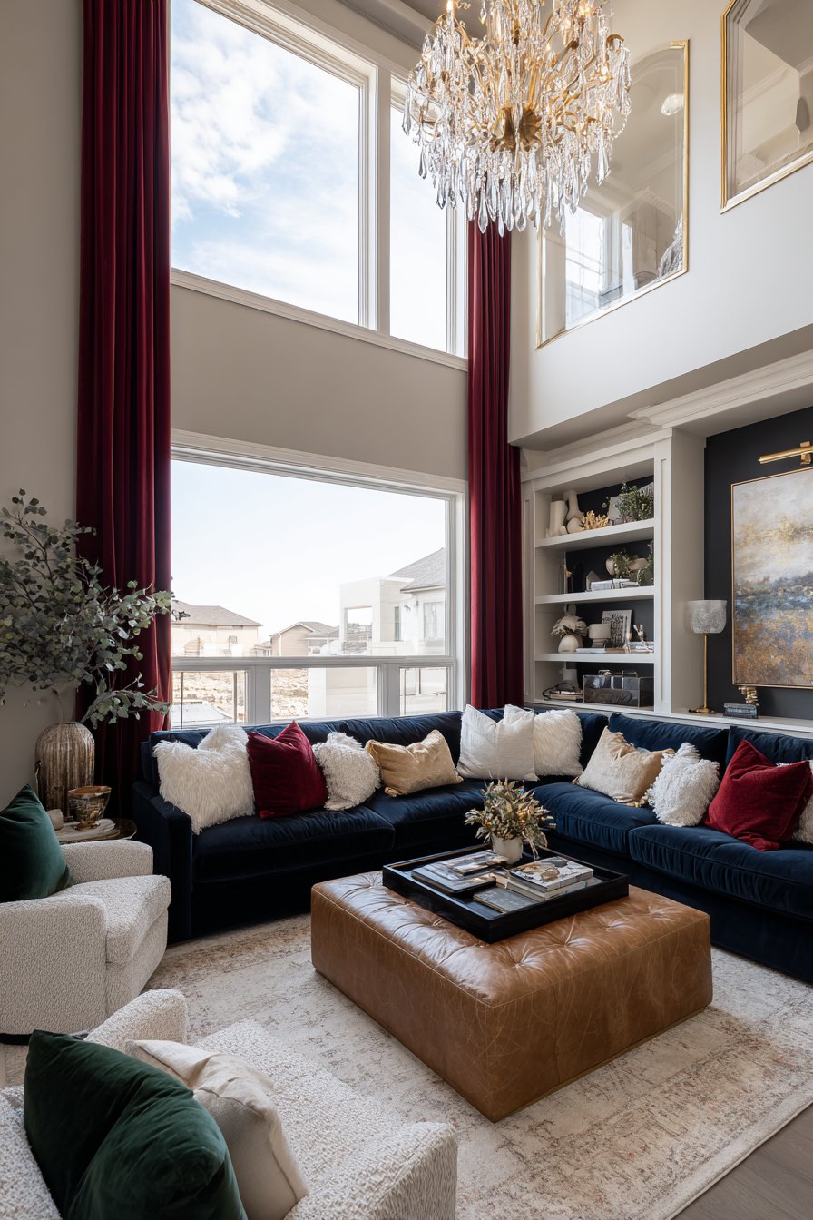
Navy blue has become the cornerstone of elegant design because it combines the calming properties of blue with the depth of black. This versatile color works as both a neutral and a statement, providing a sophisticated backdrop that makes other colors pop. Unlike lighter blues that can feel casual, navy communicates refined taste and intentional design choices.
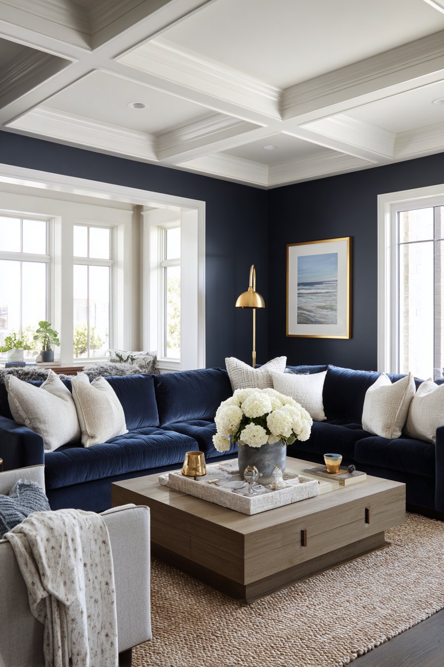
The richness of navy comes from its ability to absorb and reflect light in interesting ways throughout the day. In morning light, it appears softer and more approachable, while evening lighting reveals its dramatic, cocoon-like qualities. This color pairs beautifully with brass fixtures, warm wood tones, and cream upholstery, creating a balanced contrast that feels both classic and contemporary.
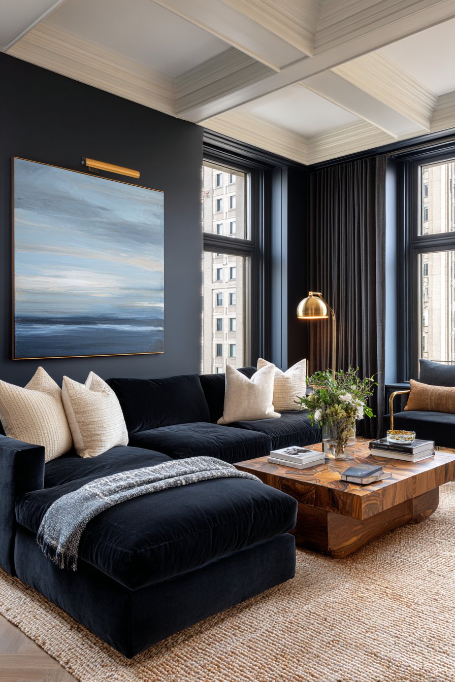
Navy blue also has the unique ability to make spaces feel larger when used correctly. By painting an accent wall or using navy in larger furniture pieces, you create visual depth that draws the eye inward rather than making rooms feel closed in.
- Use navy on feature walls to anchor seating areas
- Pair with gold or brass hardware for instant elegance
- Combine with crisp white trim to enhance architectural details
- Layer different shades of blue for dimensional richness
- Choose navy velvet upholstery for maximum luxury impact
- Balance with natural textures like jute or linen
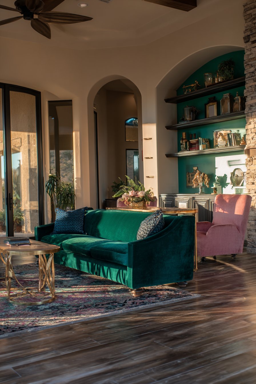
2. Emerald Green Brings Natural Opulence
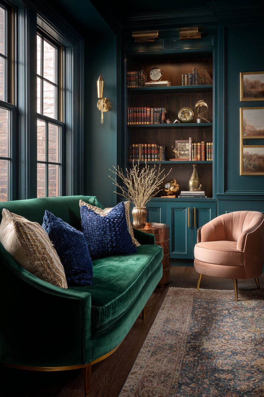
Emerald green has surged in popularity because it connects us to nature’s luxury—the deep, saturated greens found in precious gemstones and lush forests. This color carries inherent richness that feels both organic and sophisticated. The psychological effect of emerald creates feelings of balance, growth, and prosperity, making it ideal for spaces where you want to feel rejuvenated.
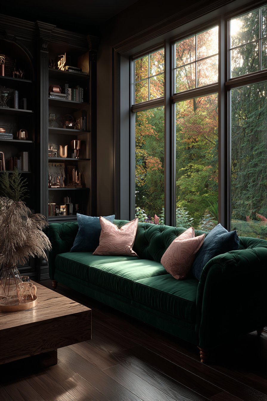
The key to emerald’s success in rich living rooms is its jewel-tone intensity that commands attention without overwhelming. It works particularly well in rooms with ample natural light, where the color can shift from forest-deep to vibrant throughout the day. When paired with warm metals like gold or copper, emerald green creates an opulent contrast that feels intentionally curated.
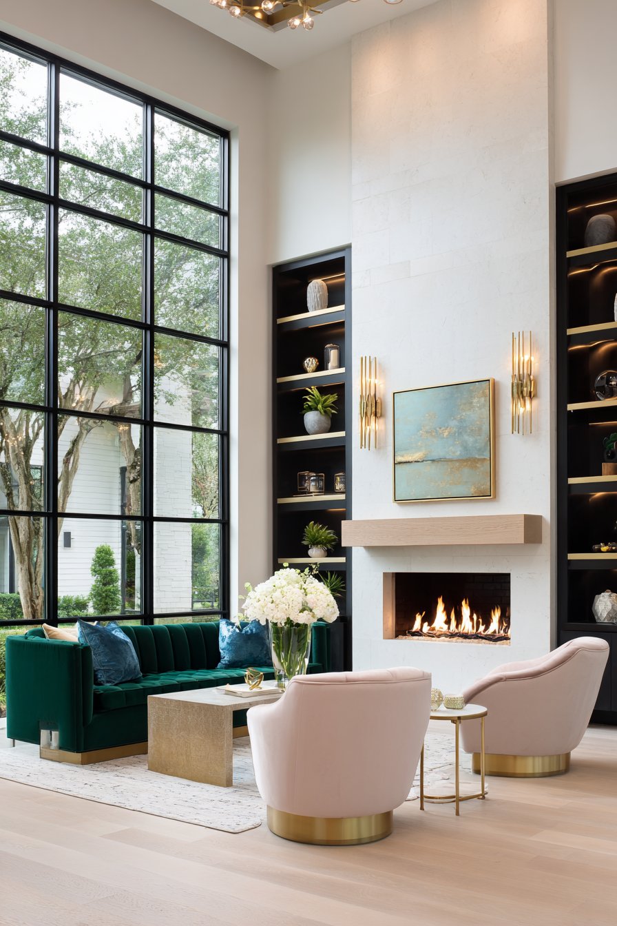
This color also has the unique advantage of working across design styles. Whether your aesthetic leans traditional, modern, or eclectic, emerald green adapts while maintaining its luxurious character. It serves as an excellent bridge between warm and cool tones in your overall palette.
- Incorporate through velvet sofas or accent chairs
- Use as an accent wall behind built-in shelving
- Pair with blush pink or coral for unexpected sophistication
- Add emerald through artwork or large decorative accessories
- Combine with natural wood tones for grounded elegance
- Layer with other jewel tones like sapphire or amethyst
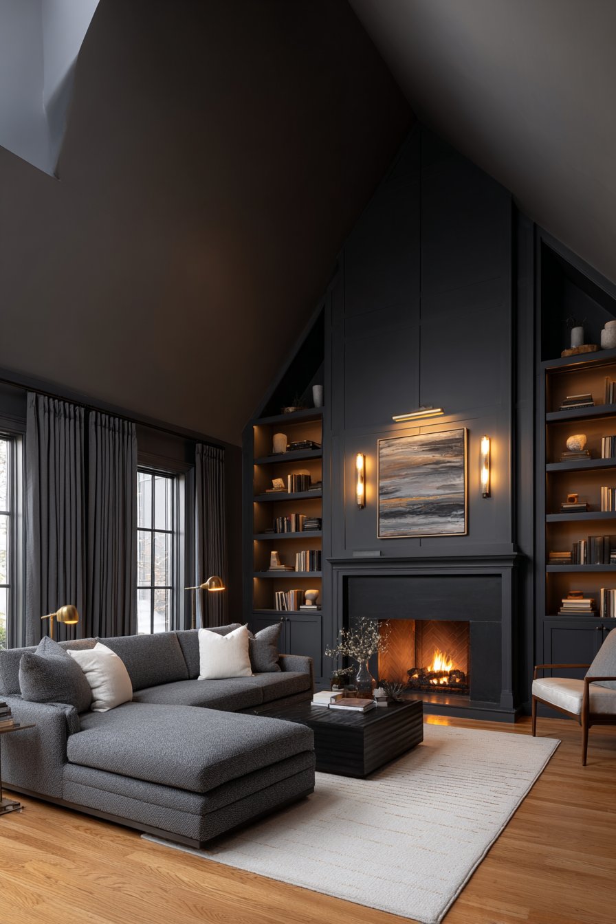
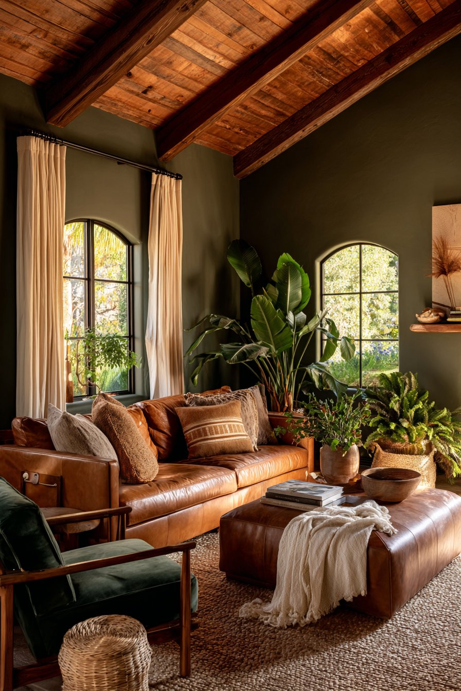
3. Warm Charcoal Gray Anchors Modern Luxury
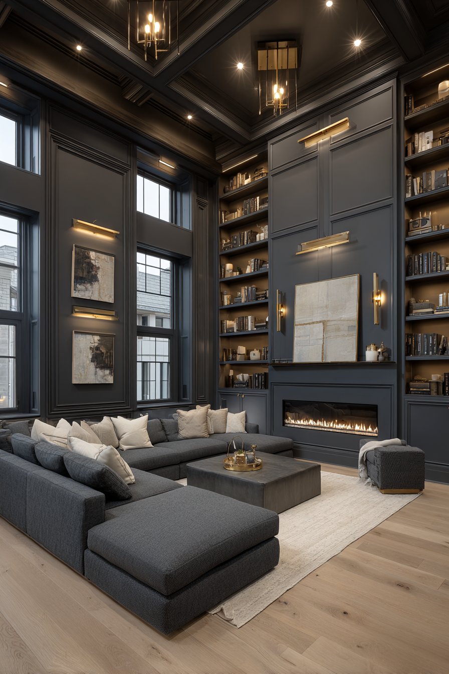
Charcoal gray has replaced black as the go-to dark neutral because it provides drama without harshness. This sophisticated shade creates a perfect backdrop for showcasing art, furniture, and accessories while adding visual weight that makes spaces feel grounded and intentional. Unlike cooler grays that can feel sterile, warm charcoal contains subtle brown or taupe undertones.
The richness of charcoal comes from its versatility and depth—it works as a primary wall color, in large furniture pieces, or as an accent through textiles and accessories. This color makes rooms feel cozy and intimate while maintaining a polished, gallery-like quality. It’s particularly effective in living rooms with high ceilings where you want to create a more intimate atmosphere.
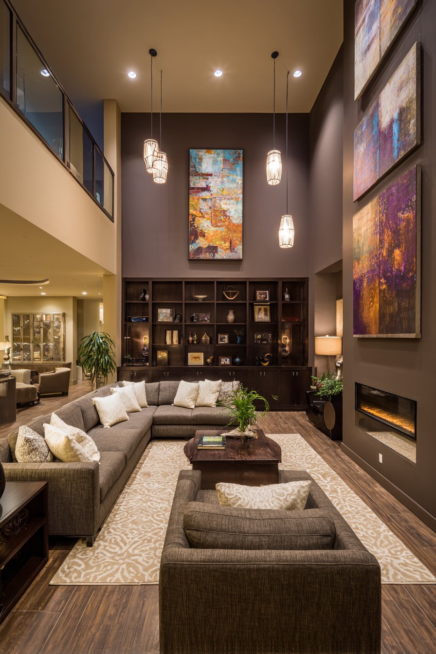
Charcoal gray also serves as an excellent canvas for metallic accents and rich textures. The contrast between matte charcoal and shiny brass, polished chrome, or brushed nickel creates visual interest that elevates the entire space.
- Paint built-ins or bookcases in charcoal for depth
- Use as a grounding color for colorful furniture
- Pair with warm whites to prevent cold undertones
- Incorporate through area rugs to anchor seating areas
- Combine with warm wood tones for balanced contrast
- Layer different charcoal shades for subtle sophistication
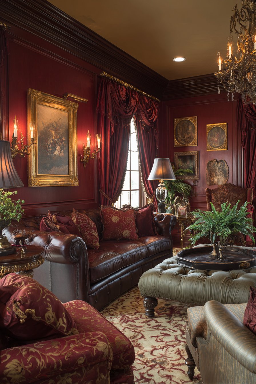
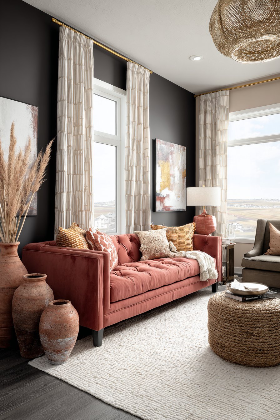
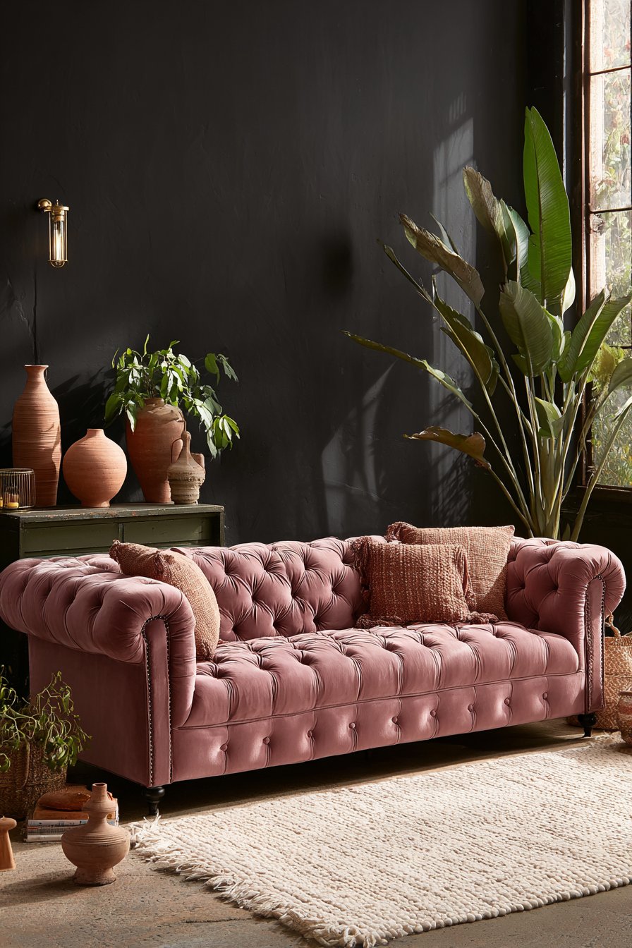
4. Burgundy and Wine Tones Add Regal Warmth
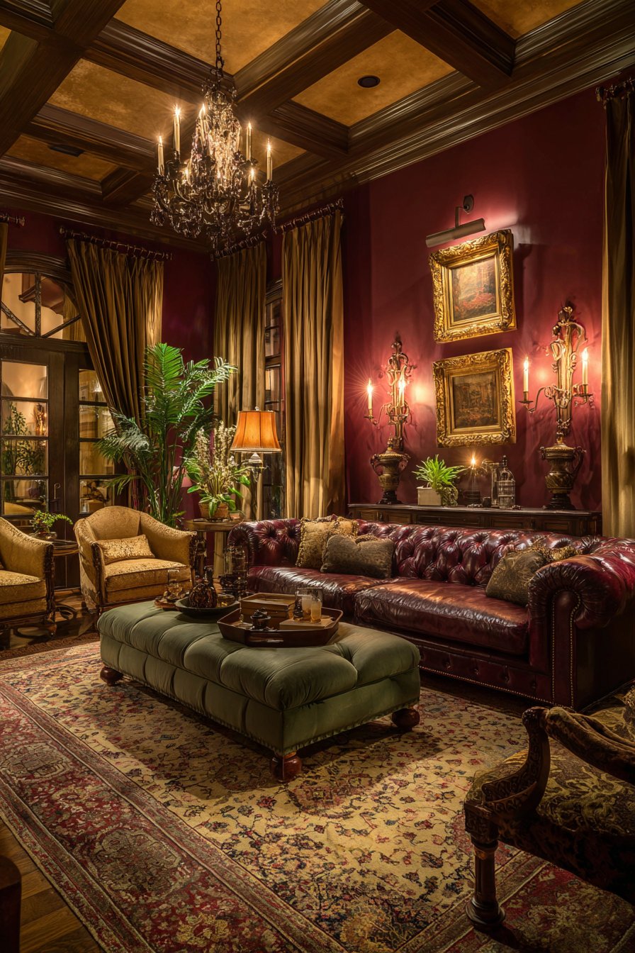
Burgundy and deep wine colors bring instant sophistication reminiscent of historical libraries and European estates. These rich reds contain enough brown and purple undertones to feel complex rather than primary, creating a cocooning warmth that makes living rooms feel intimate and luxurious. The psychological impact of these colors includes feelings of comfort, confidence, and timeless elegance.
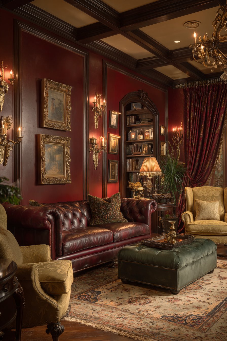
These colors work particularly well in rooms with warm lighting and traditional architectural details like crown molding or wainscoting. Burgundy doesn’t overpower when used thoughtfully—instead, it creates a dramatic backdrop that makes lighter furniture and accessories stand out beautifully. The key is balancing the intensity with plenty of neutral elements.
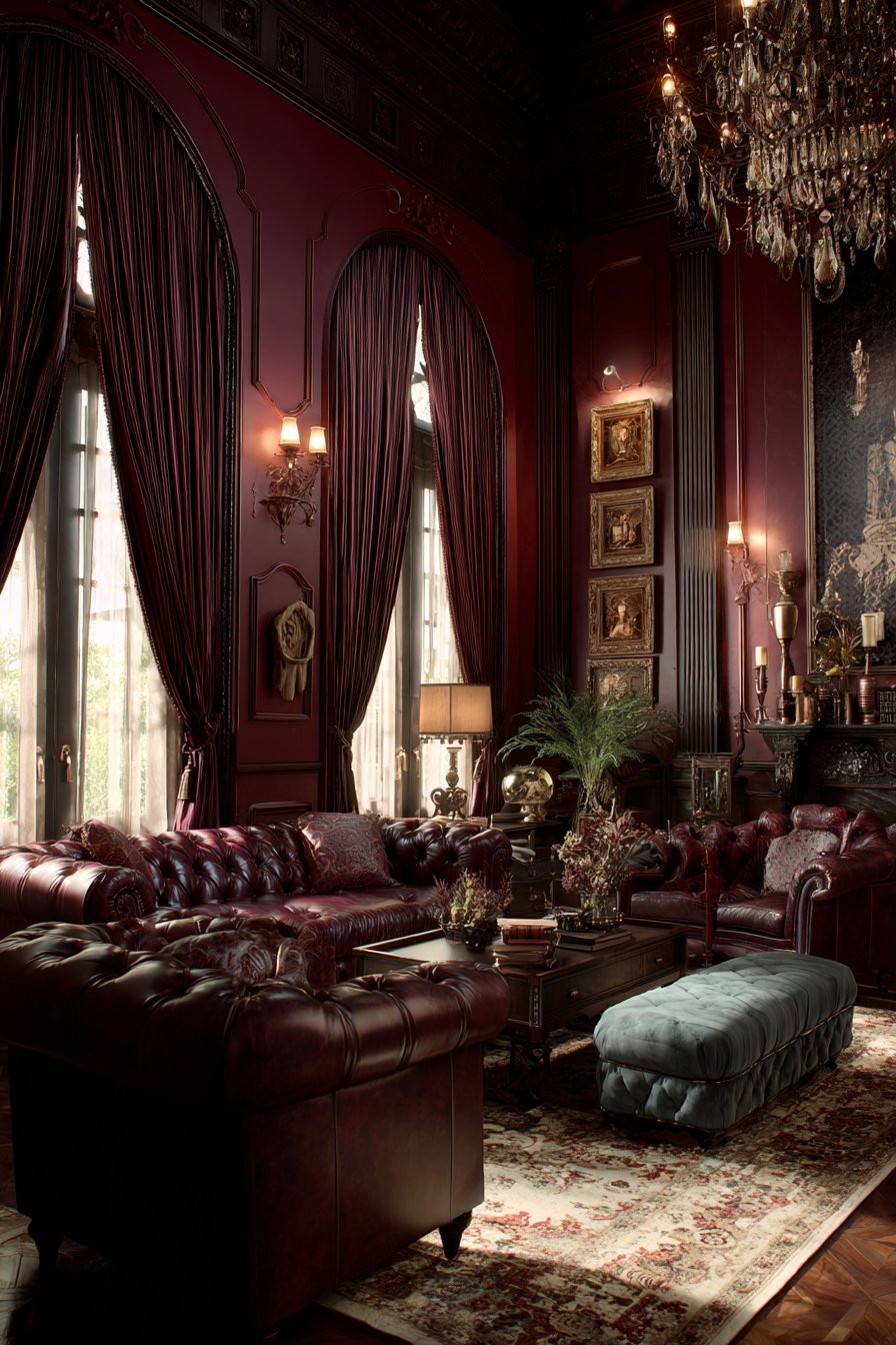
Wine-toned colors also have the advantage of aging gracefully in design terms. Unlike trendy colors that feel dated quickly, burgundy maintains its appeal across decades, making it a smart investment for homeowners who don’t want to redecorate frequently.
- Use burgundy on one accent wall for impact
- Incorporate through leather furniture for classic appeal
- Pair with sage green or dusty blue for balance
- Add through window treatments for warmth and drama
- Combine with cream and gold for regal elegance
- Layer with deep purples for dimensional richness
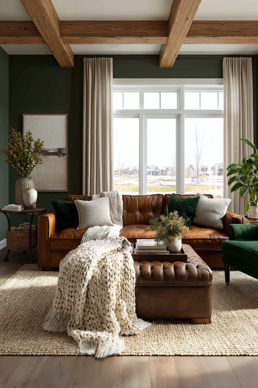
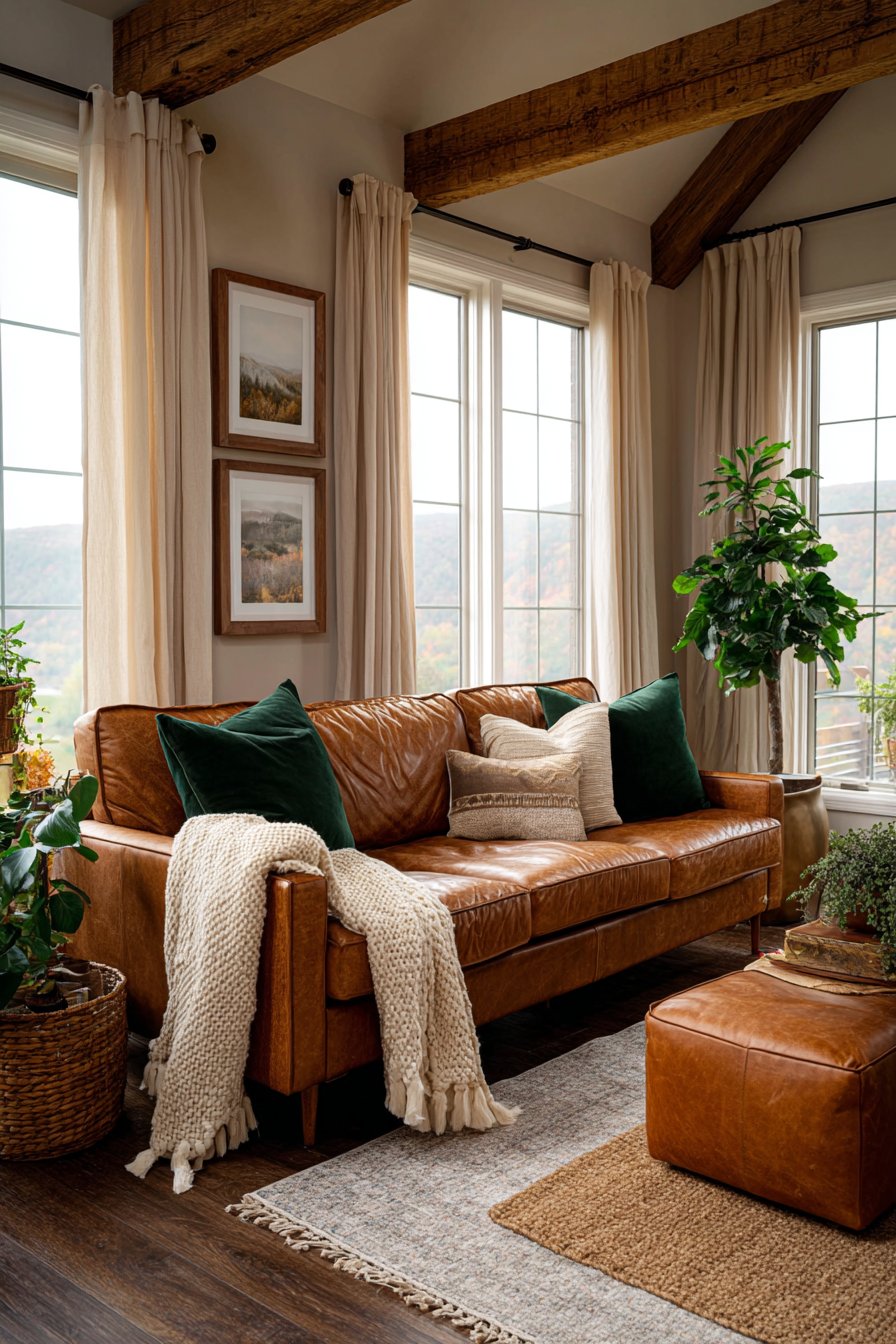
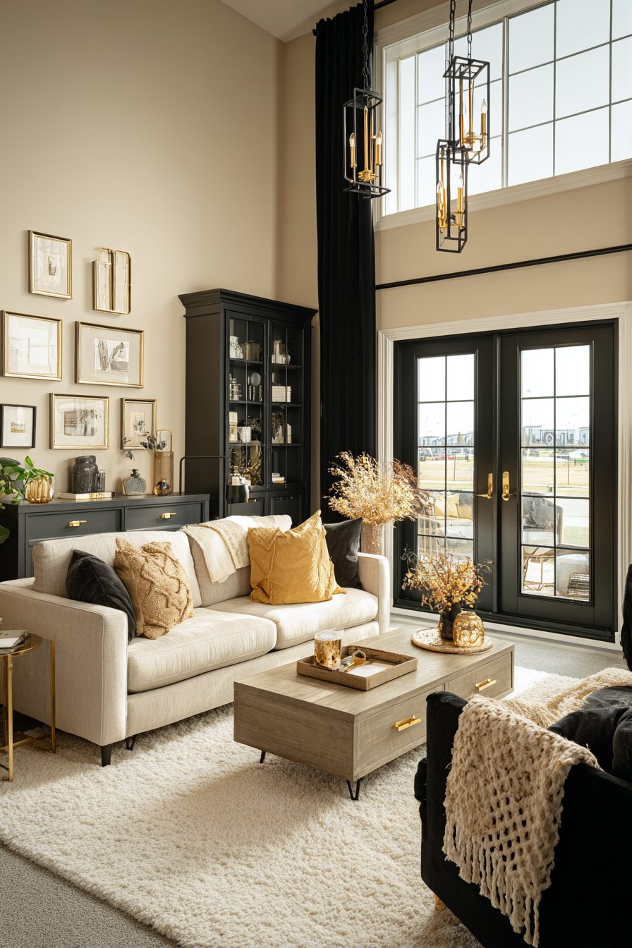
5. Caramel and Cognac Browns Create Organic Richness
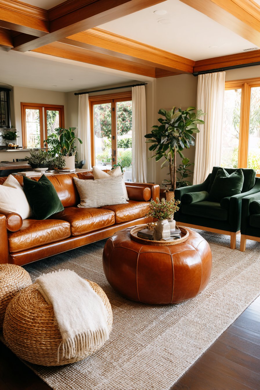
Warm brown tones like caramel and cognac have become essential elements in rich living room design because they provide sophistication without coldness. These colors connect to natural materials—leather, wood, and stone—creating an organic luxury that feels both expensive and welcoming. The warmth of these browns creates psychological comfort while maintaining visual interest.
The beauty of caramel tones lies in their ability to work with any color palette while adding depth and warmth. They serve as excellent transition colors between bolder choices, creating cohesion throughout the space. These shades also have the practical advantage of hiding wear better than lighter neutrals, making them ideal for high-traffic living rooms.
Cognac browns particularly shine in leather furniture and wood accents, where the natural patina adds character over time. This aging process actually increases the perceived richness rather than making spaces look worn.
- Invest in quality leather furniture in cognac tones
- Use caramel as a wall color for warm neutrality
- Pair with cream and ivory for soft contrast
- Incorporate through wood furniture and flooring
- Combine with deep greens or navy for balance
- Add texture through woven materials in brown tones
6. Dusty Mauve and Terracotta Bring Unexpected Sophistication
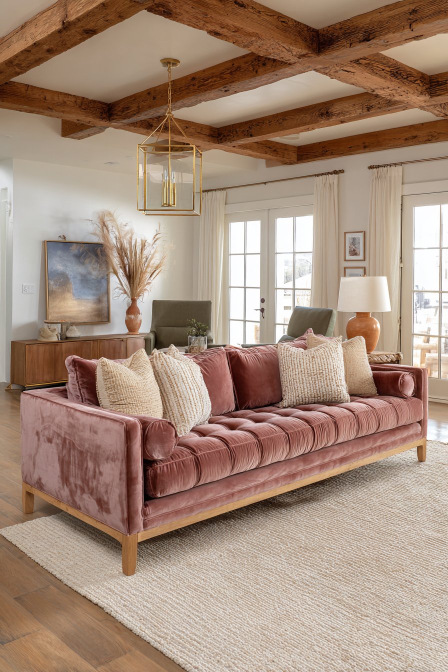
Dusty mauve and terracotta represent the modern approach to rich color palettes, offering warmth and sophistication without traditional formality. These colors contain enough complexity and nuance to feel expensive while maintaining approachability. The psychological effect creates feelings of creativity, warmth, and contemporary style.
These earth-toned colors work beautifully in spaces with abundant natural light, where their subtle undertones can shift throughout the day. Dusty mauve brings a soft, romantic quality that pairs unexpectedly well with darker charcoals and navy, while terracotta adds Mediterranean warmth that grounds more ethereal color choices.
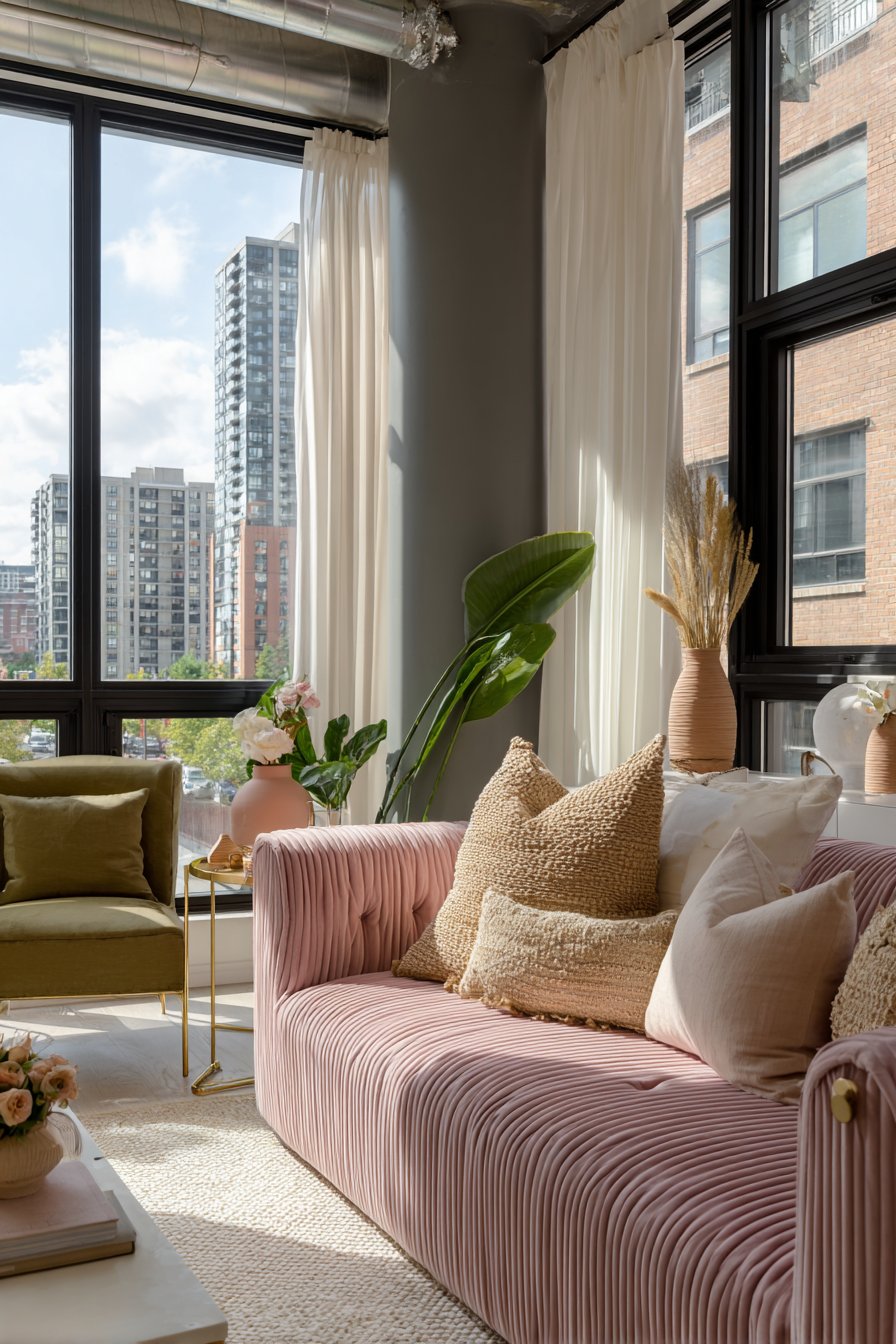
The key to using these colors in rich living rooms is commitment to quality materials. Cheap versions of mauve can look dated, but high-quality velvet or linen in dusty mauve creates instant sophistication. Similarly, terracotta works best in natural materials like clay pots, leather, or woven textiles.
- Use dusty mauve in velvet upholstery for luxury
- Incorporate terracotta through ceramic accessories and art
- Pair mauve with brass and gold for warmth
- Combine terracotta with olive green for earthiness
- Add these colors through high-quality textiles
- Balance with plenty of neutral elements
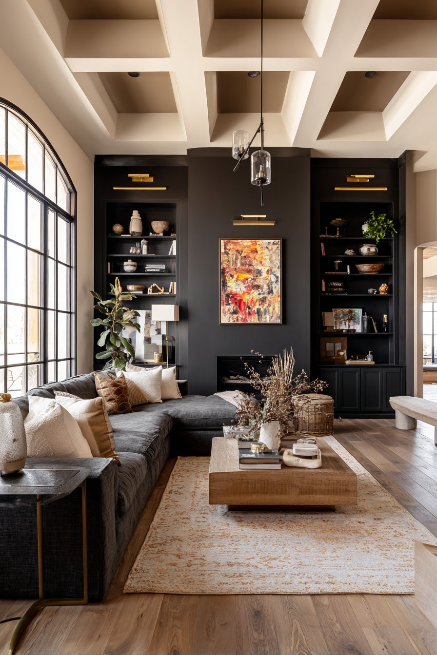
7. Black Accents Provide Essential Contrast and Drama
Black is the ultimate luxury accent that many homeowners fear but sophisticated spaces embrace. Strategic black elements create definition, drama, and visual grounding that prevents color-rich rooms from feeling washed out or unfocused. The key is using black as punctuation rather than a primary color.
In rich living rooms, black appears in intentional moments—window frames, light fixtures, furniture legs, or decorative accessories. These touches create contrast that makes other colors appear more vibrant and intentional. Black also provides visual weight that balances lighter elements and creates rhythm throughout the space.
The sophistication of black comes from its ability to enhance perceived quality. Black fixtures and hardware always look more expensive than their price point, making this an excellent strategy for creating luxury on a budget.
- Use matte black light fixtures for modern elegance
- Incorporate through window frames or door hardware
- Add black furniture legs for subtle grounding
- Include black frames on mirrors and artwork
- Use black sparingly as accent color in textiles
- Combine with metallics to prevent heaviness
8. Cream and Warm White Balance Rich Color Choices
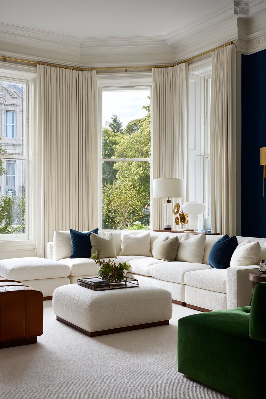
Cream and warm white serve as the essential counterbalance to deep, saturated colors, preventing spaces from feeling heavy or dark. These light neutrals aren’t boring—they’re strategic choices that allow rich colors to shine while maintaining brightness and airiness. The warm undertones in cream prevent the sterile quality of pure white.
The sophistication of cream comes from its versatility and timelessness. It works in traditional and modern spaces equally well, serving as a bridge between different color families. In rich living rooms, cream appears in large upholstered pieces, window treatments, or as ceiling and trim colors that reflect light throughout the space.
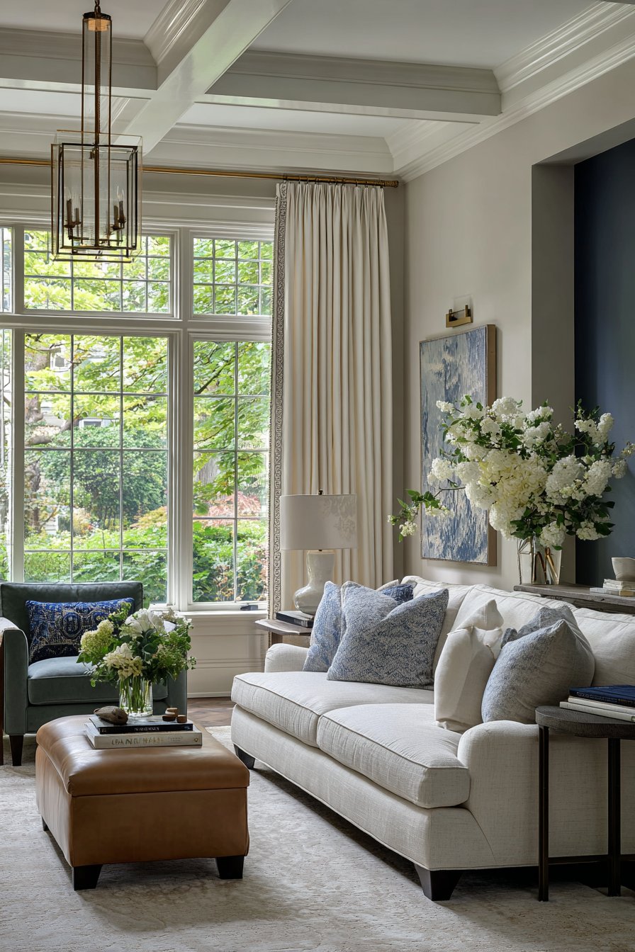
Quality matters significantly with cream and white tones. Cheap materials in these colors look exactly that—cheap. But high-quality linen, wool, or cotton in cream feels luxurious and intentional, elevating the entire space.
- Use cream for large upholstered furniture pieces
- Paint ceilings warm white to enhance light reflection
- Incorporate through drapery and window treatments
- Choose cream rugs to lighten and brighten spaces
- Layer different shades of cream for dimensional interest
- Pair with any rich color for sophisticated contrast
A rich living room achieves its luxurious atmosphere through thoughtful color selection that balances depth, warmth, and contrast. The colors explored in this article—deep navy, emerald green, warm charcoal, burgundy, caramel browns, dusty mauve, strategic black, and balancing cream—work together to create spaces that feel both expensive and inviting. Each color contributes unique psychological and visual effects that layer together into cohesive, sophisticated design.
The beauty of these color choices lies in their versatility and timelessness. Rather than following fleeting trends, these colors draw from historical design principles and natural inspiration, ensuring your living room remains stylish for years to come. Experiment with combinations that resonate with your personal style, and don’t be afraid to commit to deeper, more saturated tones. The richness you’re seeking comes from confidence in color choices and quality in execution.
"As an Amazon Associate, I earn from qualifying purchases."