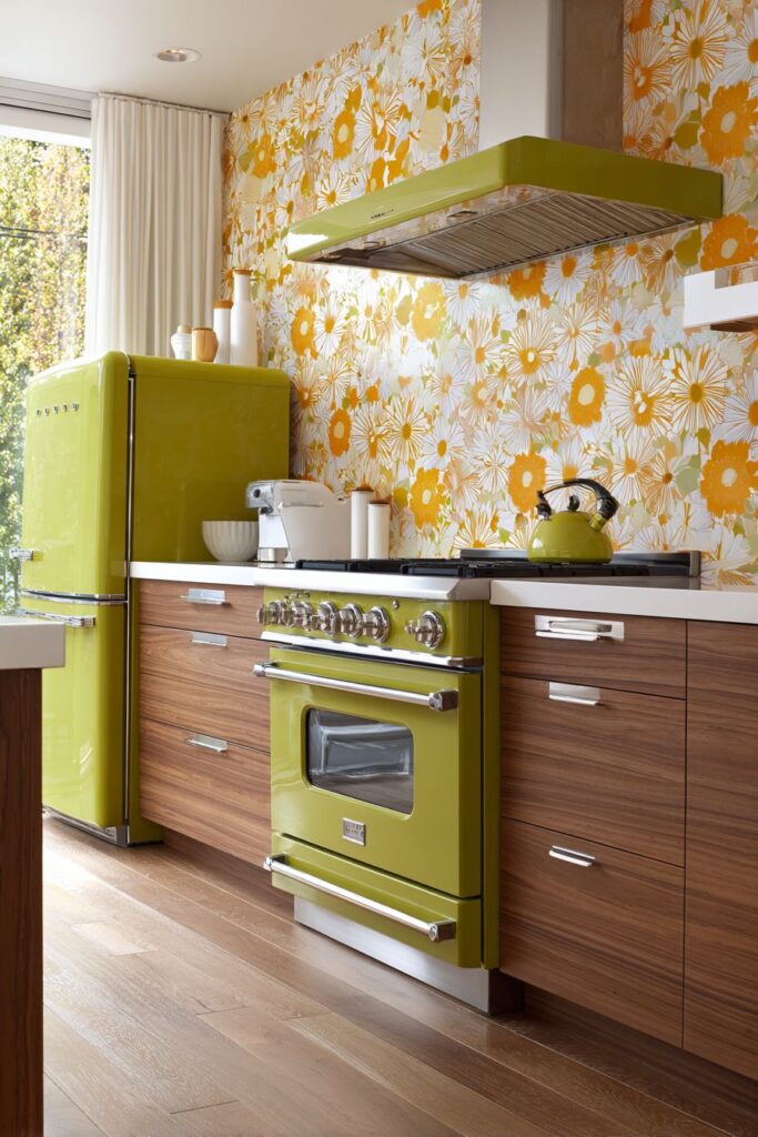
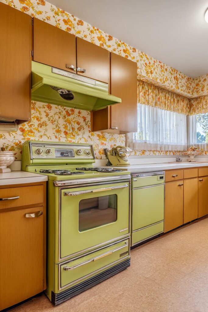
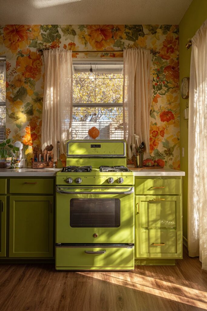
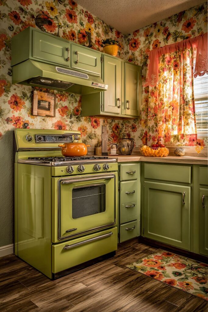
The art of interior design reaches its pinnacle when form meets function in perfect harmony, creating spaces that not only serve our daily needs but also inspire and energize us. In the realm of kitchen design, few styles capture the imagination quite like the retro aesthetic, with its bold colors, innovative materials, and optimistic vision of domestic life. The retro kitchen movement, spanning from the cheerful pastels of the 1950s through the earth tones of the 1970s, represents a fascinating period when kitchen design embraced both technological advancement and artistic expression.
Today’s homeowners are increasingly drawn to retro kitchen designs for their ability to inject personality and warmth into what is often considered the heart of the home. These spaces celebrate the era when kitchens transformed from purely functional rooms into social hubs where families gathered, entertaining became an art form, and cooking was elevated to a creative pursuit. The appeal lies not just in nostalgia, but in the timeless design principles that made these kitchens both beautiful and remarkably functional.
This comprehensive guide explores thirty distinct retro kitchen concepts, each offering unique insights into how mid-century design elements can be successfully integrated into contemporary homes. From vibrant turquoise cabinetry to atomic-age lighting fixtures, from harvest gold appliances to geometric floor patterns, these designs demonstrate the incredible versatility and enduring appeal of retro kitchen aesthetics. Whether you’re planning a complete kitchen renovation or simply looking to incorporate vintage elements into your existing space, these ideas will inspire you to create a kitchen that’s both authentically retro and perfectly suited to modern living.
1. Vibrant Turquoise Cabinet Showcase

The turquoise cabinet kitchen represents the epitome of 1950s optimism, where bold color choices reflected the era’s confidence in the future. These stunning cabinets, painted in the distinctive blue-green hue that became synonymous with mid-century design, create an immediate focal point that transforms any kitchen into a retro wonderland. The chrome handles gleaming against the vibrant surface add a touch of industrial sophistication, while their sleek lines emphasize the clean, modern aesthetic that defined the decade.

White Formica countertops adorned with the iconic boomerang pattern provide the perfect complement to the turquoise cabinetry. This distinctive surface material, with its atomic-age motifs, captures the space-age enthusiasm of the era while offering practical durability that made it a favorite among homeowners. The boomerang pattern, with its dynamic angular shapes, creates visual interest and movement across the work surfaces, turning functional countertops into artistic statements.

The addition of a pastel pink vintage-style refrigerator serves as the kitchen’s crown jewel, demonstrating how multiple bold colors can work in harmony when properly balanced. This cheerful appliance, with its rounded corners and chrome accents, embodies the friendly, approachable design philosophy of the 1950s. The white subway tile backsplash provides a classic counterpoint that prevents the space from becoming overwhelming while maintaining the clean, fresh aesthetic.
The black and white checkered vinyl flooring completes this retro masterpiece, grounding the bright colors with a timeless pattern that has remained popular across decades. This flooring choice not only reinforces the 1950s theme but also provides practical benefits, including easy maintenance and water resistance – essential qualities for busy kitchen environments.

Key Design Tips:
- Balance bold cabinet colors with neutral elements like white countertops and backsplashes
- Choose authentic period hardware in chrome or stainless steel for authenticity
- Incorporate geometric patterns in flooring or accessories to enhance the atomic-age theme
- Select appliances in complementary colors rather than matching everything perfectly
- Use natural lighting to showcase the vibrant colors and prevent the space from feeling artificial
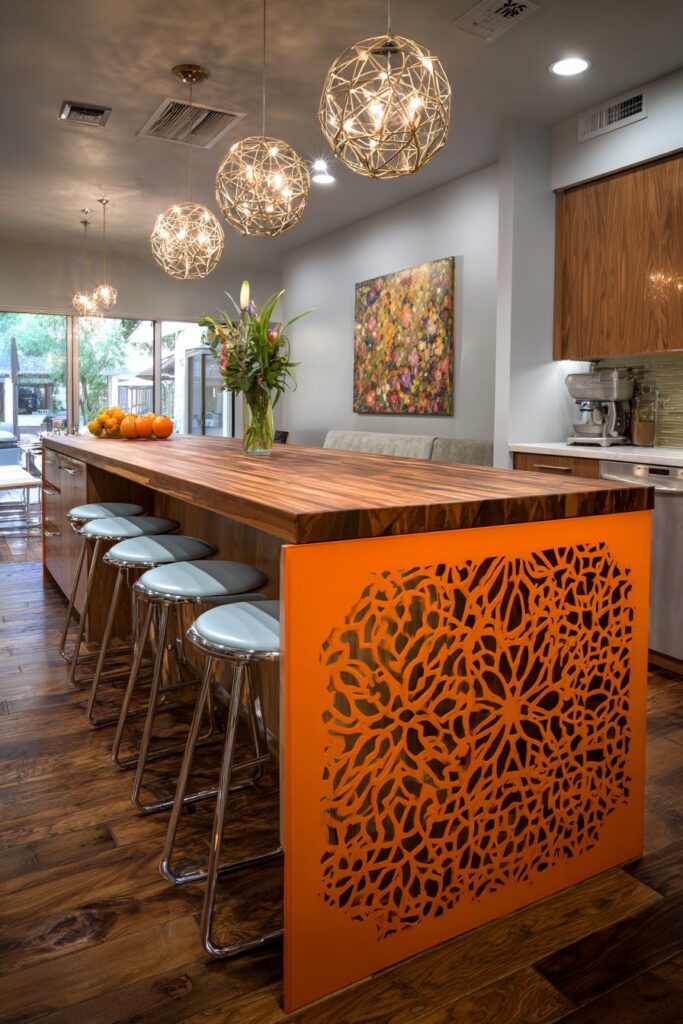
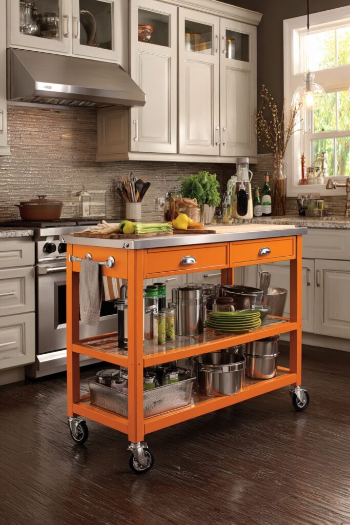
2. Geometric Island Paradise
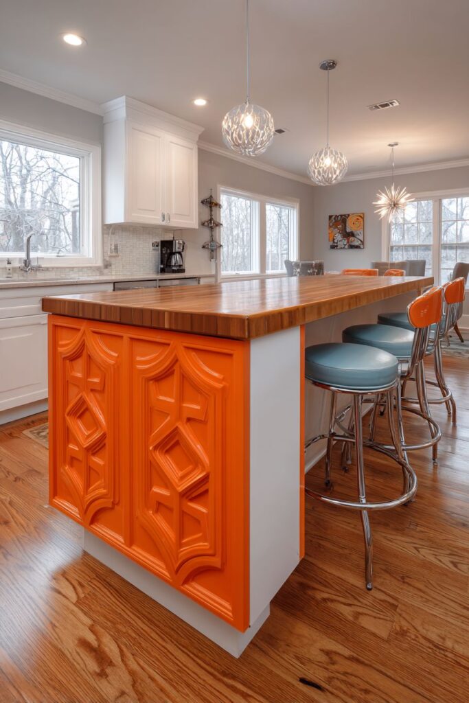
The retro kitchen island with its butcher block top and vibrant orange laminate base represents functional design at its most stylish. This central workspace combines the warmth of natural wood with the bold color confidence of 1960s design, creating a piece that serves as both practical preparation area and artistic centerpiece. The geometric cutout patterns typical of the decade add visual lightness to what could otherwise be a heavy focal point, demonstrating the era’s mastery of balancing form and function.
Chrome bar stools with coordinating vinyl seats transform the island into an informal dining area, perfect for quick meals or casual conversation while cooking. These seats, with their sleek metal frames and comfortable padding, exemplify the period’s embrace of new materials and manufacturing techniques. The swivel mechanism adds convenience while the chrome finish provides a unifying element that ties together various metallic accents throughout the space.
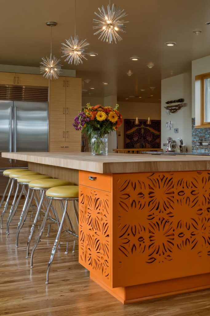
The pendant lights featuring atomic-age starburst designs serve as sculptural elements that provide both illumination and artistic interest. These fixtures, suspended at varying heights, create visual rhythm while ensuring adequate task lighting for food preparation. The starburst motif, with its radiating spokes and geometric precision, captures the optimistic, forward-looking spirit of the atomic age while providing functional illumination.
This island configuration demonstrates how retro design principles can enhance modern kitchen workflows. The generous workspace encourages social interaction while cooking, reflecting the era’s shift toward more open, sociable kitchen designs. The combination of materials – wood, laminate, chrome, and vinyl – showcases the period’s innovative approach to combining traditional and synthetic materials for both aesthetic and practical benefits.
Key Design Tips:
- Position pendant lights 30-36 inches above the island surface for optimal task lighting
- Choose geometric patterns that complement rather than compete with cabinet designs
- Balance warm wood tones with cool metallic finishes for visual interest
- Ensure adequate clearance around the island for comfortable movement and seating
- Select stool heights that work with your island’s proportions for comfortable dining
3. Harvest Gold Kitchen Warmth
The harvest gold retro kitchen epitomizes the warm, earthy aesthetic that dominated 1970s design, where natural tones created inviting, comfortable spaces. This rich, golden yellow finish on major surfaces reflects the decade’s move toward warmer, more organic color palettes that emphasized connection to nature and comfort over stark modernism. The harvest gold creates a sunny, welcoming atmosphere that makes the kitchen feel like a cozy gathering place.
Avocado green appliances, including a vintage-style range and hood, provide complementary color that enhances the natural, earth-inspired theme. These appliances, with their distinctive color and authentic styling, serve as functional sculptures that celebrate the era’s bold approach to kitchen equipment design. The combination of harvest gold and avocado green creates a sophisticated color relationship that demonstrates how seemingly challenging colors can work beautifully together when properly balanced.
Walnut-stained cabinets with simple horizontal pulls add natural warmth and texture to the space while providing practical storage solutions. The wood grain, with its rich browns and distinctive patterns, complements the golden tones while adding visual depth and authentic natural materials. The simple, horizontal hardware reflects the period’s preference for clean, unadorned lines that emphasized function over ornamentation.
Orange and yellow floral wallpaper serves as a cheerful backsplash accent that celebrates the decade’s love of botanical motifs and pattern mixing. This wallpaper choice demonstrates how retro design often layered multiple patterns and colors to create richly textured, visually engaging spaces. The floral pattern softens the geometric lines of the appliances and cabinetry while adding a touch of whimsy and personality.
Key Design Tips:
- Use warm wood tones to soften bold colored appliances and create balance
- Layer similar tones in different materials for depth without overwhelming the space
- Choose wallpaper patterns that complement your color scheme without competing with architectural elements
- Install natural lighting to enhance warm colors and prevent them from appearing muddy
- Balance busy patterns with solid color areas to create visual rest points
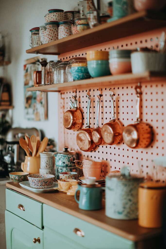
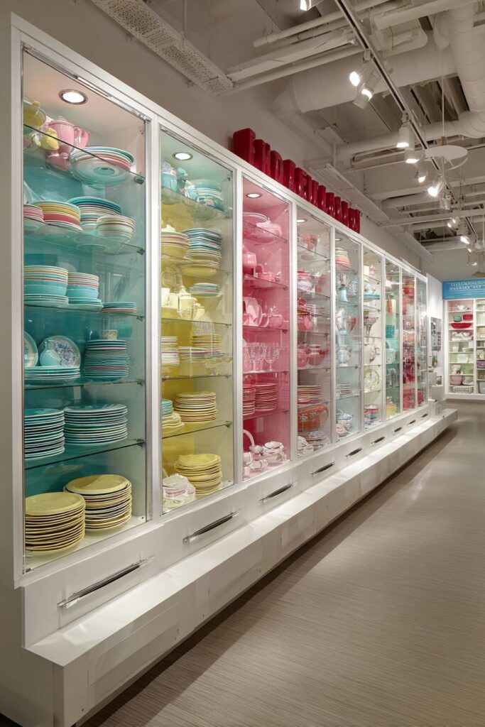
4. Colorful Storage Solutions
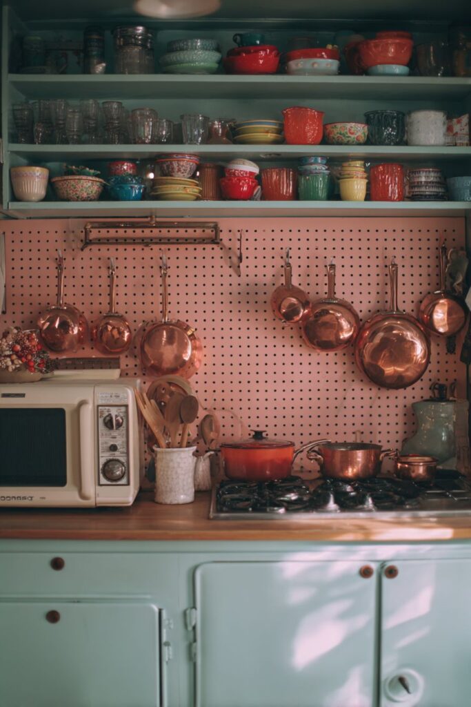
The compact retro kitchen storage solution showcases how thoughtful organization can become a design feature in itself. Open shelving displaying colorful Fiestaware and vintage glassware transforms functional storage into an artistic display that celebrates the era’s love of vibrant ceramics and innovative glass designs. This approach to storage reflects the period’s optimistic attitude toward domestic life, where everyday objects were designed to be beautiful enough to display proudly.

Mint green metal cabinets with rounded edges house modern conveniences while maintaining authentic retro aesthetics. These cabinets demonstrate how period-appropriate styling can successfully integrate contemporary appliances and storage needs. The rounded edges, a signature detail of 1950s design, soften the overall appearance while the mint green finish adds a fresh, cheerful element that complements the displayed dishware.
The pegboard backsplash painted in coral pink provides both functional hanging storage and a bold color statement. This clever storage solution allows frequently used pots and utensils to become part of the room’s decorative scheme while keeping them easily accessible. The coral pink finish transforms utilitarian pegboard into an artistic element that demonstrates how functional solutions can contribute to the overall design aesthetic.
Copper pots and utensils hanging from the pegboard add warm metallic accents that complement the coral pink background while providing beautiful, functional storage. The copper’s natural patina and warm tones create visual richness while demonstrating how authentic materials enhance retro designs. This combination of colorful backgrounds with metallic accessories creates depth and visual interest while maintaining practical functionality.
Key Design Tips:
- Display dishware as art by choosing colorful, period-appropriate pieces
- Paint utilitarian elements like pegboard in bold colors to make them design features
- Mix warm and cool colors through accessories and metallic finishes
- Choose cabinet shapes that reflect authentic period styling, such as rounded edges
- Organize displayed items by color or style for maximum visual impact
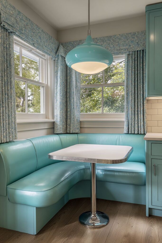
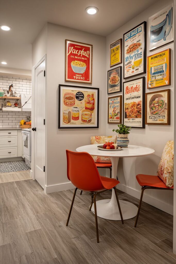
5. Breakfast Nook Bliss

The retro kitchen breakfast nook with built-in banquette seating exemplifies the era’s emphasis on creating dedicated spaces for casual dining and family interaction. The red vinyl upholstery with white piping creates a classic diner aesthetic that transforms everyday meals into special occasions. This seating arrangement maximizes space efficiency while providing comfortable, easy-to-clean surfaces that can withstand the daily demands of family life.

The matching Formica dining table with chrome legs and aluminum edge banding demonstrates the period’s mastery of synthetic materials and industrial design elements. The table’s surface, available in numerous colors and patterns, provides a durable, low-maintenance eating surface while the chrome legs add sophisticated metallic accents. The aluminum edge banding not only protects the Formica surface but also adds a finished, professional appearance that elevates the overall design.

Above the dining area, a geometric pendant light in yellow and orange provides focused task lighting while serving as a sculptural design element. This fixture demonstrates how lighting can serve multiple purposes in retro design – providing necessary illumination while contributing to the overall aesthetic theme. The warm colors create intimate, welcoming lighting that enhances the dining experience.
The integration of this breakfast nook into the overall kitchen design showcases the period’s preference for open, flowing spaces where cooking and dining areas complement each other. This arrangement encourages family interaction while maintaining distinct zones for different activities. The cozy scale makes it perfect for intimate meals, while the durable materials ensure it can handle daily use.

Key Design Tips:
- Choose vinyl upholstery in colors that coordinate with your overall kitchen palette
- Ensure adequate space between seating and table for comfortable movement
- Position pendant lighting to illuminate the table surface without creating glare
- Select table sizes that fit the space while allowing comfortable seating for your family
- Use contrasting piping or trim details to add visual interest to upholstered pieces
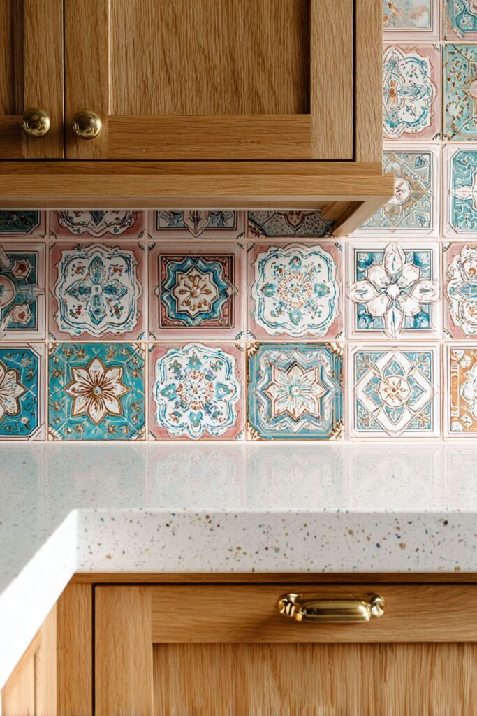
6. Artistic Tile Expressions
The retro kitchen backsplash featuring hand-painted ceramic tiles in atomic boomerang patterns represents the pinnacle of mid-century artistic expression in functional design. These tiles, adorned with turquoise, pink, and gold accents against a cream background, transform the utilitarian backsplash into a gallery-worthy art installation. The boomerang motif, with its dynamic angular shapes, captures the optimistic, forward-looking spirit of the atomic age while providing practical wall protection.
Natural birch cabinetry surrounding the artistic tilework provides a warm, neutral foundation that allows the colorful patterns to shine without competition. The birch’s natural grain and light color create visual calm while the brass hardware adds subtle metallic accents that complement the gold tones in the tile design. This combination demonstrates how natural materials can successfully support and enhance bold artistic elements.
Speckled white quartz countertops complement the vintage tile work by providing a neutral surface that doesn’t compete with the artistic backsplash. The subtle speckling adds texture and visual interest while maintaining the clean, fresh aesthetic essential to retro kitchen design. This material choice also provides modern durability and low maintenance requirements while respecting the period aesthetic.
The handcrafted quality of these tiles adds authenticity and uniqueness that mass-produced alternatives cannot match. Each tile’s slight variations in color and pattern create visual richness and demonstrate the artisanal skills that were valued during the mid-century period. This attention to craftsmanship elevates the entire kitchen design and creates a focal point that guests will remember.
Key Design Tips:
- Choose tile patterns that complement your overall color scheme without overwhelming the space
- Balance artistic elements with neutral cabinetry and countertops for visual harmony
- Invest in authentic handcrafted tiles for unique character and lasting value
- Consider the scale of patterns in relation to your kitchen size
- Use natural lighting to showcase tile colors and patterns to their best advantage
7. Farmhouse Sink Revival

The classic white porcelain farmhouse sink with chrome faucet represents timeless design that transcends decorative trends while maintaining authentic period appeal. This substantial sink, with its deep basin and exposed front panel, provides both practical benefits and visual anchoring for the entire kitchen design. The generous size accommodates large pots and serving pieces while the porcelain surface offers easy cleaning and lasting beauty.

Yellow laminate cabinets with rounded corners frame the sink area, creating a cheerful, sunny atmosphere that embodies the optimistic spirit of 1950s design. The rounded corners, a signature detail of the period, soften the overall appearance while demonstrating the era’s attention to safety and comfort. The yellow finish adds warmth and energy to the workspace while providing an ideal backdrop for the white sink.
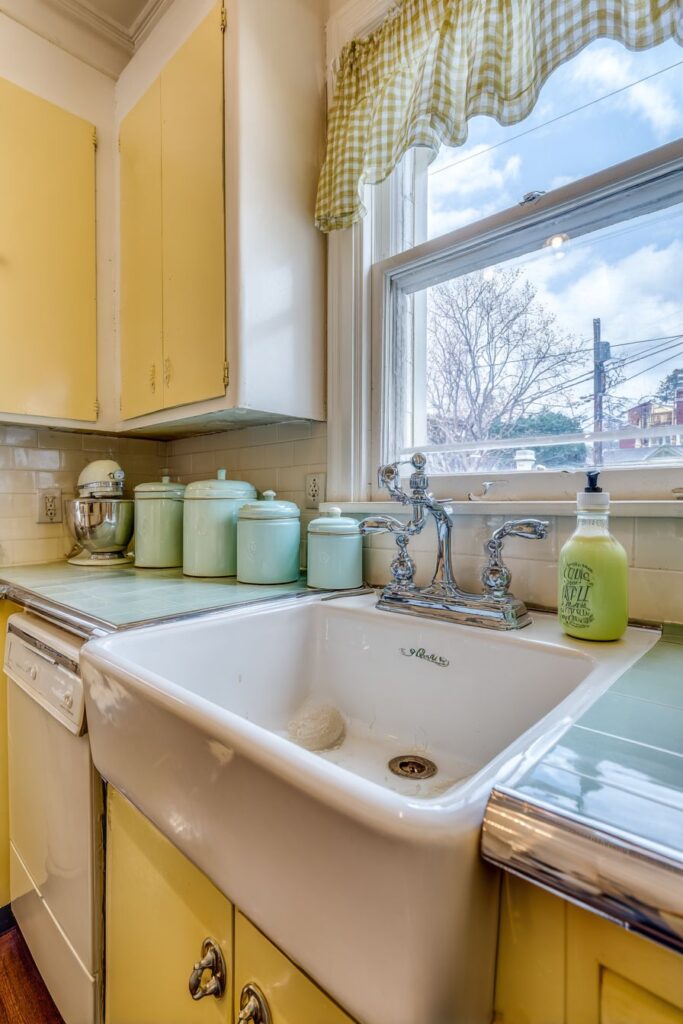
The window above the sink, dressed with gingham café curtains, provides natural light for daily tasks while adding charming pattern and color. These curtains, with their simple check pattern and casual styling, reflect the period’s preference for approachable, unpretentious window treatments that enhance rather than dominate the view. The natural light streaming through creates an ideal environment for food preparation and dishwashing.
Vintage canisters and small appliances displayed on the surrounding countertop demonstrate how functional items can contribute to the overall design aesthetic. These accessories, in coordinating pastel colors, create visual unity while providing convenient storage for frequently used ingredients. The careful arrangement of these items transforms everyday objects into decorative elements that enhance the retro theme.

Key Design Tips:
- Choose sink sizes that accommodate your cooking and cleaning needs
- Position windows to provide natural light for sink-related tasks
- Select window treatments that complement your color scheme while providing privacy
- Display vintage accessories in groupings for maximum visual impact
- Maintain consistent color relationships between major elements and accessories
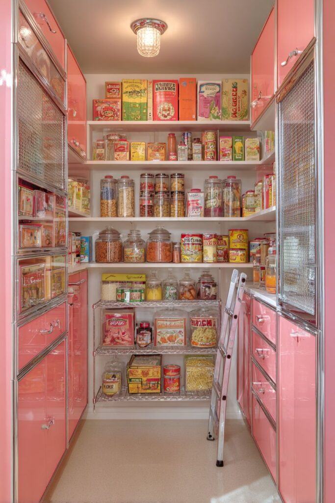
8. Pantry Organization Perfection
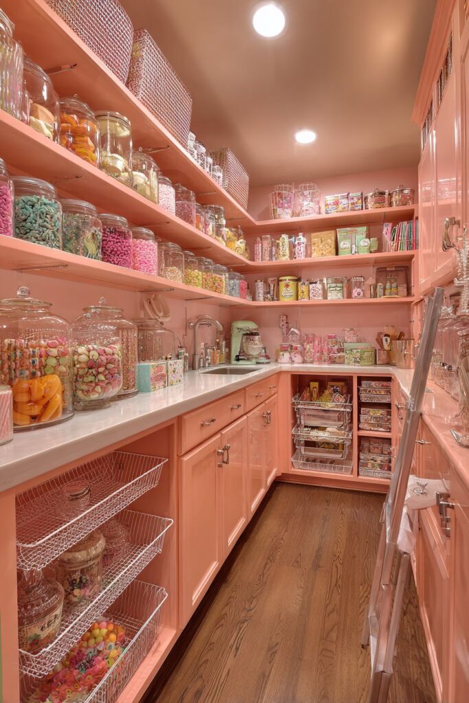
The retro kitchen pantry with floor-to-ceiling coral pink cabinets represents storage design at its most stylish and functional. These glossy cabinets, with their vibrant color and reflective finish, transform utilitarian storage into a design statement that celebrates the era’s bold use of color. The aluminum mesh inserts provide necessary ventilation while adding textural interest and industrial-inspired details that complement the period aesthetic.
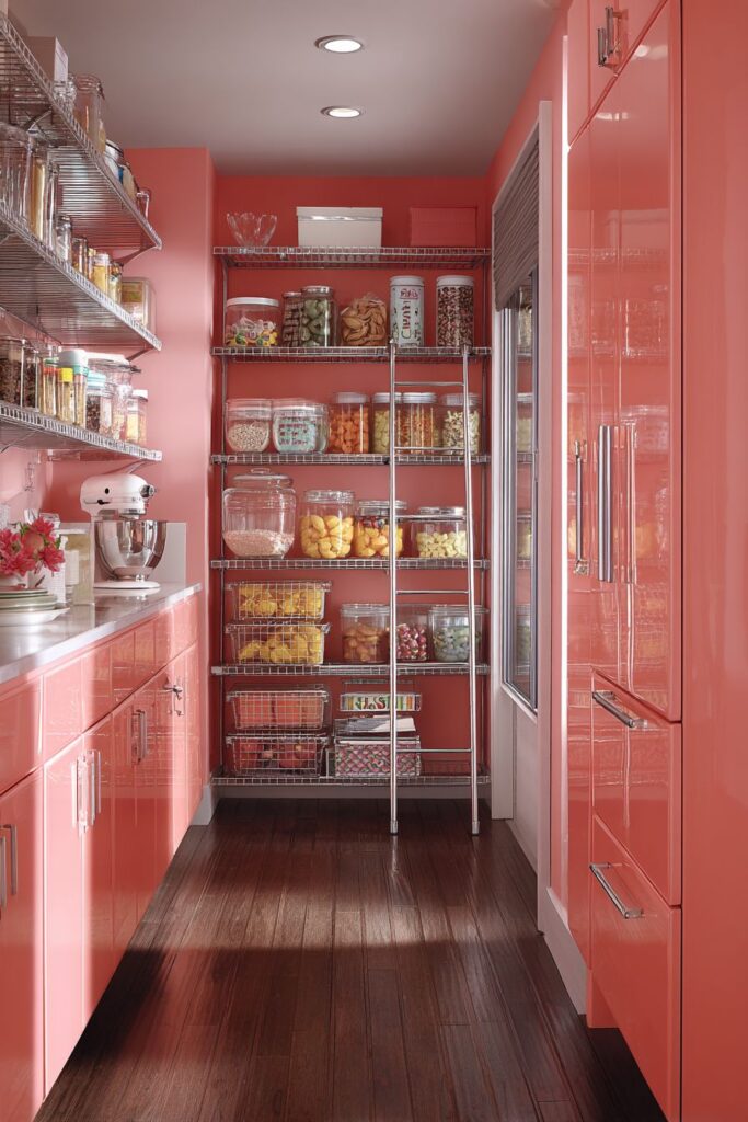
Interior shelving designed specifically for vintage packaging and glass storage containers demonstrates how thoughtful planning can accommodate both modern needs and period-appropriate accessories. The adjustable shelving allows for flexible storage solutions while the display of colorful vintage packaging creates visual interest and authenticity. Glass containers provide practical storage while their transparent nature prevents the space from feeling cluttered.
A rolling ladder in chrome provides safe, convenient access to upper shelves while adding an industrial element that reflects the period’s embrace of functional design elements. This ladder, with its sleek metallic finish and practical wheels, demonstrates how necessary functional elements can enhance rather than detract from the overall design aesthetic. The chrome finish coordinates with other metallic accents throughout the kitchen.
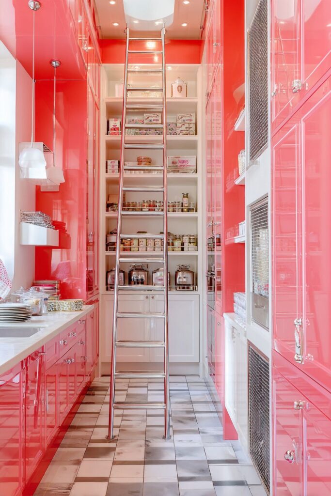
The organized storage system showcases how retro design principles emphasize both beauty and functionality in equal measure. Every element serves a practical purpose while contributing to the overall visual appeal. This approach to storage design reflects the optimistic belief that domestic tasks could and should be both efficient and enjoyable.
Key Design Tips:
- Choose bold pantry colors that coordinate with but don’t exactly match your main cabinetry
- Install adjustable shelving to accommodate various storage needs
- Use glass containers to maintain visual organization while protecting contents
- Include ventilation features to prevent moisture and odor problems
- Position frequently used items at accessible heights for daily convenience
9. Illuminating Color Clusters
The retro kitchen lighting scheme featuring clustered pendant lights with colored glass shades represents functional illumination elevated to artistic expression. These fixtures, suspended in orange, yellow, and turquoise glass, create a rainbow of warm light that transforms the central prep area into a welcoming focal point. The varied colors demonstrate the period’s confidence in bold design choices while providing adequate task lighting for food preparation activities.
Chrome fixtures throughout the space coordinate with the pendant cluster while maintaining the cohesive metallic theme essential to authentic retro design. These chrome elements, from cabinet hardware to appliance trim, create visual unity while reflecting and amplifying the colored light from the glass shades. The reflective surfaces add sparkle and energy to the overall design while emphasizing the space-age aesthetic of the period.
Neutral cabinets surrounding the colorful lighting installation provide visual calm and prevent the space from becoming overwhelming. This demonstrates the importance of balancing bold statement elements with quieter background elements that provide visual rest. The neutral backdrop allows the colored lighting to be the undisputed star while maintaining overall design harmony.
The interplay of colored light and shadow created by these fixtures adds dynamic visual interest throughout the day as natural light conditions change. Morning sunlight combines with the warm artificial light to create one ambiance, while evening illumination provides entirely different moods and atmospheres. This changing quality keeps the space visually interesting and emotionally engaging.
Key Design Tips:
- Group pendant lights at varying heights for visual interest and improved lighting coverage
- Choose glass colors that complement your overall color palette
- Balance colorful statement lighting with neutral backgrounds
- Consider how colored lighting affects the appearance of food and other kitchen activities
- Install dimmer controls to adjust lighting levels for different times of day and activities
10. Countertop Pattern Play

The retro kitchen countertop featuring authentic Formica in pink and grey boomerang pattern exemplifies how surface materials can become artistic elements in their own right. This distinctive pattern, with its dynamic angular shapes and sophisticated color combination, transforms functional work surfaces into design statements that capture the optimistic, forward-looking spirit of the atomic age. The pattern’s movement and energy add visual excitement while maintaining practical durability.
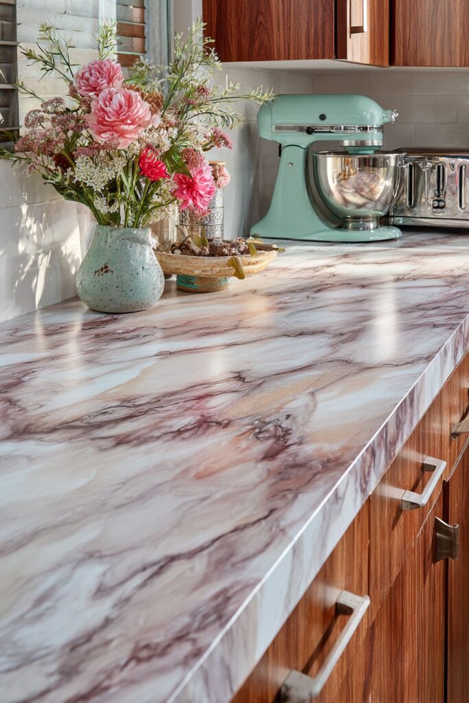
Vintage small appliances, including a mint green stand mixer and chrome toaster, complement the surface pattern while providing functional workspace tools. These appliances, with their distinctive colors and streamlined forms, serve as sculptural elements that enhance the retro theme while providing modern convenience. The mint green mixer adds a fresh color accent that coordinates beautifully with the pink and grey countertop pattern.
Fresh flowers in a ceramic vase provide natural color contrast and organic shapes that soften the geometric precision of the surrounding patterns and forms. This natural element demonstrates how retro design often incorporated organic elements to balance the synthetic materials and atomic-age motifs that dominated the aesthetic. The flowers add life and freshness while creating a connection to nature.

The close integration of pattern, color, and texture in this vignette showcases the sophisticated design relationships that make retro kitchens so visually compelling. Every element works with the others to create a harmonious composition that is both functional and beautiful. This attention to detail and relationship between elements reflects the era’s belief that everyday objects could and should be designed to enhance daily life.

Key Design Tips:
- Choose countertop patterns that complement rather than compete with cabinet designs
- Select appliances in colors that coordinate with your surface materials
- Add natural elements like flowers to balance geometric patterns and synthetic materials
- Display appliances as decorative elements when they have attractive vintage styling
- Consider how patterns will look with various lighting conditions throughout the day
11. Cheerful Workspace Harmony

The retro kitchen workspace featuring a double-basin sink in cheerful yellow porcelain represents functional design at its most optimistic and welcoming. This vibrant fixture, with its matching yellow faucet and accessories, creates a sunny focal point that energizes daily kitchen tasks. The double-basin configuration provides practical benefits for food preparation and cleanup while the cheerful color transforms routine activities into more enjoyable experiences.

Open shelving surrounding the sink area displays colorful dishware that serves both storage and decorative functions. This approach to storage reflects the period’s confidence in the beauty of everyday objects and the belief that functional items could enhance rather than clutter the visual environment. The colorful dishes create a rainbow effect that complements the yellow sink while providing easy access to frequently used items.
The tiled backsplash featuring coordinating geometric patterns provides both practical protection and artistic enhancement. These tiles, with their precise patterns and complementary colors, create visual rhythm and movement while protecting walls from water and cooking splashes. The geometric motifs echo the atomic-age aesthetic while providing timeless appeal that remains fresh and contemporary.

Under-cabinet lighting illuminates the work surface while natural window light provides overall ambiance, creating layered illumination that enhances both function and atmosphere. This combination of artificial and natural light ensures adequate illumination for detailed tasks while creating warm, welcoming overall lighting. The multiple light sources prevent harsh shadows and create an inviting environment for food preparation.

Key Design Tips:
- Choose sink colors that energize rather than tire you during daily use
- Display colorful dishware as art while maintaining easy access for daily use
- Install under-cabinet lighting to eliminate shadows on work surfaces
- Select backsplash patterns that coordinate with your overall geometric theme
- Balance artificial and natural lighting for optimal function and ambiance
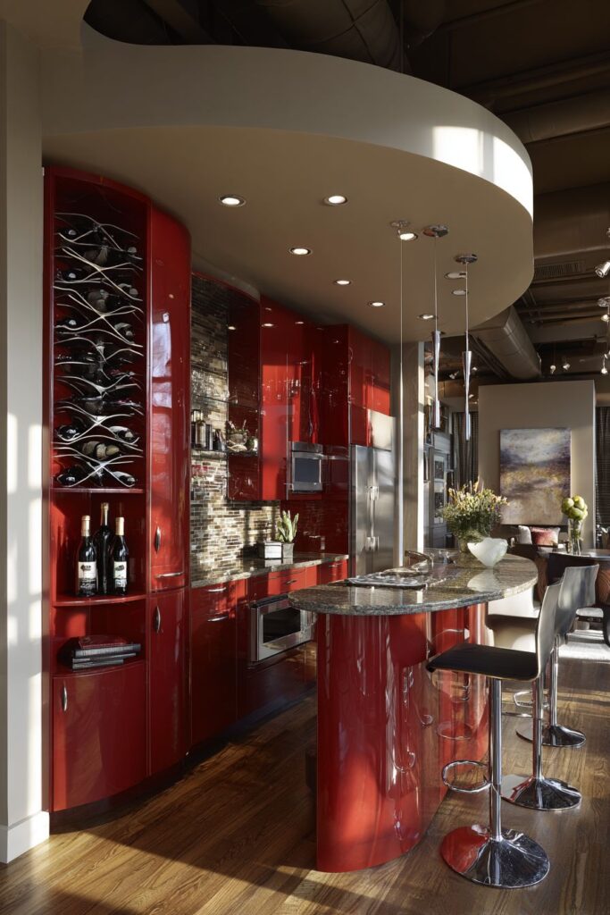
12. Entertainment Central Station
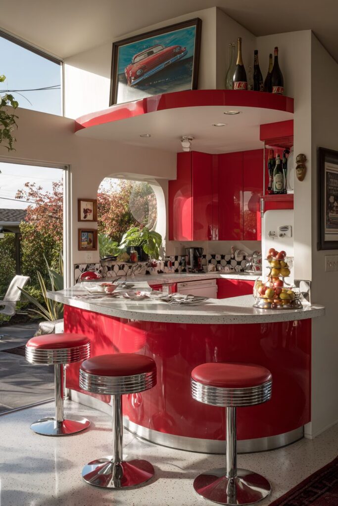
The retro kitchen bar area with high-gloss red cabinets represents entertainment-focused design at its most dramatic and sophisticated. These vibrant cabinets, with their mirror-like finish and bold color, create an immediate focal point that transforms the kitchen into a social hub perfect for cocktail parties and casual gatherings. The high-gloss finish reflects light and adds glamour, while the red color conveys energy and excitement.
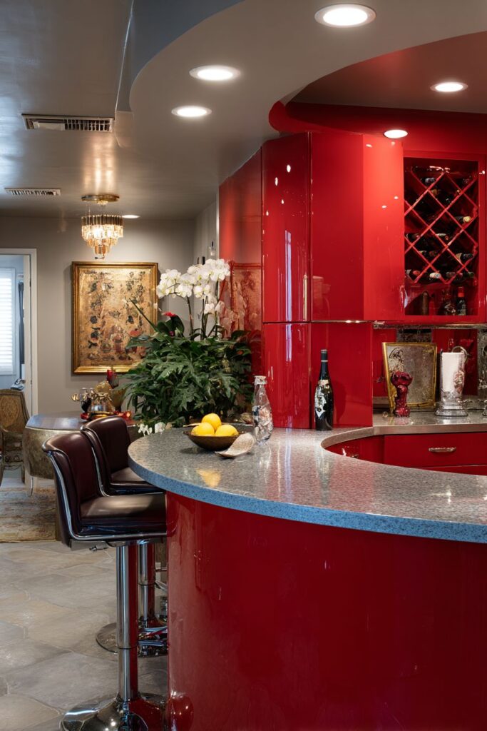
The curved breakfast bar topped with speckled Formica provides an elegant serving surface that accommodates both casual meals and formal entertaining. The curve softens the overall design while creating natural conversation areas where guests can gather comfortably. The speckled Formica adds subtle texture and visual interest while providing the durability necessary for heavy use during entertaining.
Swivel bar stools in chrome and vinyl provide flexible seating that can be easily adjusted to accommodate different users and activities. These stools, with their sleek metallic frames and comfortable padding, exemplify the period’s embrace of functional furniture that serves multiple purposes. The swivel mechanism allows easy conversation in different directions while the chrome finish coordinates with other metallic accents.
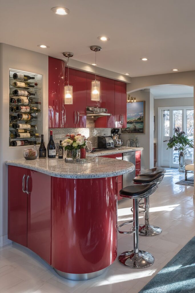
A built-in wine rack displays vintage bottles as decorative elements while providing convenient storage for entertaining essentials. This integrated storage solution reflects the era’s emphasis on combining beauty and function in every design element. The display of wine bottles adds sophistication while the convenient location encourages social drinking and conversation.
Key Design Tips:
- Use high-gloss finishes to add glamour and reflect light in entertaining areas
- Design curved surfaces to create natural gathering spots and soften geometric elements
- Choose seating that can accommodate various heights and provide comfortable conversation positions
- Integrate wine storage as both functional storage and decorative display
- Install dramatic lighting to enhance the entertaining atmosphere and create focal points
13. Appliance Wall Integration

The retro kitchen appliance wall featuring built-in oven and cooktop in avocado green demonstrates how major appliances can be integrated as design elements rather than necessary intrusions. These appliances, with their distinctive color and authentic styling, serve as functional sculptures that celebrate the era’s bold approach to kitchen equipment design. The avocado green finish provides earthy warmth while the chrome trim adds sophisticated metallic accents.
The surrounding cabinetry in natural wood grain laminate provides complementary warmth and texture that balances the bold appliance colors. This wood-look surface offers the beauty of natural grain while providing the durability and easy maintenance of laminate materials. The warm brown tones create visual harmony with the avocado green appliances while adding natural texture and visual depth.

Analog controls on the appliances reflect the period’s preference for straightforward, user-friendly interfaces that prioritized function over complexity. These controls, with their clear markings and simple operation, demonstrate how good design makes complex appliances easy to use. The analog style adds authentic period character while providing reliable, long-lasting operation.

A decorative range hood with geometric cutouts completes the vintage appliance suite while providing necessary ventilation for cooking activities. The geometric patterns echo the atomic-age aesthetic while the functional design ensures proper air circulation. This demonstrates how even the most utilitarian elements can be designed to enhance the overall aesthetic while serving practical needs.

Key Design Tips:
- Choose appliance colors that coordinate with your overall color scheme
- Balance bold appliance colors with complementary cabinetry tones
- Look for appliances with authentic period styling rather than modern interpretations
- Integrate range hoods as decorative elements rather than hiding them
- Consider how appliance placement affects both function and visual flow
14. Floor Pattern Drama
The retro kitchen floor featuring authentic linoleum in atomic starburst pattern represents surface design at its most bold and sophisticated. This flooring, with its black, white, and gold geometric designs, creates dramatic visual impact that serves as the foundation for the entire room design. The starburst motif, with its radiating spokes and atomic-age symbolism, captures the optimistic, space-age enthusiasm of the era while providing practical, durable flooring.
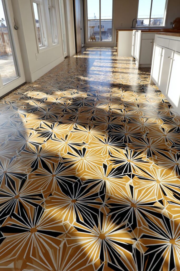
Simple white cabinets surrounding the dramatic flooring allow the pattern to dominate the design without creating visual chaos. This demonstrates the importance of balancing bold statement elements with quieter background elements that provide visual rest. The white cabinets create clean, fresh contrast while maintaining focus on the spectacular floor pattern.
Natural lighting from multiple windows creates interesting shadow patterns across the decorative floor surface throughout the day. These changing patterns add dynamic visual interest and prevent the bold design from becoming static or overwhelming. The interplay of light and shadow emphasizes the three-dimensional quality of the pattern while creating constantly changing visual experiences.
The authentic linoleum material provides practical benefits, including durability, easy maintenance, and comfort underfoot, while delivering authentic period character. This material choice demonstrates how original materials often provide superior performance compared to modern imitations while maintaining historical authenticity. The genuine linoleum ages beautifully while developing character over time.
Key Design Tips:
- Choose floor patterns that can serve as the room’s primary design element
- Balance dramatic floors with simple, neutral cabinetry and wall treatments
- Consider how natural lighting will interact with floor patterns throughout the day
- Invest in authentic materials for superior performance and genuine period character
- Plan furniture and accessory placement to showcase rather than hide pattern elements
15. Cozy Corner Dining

The retro kitchen corner featuring built-in breakfast booth with curved banquette seating exemplifies intimate dining design at its most charming and efficient. The turquoise vinyl upholstery creates a welcoming, easy-to-clean surface that can withstand daily family use while maintaining its cheerful appearance. The curved design maximizes seating capacity while creating natural conversation areas that encourage family interaction and social dining experiences.
The coordinating table with white Formica top and aluminum edging provides a durable, attractive dining surface that complements the seating while maintaining the cohesive design theme. The chrome pedestal base adds sophisticated metallic accents while maximizing leg room and making the seating area feel more spacious. The Formica surface offers easy maintenance and lasting beauty that makes daily dining more enjoyable.

A dome pendant light in matching turquoise provides intimate lighting that creates a cozy atmosphere for family meals and conversation. This fixture demonstrates how lighting can define spaces within larger rooms while providing necessary illumination for dining activities. The colored light creates warmth and intimacy while the dome shape focuses light downward onto the table surface.
The integration of this dining nook into the overall kitchen design showcases efficient space planning that maximizes functionality while maintaining design coherence. The corner location makes efficient use of space while creating a defined dining area that feels separate from cooking activities. This arrangement encourages family meals while maintaining visual connection to kitchen activities.

Key Design Tips:
- Choose upholstery colors that coordinate with your overall kitchen palette
- Design seating curves to maximize capacity while maintaining comfort
- Position pendant lighting to create intimate dining atmosphere without glare
- Select table sizes that fit the space while accommodating your family’s needs
- Consider how the dining area relates to cooking and cleanup activities for optimal workflow
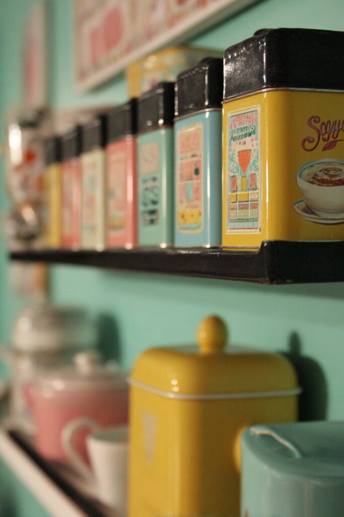
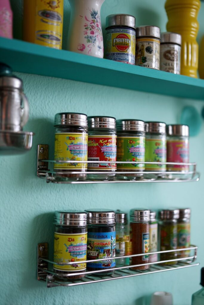
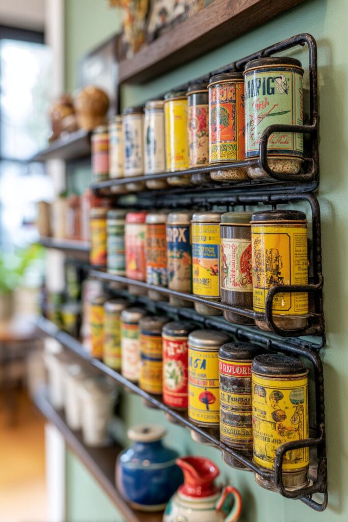
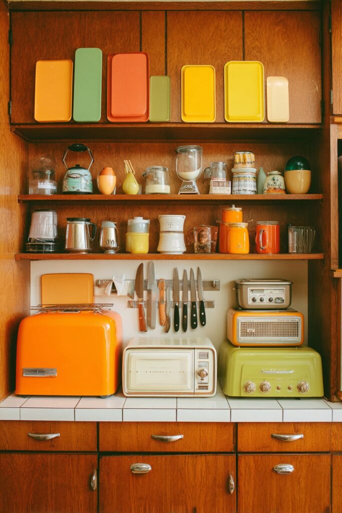
16. Spice Organization Artistry
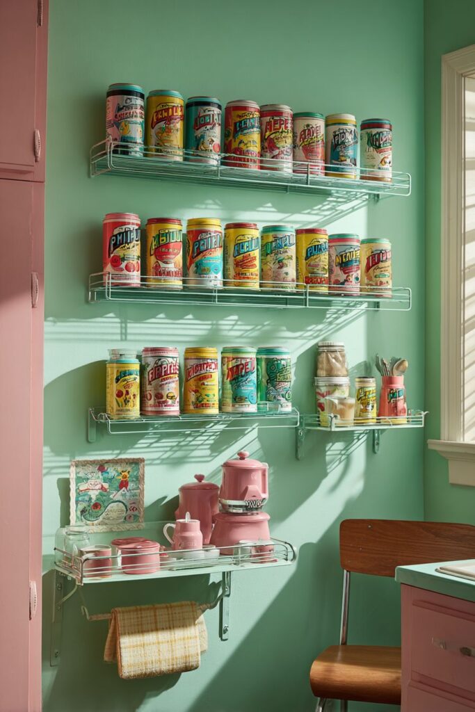
The retro kitchen spice rack system featuring wall-mounted magnetic strips transforms functional storage into an artistic display that celebrates the era’s love of colorful packaging and innovative storage solutions. The vintage spice tins, with their atomic-age graphics and vibrant labels, create a rainbow of colors and patterns that enhance the kitchen’s visual appeal while providing convenient access to cooking essentials. This approach to storage reflects the period’s belief that functional elements could and should contribute to the overall design aesthetic.
The mint green wall with high-gloss finish provides a perfect backdrop that makes the colorful spice containers pop while maintaining the fresh, cheerful atmosphere characteristic of retro design. The glossy surface reflects light and adds depth while the green color provides cool contrast to the warm spice tin colors. This sophisticated color relationship demonstrates the era’s mastery of color theory and practical application.
Small shelves displaying additional vintage kitchen accessories create layered storage solutions that maximize wall space while maintaining visual interest. These accessories, in coordinating colors and authentic period styling, extend the storage theme while adding personality and character. The careful arrangement of these items creates visual rhythm and prevents the storage area from appearing cluttered or chaotic.
The authentic packaging and period typography on the spice containers add historical character while demonstrating the sophisticated graphic design of the era. These elements provide visual richness and authenticity that mass-produced modern alternatives cannot match. The attention to these details reflects the period’s belief that every element of daily life could be designed to be both beautiful and functional.
Key Design Tips:
- Choose wall colors that enhance rather than compete with displayed items
- Group storage containers by color or size for maximum visual impact
- Use magnetic strips for easy access and flexible arrangement options
- Display vintage packaging as art while maintaining practical functionality
- Create layered storage solutions to maximize wall space and visual interest
17. Window Treatment Wonder

The retro kitchen window treatment featuring café curtains in bold geometric print demonstrates how fabric choices can dramatically enhance the overall design theme while providing practical light control and privacy. These curtains, with their orange, yellow, and brown atomic patterns, create visual excitement while filtering natural light to create warm, welcoming ambiance. The geometric motifs echo the atomic-age aesthetic while adding softness and movement to the angular kitchen elements.
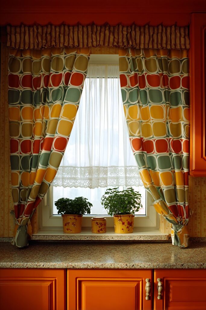
The window frame painted in coordinating orange provides architectural emphasis that integrates the window treatment into the overall design scheme. This bold color choice transforms the utilitarian window frame into a design element that supports and enhances the fabric pattern. The coordination between frame color and fabric pattern demonstrates sophisticated color planning and attention to detail.
Natural wood grain cabinetry surrounding the window provides warm contrast that balances the bold fabric patterns and bright frame color. The wood tones add natural warmth and texture while preventing the bold colors and patterns from overwhelming the space. This balance between natural and synthetic elements reflects the period’s successful integration of different materials and textures.
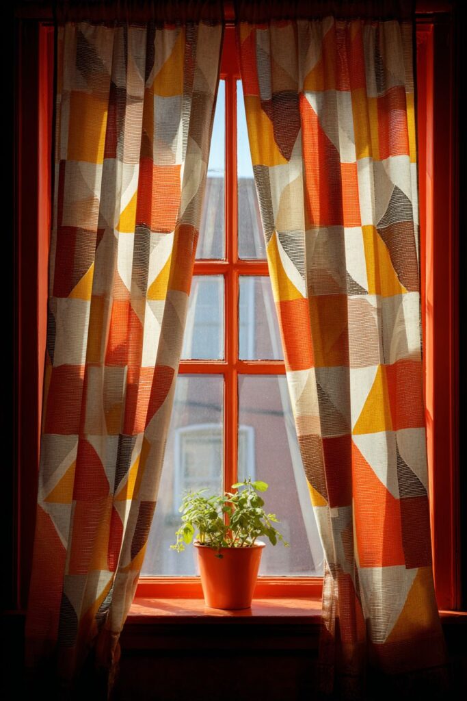
Potted herbs on the windowsill add natural elements that complement the vintage color scheme while providing fresh ingredients for cooking. These living plants soften the geometric patterns while adding organic shapes and natural colors that balance the synthetic materials and atomic-age motifs. The herbs also provide practical benefits while enhancing the overall aesthetic appeal.

Key Design Tips:
- Choose window treatment patterns that complement your overall geometric theme
- Paint window frames in coordinating colors to integrate them into the design scheme
- Balance bold patterns with natural wood tones for visual harmony
- Add living plants to soften geometric elements and provide natural contrast
- Consider how window treatments affect natural light and privacy throughout the day
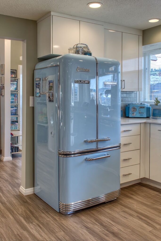
18. Appliance Color Coordination
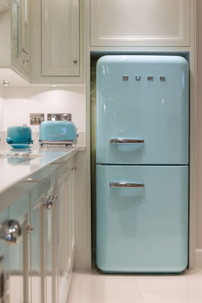
The retro kitchen refrigerator in classic pastel blue represents appliance design at its most charming and distinctive. This substantial appliance, with its rounded corners, chrome handles, and authentic vintage proportions, serves as a focal point that defines the entire kitchen’s character. The pastel blue finish provides cool, calming color that creates a fresh, cheerful atmosphere while the vintage styling adds authentic period character that modern appliances cannot match.
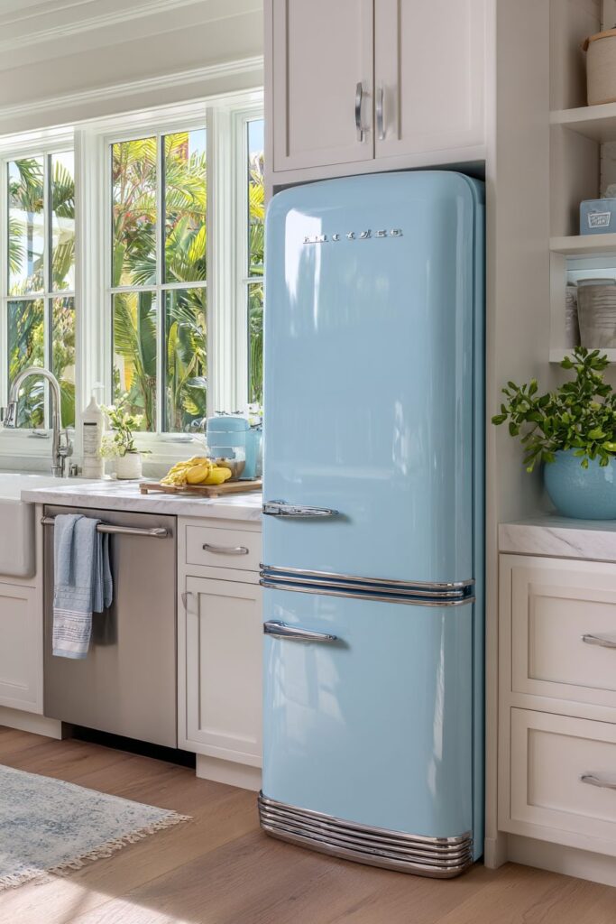
Coordinating blue accents in small appliances and accessories creates visual unity while preventing color overwhelm through careful distribution of the dominant hue. These smaller blue elements, including mixers, toasters, and decorative accessories, reinforce the color theme while maintaining appropriate scale relationships. This approach demonstrates how color coordination can be achieved without creating monotonous repetition.
Neutral cabinets provide essential visual balance that prevents the bold appliance color from dominating the space inappropriately. These cabinets, in subtle tones that complement rather than compete with the blue appliance, create calm backgrounds that allow the colorful elements to shine. This balance between bold and neutral elements reflects sophisticated color planning and restraint.
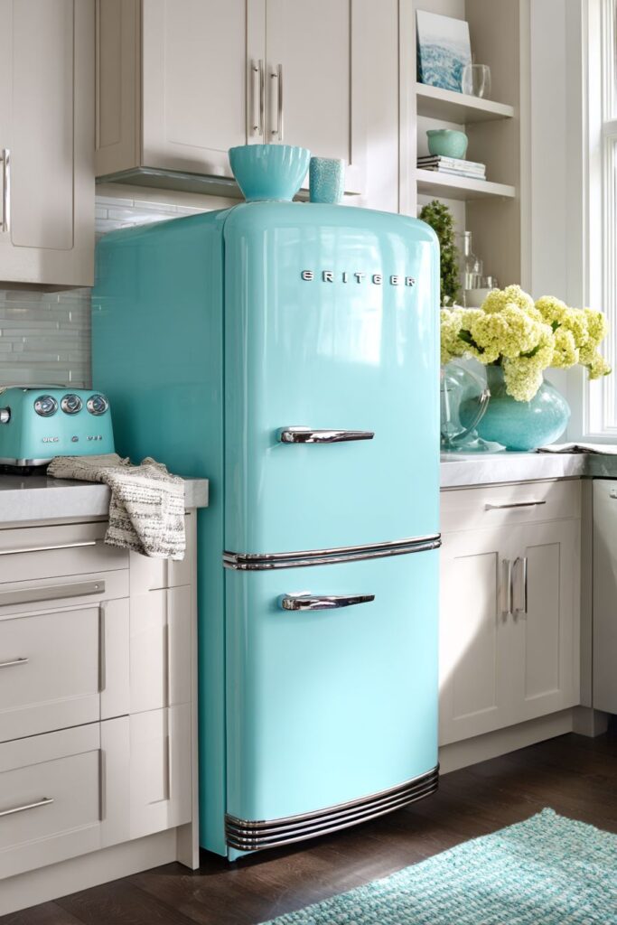
The practical integration of vintage-styled appliances into modern kitchen layouts demonstrates how retro aesthetics can successfully accommodate contemporary functionality and efficiency requirements. The authentic proportions and period-appropriate styling create visual authenticity while modern internal components provide reliable performance and energy efficiency. This combination offers the best of both aesthetic appeal and practical function.
Key Design Tips:
- Choose appliance colors that create focal points without overwhelming the space
- Distribute accent colors through smaller elements to create visual unity
- Balance bold appliance colors with neutral cabinetry for sophisticated results
- Look for appliances with authentic vintage styling and proportions
- Consider how large appliance colors will affect the overall room atmosphere
19. Tool Display Innovation
The retro kitchen cutting board collection displayed on magnetic knife strips demonstrates how functional kitchen tools can become decorative elements when thoughtfully organized and displayed. The colorful plastic boards in orange, yellow, and green reflect the era’s embrace of synthetic materials and bold colors while providing practical cutting surfaces for daily food preparation. This approach to tool storage makes frequently used items easily accessible while contributing to the overall visual appeal.
Additional vintage gadgets and tools arranged on open shelving extend the display concept while providing convenient storage for specialized kitchen equipment. These tools, with their distinctive colors and streamlined forms, serve as sculptural elements that enhance the retro theme while remaining functionally accessible. The careful arrangement prevents the display from appearing cluttered while maximizing storage efficiency.
Natural wood cabinets provide warm background contrast that enhances the bright colors of the displayed tools while maintaining visual balance. The wood tones add natural warmth and texture while preventing the synthetic materials and bold colors from creating an artificial atmosphere. This balance between natural and synthetic elements reflects the period’s successful material integration strategies.
The authentic vintage tools and gadgets add historical character while demonstrating the innovative design approaches that characterized kitchen equipment of the era. These items, with their distinctive styling and quality construction, provide superior performance while adding authentic period details that enhance the overall design credibility. The attention to authentic details reflects the era’s belief in quality design for everyday objects.
Key Design Tips:
- Display functional tools as decorative elements through thoughtful arrangement
- Choose storage solutions that provide easy access while maintaining visual appeal
- Balance synthetic materials and bold colors with natural wood tones
- Collect authentic vintage tools for superior performance and genuine character
- Organize displayed items to prevent visual clutter while maximizing storage efficiency
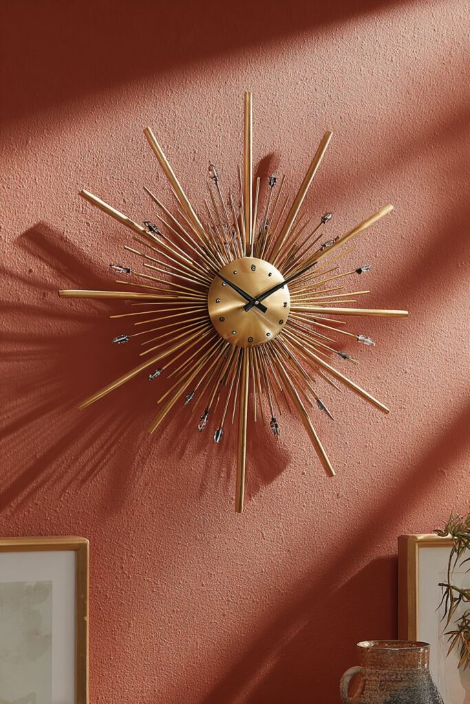
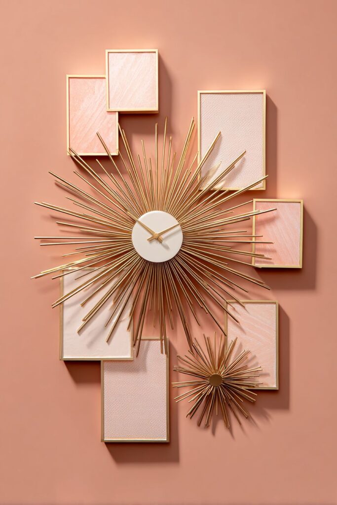
20. Wall Art Time Piece
The retro kitchen clock and wall décor arrangement featuring a sunburst clock demonstrates how functional timepieces can serve as artistic focal points that enhance the overall design theme. This brass clock, with its atomic-style radiating rays, captures the optimistic, space-age enthusiasm of the era while providing essential timekeeping function. The dimensional design creates visual interest through light and shadow while adding sophisticated metallic accents to the wall arrangement.
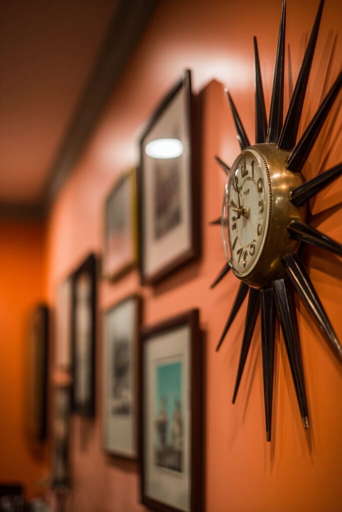
Coordinating wall art in period-appropriate frames extends the atomic-age theme while creating a cohesive gallery arrangement that transforms functional wall space into artistic display area. These pieces, with their authentic period styling and complementary themes, provide visual rhythm and balance while maintaining the sophisticated aesthetic. The careful frame selection and arrangement demonstrates attention to curatorial principles and design relationships.
The warm peach wall color with subtle texture provides an ideal backdrop that enhances the brass clock and framed art while maintaining the fresh, optimistic atmosphere characteristic of mid-century design. This sophisticated color choice demonstrates the period’s mastery of warm, welcoming tones that complement metallic elements while providing visual depth and richness. The subtle texture adds tactile interest without competing with the displayed art.
Professional lighting arrangement creates gentle shadows that emphasize the dimensional qualities of the sunburst design while providing adequate illumination for the wall art. The balanced lighting prevents harsh contrasts while creating visual drama that enhances the artistic elements. This attention to lighting quality reflects the period’s understanding of how illumination affects both function and aesthetic appeal.
Key Design Tips:
- Choose clocks with dimensional designs that create interesting shadow patterns
- Create gallery arrangements that support and enhance the primary timepiece
- Select wall colors that complement metallic elements without overwhelming them
- Frame wall art in period-appropriate styles and coordinating materials
- Use lighting to enhance dimensional elements and create visual drama
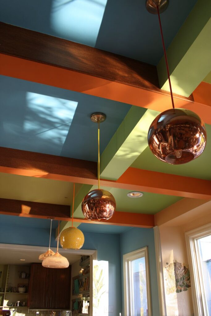
21. Ceiling Statement Drama
The retro kitchen ceiling featuring exposed beams painted in contrasting colors represents bold architectural treatment that transforms utilitarian structural elements into design features. These beams, painted in vibrant hues that coordinate with the overall color scheme, create visual rhythm and architectural interest while demonstrating the era’s confidence in bold color applications. The contrasting colors add energy and excitement while emphasizing the room’s proportions and spatial relationships.
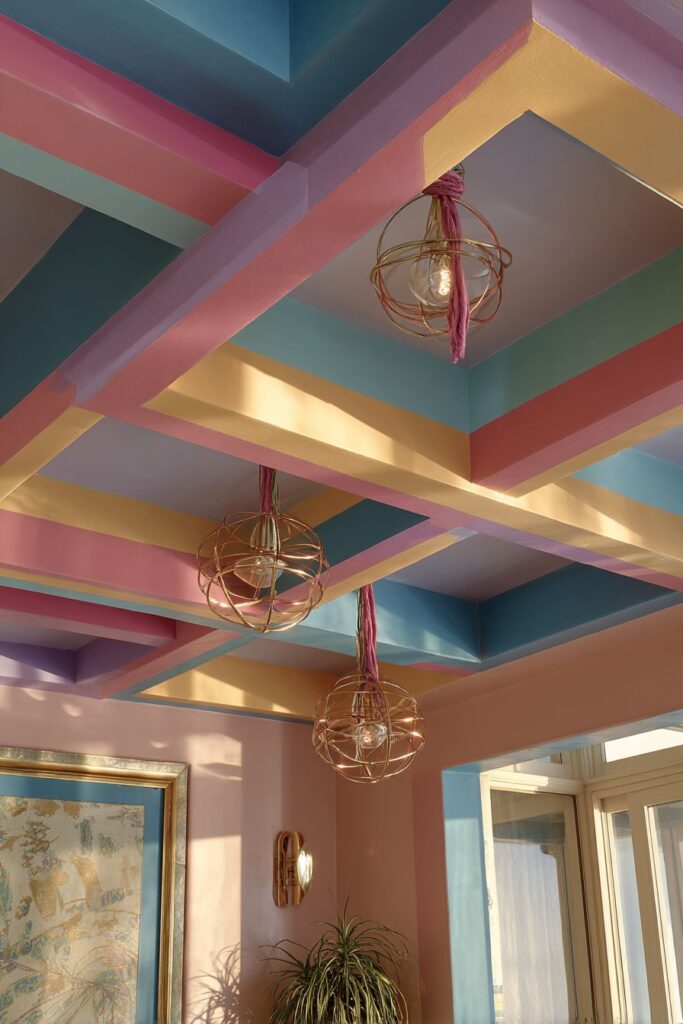
Pendant lights suspended on colorful cloth cords add functional illumination while reinforcing the playful, artistic approach to ceiling design. These fixtures, with their atomic-age designs in copper and brass finishes, provide essential task lighting while serving as sculptural elements that enhance the overall aesthetic. The colorful cords demonstrate creative approaches to utilitarian elements that reflect the period’s innovative design thinking.
The coordinating elements throughout the space tie the bold ceiling treatment into the complete design scheme, preventing the overhead elements from appearing disconnected or overwhelming. These relationships between ceiling, wall, and floor elements create visual harmony while maintaining the dramatic impact of the colored beams. This integrated approach reflects sophisticated design planning and execution.
Natural lighting interaction with the painted beams creating constantly changing shadow patterns that add dynamic visual interest throughout the day. These changing patterns prevent the bold colors from becoming static while creating engaging visual experiences that enhance the room’s atmosphere. The interplay of natural and artificial light demonstrates understanding of how illumination affects color perception and spatial relationships.
Key Design Tips:
- Paint structural elements in colors that coordinate with your overall palette
- Use pendant cords as design elements by choosing interesting colors and textures
- Create visual relationships between ceiling treatments and other room elements
- Consider how natural lighting will interact with bold ceiling colors throughout the day
- Balance dramatic ceiling treatments with complementary rather than competing floor and wall elements
22. Mobile Storage Solutions
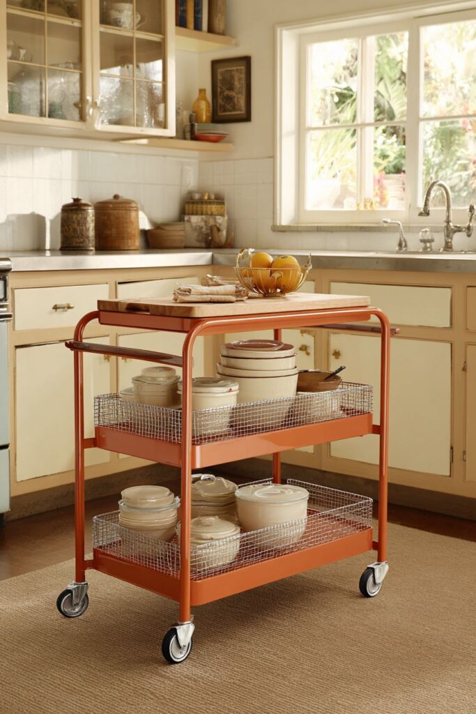
The retro kitchen rolling cart in bright orange represents functional storage design at its most flexible and stylish. This mobile storage piece, with its multiple tiers and built-in cutting board surface, provides adaptable workspace that can be moved where needed while maintaining the bold color confidence characteristic of the era. The authentic period wheels and chrome details add industrial sophistication while ensuring smooth mobility and durability.
Multiple tiers maximize storage capacity while maintaining a compact footprint that makes the cart practical for various kitchen sizes and layouts. The different tier heights accommodate various storage needs from large appliances to small accessories while maintaining visual balance and proportional relationships. This efficient design reflects the period’s emphasis on maximum functionality within minimum space requirements.
The built-in cutting board surface transforms the cart from simple storage into active workspace that can supplement fixed preparation areas when needed. This dual-purpose design demonstrates the era’s innovative approaches to combining multiple functions within single pieces of equipment. The cutting board surface provides additional workspace while maintaining the cart’s mobility and storage functions.
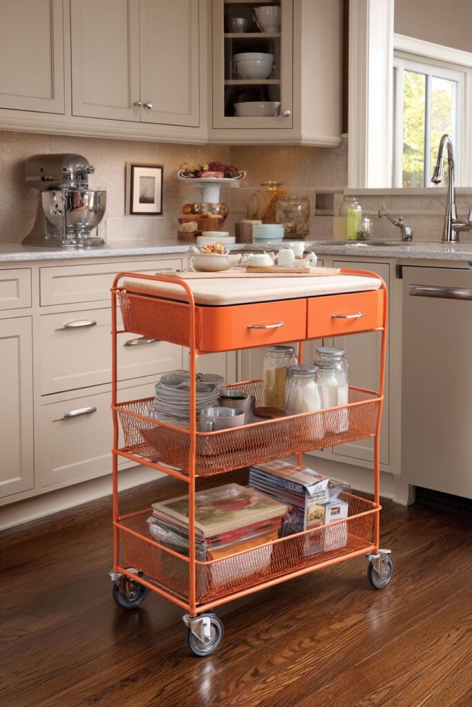
Surrounding neutral cabinetry allows the mobile storage piece to serve as a focal point while preventing visual competition that could create chaotic appearances. The bright orange finish creates energy and excitement while the chrome details add sophisticated metallic accents. This balance between bold statement pieces and quiet backgrounds reflects mature design judgment and restraint.
Key Design Tips:
- Choose mobile storage in colors that complement but don’t match fixed cabinetry
- Look for pieces that combine multiple functions for maximum versatility
- Ensure wheels and hardware are sturdy enough for frequent movement and heavy loads
- Balance bold mobile pieces with neutral fixed elements to prevent visual chaos
- Consider storage needs that change throughout cooking processes when selecting mobile solutions
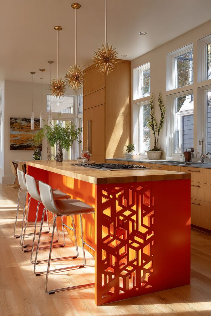
23. Custom Metalwork Artistry
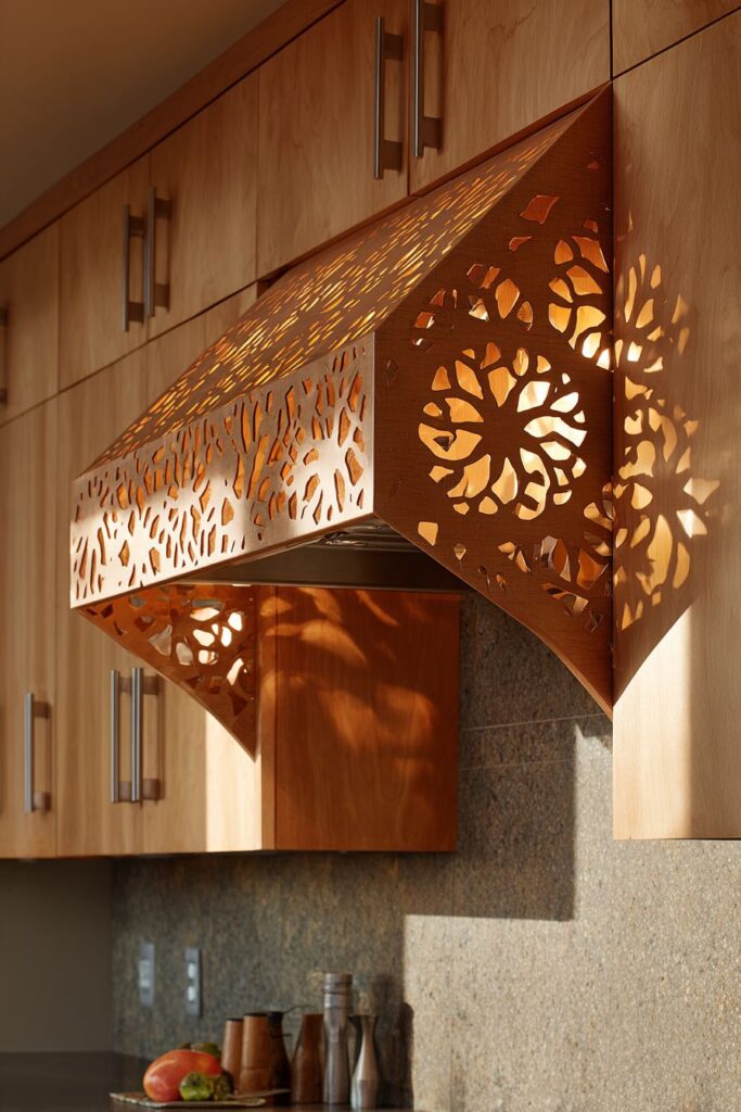
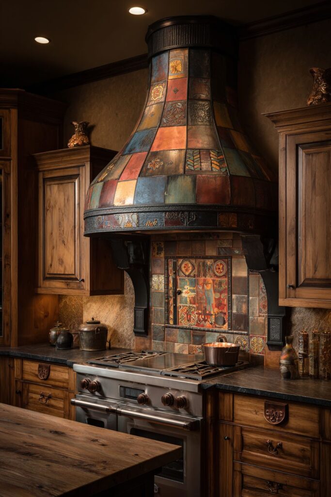
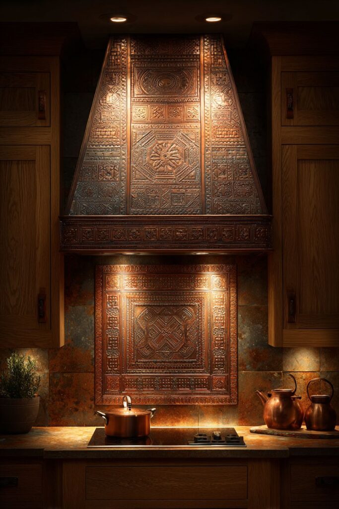
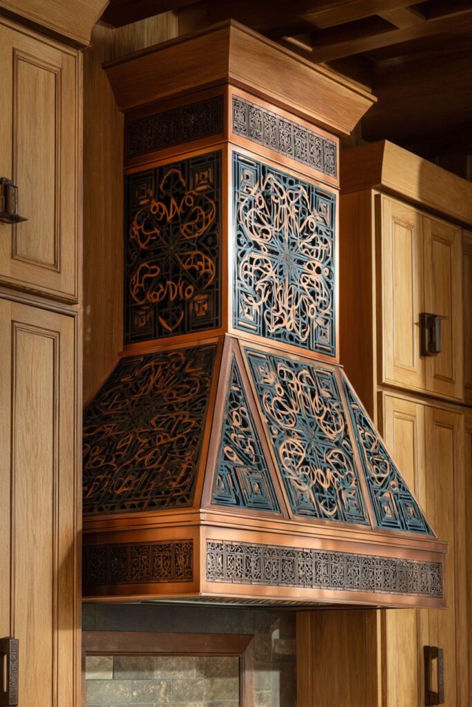
The retro kitchen range hood featuring custom metalwork in atomic-age patterns represents functional ventilation design elevated to artistic expression. This copper-finished hood, with its handcrafted geometric patterns and integrated task lighting, transforms the essential but often-hidden ventilation system into a sculptural focal point that celebrates the era’s mastery of metalwork and industrial design. The atomic-age patterns capture the optimistic, forward-looking spirit while providing necessary cooking ventilation.
Matching copper accents in cabinet hardware and backsplash trim create visual unity while distributing the warm metallic tones throughout the space to prevent the hood from appearing isolated or overwhelming. These coordinated elements demonstrate sophisticated material planning, while the copper’s natural patina adds richness and depth that improves with age. The consistent metallic theme creates cohesive design relationships.
Natural wood cabinetry provides complementary warmth and texture that balances the metallic elements while adding organic contrast to the geometric patterns. The wood tones create visual harmony with the copper finish while providing natural texture that prevents the space from appearing too industrial or cold. This balance between natural and manufactured materials reflects the period’s successful integration strategies.
Professional lighting arrangement emphasizes the handcrafted metalwork details while creating dramatic shadow patterns that add visual interest and depth. The integrated task lighting provides functional illumination for cooking activities while the dramatic uplighting showcases the artistic metalwork. This attention to lighting quality demonstrates an understanding of how illumination enhances both function and artistic elements.
Key Design Tips:
- Invest in custom metalwork for unique character and lasting value
- Coordinate metallic finishes throughout the space for visual unity
- Balance metal elements with natural wood tones for warmth and texture
- Design lighting to showcase metalwork details and create visual drama
- Choose patterns that reflect authentic period motifs rather than modern interpretations
24. Dishware Display Gallery

The retro kitchen dishware display featuring built-in plate racks demonstrates how functional storage can be transformed into artistic presentation that celebrates the era’s love of colorful ceramics and innovative materials. The melamine dinnerware in pink, turquoise, and yellow creates a rainbow effect that energizes the space while providing practical, unbreakable dishes perfect for daily family use. The integrated lighting highlights the collection while glass fronts protect the vintage pieces from dust and damage.
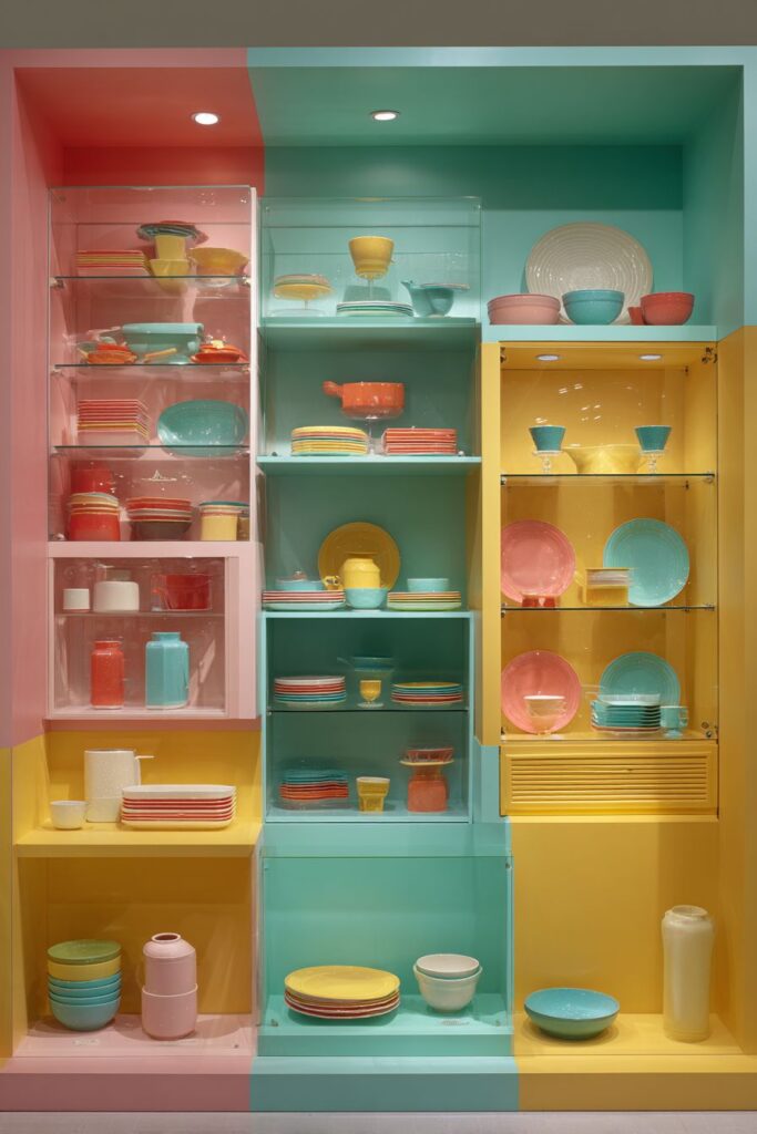
Display cabinetry designed specifically for the dishware collection maximizes visual impact while providing organized storage that makes pieces easily accessible for daily use. The built-in plate racks hold dishes securely while presenting them at angles that showcase their colors and patterns most effectively. This approach to storage demonstrates how thoughtful planning can transform utilitarian cabinets into display cases worthy of valuable collections.
Glass fronts protect the displayed dishes while allowing full visibility that transforms the storage into an art installation. The glass also prevents dust accumulation while maintaining easy access when pieces are needed. This practical solution demonstrates how protective measures can enhance rather than hide beautiful collections.
Surrounding elements coordinate with the dishware colors through subtle accents throughout the space, creating visual relationships that tie the display into the overall design scheme. These coordinated elements prevent the colorful display from appearing disconnected while maintaining focus on the beautiful dishware collection. The restraint in surrounding elements allows the dishes to be the undisputed stars.

Key Design Tips:
- Design display storage specifically for your collection’s requirements
- Use integrated lighting to enhance displayed items and create focal points
- Protect valuable collections with glass fronts while maintaining visibility
- Coordinate surrounding elements with display colors without creating competition
- Arrange displayed items for maximum visual impact and easy access
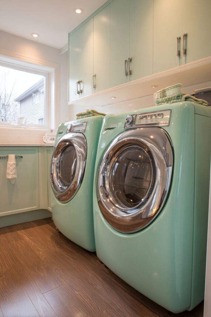
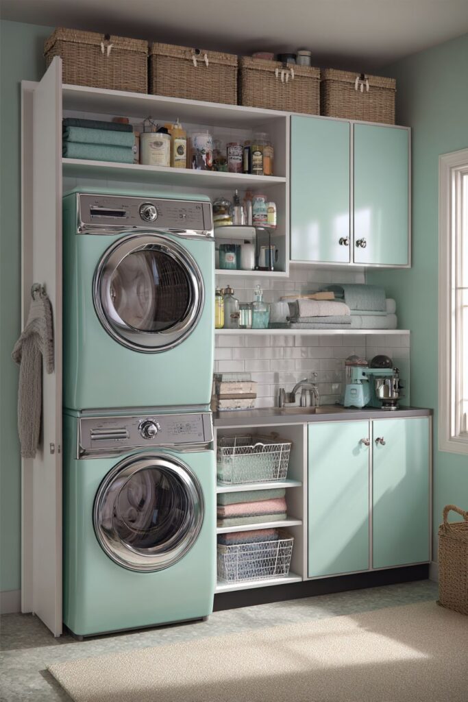
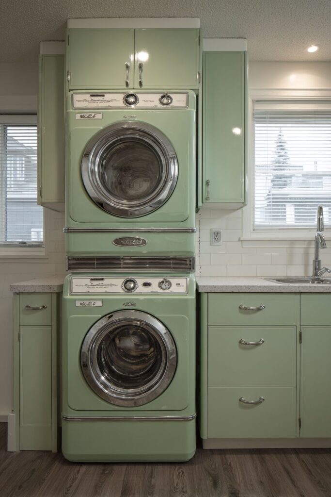
25. Laundry Integration Mastery
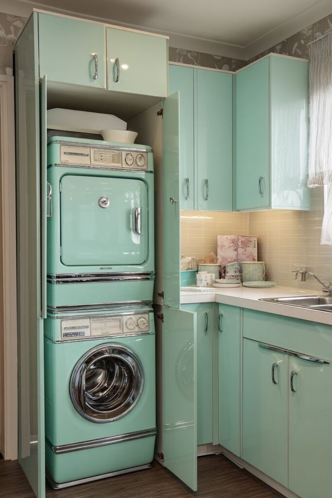
The retro kitchen laundry area featuring compact washer and dryer in matching mint green demonstrates how utilitarian appliances can be successfully integrated into kitchen designs without compromising aesthetic appeal. These appliances, with chrome details and authentic vintage styling, serve as functional equipment while contributing to the overall design theme through coordinated colors and period-appropriate forms. The mint green finish provides fresh, cheerful color that enhances rather than detracts from the kitchen atmosphere.
Surrounding cabinetry provides essential storage for laundry supplies while maintaining visual consistency with the overall kitchen aesthetic. This integrated approach prevents the laundry area from appearing as an afterthought while ensuring adequate storage for detergents, fabric softeners, and other cleaning supplies. The coordinated cabinetry creates visual unity while maximizing storage efficiency in the compact space.
Folding surfaces in coordinating Formica complete the functional workspace while maintaining material consistency with other kitchen surfaces. These surfaces provide essential workspace for laundry activities while their durable, easy-to-clean properties make them ideal for the dual-purpose environment. The Formica material ties the laundry area into the overall kitchen design while providing practical benefits.
The space-saving design demonstrates how modern homes can accommodate multiple functions within single rooms when proper planning and coordination are applied. The compact appliances fit comfortably within the kitchen footprint, while the integrated design approach ensures visual harmony. This solution reflects contemporary needs while maintaining authentic period styling and color coordination.
Key Design Tips:
- Choose laundry appliances in colors that coordinate with your kitchen palette
- Integrate storage solutions that serve both kitchen and laundry needs
- Use consistent materials throughout to maintain visual unity
- Plan folding and sorting spaces that don’t interfere with kitchen activities
- Consider ventilation requirements for both cooking and laundry activities
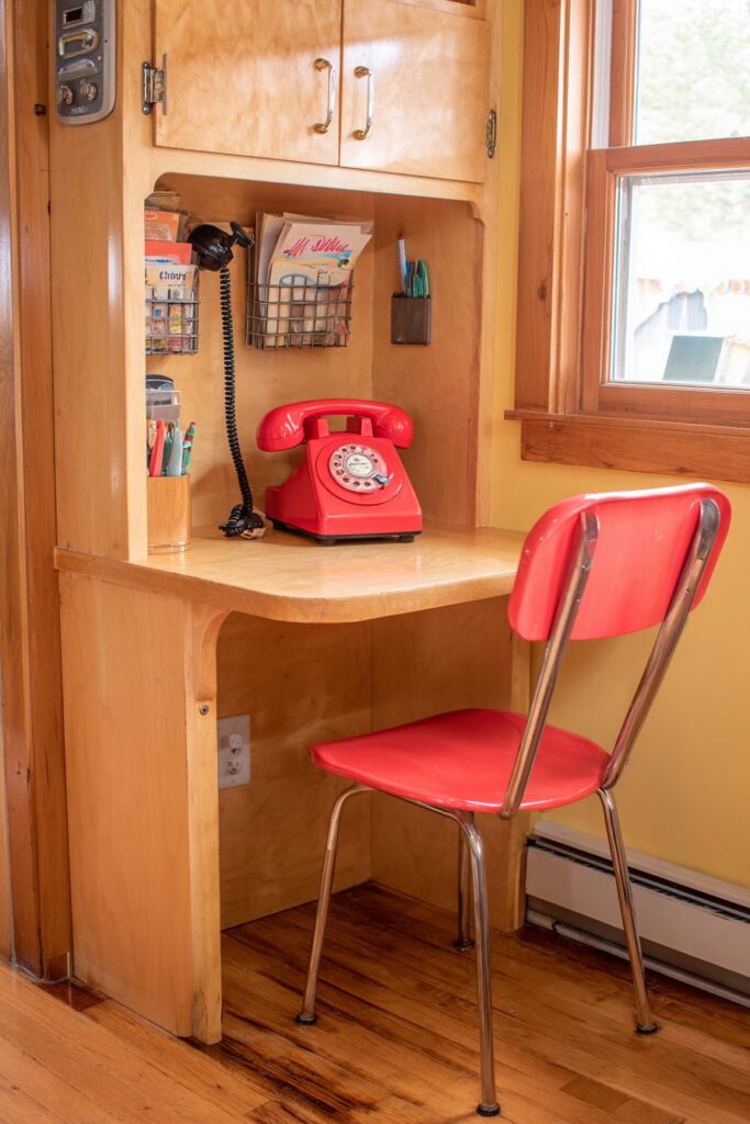
26. Communication Station Heritage
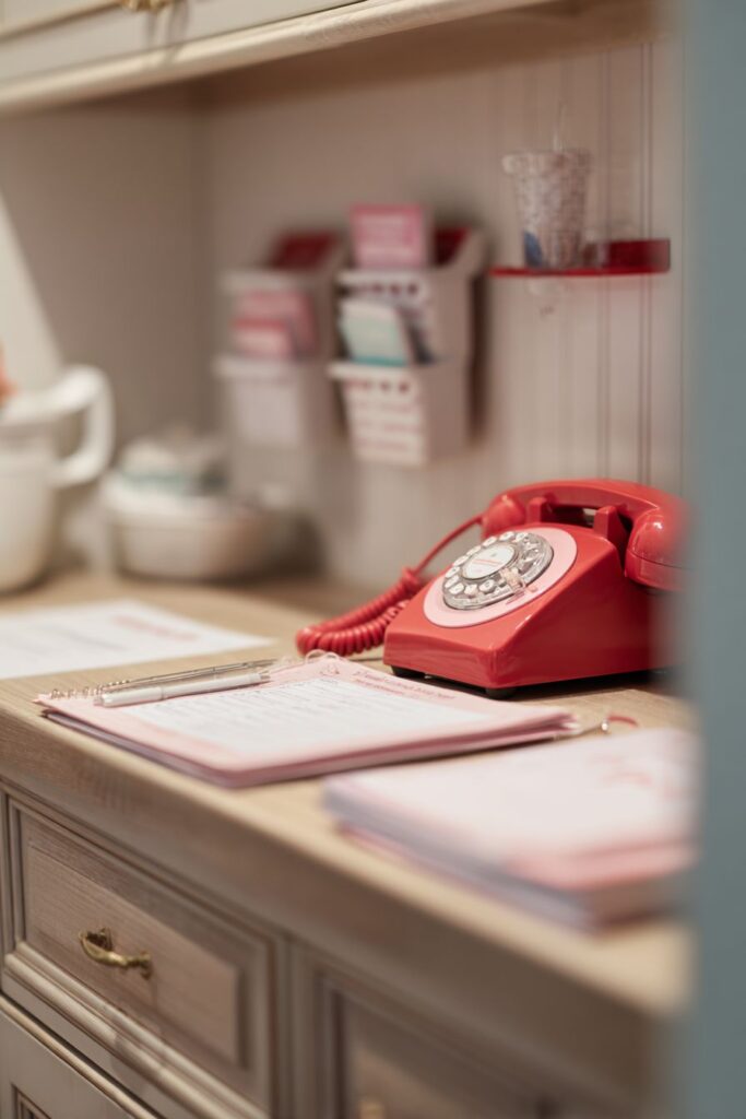
The retro kitchen telephone nook featuring built-in desk area represents the era’s emphasis on communication and organization as essential elements of efficient household management. This dedicated space, with storage for directories and note-taking supplies, transforms the telephone from a simple appliance into the center of a complete communication system. The built-in desk provides workspace for menu planning, grocery lists, and family scheduling while maintaining organized, accessible storage.
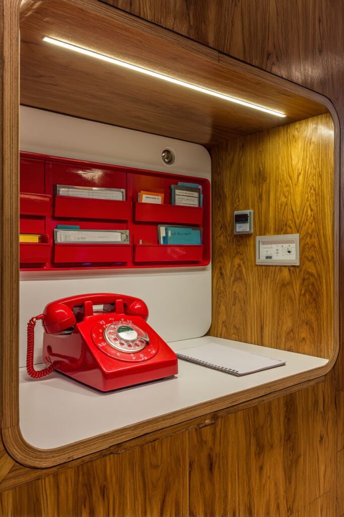
The authentic rotary phone in bright red serves as both functional communication device and sculptural design element that captures the optimistic, social nature of mid-century domestic life. This substantial phone, with its distinctive styling and quality construction, represents the era’s belief in durable, beautiful design for everyday objects. The bright red color creates energy and excitement while serving as a focal point for the communication area.
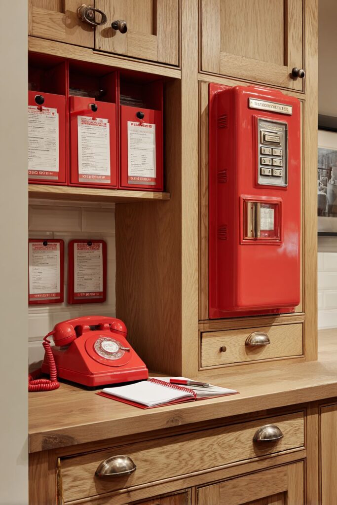
Wall-mounted organizers coordinate with the phone color while providing systematic storage for kitchen planning materials, phone directories, and writing supplies. These organizers demonstrate the period’s innovative approaches to storage and organization that maximize efficiency while maintaining attractive appearances. The coordinated colors create visual unity while the organized system encourages systematic household management.
Natural wood cabinetry surrounding the communication station provides warm contrast that balances the bold phone color while integrating the area into the overall kitchen design. The wood tones add natural warmth and texture while preventing the bright accent from overwhelming the space. This balance reflects sophisticated color planning and material coordination.
Key Design Tips:
- Create dedicated communication areas with adequate workspace and storage
- Choose communication equipment in colors that enhance your overall palette
- Provide organized storage for directories, notepads, and planning materials
- Integrate communication areas into overall kitchen design rather than treating them as separate elements
- Consider both functional needs and aesthetic impact when planning communication spaces
27. Overhead Storage Theater
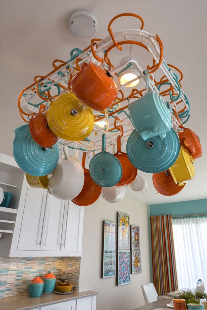
The retro kitchen pot rack system featuring ceiling-mounted rails demonstrates how functional storage can become dramatic design elements that enhance both utility and visual appeal. The S-hooks displaying colorful enameled cookware in orange, yellow, and turquoise transform everyday pots and pans into an artistic installation that celebrates the beauty of functional objects. This overhead storage approach maximizes cabinet space while keeping frequently used items easily accessible.
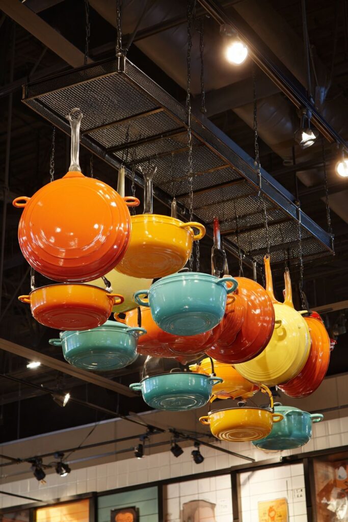
Integrated lighting within the rack system provides dual benefits of highlighting the pot collection while supplying functional task illumination for food preparation areas below. This innovative lighting approach demonstrates the era’s mastery of combining multiple functions within single design elements. The lighting creates visual drama while ensuring adequate illumination for cooking activities.
The colorful enameled cookware serves as sculptural elements that add energy and excitement while providing superior cooking performance. These pots and pans, with their vibrant colors and quality construction, demonstrate how functional kitchen equipment can enhance the overall aesthetic while serving practical needs. The varied sizes and coordinated colors create visual rhythm and balance.
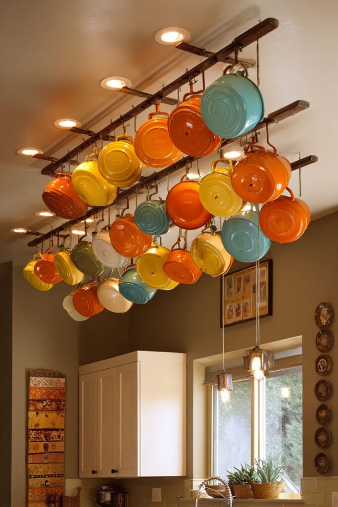
Surrounding neutral elements allow the colorful cookware display to dominate the design without creating visual chaos or competition. The careful restraint in background elements demonstrates mature design judgment while ensuring the overhead storage remains the undisputed focal point. This balance between drama and restraint reflects sophisticated space planning and color coordination.
Key Design Tips:
- Choose pot rack systems that accommodate your cookware collection while providing adequate clearance
- Integrate lighting to enhance displayed items and provide functional task illumination
- Select cookware in coordinating colors that contribute to the overall design aesthetic
- Balance dramatic overhead elements with neutral backgrounds to prevent visual overwhelm
- Consider both storage needs and visual impact when planning overhead installations
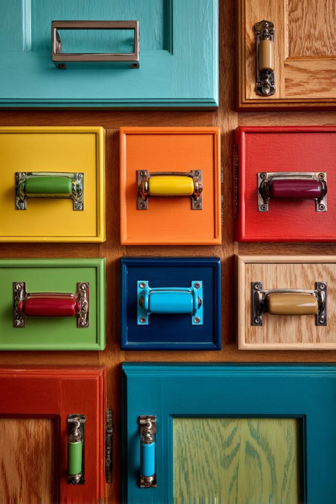
28. Hardware Details Showcase
The retro kitchen cabinet hardware showcase demonstrates how seemingly minor details can significantly impact the overall design authenticity and visual appeal. The collection of authentic pulls and knobs in brass, chrome, and colored plastic represents the diverse material palette that characterized mid-century design while showing how different hardware styles can be matched to appropriate cabinet types for optimal aesthetic results.
Various cabinet door styles from flat-front laminate to raised-panel wood grain demonstrate the range of options available during the period while showing how hardware selection should complement the cabinet style for authentic results. The flat-front laminate doors work beautifully with sleek chrome or colored plastic hardware, while raised-panel wood doors are enhanced by brass or bronze finishes that complement the natural materials.
Different hardware styles showcase period-appropriate choices that reflect authentic design approaches rather than modern interpretations. The streamlined pulls, atomic-inspired knobs, and geometric shapes capture the era’s optimistic, forward-looking spirit while providing functional benefits. The authentic proportions and finishes provide genuine period character that enhances overall design credibility.
The detailed installation examples show proper techniques for achieving professional results that enhance rather than detract from cabinet styling. The careful attention to spacing, alignment, and proportional relationships demonstrates how hardware installation affects both function and appearance. These technical details reflect the era’s emphasis on quality craftsmanship and attention to detail.
Key Design Tips:
- Match hardware styles to appropriate cabinet door types for authentic results
- Choose finishes that complement your overall material palette and color scheme
- Pay attention to proper spacing and alignment for professional installation results
- Consider both aesthetic impact and functional requirements when selecting hardware
- Invest in authentic period pieces rather than modern reproductions for superior quality and genuine character
29. Advertising Art Gallery
The retro kitchen art wall featuring framed vintage advertisements represents the era’s sophisticated approach to graphic design and commercial art that transformed everyday advertising into gallery-worthy art pieces. These advertisements for kitchen appliances and food products from the 1950s and 1960s showcase the optimistic, colorful aesthetic that characterized commercial design while providing authentic historical documentation of the period’s lifestyle and values.
The gallery wall arrangement with coordinating frames in period-appropriate styles demonstrates curatorial skills that transform advertising ephemera into sophisticated art installations. The consistent frame styles and careful arrangement create visual unity while the varied advertisement sizes and layouts provide rhythm and interest. This approach shows how commercial graphics can be elevated to fine art status through thoughtful presentation.
Authentic typography and color schemes in the vintage advertisements provide genuine period character that cannot be replicated through modern reproductions. The distinctive fonts, color relationships, and graphic techniques represent the highest standards of commercial art and demonstrate the era’s mastery of visual communication. These authentic elements add credibility and historical value to the overall design.
Neutral wall color surrounding the advertisement collection allows the vintage graphics to dominate without competition while providing visual rest that prevents overwhelming. The careful color selection ensures the colorful advertisements remain the focal point while maintaining overall design harmony. This restraint demonstrates mature curatorial judgment and sophisticated color planning.
Key Design Tips:
- Collect authentic vintage advertisements rather than modern reproductions for genuine character
- Create consistent frame treatments that unify varied graphic materials
- Arrange gallery walls with attention to visual balance and rhythm
- Choose neutral backgrounds that enhance rather than compete with displayed graphics
- Consider lighting that minimizes glare while adequately illuminating framed pieces
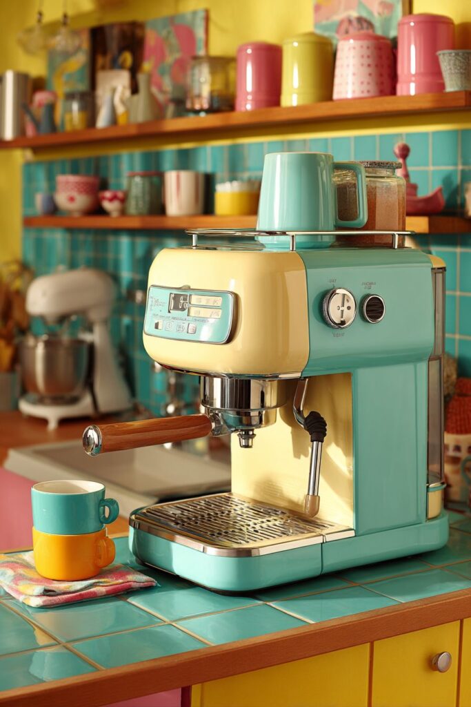
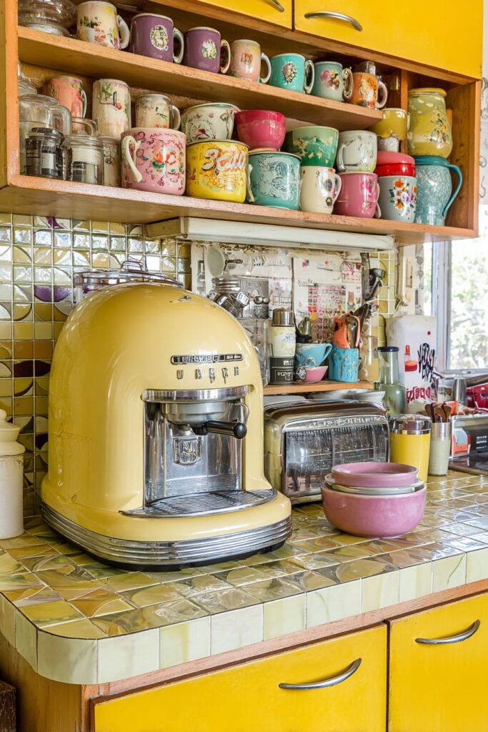
30. Coffee Station Sophistication
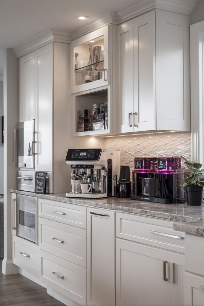
The retro kitchen coffee station featuring vintage-style espresso machine represents the era’s elevation of daily rituals into sophisticated experiences worthy of beautiful equipment and dedicated spaces. This cream and chrome espresso machine, with its streamlined form and quality construction, serves as both functional appliance and sculptural design element that celebrates the period’s mastery of industrial design. The authentic vintage styling adds character while modern internal components ensure reliable performance.
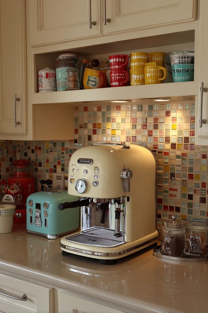
Coordinating accessories including colorful cups, sugar dispensers, and coffee storage containers create a complete coffee preparation system that transforms the daily routine into an artistic ritual. These accessories, with their period-appropriate colors and forms, demonstrate how functional items can enhance the overall aesthetic while providing practical benefits. The careful color coordination creates visual unity while the varied forms add interest and personality.
The dedicated counter area with atomic-pattern tile backsplash provides essential workspace while maintaining design consistency with the overall kitchen theme. This specialized area demonstrates the period’s approach to creating dedicated zones for specific activities while maintaining visual integration with the larger space. The tile pattern adds geometric interest while providing practical wall protection.
Under-cabinet lighting ensures adequate task illumination for coffee preparation while creating dramatic accent lighting that showcases the beautiful equipment and accessories. This lighting approach demonstrates understanding of how proper illumination enhances both function and aesthetic appeal. The focused lighting creates intimate atmosphere while ensuring practical visibility for detailed preparation tasks.
Key Design Tips:
- Create dedicated areas for specialized activities like coffee preparation
- Choose equipment that combines authentic styling with modern reliability
- Coordinate accessories in colors and styles that complement your overall palette
- Provide adequate task lighting for detailed preparation activities
- Design storage solutions that keep supplies organized and easily accessible while maintaining visual appeal
Conclusion
The journey through these thirty distinctive retro kitchen concepts reveals the incredible depth and versatility of mid-century design principles that continue to inspire contemporary homeowners seeking spaces that combine authentic character with modern functionality. Each design demonstrates how the optimistic spirit of the atomic age, expressed through bold colors, innovative materials, and forward-thinking forms, can be successfully adapted to meet today’s lifestyle needs while maintaining historical authenticity and visual appeal.

The enduring popularity of retro kitchen design stems from its fundamental belief that everyday spaces should be both beautiful and functional, that domestic activities deserve environments that inspire and energize, and that thoughtful design can transform routine tasks into enjoyable experiences. Whether through the cheerful energy of turquoise cabinetry, the sophisticated warmth of harvest gold appliances, or the artistic expression of atomic-age tile patterns, these kitchens celebrate the joy of cooking and gathering while providing practical solutions for modern living demands.
As you consider incorporating retro elements into your own kitchen, remember that successful period design requires attention to authentic details, quality materials, and thoughtful color relationships rather than simple surface treatments or modern interpretations. The investment in genuine vintage pieces, authentic materials, and proper installation techniques will reward you with a kitchen that captures the true spirit of the era while providing lasting beauty and functionality that improves with age. Whether you choose to embrace a complete retro transformation or incorporate selected vintage elements into a contemporary design, these timeless principles will help you create a kitchen that truly reflects your personality while honoring the innovative design legacy of the mid-century period.
"As an Amazon Associate, I earn from qualifying purchases."