The kitchen countertop serves as the operational heart of your culinary space, where functionality meets aesthetics in daily rituals. Yet this prime real estate often becomes cluttered, disorganized, or visually chaotic through well-intentioned but misguided styling choices. Understanding common countertop mistakes transforms this essential surface from overwhelmed workspace into a harmonious blend of beauty and efficiency.
Professional designers recognize that countertop styling requires careful balance between accessible essentials and visual breathing room. The difference between a magazine-worthy kitchen and a cluttered workspace often comes down to intentional curation rather than expensive upgrades. This article explores seven critical mistakes that compromise both the functionality and aesthetic appeal of your kitchen counters, offering practical solutions that respect your cooking habits while elevating your space’s overall design integrity.
1. Overcrowding With Too Many Appliances
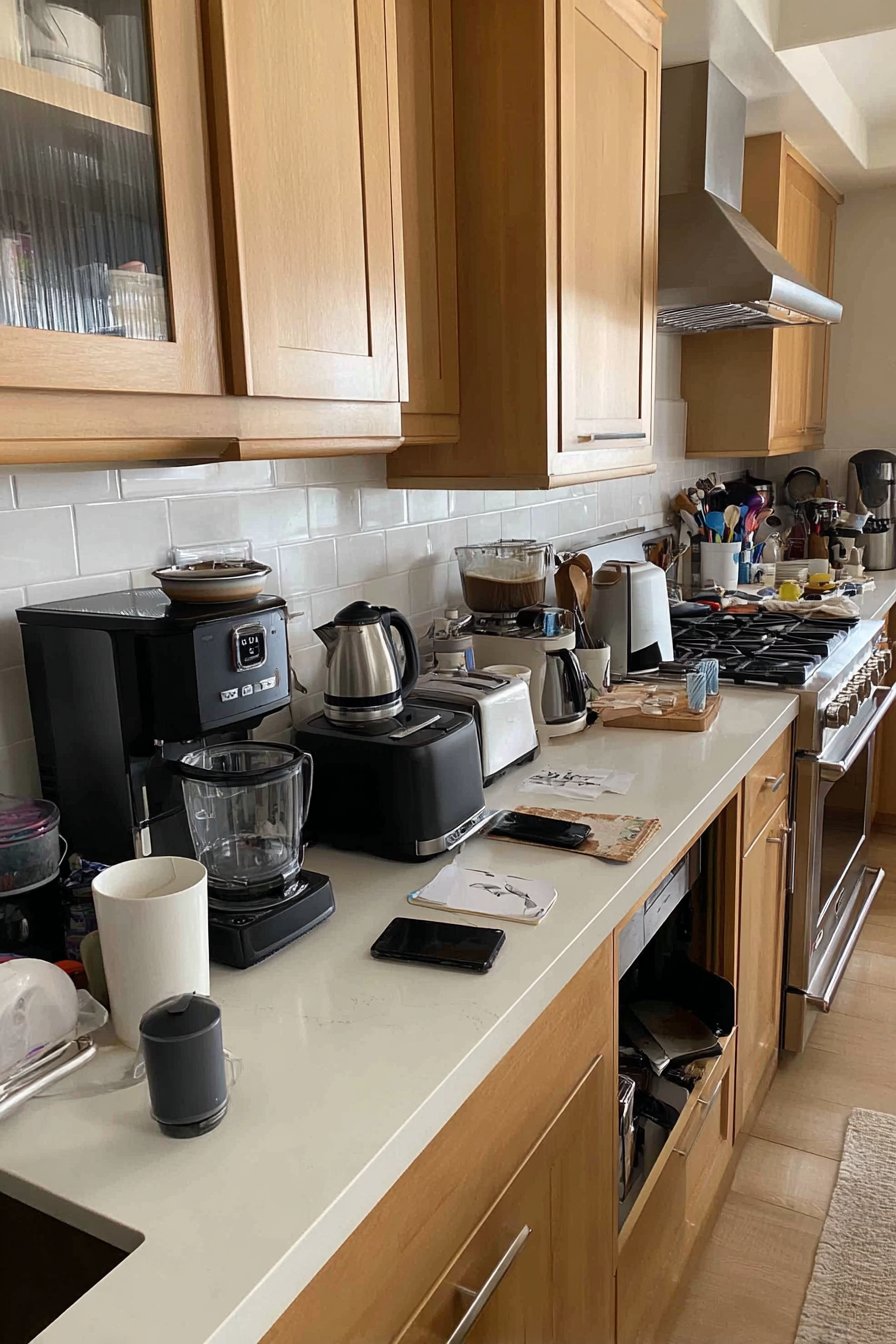
The appliance sprawl phenomenon occurs when every kitchen gadget claims permanent countertop residency, creating visual chaos and limiting actual workspace. Many homeowners fall into the trap of keeping rarely-used items accessible, sacrificing valuable prep space for convenience they seldom utilize. This mistake transforms counters into appliance showrooms rather than functional work surfaces.
Professional kitchens operate on the principle of strategic placement, where only daily-use items earn counter space. The coffee maker, toaster, and perhaps a stand mixer deserve visibility, but specialty appliances like waffle irons or food processors should migrate to cabinets. Consider your actual cooking patterns rather than aspirational habits when deciding what stays visible.
The psychological impact of clear countertops extends beyond aesthetics—research shows that cluttered surfaces increase stress and decrease cooking motivation. By limiting countertop appliances to three or four frequently-used items, you create breathing room that makes food preparation more enjoyable and efficient.
- Store seasonal appliances like ice cream makers in pantry or garage storage
- Install appliance garages with retractable doors for medium-use items
- Use vertical storage solutions to house small appliances in cabinets
- Evaluate each appliance’s last use date—if over three months, it belongs in storage
- Create dedicated zones for appliances that must remain visible
- Consider multi-functional appliances that consolidate several single-use gadgets
2. Neglecting the Power of Negative Space
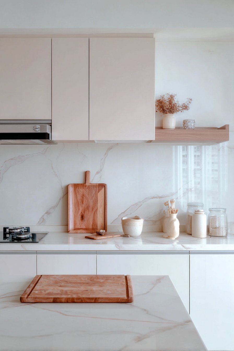
The concept of negative space—intentional emptiness—remains one of the most misunderstood principles in countertop styling. Many homeowners feel compelled to fill every inch with decorative objects, utensil holders, or organizational solutions, creating visual noise that overwhelms the senses. This mistake stems from misunderstanding that empty space actually enhances rather than wastes your kitchen’s design potential.
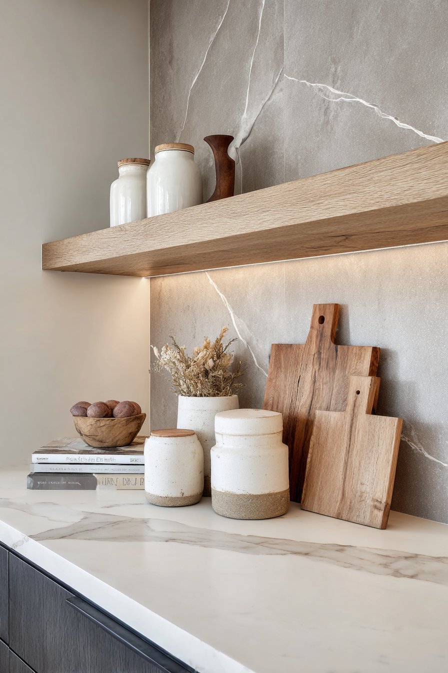
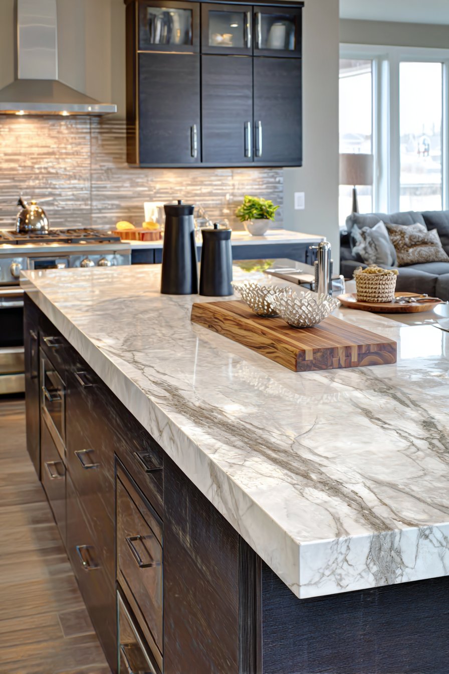
Interior designers use the 30-50% rule for countertop coverage, meaning at least half your counter should remain clear and functional. This breathing room allows your eye to rest, makes cleaning efficient, and provides flexible workspace for food preparation. The most sophisticated kitchens embrace emptiness as a design element rather than viewing it as wasted opportunity.
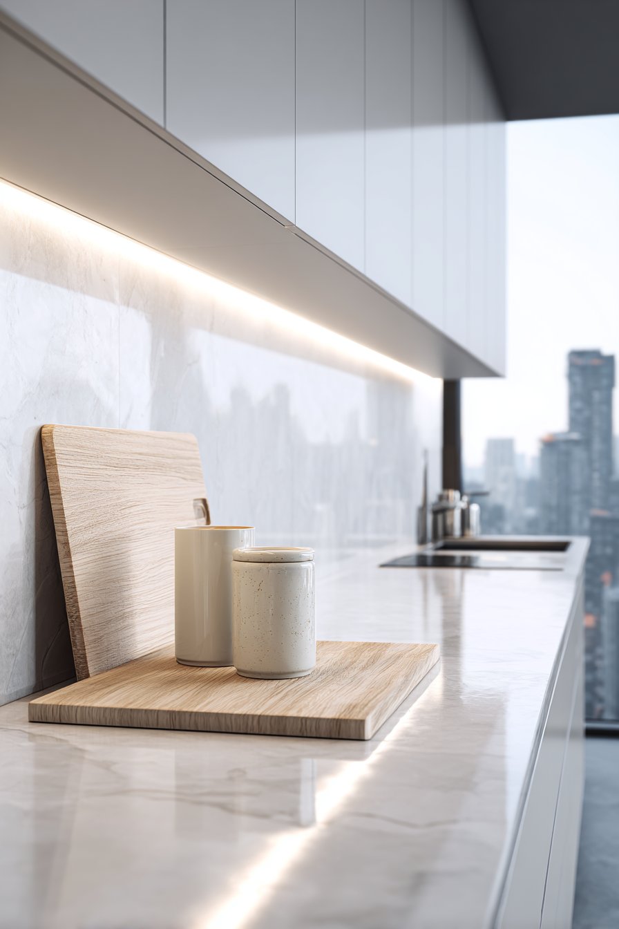
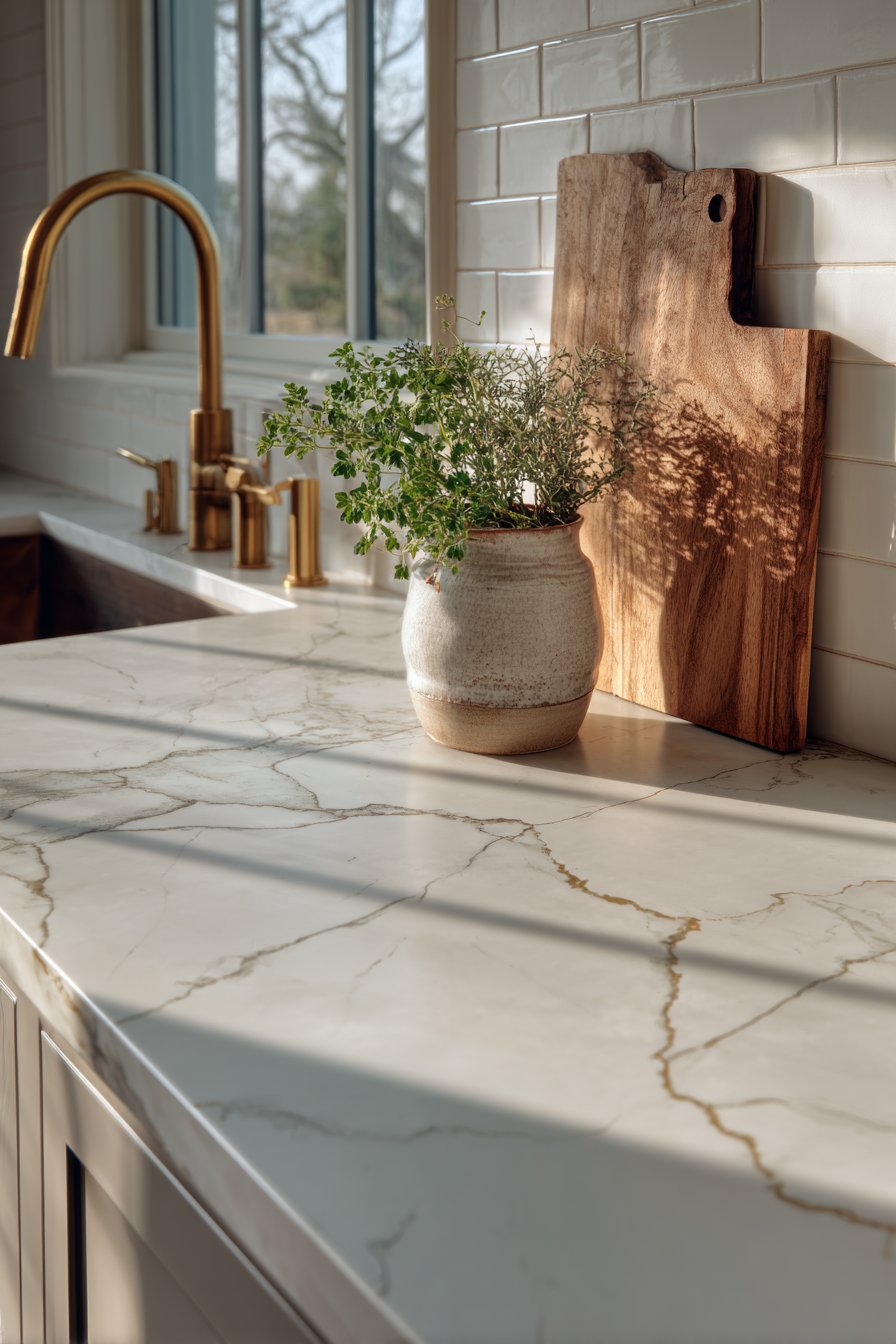
Strategic negative space also highlights the items you do display, creating focal points that draw attention intentionally. A single beautiful cutting board leans more impressively against bare backsplash than when surrounded by competing objects. This curated approach communicates confidence and restraint, hallmarks of professional design thinking.
- Clear at least 50% of total counter space for optimal visual balance
- Group remaining items into one or two distinct zones rather than scattering
- Allow 24-36 inches of continuous clear counter for primary prep work
- Frame displayed items with empty space to increase their visual impact
- Resist the urge to immediately fill cleared areas with new objects
- Photograph your counters to objectively assess clutter versus breathing room
3. Ignoring Proper Scale and Proportion
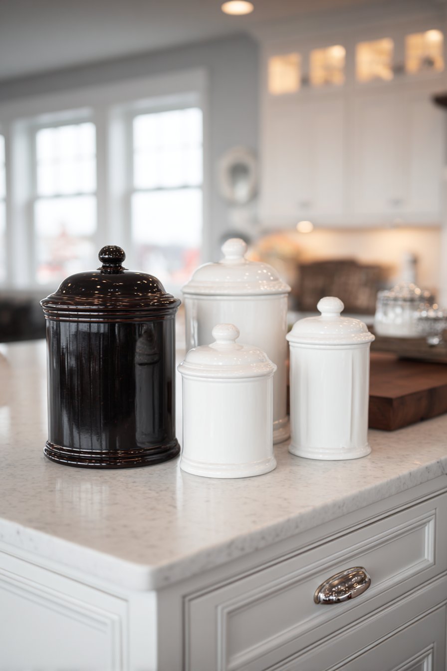
Scale mistakes occur when objects dramatically mismatch the counter dimensions or surrounding elements, creating awkward visual relationships. Oversized canisters overwhelm small kitchens, while tiny accessories disappear on expansive countertops. This error reveals itself through uncomfortable eye movement as you scan surfaces that lack cohesive visual rhythm.
The principle of proportion suggests that decorative objects should relate to both counter depth and overall kitchen volume. In compact kitchens with 18-24 inch counters, accessories should range from 6-10 inches tall. Larger kitchens with deeper counters can accommodate 12-18 inch items without overwhelming the space. Height variation within appropriate ranges creates interest while maintaining harmony.
Counter depth also dictates display strategies—items should never consume more than one-third of the counter’s depth from back to front. This preserves functional workspace while allowing visual interest near the backsplash. Consider your counter as a stage where properly scaled elements perform together rather than competing for attention.
- Match container heights to cabinet lower edge for visual continuity
- Use three-inch increments when grouping objects of varying heights
- Measure counter depth before purchasing canisters or decorative pieces
- Apply the one-third rule—decor should occupy back third only
- Scale up or down based on kitchen square footage and ceiling height
- Group small items on trays to create appropriate visual weight
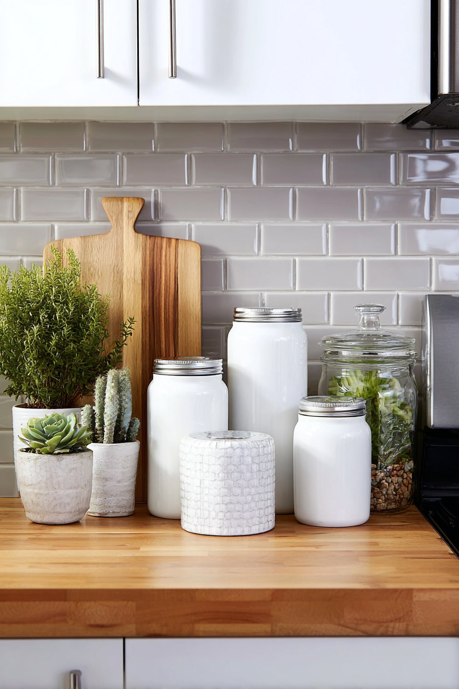
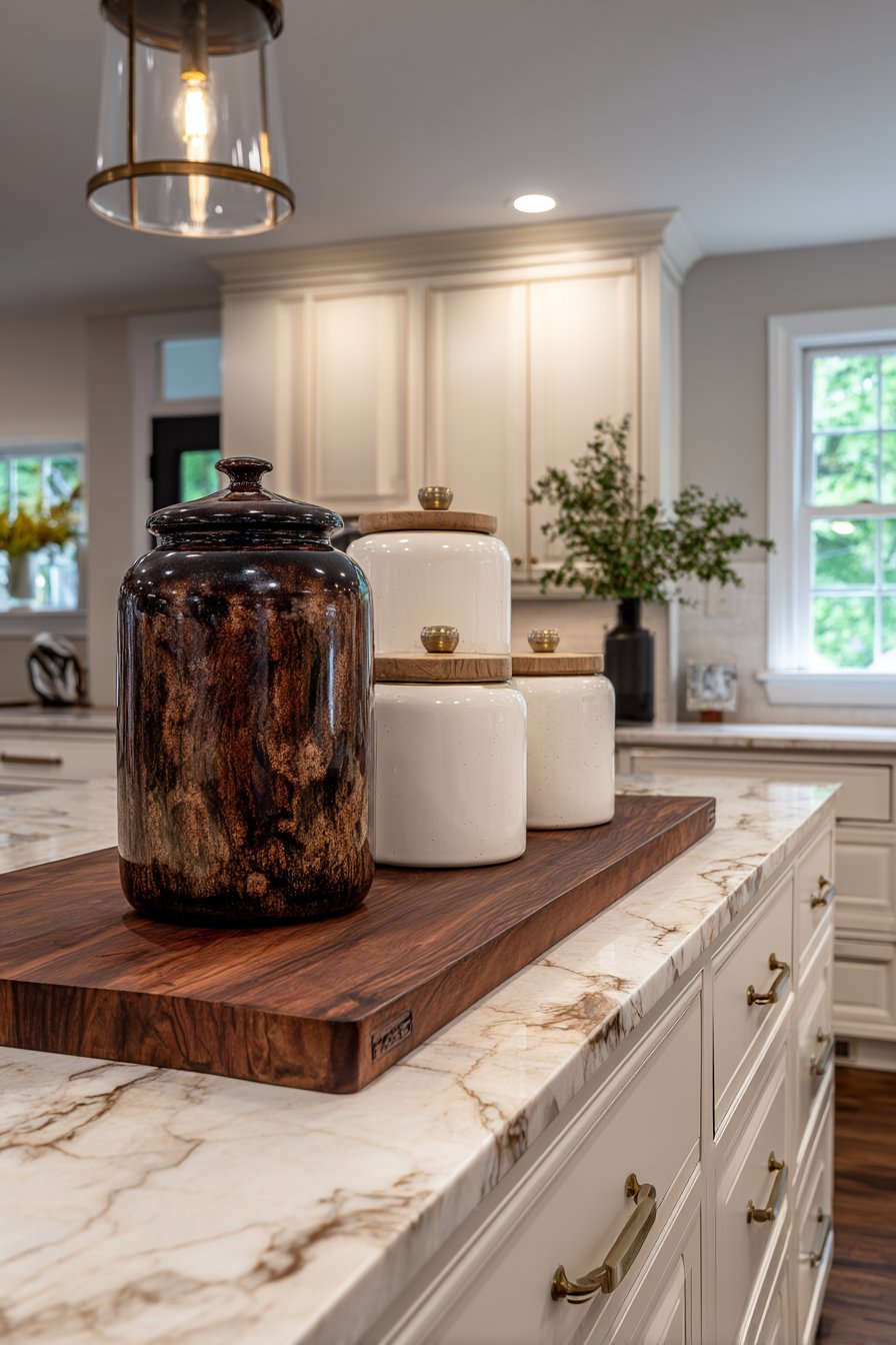
4. Creating Color Chaos Without Cohesion
The color confusion mistake manifests when countertop items represent too many competing hues without intentional palette planning. Random appliance colors, mismatched containers, and uncoordinated accessories create visual static that makes kitchens feel disorganized regardless of actual cleanliness. This error particularly plagues kitchens where items accumulated gradually without cohesive vision.
Professional designers limit countertop color schemes to three primary hues plus metallics, creating harmony that feels intentional rather than accidental. If your counters feature stainless appliances, white ceramics, and natural wood cutting boards, additional colors should complement rather than compete. The 60-30-10 rule applies here: 60% neutral base, 30% secondary color, 10% accent.
Color psychology also influences kitchen atmosphere—warm tones stimulate appetite and conversation, while cool tones create calm, focused preparation environments. Evaluate whether your current color temperature supports your kitchen’s intended function, then eliminate items that disrupt this foundation. Strategic color curation transforms random collections into deliberate design statements.
- Photograph counters in natural light to identify color conflicts
- Replace mismatched containers with uniform canisters in one finish
- Choose appliances in consistent color families when upgrading
- Limit pattern to one element—solid colors for everything else
- Use metallic accents as neutrals that bridge color transitions
- Consider seasonal rotations for accent colors while maintaining base palette
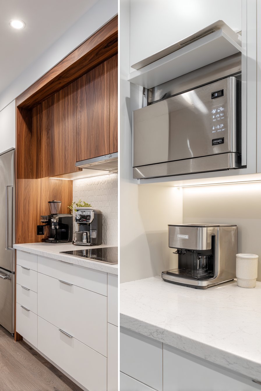
5. Overlooking Functional Workflow Zones
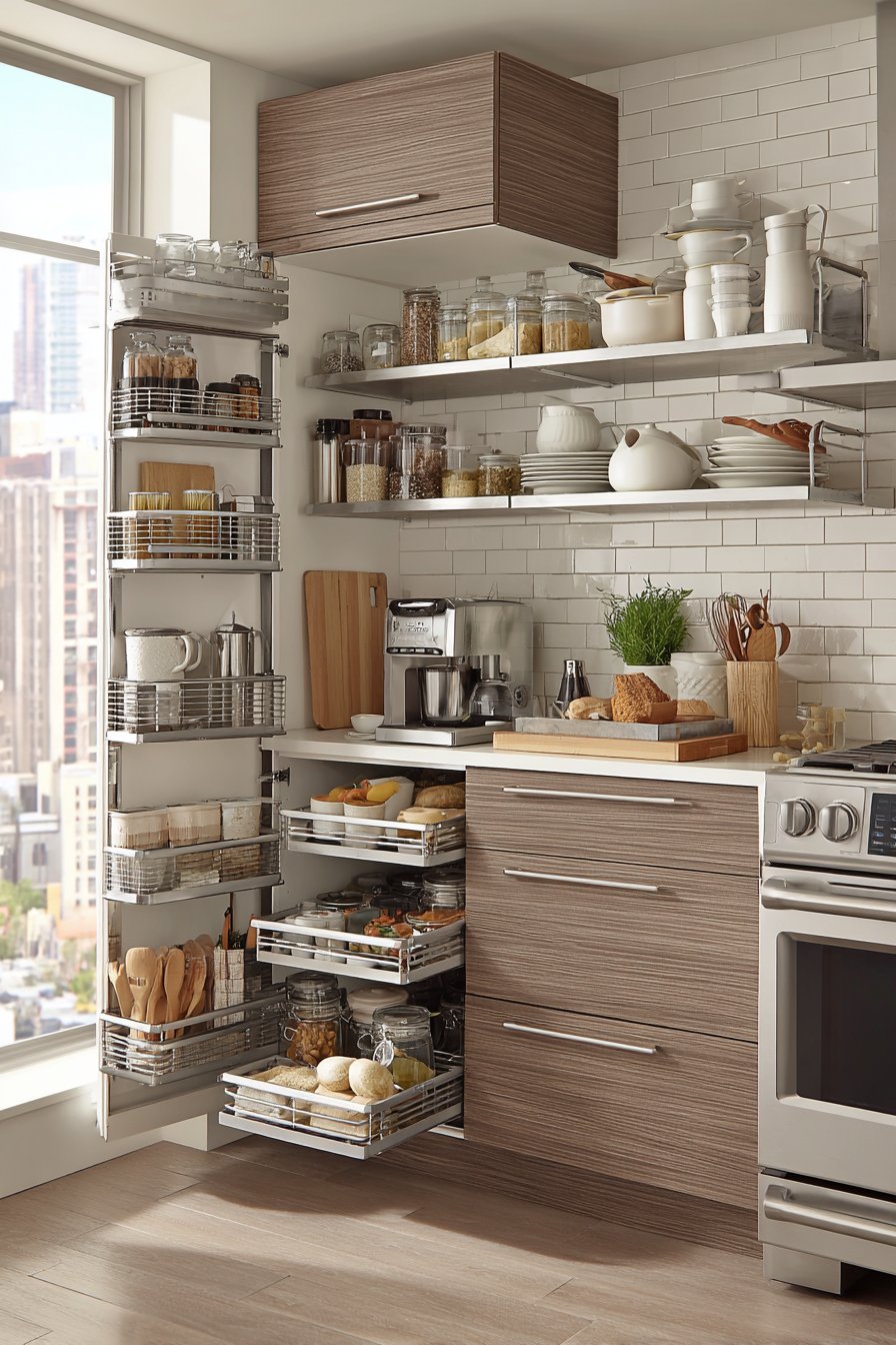
The workflow disruption mistake occurs when countertop styling ignores the kitchen work triangle and natural task sequences. Placing coffee supplies far from the coffee maker or storing cooking utensils away from the stove creates inefficient movement patterns that frustrate daily routines. This error prioritizes visual symmetry over practical function, a fundamental design failure.
Professional kitchen planning establishes zones: prep, cooking, cleaning, and serving. Each zone should contain its essential tools within arm’s reach of the corresponding appliance or sink. The most beautiful countertop arrangement fails if it requires you to cross the kitchen repeatedly for basic tasks. Ergonomic placement should drive styling decisions, not arbitrary aesthetic rules.
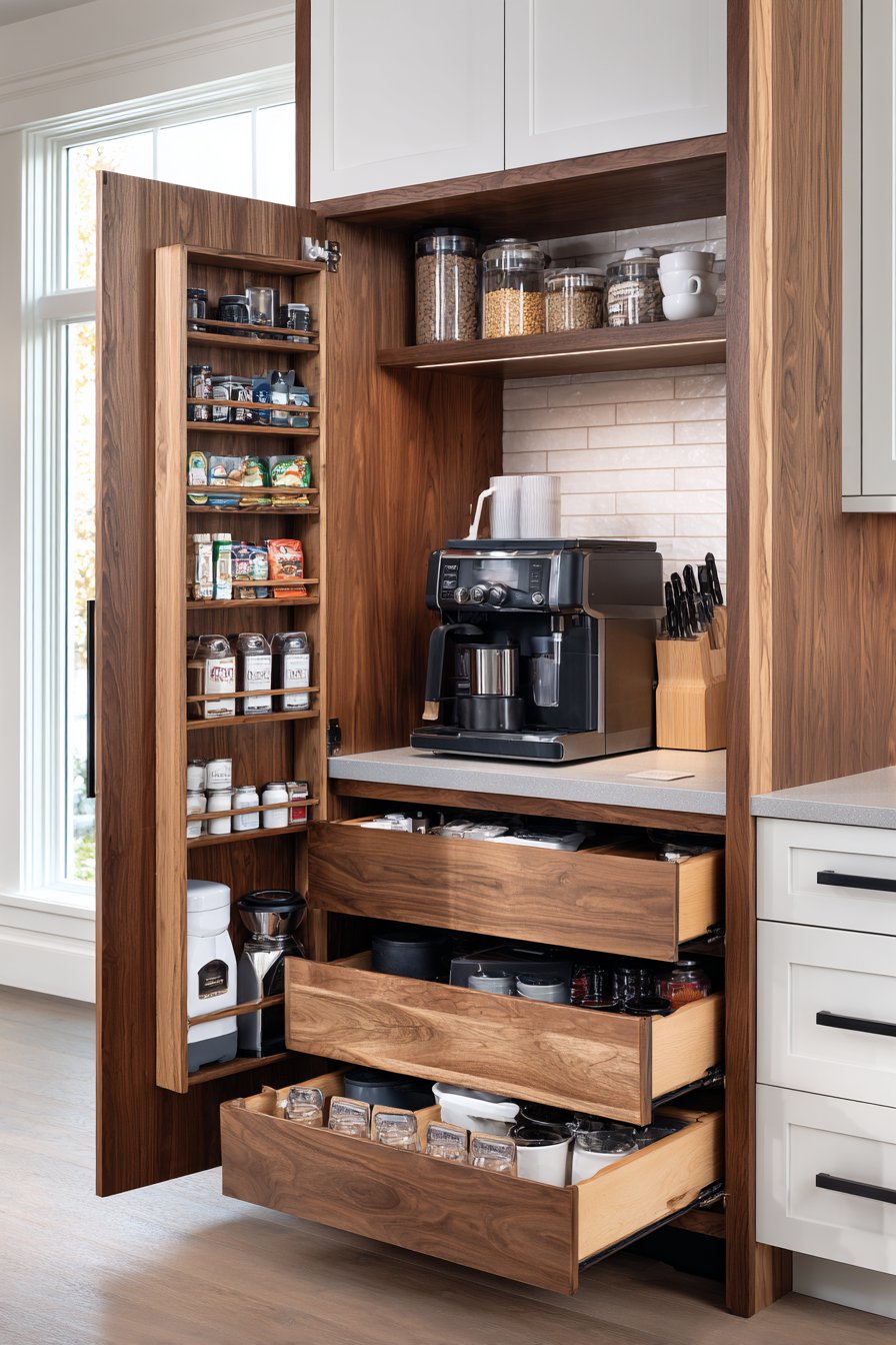
Understanding your personal cooking patterns reveals zone requirements. Frequent bakers need flour, sugar, and mixing tools near counter workspace. Daily coffee drinkers deserve a dedicated beverage station with cups, filters, and sweeteners consolidated. This functional approach actually enhances aesthetics by creating purposeful groupings rather than random object distribution.
- Map your movement patterns during typical meal preparation
- Establish a coffee station with all supplies within 24-inch radius
- Position frequently-used cooking utensils within arm’s reach of stove
- Create a prep zone near the sink with cutting boards and knives
- Store serving pieces near the dishwasher for easy unloading
- Test workflow efficiency before finalizing any styling arrangements
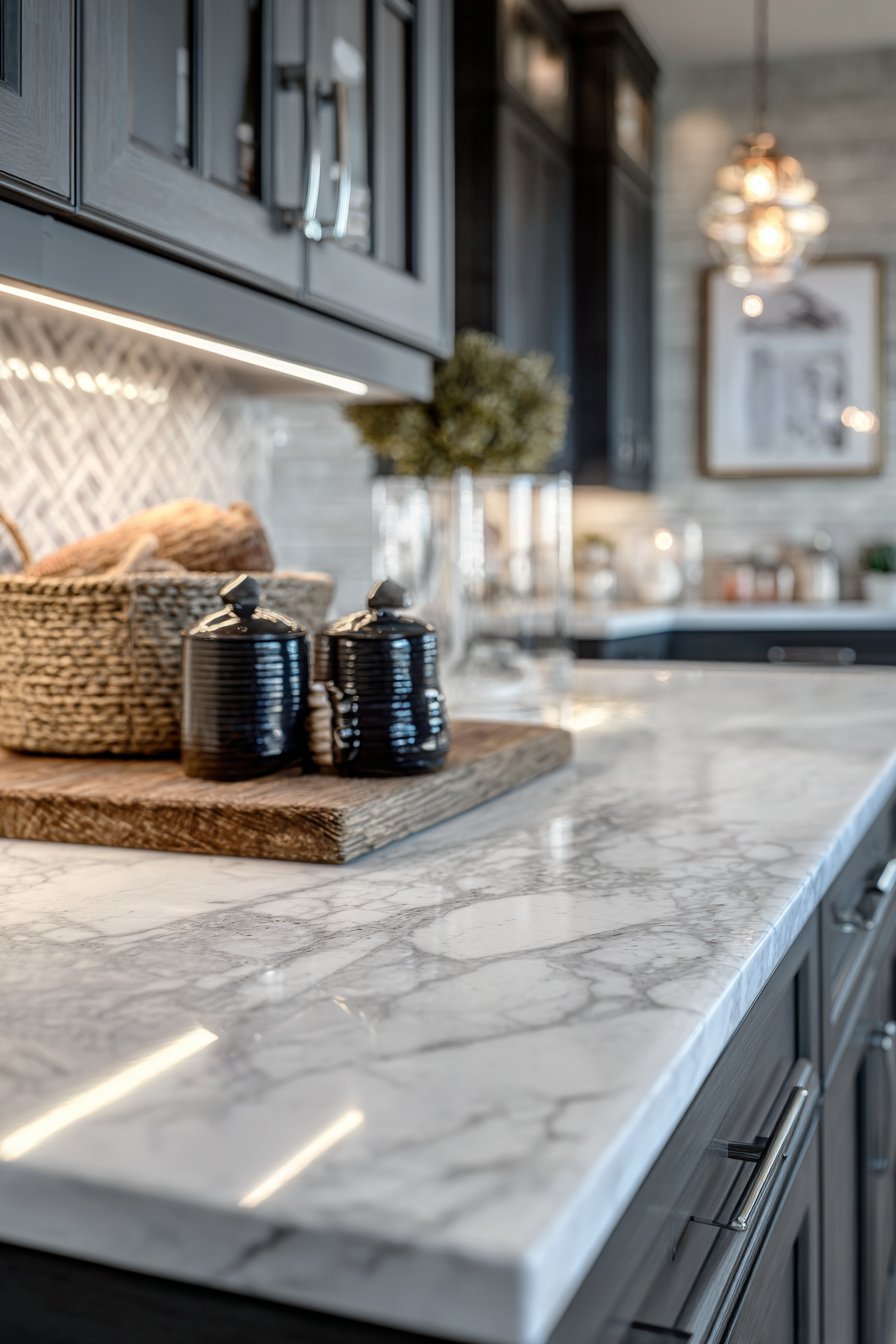
6. Failing to Manage Visual Weight Distribution
Visual weight imbalance creates the sensation that your countertop might tip over, even though intellectually you know it’s stable. This happens when all large, dark, or visually heavy items cluster on one side while the other appears sparse. The human eye instinctively seeks equilibrium, and unbalanced compositions cause subtle discomfort that undermines your kitchen’s overall appeal.
Interior designers use the concept of visual weight to distribute mass across horizontal surfaces. Dark colors, large objects, and complex patterns register as heavy, while light hues, small items, and simple forms feel lighter. Achieving balance doesn’t require identical sides—asymmetrical balance often proves more interesting than mirror-image symmetry.
Consider your countertop as a seesaw where different elements carry different weights. A large dark canister on one end might balance with three smaller white containers on the other. The goal is perceived equilibrium that feels stable without being boring. This sophisticated approach creates dynamic compositions that satisfy the eye’s need for order.
- Place your heaviest visual element slightly off-center as an anchor
- Balance one large object with a group of smaller coordinated items
- Distribute dark colors across both sides rather than clustering
- Use height variation to create dynamic balance without symmetry
- Step back to evaluate balance from typical viewing angles
- Photograph from multiple perspectives to identify weight distribution issues
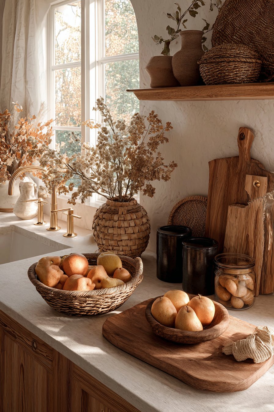
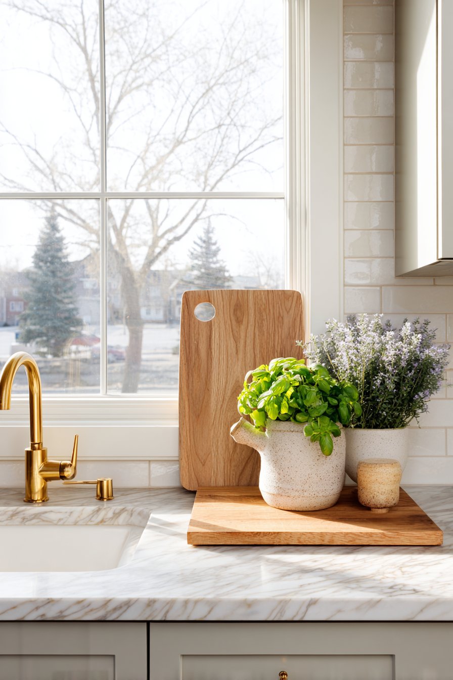
7. Disregarding Material and Texture Variety
The monotone mistake occurs when all countertop items share identical materials, creating flat, uninteresting surfaces despite being organized and appropriately scaled. All-ceramic displays or exclusively stainless containers lack the tactile interest that makes kitchens feel warm and inviting. This error reflects missed opportunities to layer materials that add depth and sophistication to your space.
Professional stylists deliberately mix materials within cohesive color palettes—wood cutting boards against ceramic canisters, glass storage beside metal appliances, woven baskets near stone counters. This material dialogue creates visual richness that engages viewers beyond simple color and form. The interplay between smooth and textured, matte and glossy, natural and manufactured elevates simple arrangements into curated displays.
Texture consideration extends to your countertop material itself. Matte quartz counters benefit from glossy accessories, while polished granite pairs beautifully with matte or textured elements. This contrast principle prevents visual monotony and creates layered interest that sophisticated spaces demand. Strategic material mixing demonstrates design confidence and understanding of advanced styling principles.
- Combine at least three different materials in your countertop display
- Balance natural materials like wood with manufactured elements like ceramic
- Mix surface finishes—pair glossy with matte, smooth with textured
- Consider weight contrast—heavy stone beside lightweight wood or glass
- Use metal as a transitional material that bridges other textures
- Ensure material choices complement your actual countertop surface
Conclusion
Avoiding these seven critical mistakes transforms your kitchen countertops from cluttered afterthoughts into intentionally styled surfaces that enhance both function and beauty. The principles of scale, color cohesion, negative space, workflow optimization, visual balance, and material variety work together to create sophisticated environments that support your daily routines while impressing guests.
Remember that effective countertop styling evolves through experimentation rather than achieving perfection immediately. Start by addressing your most problematic area, then gradually refine your approach as you develop confidence in these design principles. Your kitchen counters deserve the same thoughtful attention as any other surface in your home, rewarding your efforts with a space that truly serves your culinary lifestyle while reflecting your personal aesthetic vision.
"As an Amazon Associate, I earn from qualifying purchases."