The kitchen has evolved far beyond its utilitarian roots to become the vibrant heart of the modern home—a space where culinary creativity meets artistic expression. Today’s homeowners are embracing bold, colorful kitchen designs that reflect their personalities while creating inspiring environments for cooking, entertaining, and daily living. A well-designed colorful kitchen doesn’t just serve functional needs; it energizes the soul, sparks creativity, and transforms everyday cooking into a joyful experience.
Gone are the days when kitchens were confined to neutral palettes and sterile environments. Modern interior design celebrates the power of color to create mood, define spaces, and express individual style. From vibrant two-tone cabinetry to stunning mosaic backsplashes, colorful appliances to rainbow-organized storage solutions, today’s colorful kitchens demonstrate that functionality and beauty can coexist harmoniously. Whether you prefer subtle pops of color or bold, dramatic statements, there are countless ways to infuse your kitchen with personality and warmth.
This comprehensive guide explores twenty innovative approaches to creating stunning, colorful kitchens that cater to diverse tastes and lifestyles. Each design concept showcases unique color applications, from architectural elements to decorative accessories, proving that every kitchen can benefit from thoughtful color integration. These designs range from sophisticated gradient effects to playful rainbow themes, each offering practical insights and actionable tips for transforming your culinary space into a vibrant, inspiring environment.
1. Energetic Two-Tone Cabinet Drama
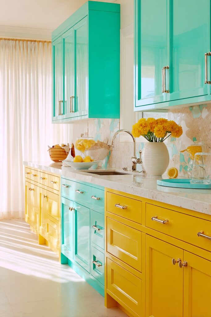
Step into a kitchen that radiates pure energy through its bold two-tone cabinet design, where vibrant turquoise upper cabinets dance harmoniously with sunny yellow lower cabinets. This striking color combination creates an instantly uplifting atmosphere that transforms cooking from a chore into a celebration. The turquoise evokes feelings of tranquility and creativity, while the sunny yellow brings warmth and optimism, creating a perfect balance that energizes without overwhelming.
The white quartz countertop with subtle sparkle provides a sophisticated neutral foundation that allows both cabinet colors to shine while offering practical durability for daily use. The brass hardware adds a luxurious touch that bridges the cool and warm tones, creating cohesion throughout the design. This metallic accent catches and reflects light, adding depth and richness to the overall color scheme.
The hand-painted ceramic tile backsplash featuring coral, mint green, and cream creates a playful mosaic pattern that ties all the colors together while adding textural interest. Each tile tells a story, creating an artisanal quality that makes the kitchen feel custom and personal. The natural light streaming through sheer white curtains illuminates this cheerful palette, creating subtle color variations throughout the day as the light changes.
This design approach works exceptionally well in kitchens that receive abundant natural light, as the bright colors can absorb and reflect light beautifully. Consider using this two-tone cabinet approach in open-plan homes where the kitchen serves as a focal point. Mix different cabinet door styles between upper and lower sections to add even more visual interest. Ensure adequate task lighting to maintain functionality during evening hours. Balance bold cabinet colors with neutral flooring to prevent visual overload.
2. Statement Island Color Pop
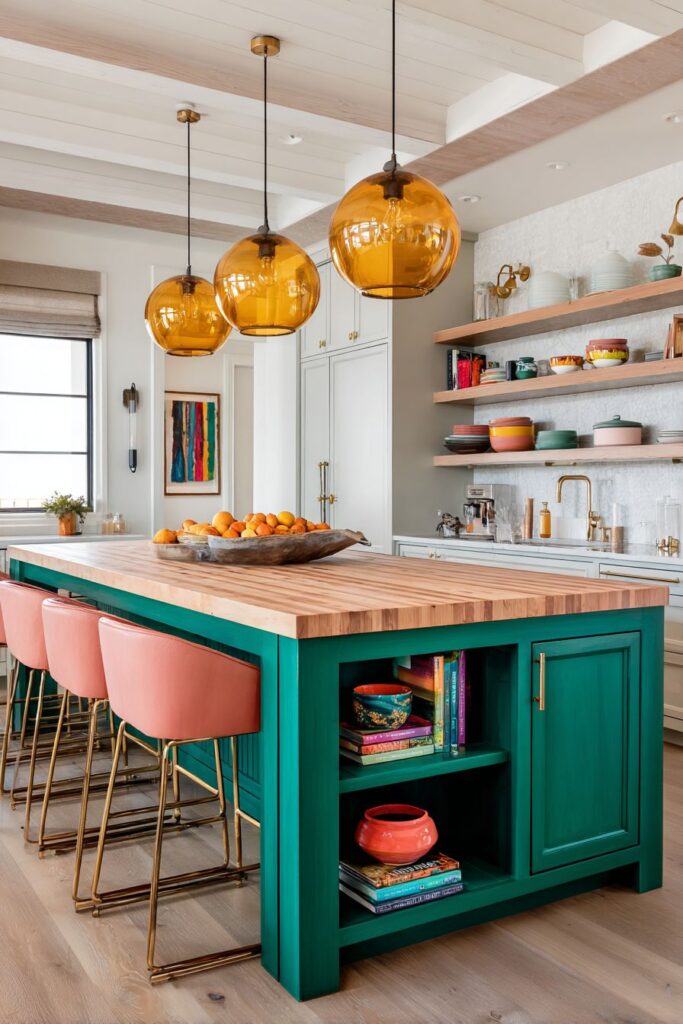
Transform your kitchen’s focal point with a dramatic emerald green island that commands attention while maintaining sophisticated elegance. This deep, jewel-toned base creates a stunning contrast against the natural butcher block countertop, where the rich wood grain adds warmth and organic texture. The coral-colored bar stools with brass legs introduce a complementary pop of color that energizes the space while providing comfortable seating for casual dining and conversation.
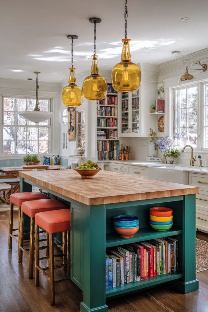
The island’s open shelving displays become a curated showcase for colorful ceramic bowls and vibrant cookbooks, turning functional storage into decorative art. This display technique allows personality to shine through carefully selected accessories while keeping frequently used items within easy reach. The amber glass pendant lights hanging overhead cast warm, honey-colored light across the workspace, creating an inviting atmosphere that encourages gathering and culinary exploration.
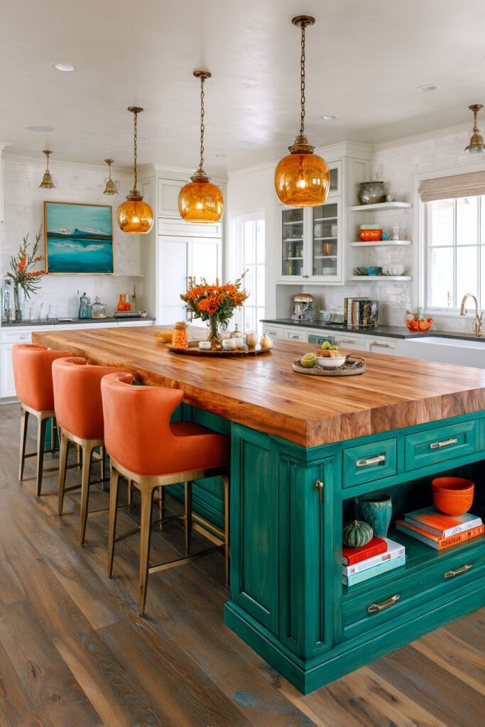
The surrounding white kitchen provides the perfect neutral backdrop that allows the colorful island to truly pop without competing elements. This design strategy demonstrates how a single colorful element can transform an entire space when properly balanced with neutral surroundings. The white cabinetry reflects light throughout the space, making the kitchen feel larger while ensuring the emerald island remains the undisputed star.
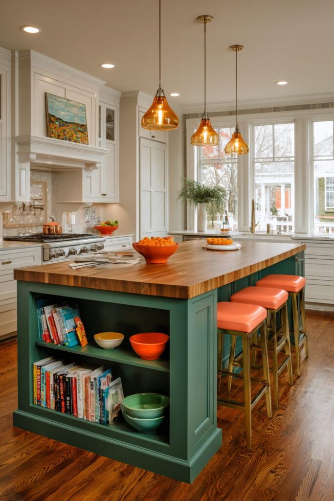
Choose deep, saturated colors for maximum impact when creating a statement island. Consider the island’s proportions—larger islands can handle bolder colors more successfully. Incorporate both open and closed storage to balance display opportunities with practical needs. Select complementary accent colors that enhance rather than compete with your main island color. Ensure proper lighting both above and around the island to showcase the color effectively.
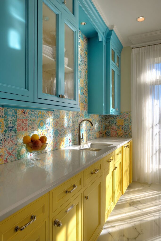
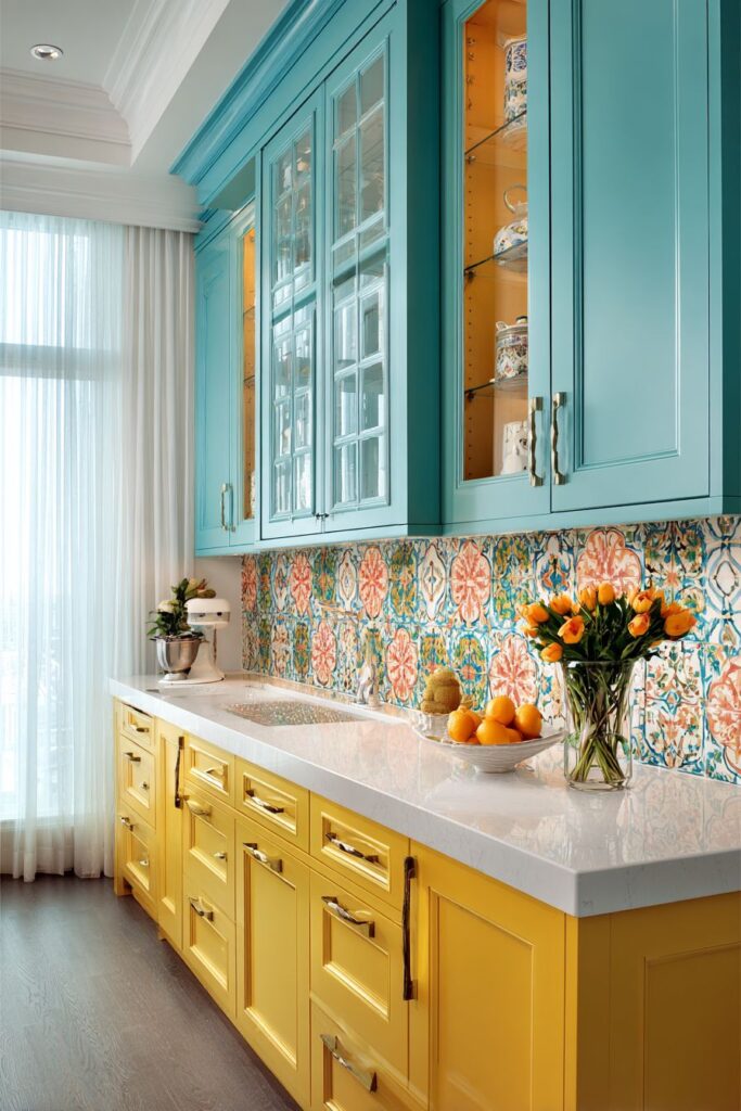
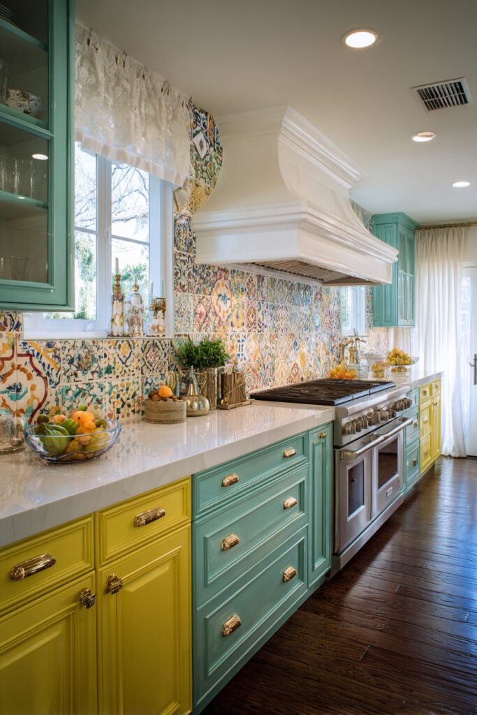
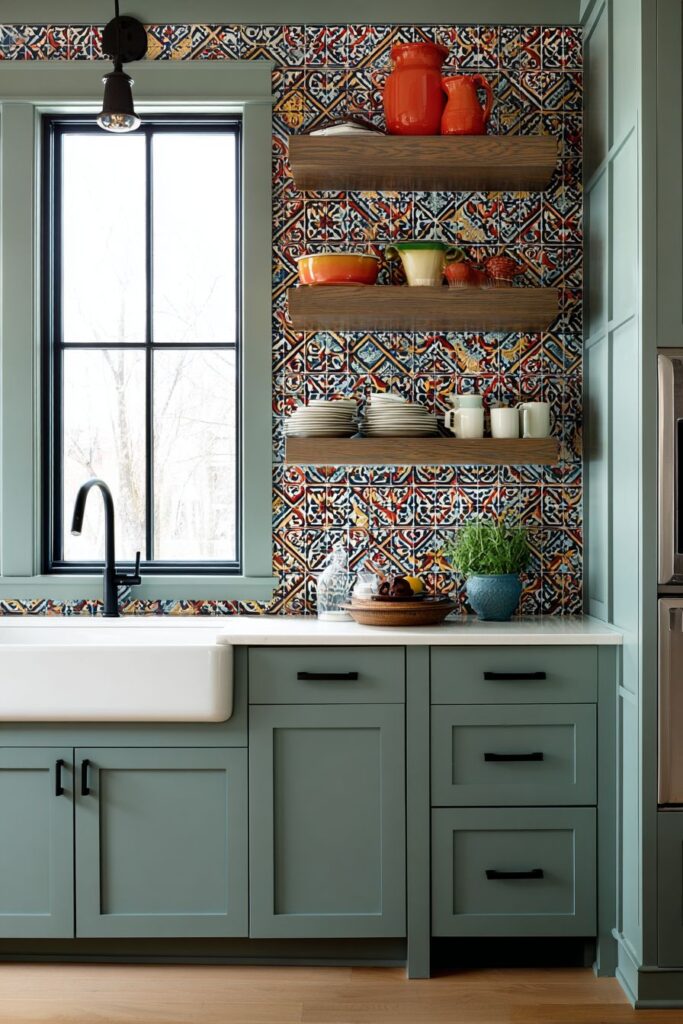
3. Geometric Tile Artistry
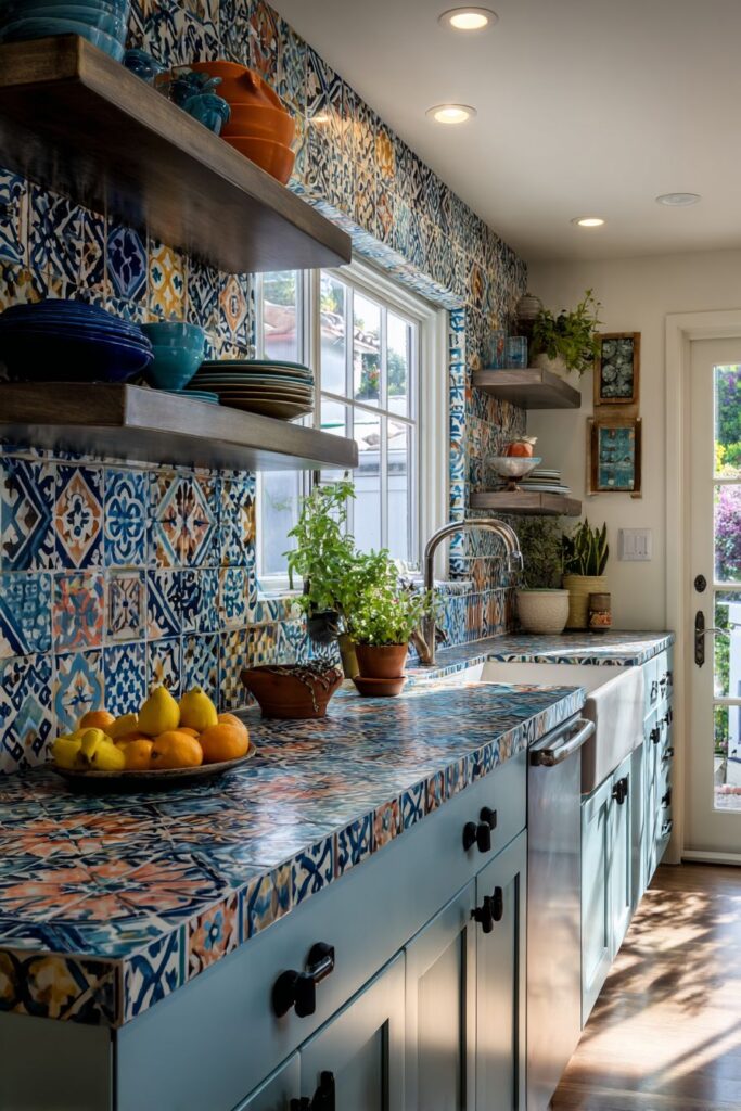
Elevate your kitchen’s sophistication with a stunning geometric cement tile backsplash that combines navy blue, terracotta, and cream in an intricate pattern that serves as functional art. This bold backsplash creates visual drama while protecting walls from cooking splashes, proving that practical elements can be breathtakingly beautiful. The sophisticated color combination evokes Mediterranean coastal charm while maintaining contemporary relevance.
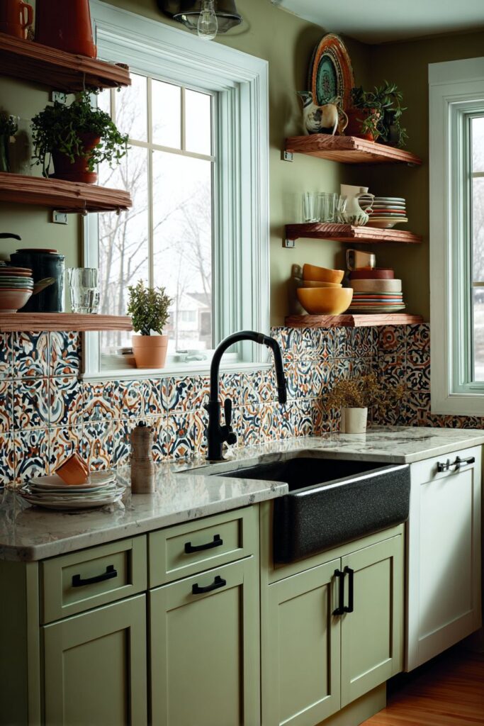
The surrounding sage green cabinetry with matte black hardware provides a refined contrast that allows the geometric tile pattern to shine. The sage green offers a calming, nature-inspired backdrop that complements both the navy and terracotta in the tiles, creating a cohesive color story throughout the space. The matte black hardware adds contemporary edge while providing visual weight that grounds the lighter colors.
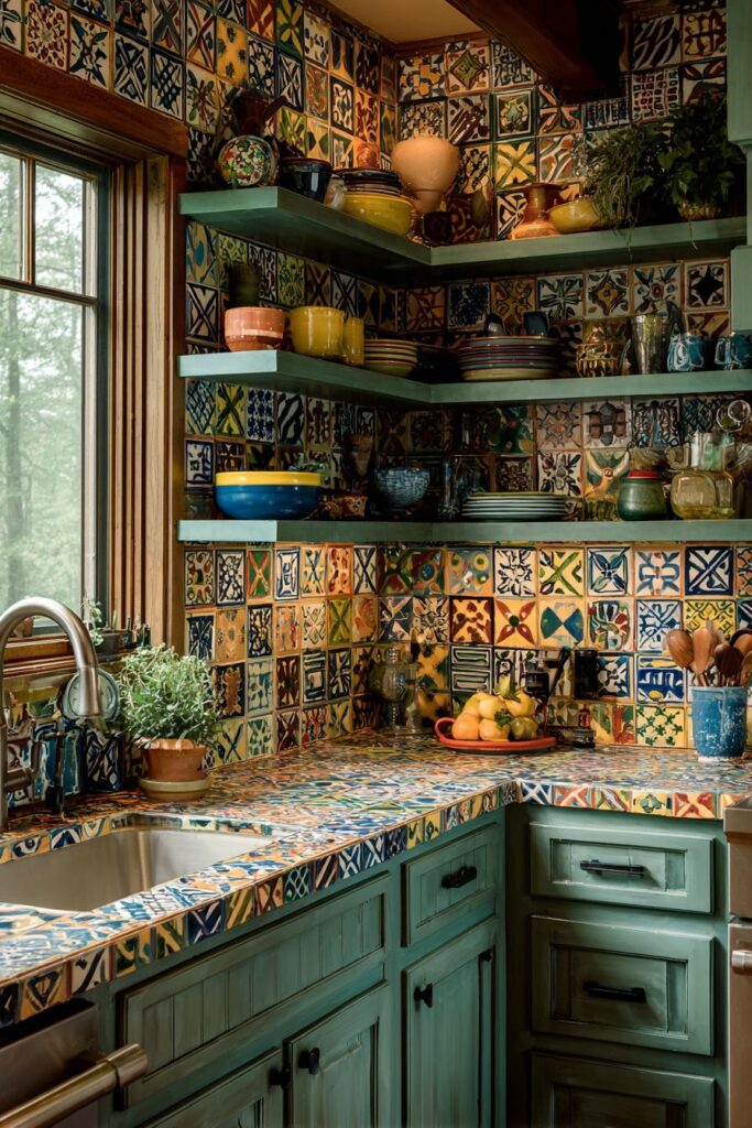
Open floating shelves display an array of colorful dishware and potted herbs, creating layers of color and texture that enhance the overall design. The natural morning light filtering through the window above the sink highlights the intricate tile pattern and creates subtle shadows that emphasize the geometric design’s depth and dimensionality.
Research tile patterns carefully before installation—geometric designs require precise alignment for best results. Consider the scale of your pattern in relation to your kitchen size—smaller kitchens benefit from smaller-scale patterns. Select grout color thoughtfully as it significantly impacts the overall appearance. Coordinate cabinet colors with dominant tile colors for cohesion. Plan adequate lighting to showcase intricate tile work effectively.
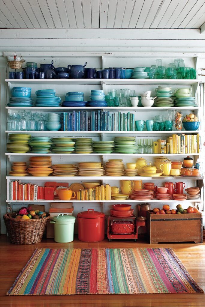
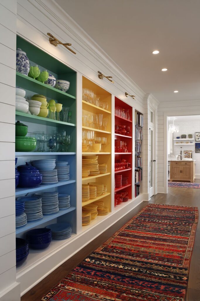
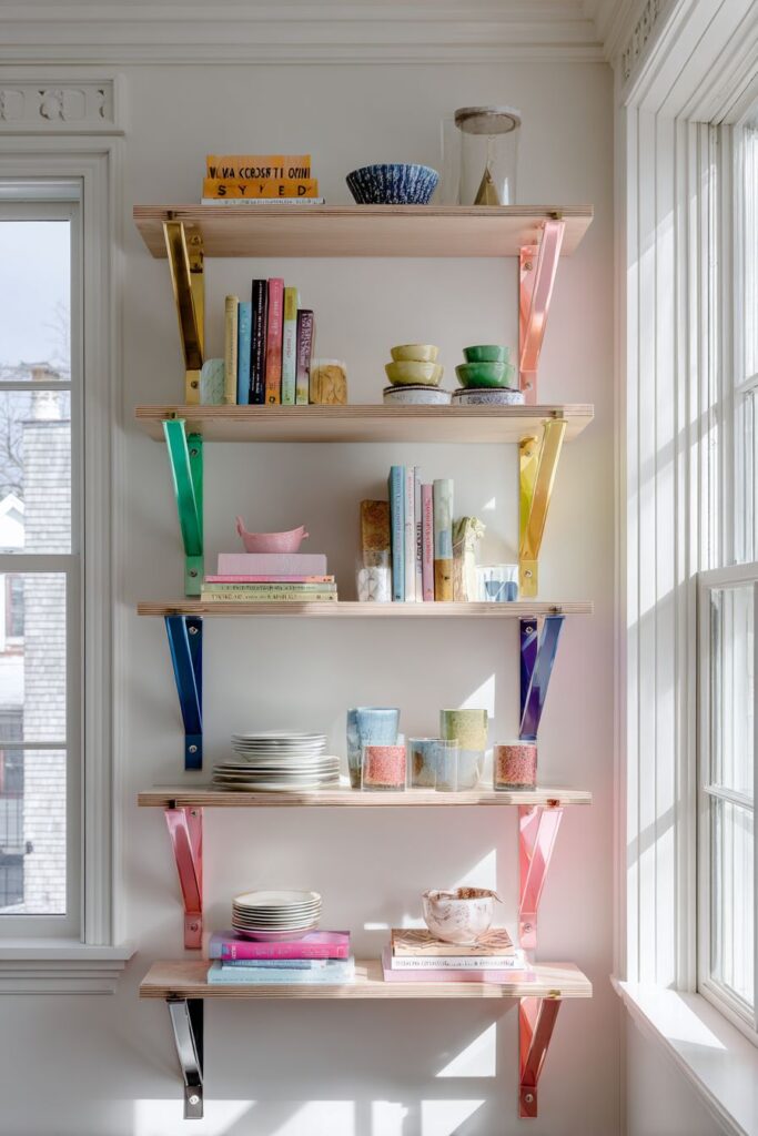
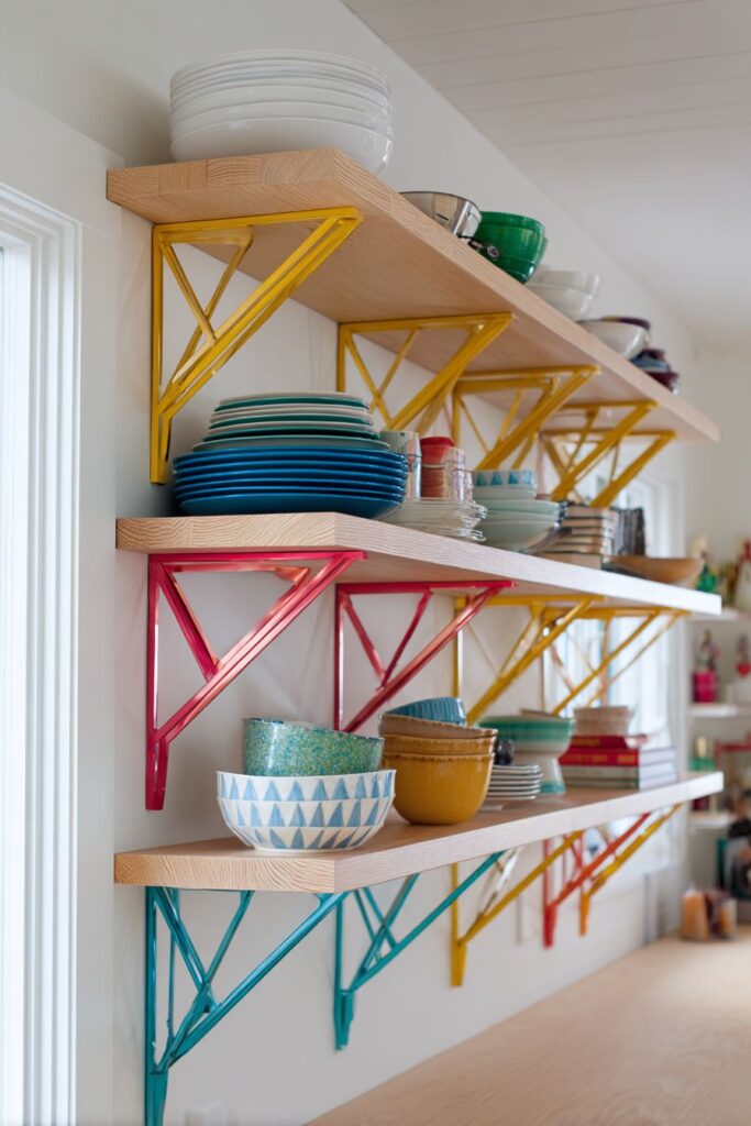
4. Rainbow Organization Display
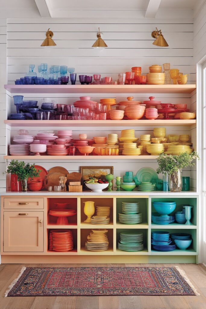
Transform functional storage into a vibrant art installation with rainbow-hued open shelving that displays an organized collection of colorful dishes, glassware, and cookbooks arranged by color gradient. This approach turns everyday items into a stunning visual display that brings joy to daily kitchen activities. The systematic color organization creates a sense of order and intentionality that elevates the aesthetic appeal while maintaining functionality.
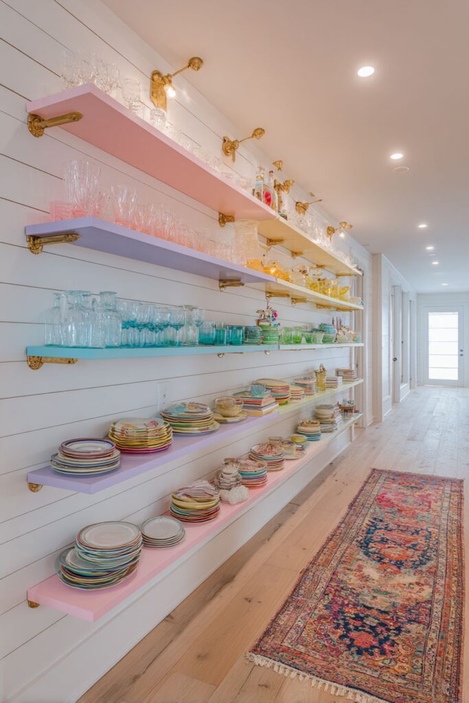
The brass bracket hardware against white shiplap walls adds warmth and sophistication to the display system. The combination of industrial brass elements with cottage-style shiplap creates an interesting juxtaposition that feels both modern and timeless. The white background allows each colorful item to stand out distinctly while creating visual cohesion across the entire display.
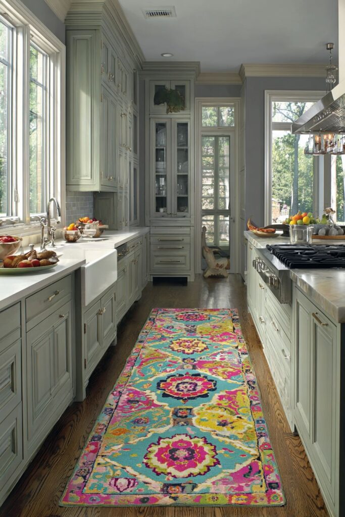
A vintage-inspired colorful Persian runner adds pattern and warmth to the hardwood floor below, creating a foundation that complements the overhead display. The runner’s intricate patterns and rich colors echo the organized display above, creating visual connections that unify the space from floor to ceiling.
Group items by color families for maximum visual impact when creating rainbow displays. Invest in matching or coordinated storage containers to maintain visual consistency. Consider the weight distribution when planning open shelving installations. Rotate seasonal items to keep displays fresh and engaging. Maintain consistent spacing between items for a clean, organized appearance.
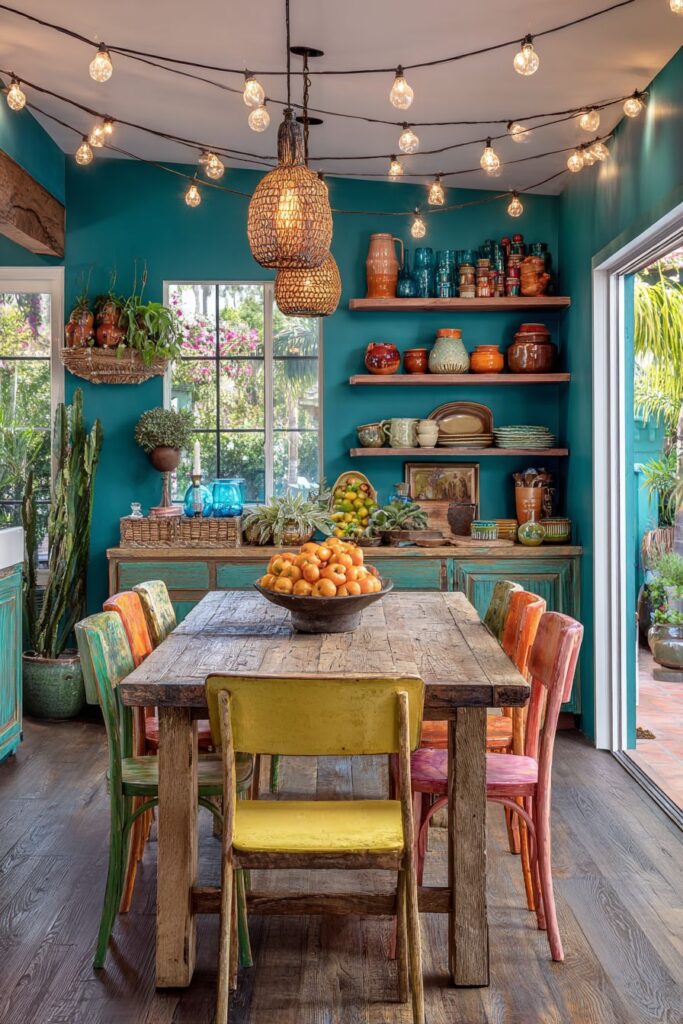
5. Bohemian Color Statement Wall
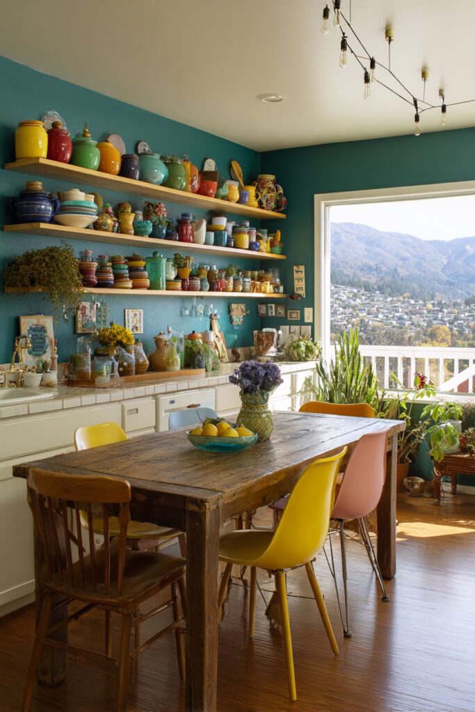
Create an instant focal point with a deep teal statement wall that serves as a dramatic backdrop for floating shelves displaying colorful vintage pottery and glassware collections. This rich, jewel-toned wall color adds depth and sophistication while providing the perfect canvas for showcasing treasured collections. The teal evokes feelings of creativity and tranquility, making it an ideal choice for kitchen spaces where both function and inspiration are important.
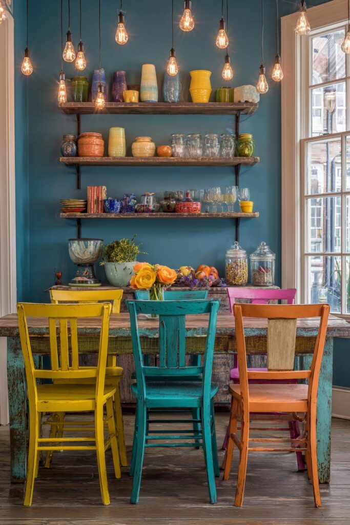
The rustic wooden dining table surrounded by mismatched colorful chairs in yellow, orange, and pink creates an eclectic breakfast nook that celebrates individuality and creative expression. This mix-and-match approach demonstrates how different colors can work harmoniously when unified by similar style or material choices. Each chair tells its own story while contributing to a cohesive, curated look that feels collected over time rather than purchased all at once.
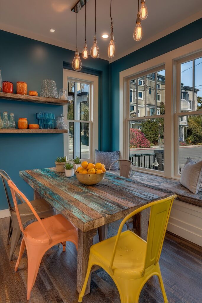
String lights overhead add ambient lighting that creates a magical atmosphere during evening gatherings, while natural daylight from large windows ensures adequate illumination for practical activities. This layered lighting approach allows the space to transition seamlessly from functional work area to intimate dining space.
Test paint colors in different lighting conditions before committing to dark statement walls. Balance bold wall colors with lighter furniture and accessories to prevent the space from feeling closed-in. Mix vintage and new pieces for authentic collected-over-time appeal. Consider the room’s natural light when selecting deep colors—south-facing rooms can handle darker colors more successfully. Layer different types of lighting to accommodate various activities and moods.
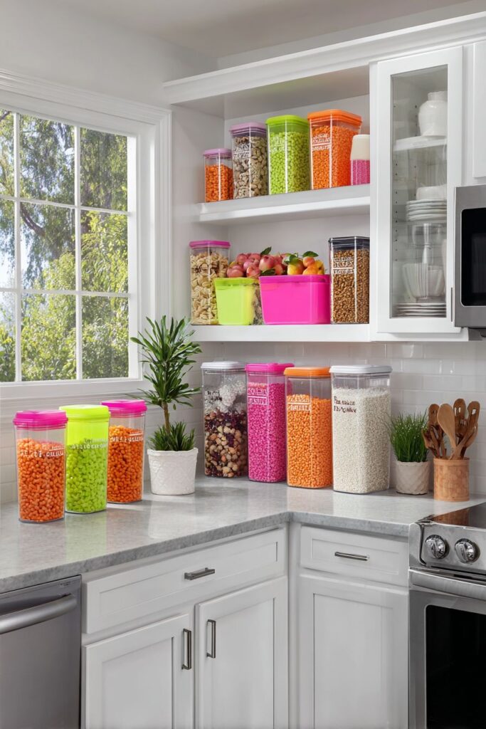
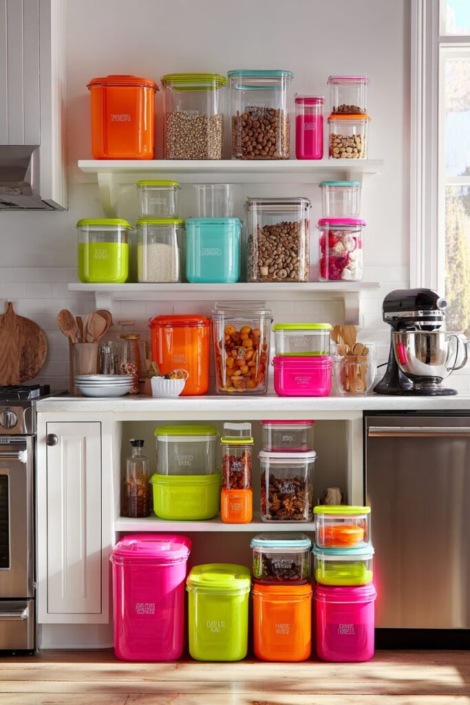
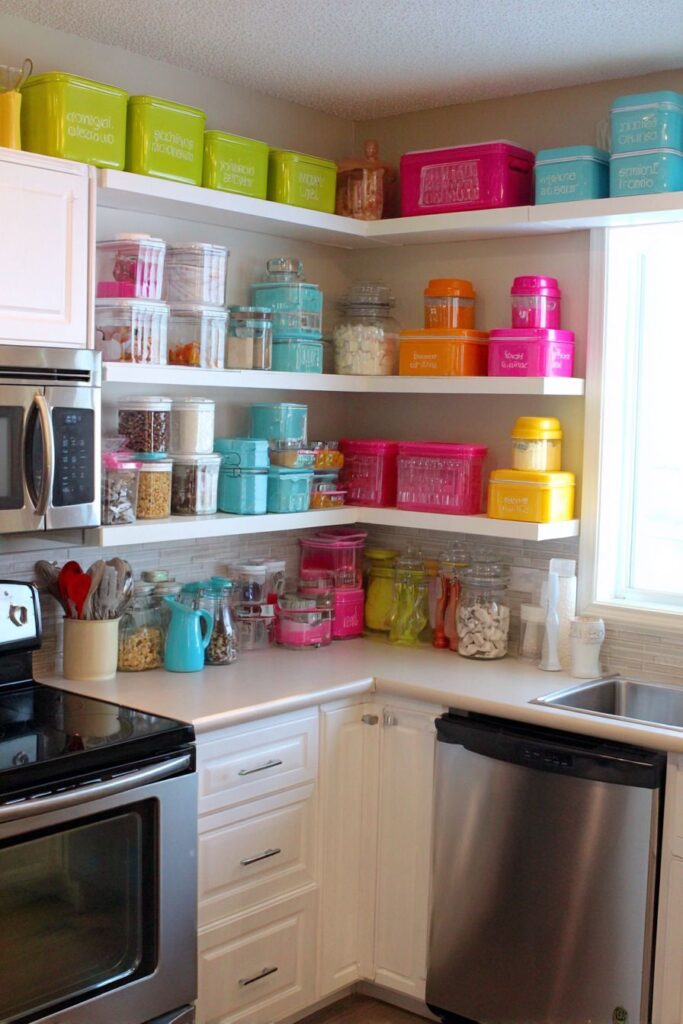
6. Systematic Storage Beauty
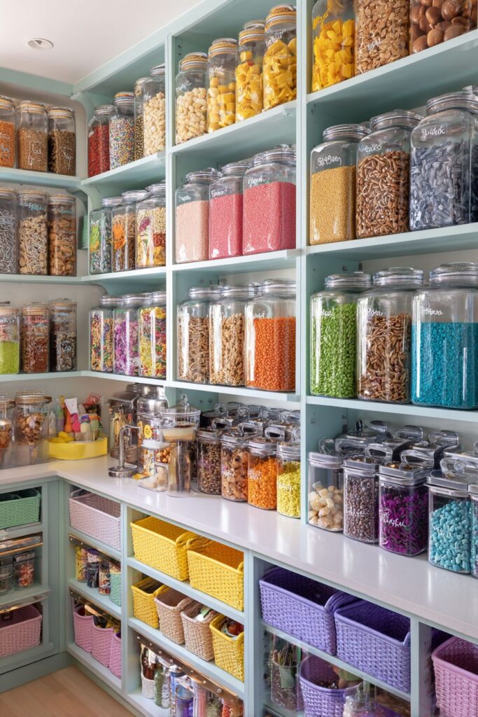
Transform kitchen organization into a beautiful display with a colorful pantry system featuring clear glass jars with coordinating labels and rainbow-organized shelving. This systematic approach to storage proves that functionality and beauty are not mutually exclusive. The clear containers allow colorful ingredients to become part of the decor while maintaining freshness and easy identification.
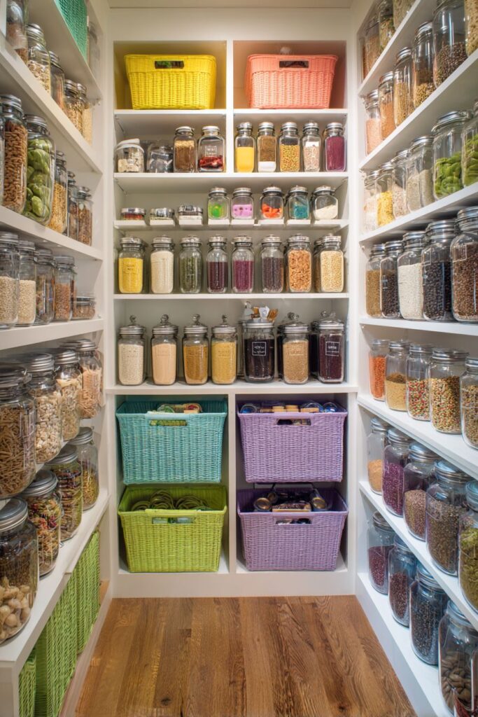
Bright yellow shelving brackets create a cheerful contrast against white walls while providing sturdy support for organized displays. The yellow adds sunshine and energy to what could otherwise be a mundane storage area, demonstrating how small color accents can transform functional elements. Colorful storage baskets in coral, mint, and lavender organize smaller items while contributing to the overall color scheme.
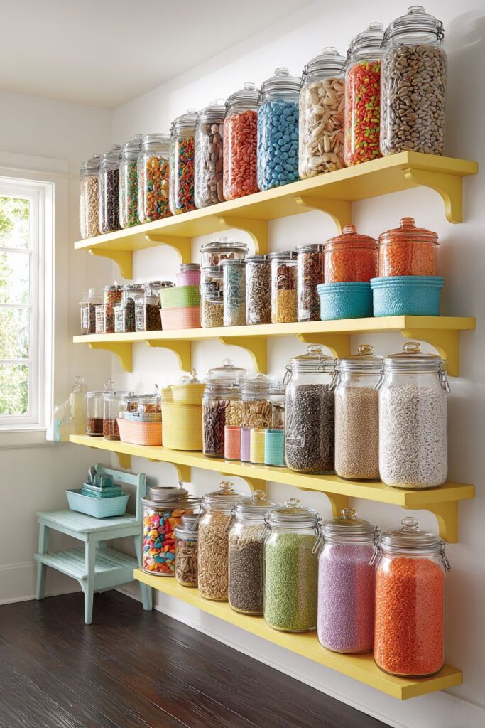
A vintage-style colorful step ladder provides both practical access to higher shelves and additional visual interest as a decorative element. This multi-functional approach maximizes both utility and aesthetic appeal, showing how thoughtful selection of practical items can enhance rather than detract from overall design.
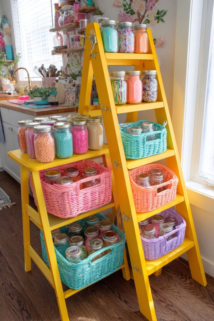
Invest in matching storage containers for visual consistency in organized displays. Label everything clearly with coordinating colors for both function and aesthetics. Consider ingredient colors when planning storage displays—colorful spices, grains, and dry goods naturally enhance the visual appeal. Maintain consistent spacing and alignment for professional-looking results. Choose storage solutions that are easy to clean and maintain for long-term success.
7. Charming Window Treatment Focus
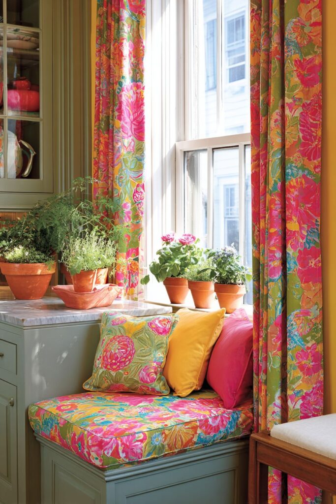
Create a cozy breakfast spot with cheerful café curtains featuring vibrant floral patterns in shades of pink, green, and yellow that filter natural light beautifully. These window treatments demonstrate how textiles can introduce color and pattern while maintaining privacy and light control. The floral motifs bring nature indoors while adding feminine charm that softens hard kitchen surfaces.
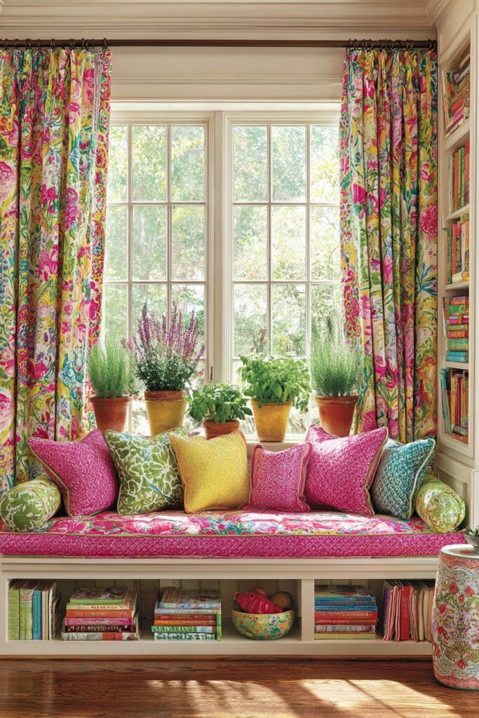
The cushioned window seat below, adorned with coordinating colorful throw pillows in complementary solids and patterns, creates an inviting reading nook or casual dining spot. This layered approach to textile design shows how mixing patterns and solids can create visual interest without overwhelming the space. Each pillow adds another layer of color and texture while maintaining overall harmony.
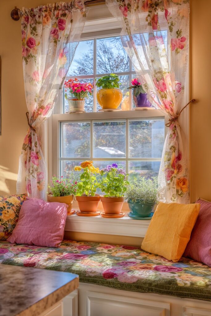
Small colorful herb gardens growing on the windowsill in painted terracotta pots provide fresh ingredients while adding living color to the display. This practical element demonstrates how functional gardening can enhance kitchen design while providing fresh herbs for cooking.

Select window treatments that complement your kitchen’s overall color scheme while providing adequate privacy. Layer different textile patterns carefully—start with one dominant pattern and add smaller-scale coordinating patterns. Consider seasonal changes when selecting window treatments—lighter fabrics work better in summer while heavier textures add warmth in winter. Ensure window seats have adequate support and weather-appropriate cushion materials.
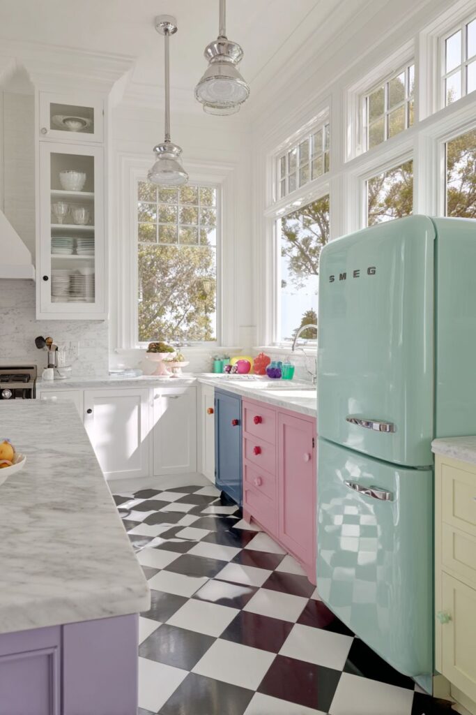
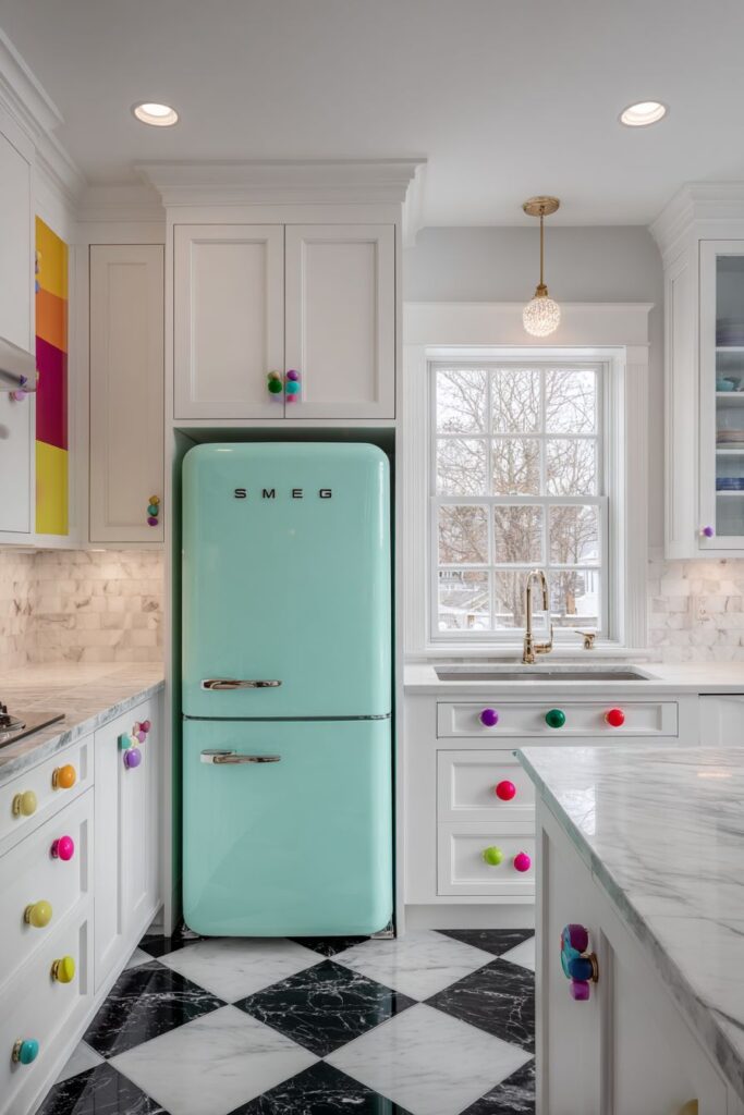
8. Retro Appliance Charm
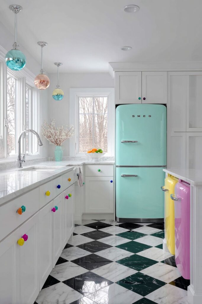
Make a bold statement with a vintage-inspired pastel mint green Smeg refrigerator that serves as the kitchen’s focal point, surrounded by white cabinetry adorned with colorful knobs in jewel tones including ruby, sapphire, and emerald. This approach demonstrates how a single colorful appliance can transform an entire kitchen’s personality while maintaining sophisticated appeal.
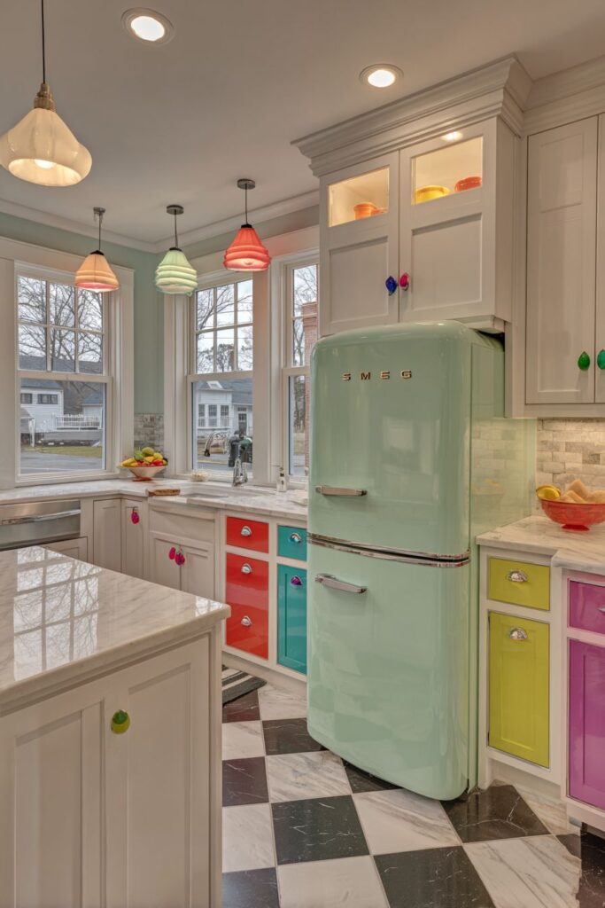
The white marble countertops with subtle veining provide an elegant foundation that complements the retro aesthetic while offering timeless sophistication. The natural stone patterns add organic movement that softens the geometric lines of cabinetry and appliances. Classic black and white checkered tiles create a timeless floor pattern that bridges vintage and contemporary design elements.
The combination of the mint green refrigerator with jewel-toned cabinet hardware creates a curated, intentional look that feels both playful and sophisticated. Each colored knob becomes a small jewelry-like accent that adds sparkle and personality without overwhelming the clean white cabinetry.
Research appliance colors carefully as they represent significant investments that should coordinate with long-term design plans. Consider how colored appliances will age and whether they’ll remain appealing over time. Balance bold appliance colors with neutral cabinetry for flexibility in future updates. Select hardware colors that complement rather than compete with major appliance colors. Plan adequate lighting to showcase colored appliances effectively.
9. Architectural Color Drama
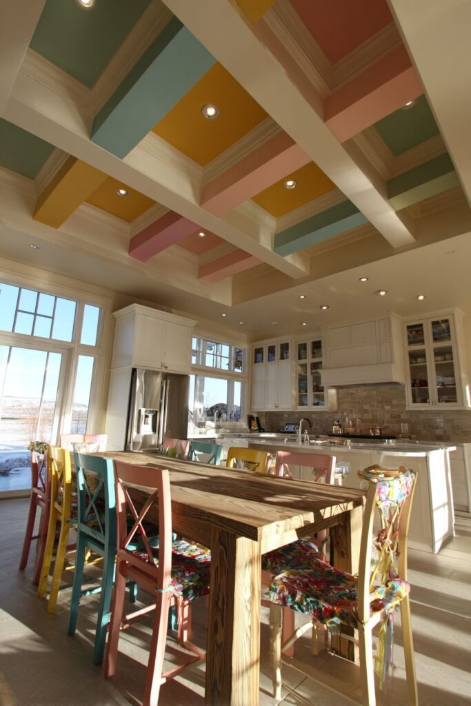
Draw the eye upward with painted wooden ceiling beams in alternating colors of soft coral, sage green, and cream white against a neutral ceiling. This architectural color treatment creates visual drama while adding warmth and character to the kitchen space. The overhead color display demonstrates how often-overlooked architectural elements can become stunning design features.
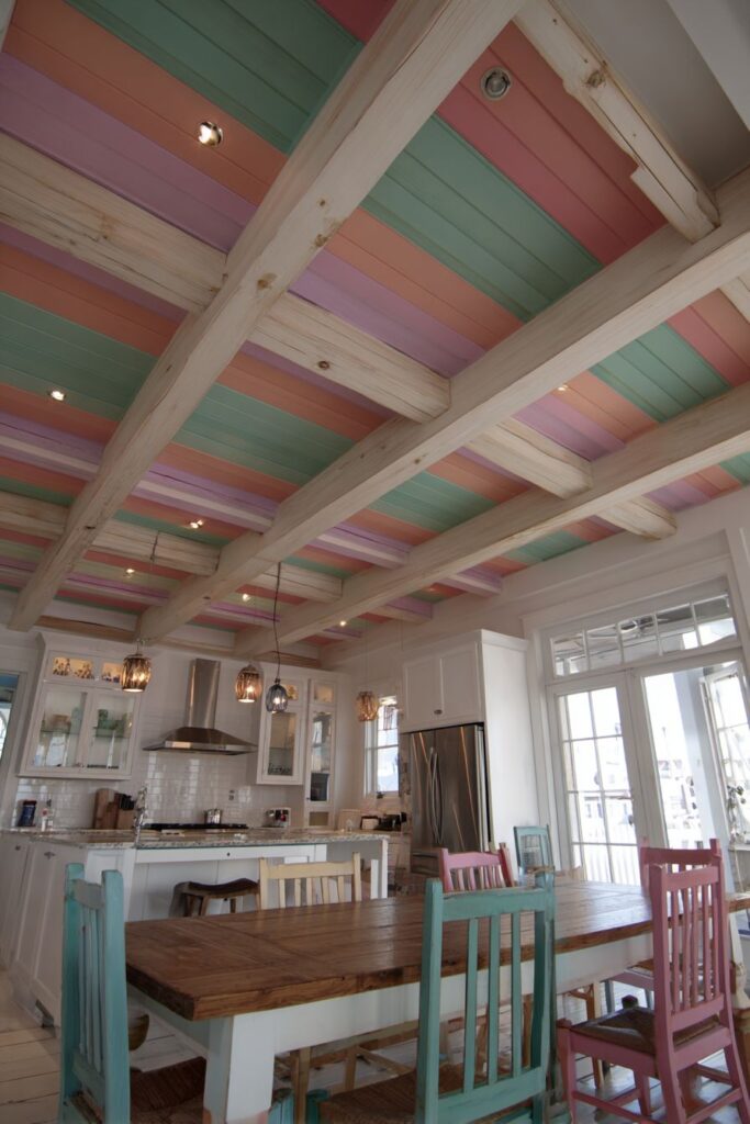
The simple white cabinetry and stainless steel appliances below maintain focus on the colorful ceiling treatment while providing clean, functional workspace. This restraint in lower elements allows the colorful beams to command attention without creating visual chaos. The neutral foundation ensures that the colored ceiling remains the star while maintaining kitchen functionality.
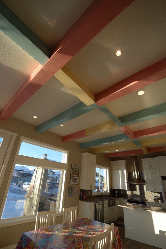
The large farmhouse table with mismatched colorful chairs continues the playful color theme at floor level, creating visual connections between ceiling and seating areas. This repetition of the colorful theme throughout different elevations creates cohesion and intentionality in the overall design approach.
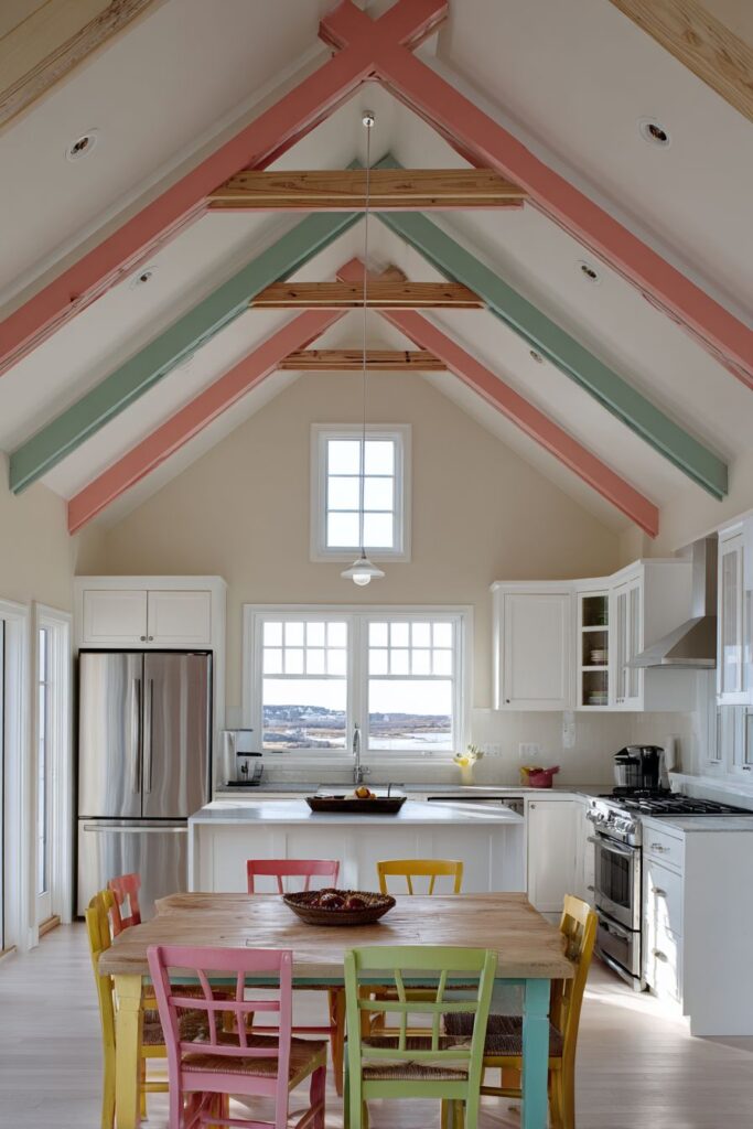
Consult structural engineers before painting existing ceiling beams to ensure proper preparation and paint compatibility. Consider room height when planning overhead color treatments—higher ceilings can accommodate bolder colors more successfully. Select colors that complement natural lighting conditions throughout the day. Plan the painting sequence carefully to achieve clean lines between different colored beams. Use high-quality paint suitable for wood and potential moisture exposure.
10. Artistic Cabinet Expression
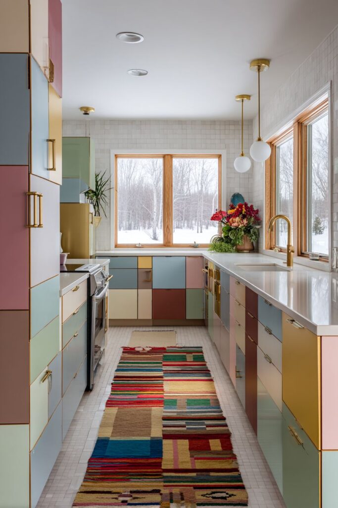
Transform ordinary cabinet doors into artistic expressions with hand-painted panels in different complementary colors including dusty rose, sage green, cream, and soft gray. This custom approach creates a truly unique kitchen that reflects personal creativity while maintaining sophisticated color harmony. Each cabinet door becomes a canvas that contributes to an overall artistic composition.
The brass hardware provides unifying elements that tie the different colored panels together while adding luxurious accents throughout the space. The consistent hardware finish creates visual continuity despite the varied cabinet colors, demonstrating how metallic elements can provide cohesion in colorful designs. White subway tile backsplash provides visual rest areas that prevent color overload while maintaining timeless appeal.
A colorful vintage-style geometric rug grounds the space in front of the sink area, adding pattern and comfort while echoing the creative cabinet treatment. The rug’s colors coordinate with the cabinet palette while introducing new pattern elements that enhance visual interest.
Plan color placement carefully to create balanced distribution throughout the kitchen when painting individual cabinet doors. Test paint samples on actual cabinet material before committing to colors. Consider daily wear patterns when selecting paint finishes—high-use areas need more durable finishes. Maintain consistent style in hardware selection to unify varied color treatments. Document your color choices for future touch-ups and repairs.
11. Oceanic Floor Artistry
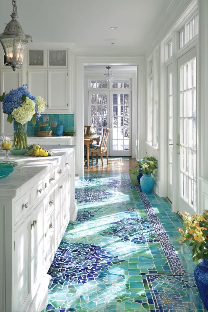
Create stunning visual impact from the ground up with a mosaic tile floor featuring small tiles in gradating shades of blue, green, and white that create an ocean-inspired ombré effect. This dramatic floor treatment demonstrates how horizontal color gradients can add movement and visual interest while maintaining sophisticated appeal. The oceanic theme brings tranquility and natural beauty into the kitchen environment.
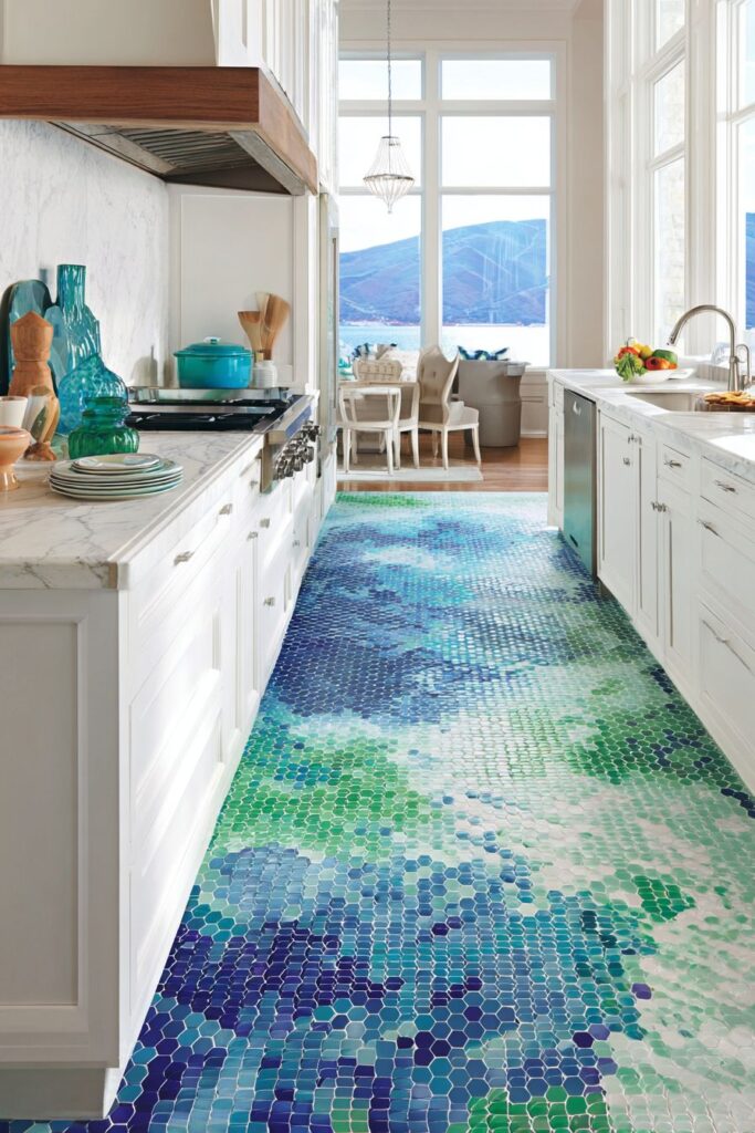
White cabinetry and marble countertops allow the colorful floor to be the undisputed star while providing clean, timeless elements that won’t compete with the artistic floor treatment. This restraint in upper elements ensures that the spectacular floor remains the focal point while maintaining kitchen functionality and visual balance.
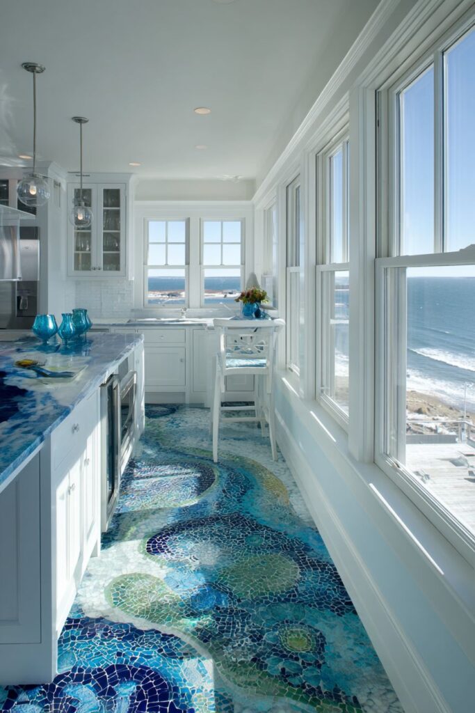
Large windows flood the space with natural light, highlighting the intricate tile work and color transitions throughout the day. The changing light conditions create subtle variations in the floor’s appearance, making it a living artwork that evolves with natural lighting patterns.
Research mosaic installation techniques carefully as gradient effects require precise planning and execution. Consider traffic patterns when planning gradient placement—central areas receive more visual attention. Select tiles with consistent size and finish for professional-looking gradients. Plan adequate lighting to showcase tile work effectively throughout the day. Choose grout colors that enhance rather than interrupt color transitions.
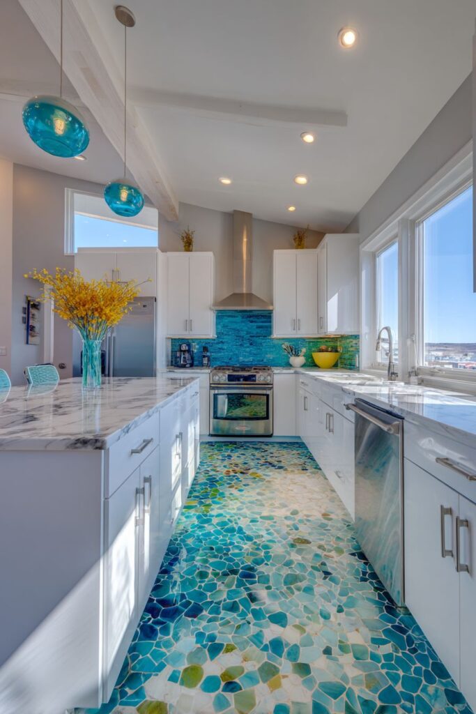
12. Vibrant Appliance Collection
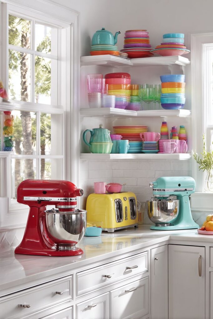
Celebrate kitchen personality with a curated collection of colorful small appliances including a bright red stand mixer, yellow toaster, and turquoise kettle arranged on white countertops. This approach proves that functional items can serve as decorative elements while maintaining their practical purposes. Each appliance becomes a colorful sculpture that adds joy to daily kitchen routines.
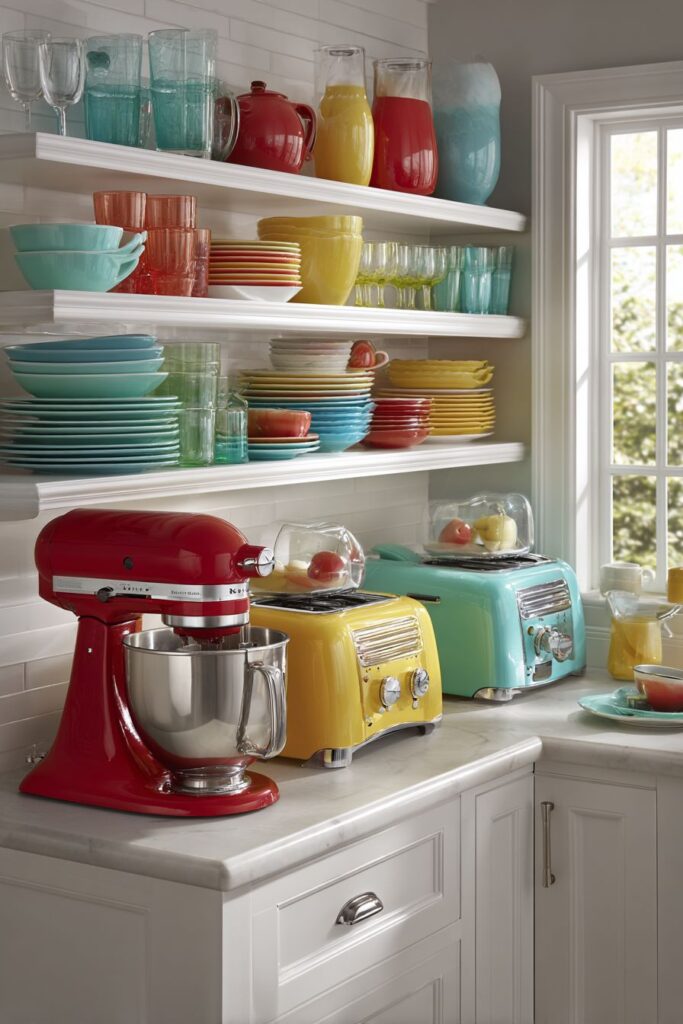
Open shelving displays colorful dishware and glassware organized by color families, creating harmonious displays that complement the colorful appliances. This systematic organization approach demonstrates how thoughtful arrangement can turn everyday items into beautiful displays while maintaining easy access for daily use.
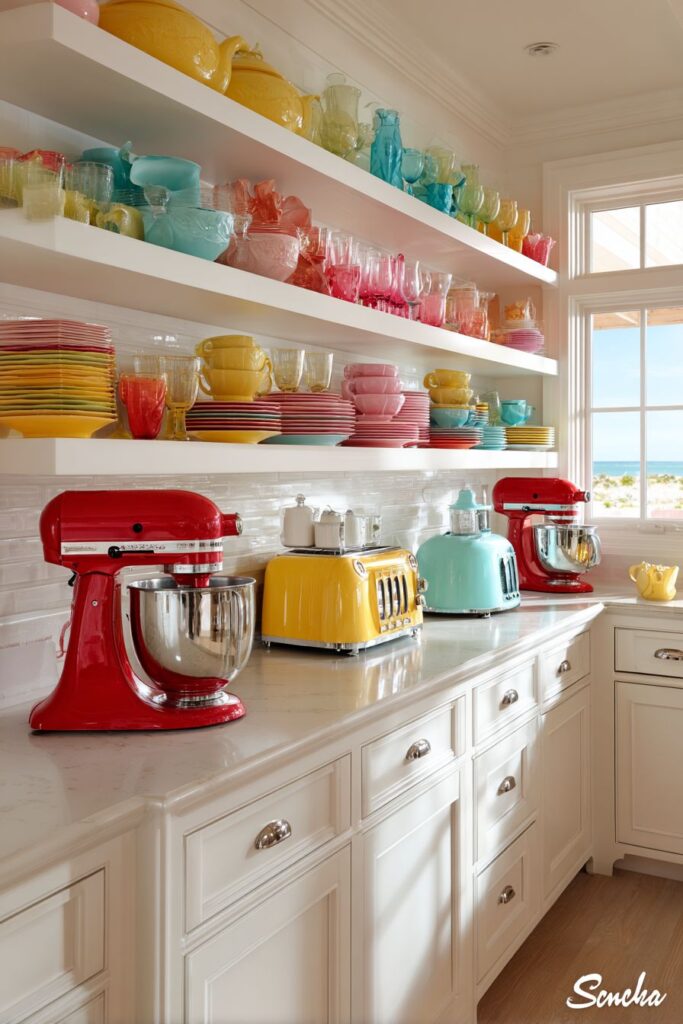
The surrounding neutral white cabinetry provides a clean backdrop that allows the vibrant accessories to shine without visual competition. This restraint in permanent elements allows for flexibility in changing colorful accents over time while maintaining a cohesive foundation.
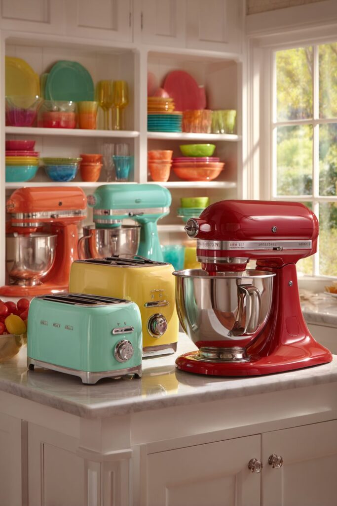
Select appliance colors that coordinate with your overall kitchen color scheme while considering long-term appeal. Invest in quality appliances that will maintain their color and function over time. Group colorful appliances thoughtfully to create balanced visual weight throughout the kitchen. Consider seasonal rotation of colorful accessories to keep the look fresh. Maintain consistent finishes—matte or glossy—across appliance collections for cohesion.
13. Illuminated Glass Art
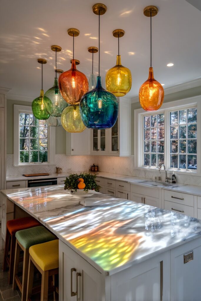
Create magical overhead lighting with colorful glass pendant lights in various sizes and hues including amber, emerald, and cobalt blue hanging over a white kitchen island. These luminous sculptures serve dual purposes as both functional task lighting and artistic focal points. The colored glass creates beautiful patterns of colored light and shadow on surfaces below, transforming the kitchen into an ever-changing art installation.
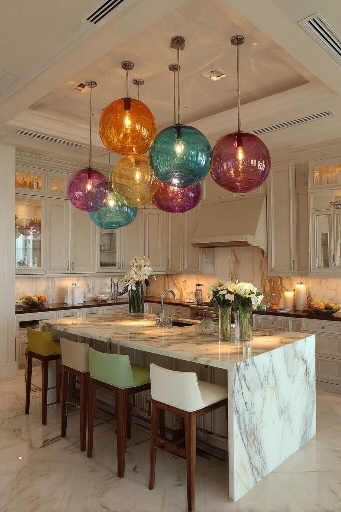
The lights create stunning colored shadows and reflections on the white marble countertop below, demonstrating how lighting can interact with surfaces to create additional design elements. Evening lighting showcases the pendants as glowing jewels while maintaining adequate illumination for kitchen tasks and food preparation.
Neutral cabinetry surrounds the space while bar stools in complementary colors provide seating that coordinates with the overhead lighting scheme. This approach shows how lighting choices can influence and coordinate with other design elements throughout the space.
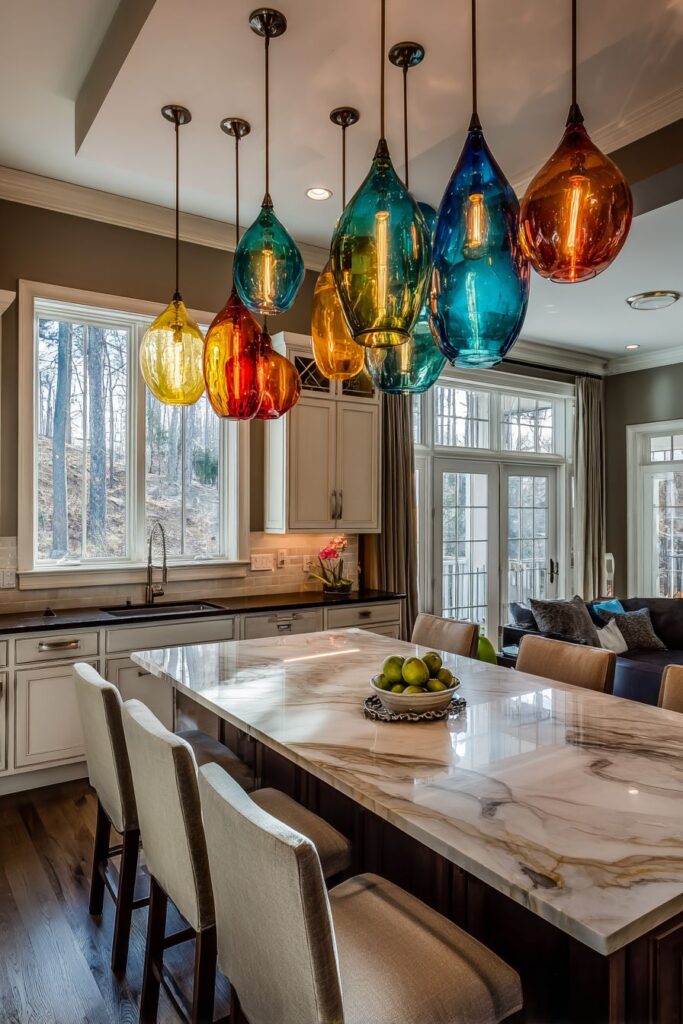
Plan electrical requirements carefully when installing multiple pendant lights over islands. Consider pendant height in relation to typical users and island activities. Select glass colors that complement your overall color scheme while providing adequate light output. Install dimmer controls to adjust lighting for different activities and moods. Ensure pendant lights are properly sized for your island proportions.
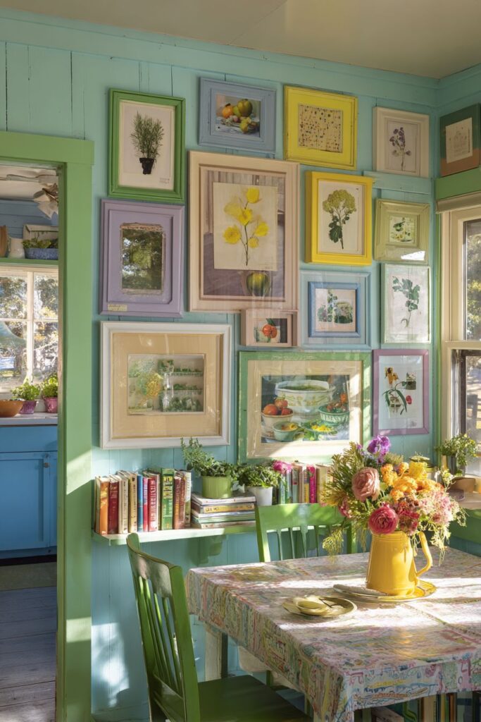
14. Curated Gallery Wall
Transform a blank wall into an inspiring gallery with colorful vintage botanical prints and food-related artwork in mismatched frames painted in various bright colors. This curated approach creates a personal, collected-over-time feeling that adds character and storytelling to the kitchen environment. Each piece contributes to an overall narrative while maintaining individual charm.
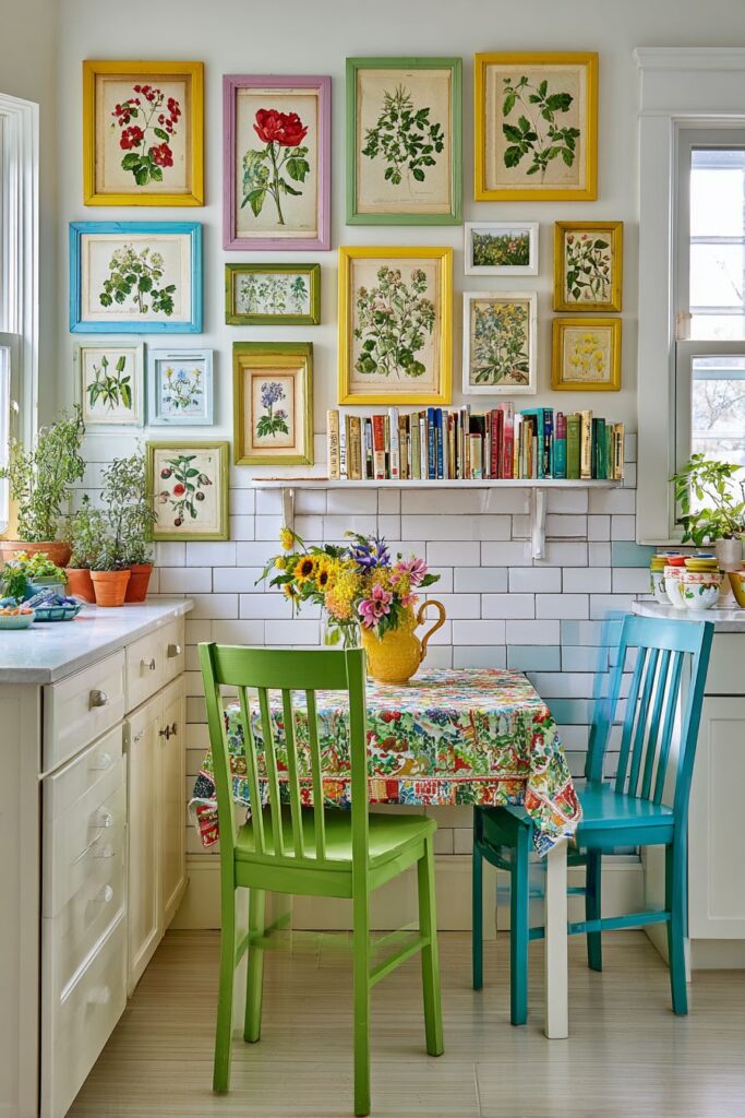
The colorful frame collection demonstrates how unifying elements—in this case, vibrant paint colors—can create cohesion among disparate artworks and frame styles. Open shelving displays colorful vintage cookbooks and small potted herbs, extending the gallery concept into three-dimensional space while adding functional storage.
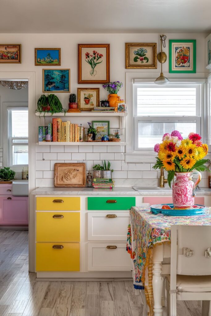
A vintage tablecloth covers a small breakfast table with fresh flowers in a bright ceramic vase, creating a dining vignette that complements the gallery wall while providing practical seating space. This layered approach to color and pattern shows how multiple elements can work together to create rich, engaging environments.
Collect artwork gradually to create authentic, personal gallery walls rather than purchasing complete sets. Mix frame sizes and styles while maintaining color coordination for visual unity. Consider wall space and scale when planning gallery layouts—sketch arrangements before hanging. Incorporate three-dimensional elements like plants and books to add depth and interest. Update seasonal elements like flowers to keep displays fresh and engaging.
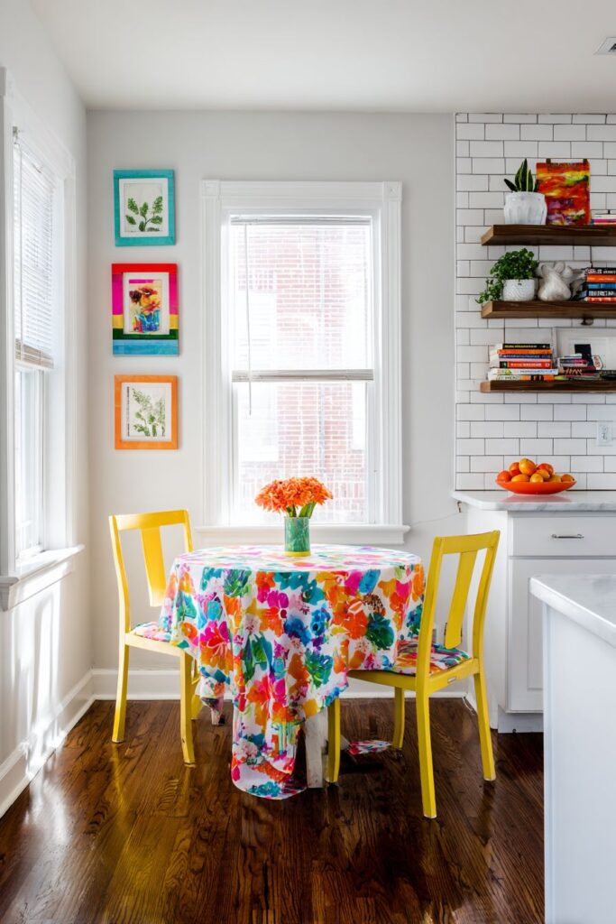
15. Rainbow Seating Celebration
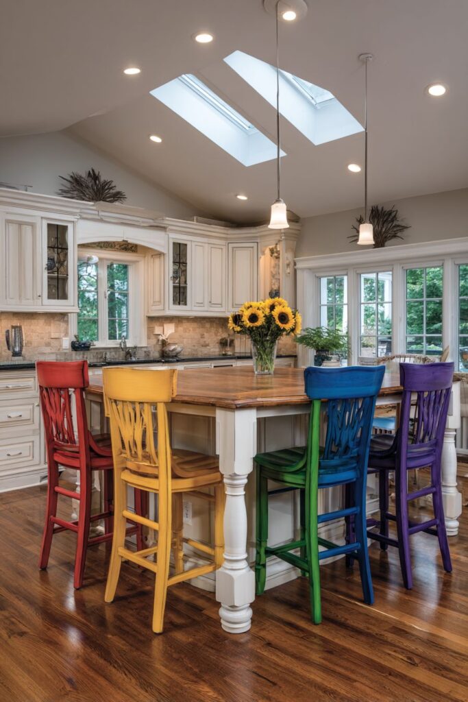
Make kitchen seating the star with colorful bar stools in a rainbow arrangement of red, orange, yellow, green, blue, and purple surrounding a white kitchen island with natural wood countertop. This bold approach demonstrates how repetitive elements in different colors can create stunning visual impact while maintaining functional seating for the entire family.
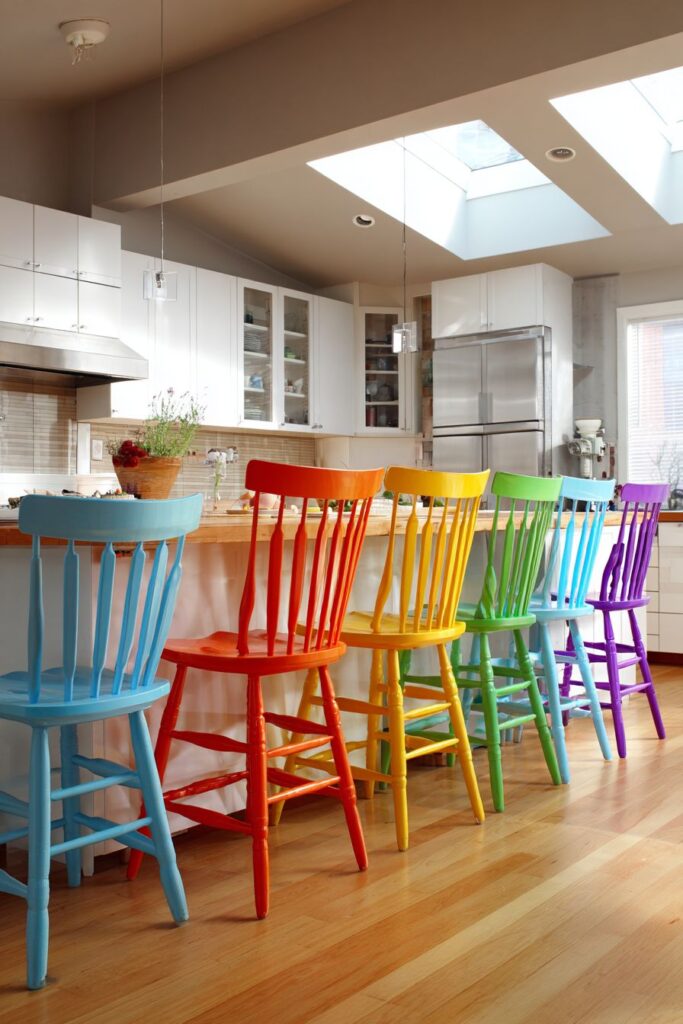
Each stool maintains slightly different design details while sharing similar proportions and heights, creating visual interest through subtle variations rather than complete uniformity. This approach feels more collected and personal than matching sets while maintaining overall cohesion through consistent scale and function.
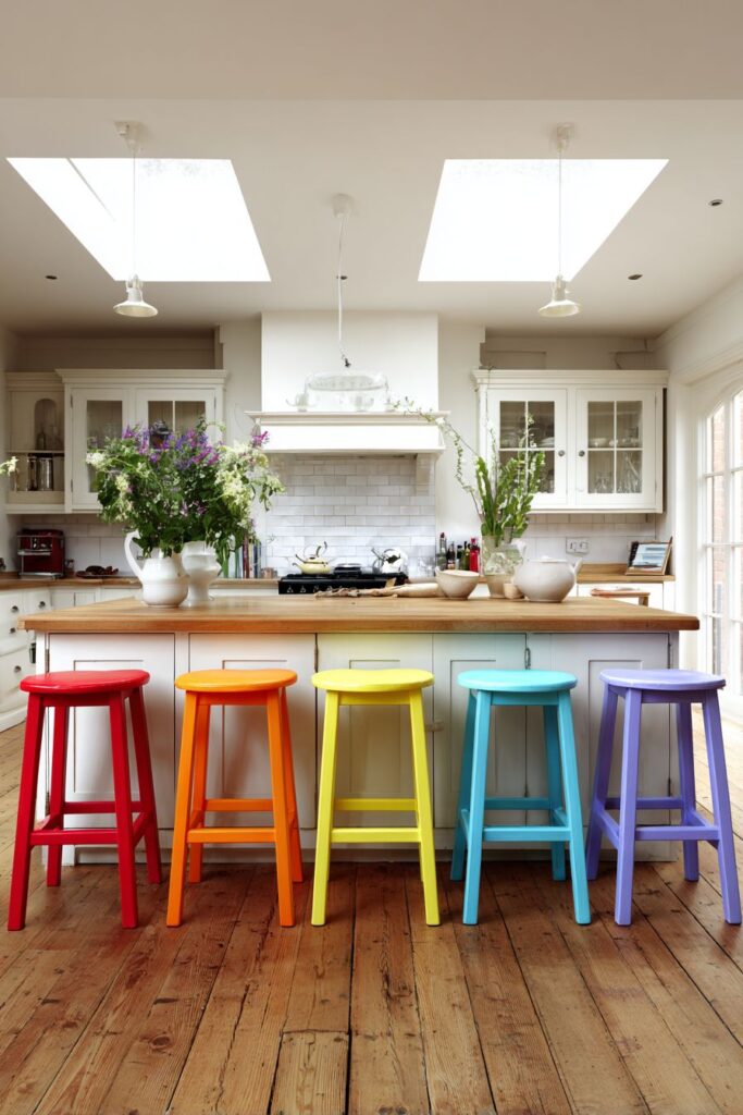
The surrounding neutral kitchen allows the colorful seating to create maximum visual impact without competing elements. Natural daylight from skylights above creates even illumination across all colors, ensuring each stool receives equal visual attention throughout the day.
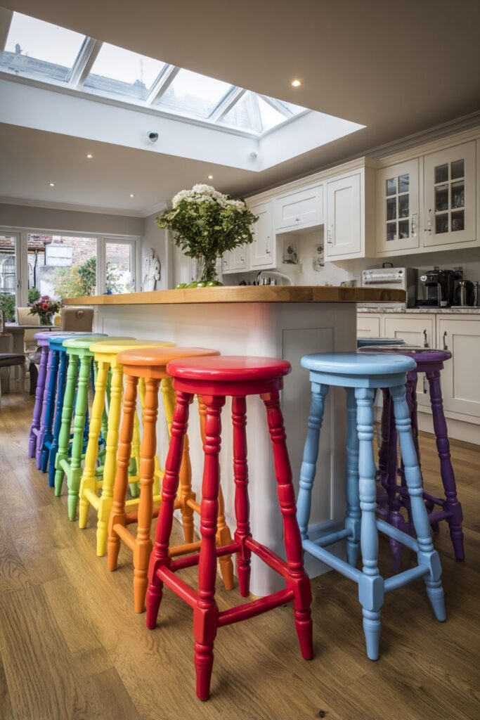
Select stools with similar scale and proportions for visual unity despite different colors. Consider comfort and durability when choosing rainbow seating—all pieces should function equally well. Plan adequate space between stools for comfortable seating and movement. Coordinate stool colors with other accent colors throughout the kitchen for overall harmony. Consider seasonal flexibility—some homeowners enjoy rotating stool positions to create different color arrangements.
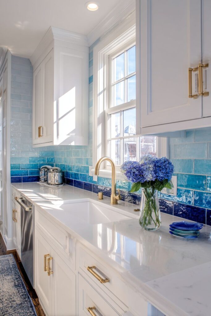
16. Gradient Tile Sophistication
Create sophisticated color drama with ceramic subway tiles arranged in a gradient pattern that transitions from deep navy at the bottom to light sky blue at the top, mimicking an underwater effect. This advanced color technique demonstrates how familiar tile shapes can be used in innovative ways to create stunning visual effects while maintaining classic appeal.
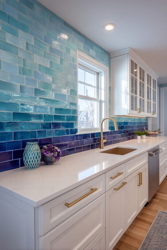
White cabinetry with brass hardware complements the blue gradient while white quartz countertops provide clean work surfaces that don’t compete with the dramatic backsplash. A few coordinating blue accessories tie the design together while maintaining restraint that allows the gradient to remain the focal point.
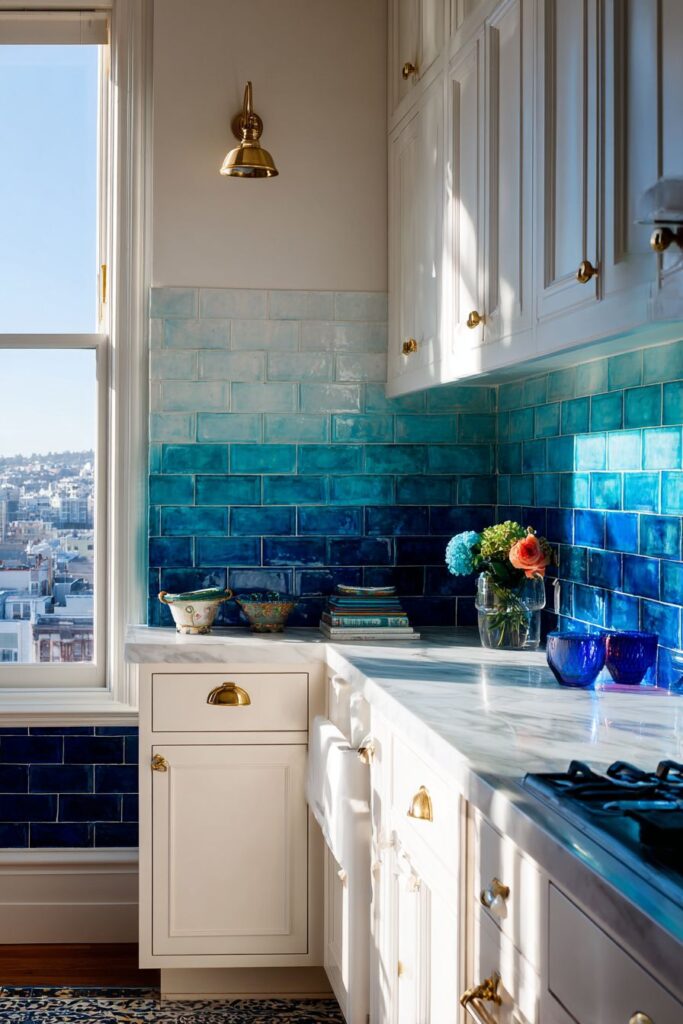
Natural window light enhances the tile color variations throughout the day while creating subtle shadows along grout lines that emphasize the handcrafted quality of the installation. The interplay between natural light and the color gradient creates a dynamic backdrop that changes subtly throughout the day.
Plan gradient layouts carefully with professional installers to ensure smooth color transitions. Order tiles in gradual color steps for smooth transitions—avoid dramatic color jumps. Consider grout color selection carefully as it significantly impacts the gradient effect. Test layouts with actual tiles before installation to ensure satisfactory color progression. Plan adequate lighting to showcase gradient effects throughout different times of day.
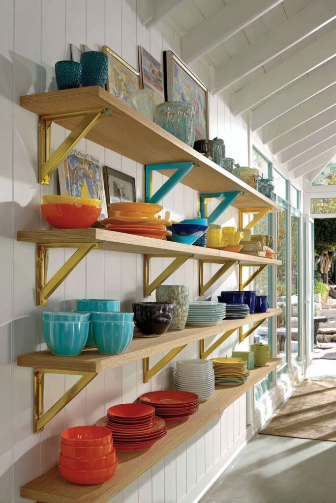
17. Hardware as Art
Transform utilitarian elements into design features with colorful open shelving brackets and supports in different metallic finishes including brass, copper, and painted steel in bright colors. This innovative approach demonstrates how functional hardware can become decorative elements that contribute to overall kitchen personality while maintaining structural integrity.
Natural wood shelves supported by the colorful brackets display organized collections of dishware, cookbooks, and decorative objects. The combination of natural wood with colorful metal creates visual interest through material contrast while maintaining practical storage functionality. White walls provide neutral backgrounds that allow the colorful hardware to shine.
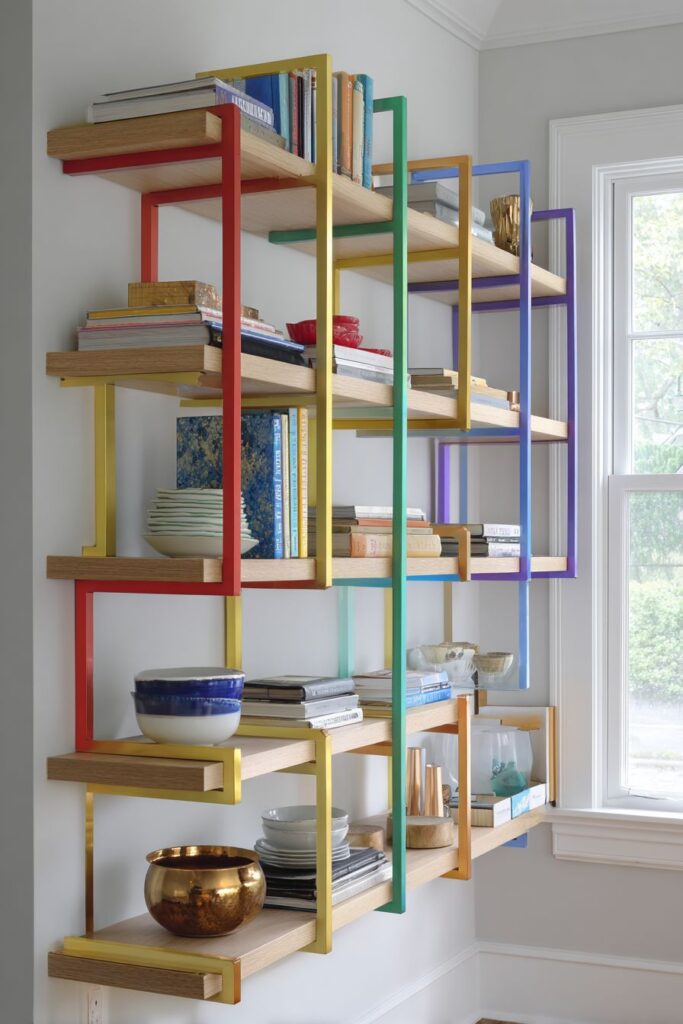
Natural light highlights the metallic finishes throughout the day while creating interesting color reflections on nearby surfaces. This interplay between colored metals and natural light adds dynamic visual elements that change subtly with lighting conditions.
Research weight-bearing capacity when selecting decorative shelf hardware to ensure safety and functionality. Consider how different metal finishes will age and patina over time. Plan bracket placement carefully to create balanced visual weight while maintaining adequate support. Coordinate hardware colors with other accent colors throughout the kitchen space. Select high-quality finishes that will maintain their appearance with regular cleaning and use.
18. Organized Color System
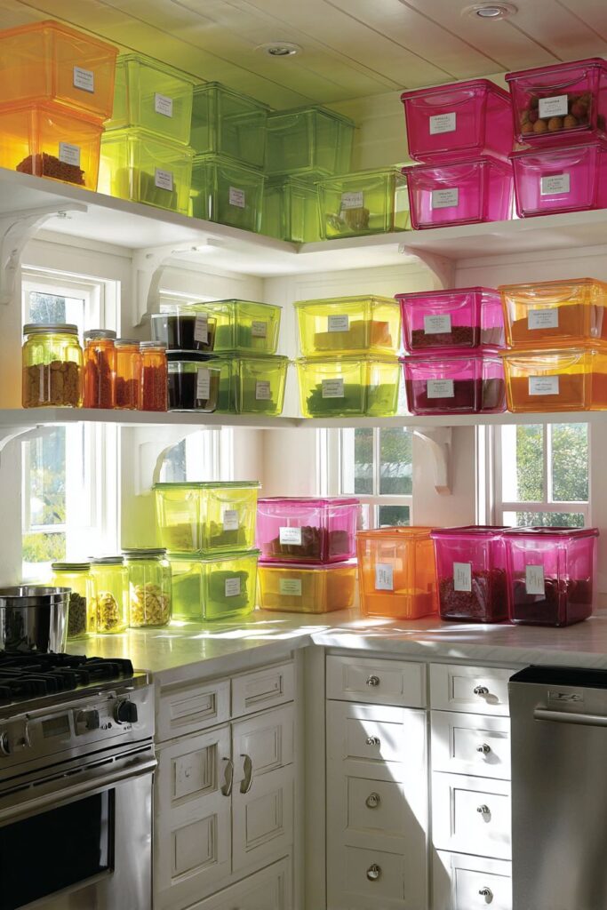
Create systematic beauty with colorful storage containers and canisters in matching sets of bright colors including lime green, hot pink, and orange organized on open shelving and countertops. This approach proves that practical storage can be visually stunning when approached with intentionality and color coordination.
Clear labels in coordinating colors maintain the systematic organization while providing functional identification for contents. White cabinetry and stainless steel appliances provide clean backdrops that allow the vibrant storage system to command attention while maintaining kitchen functionality.
Natural daylight illuminates the space and highlights the glossy finishes of colorful containers, creating reflective surfaces that add depth and visual interest. The systematic approach to color organization creates a sense of order and intentionality that elevates everyday storage into decorative display.
Invest in quality storage containers that maintain their color and function over time. Plan storage systems that balance display areas with concealed storage for less attractive items. Select colors that coordinate with your overall kitchen palette while providing adequate contrast for easy identification. Maintain consistent labeling systems for professional appearance. Consider seasonal rotation of displayed containers to maintain visual interest.
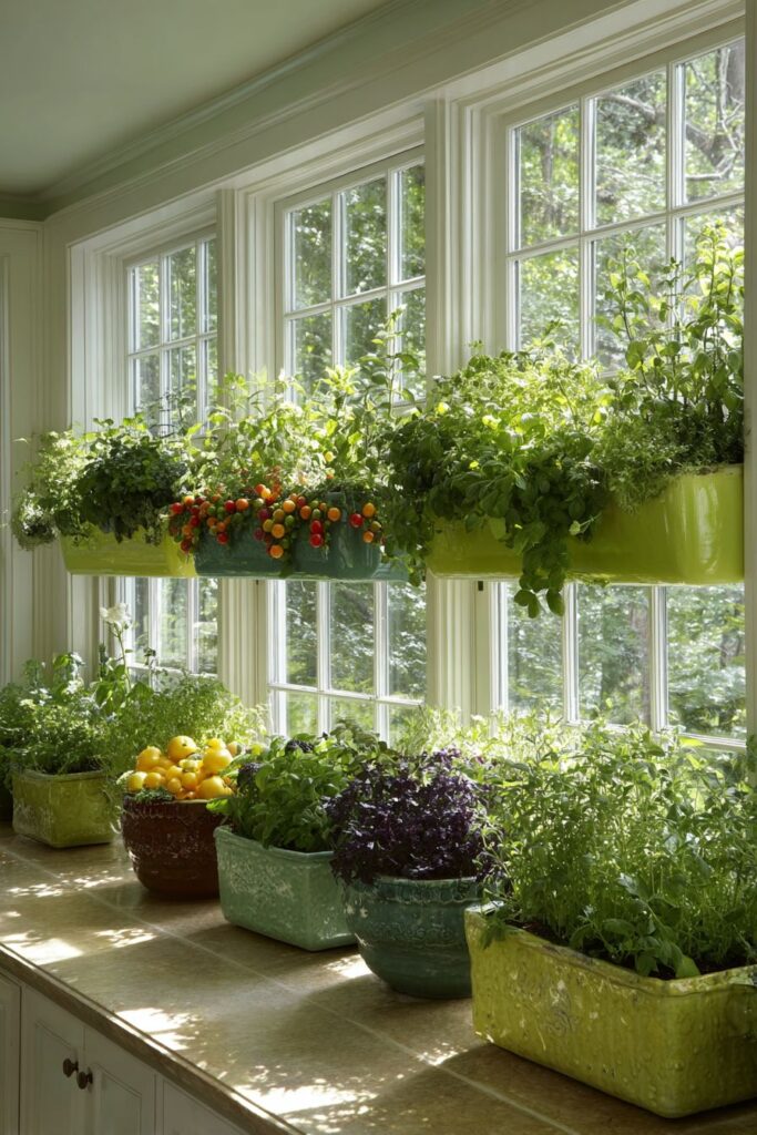
19. Living Color Garden
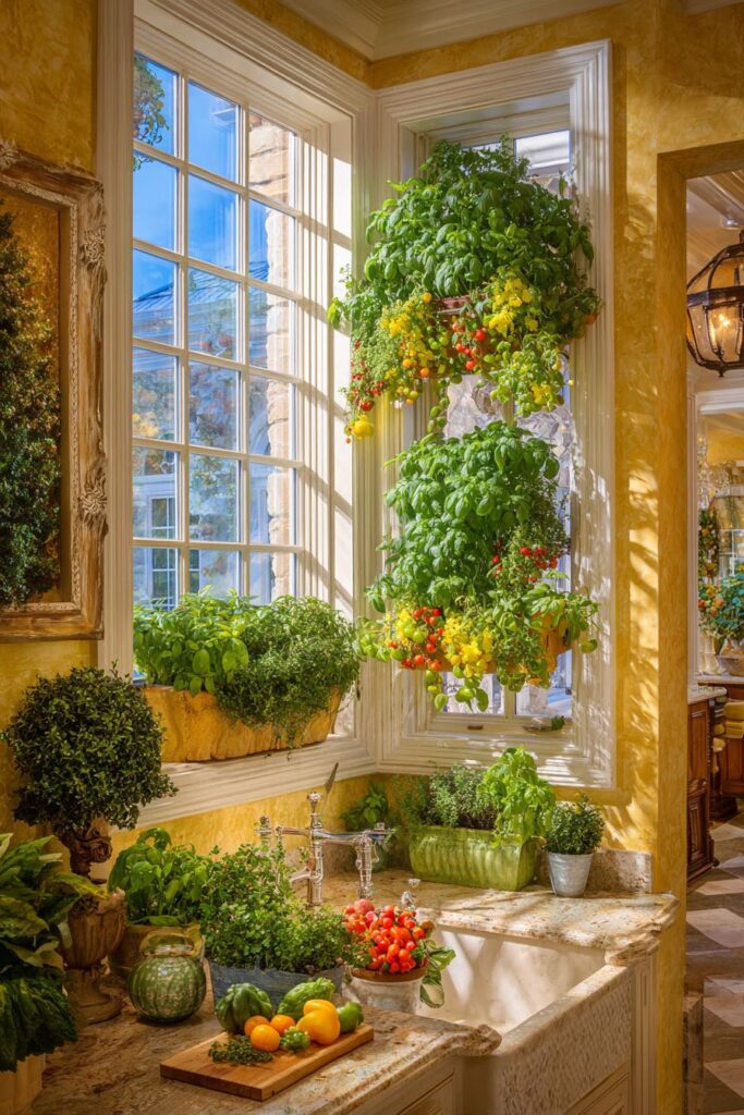
Bring nature’s colors indoors with window boxes mounted inside large windows filled with herbs and small vegetables in various shades of green, plus colorful cherry tomatoes and peppers. This living display creates ever-changing color as plants grow and produce colorful fruits and vegetables throughout growing seasons.
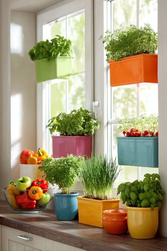
Simple white window frames and sills provide clean, neutral foundations that complement the natural plant colors while additional ceramic planters on countertops below extend the garden theme throughout the kitchen workspace. This integration of edible landscaping with kitchen design proves that functional elements can be beautiful.
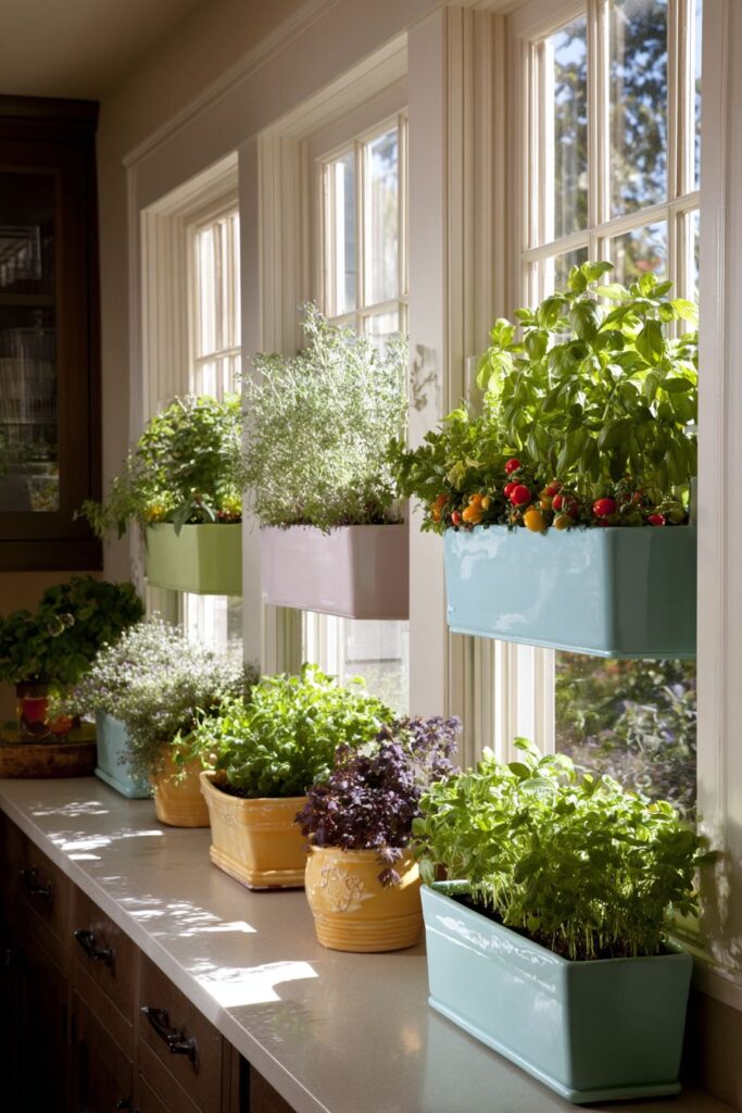
Natural morning light filters through plants, creating beautiful shadows and highlighting the natural color palette while providing optimal growing conditions for herbs and vegetables. The combination of practical gardening with decorative display shows how sustainable living can enhance rather than compromise design aesthetics.
Select plants appropriate for indoor growing conditions and available light levels. Choose containers that complement your kitchen design while providing adequate drainage and growing space. Plan watering systems that protect surrounding surfaces from moisture damage. Consider seasonal plant rotation to maintain year-round color and interest. Research companion planting techniques to maximize productivity in limited space.
20. Foundation Color Comfort
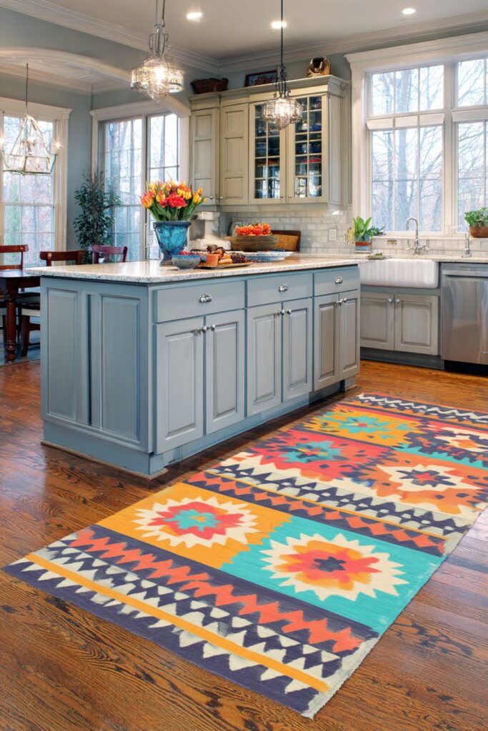
Ground your colorful kitchen with a large area rug featuring geometric patterns in coral, teal, yellow, and cream placed strategically in front of the sink and prep area. This practical element demonstrates how floor treatments can define workspace zones while adding comfort underfoot and visual warmth to hard flooring surfaces.
The rug’s strategic placement defines the primary work zone while coordinating accessories in similar colors throughout the space create visual connections that unify the overall design. Soft gray cabinetry allows the colorful rug to serve as a focal point while providing neutral foundations that won’t compete with the vibrant floor treatment.
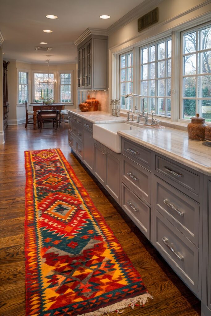
Natural light from windows highlights the rug’s intricate patterns and rich colors while demonstrating the rug’s practical placement in the active kitchen workspace. The combination of beauty and function shows how thoughtful design choices can enhance both aesthetics and daily comfort in kitchen environments.
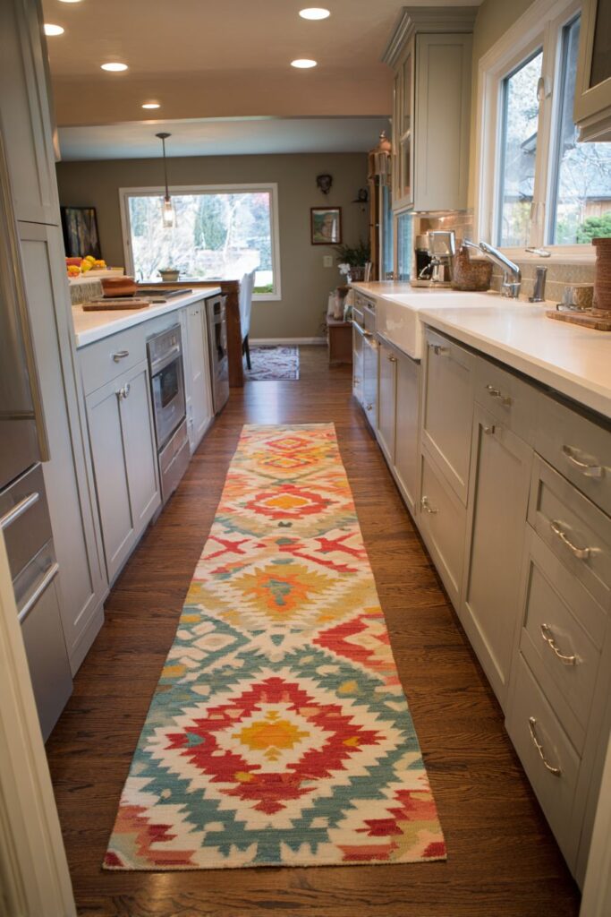
Select rugs designed for kitchen use with appropriate backing and easy-care materials. Consider rug size in relation to work zones—rugs should extend beyond immediate work areas for visual balance. Choose patterns and colors that complement rather than compete with other kitchen elements. Plan for regular cleaning and maintenance to keep rugs looking fresh in active kitchen environments. Consider seasonal rug changes to update kitchen appearance with minimal investment.
Why These Colorful Kitchen Designs Represent the Best in Contemporary Interior Design
These twenty colorful kitchen concepts represent the pinnacle of contemporary interior design because they successfully balance aesthetic appeal with practical functionality while addressing diverse lifestyle needs and personal preferences. Each design demonstrates sophisticated color theory application, showing how strategic color placement can enhance spatial perception, improve mood, and create personalized environments that reflect individual personalities and lifestyles.
The best colorful kitchen designs featured here incorporate multiple color application techniques, from architectural elements like painted ceiling beams and gradient tile installations to decorative accessories like colorful appliances and curated collections. This multi-layered approach to color integration creates rich, complex environments that remain visually interesting over time while maintaining practical functionality for daily cooking and entertaining activities.
Professional interior designers recognize these approaches as exemplary because they demonstrate advanced understanding of color psychology, spatial design principles, and material coordination. The gradient tile backsplash design showcases technical expertise in color progression while the rainbow-organized storage systems prove that systematic organization can be both beautiful and functional. The two-tone cabinet concepts illustrate sophisticated color blocking techniques that create visual drama without overwhelming smaller spaces.
These colorful kitchen designs excel in their application of contemporary design trends while maintaining timeless appeal that won’t quickly become outdated. The use of brass hardware throughout multiple concepts reflects current metallic preferences while the emphasis on natural materials like butcher block countertops and natural wood shelving demonstrates the ongoing trend toward organic elements in kitchen design. The integration of living plants and herb gardens addresses growing interest in sustainable living and indoor agriculture.
The lighting strategies employed in these designs represent best practices in contemporary kitchen illumination, combining natural light optimization with layered artificial lighting systems. The colorful glass pendant lights serve dual purposes as task lighting and artistic elements, while the emphasis on window treatments that filter rather than block natural light demonstrates understanding of how daylight affects color perception throughout different times of day.
Storage solutions featured in these designs represent innovative approaches to kitchen organization that prioritize both functionality and visual appeal. The open shelving systems allow for colorful displays while maintaining easy access to frequently used items, while the systematic color coordination of storage containers demonstrates how practical organization can become decorative art when approached with intentionality and design expertise.
Conclusion
Creating a colorful kitchen requires balancing bold creative vision with practical functionality, and these twenty innovative designs demonstrate that spectacular results are achievable when color is approached thoughtfully and systematically. From dramatic two-tone cabinetry to sophisticated gradient effects, living herb gardens to curated gallery walls, each approach offers unique benefits while contributing to the growing movement toward personalized, expressive kitchen environments.
The key to successful colorful kitchen design lies in understanding how color affects both mood and spatial perception while maintaining the practical requirements of active cooking and entertaining spaces. Whether you prefer subtle color accents through accessories and textiles or bold architectural statements through painted cabinetry and dramatic tile installations, these concepts provide tested approaches that can be adapted to various budgets, space constraints, and personal style preferences.
Remember that the best colorful kitchen is one that reflects your personality while serving your practical needs effectively. Start with small color experiments through accessories and textiles before committing to permanent installations, and don’t be afraid to layer different color techniques throughout your space for rich, complex results that will bring joy to your daily cooking adventures for years to come.
"As an Amazon Associate, I earn from qualifying purchases."