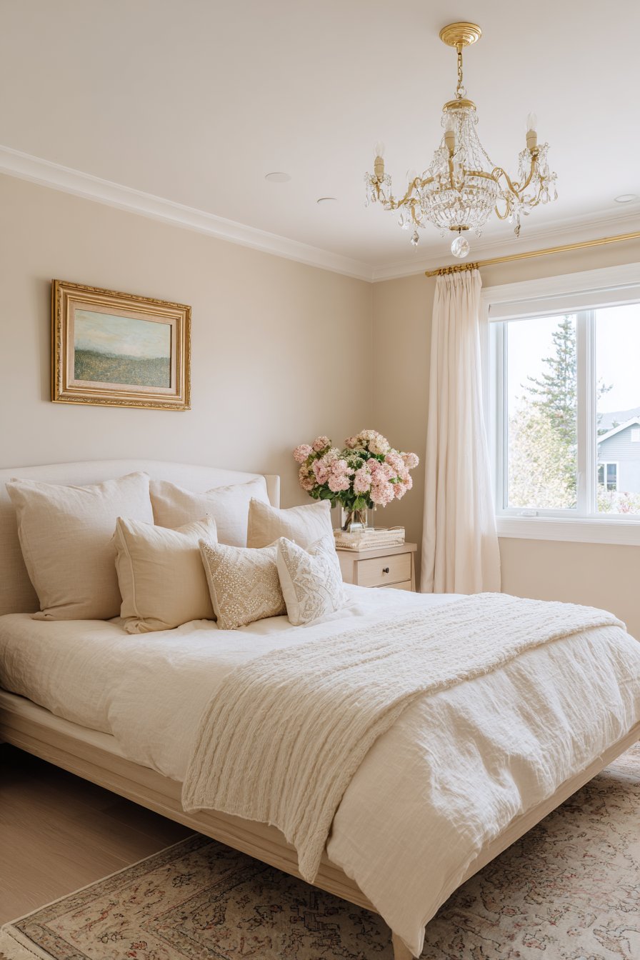
Choosing the right color for your bedroom can transform it from a simple sleeping space into a personal sanctuary. The colors you select influence your mood, sleep quality, and overall well-being. Yet many homeowners rush into painting decisions without considering the psychological and practical implications of their choices. A poorly chosen bedroom color can disrupt sleep patterns, make the space feel cramped, or create an atmosphere that feels jarring rather than restful.
Understanding common color mistakes helps you avoid costly repainting projects and design regrets. Whether you’re refreshing a master suite or updating a guest room, the principles remain consistent. The right approach balances personal preference with proven design strategies, creating a space that feels both uniquely yours and professionally composed. This guide explores seven critical mistakes that can undermine your bedroom’s aesthetic and functionality, offering practical solutions to help you make confident color decisions.
1. Ignoring Natural Light Conditions
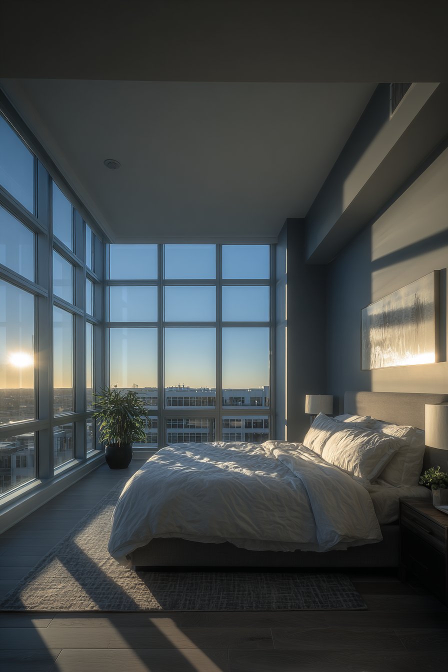
Natural light dramatically affects how paint colors appear throughout the day. A shade that looks perfect on a sample card can transform completely once applied to your walls. North-facing bedrooms receive cooler, indirect light that can make colors appear more muted and gray. South-facing rooms enjoy warm, consistent illumination that intensifies color vibrancy. East-facing spaces get bright morning light that fades to cooler tones by evening, while west-facing rooms experience the reverse pattern.
Testing paint colors under your specific lighting conditions prevents disappointment after the final coat dries. Colors shift dramatically between morning and evening, between sunny and overcast days. What appears as a soft sage in afternoon light might read as institutional green under morning sun. Many homeowners select colors based solely on store lighting or small swatches, only to discover their bedroom feels entirely different than expected.
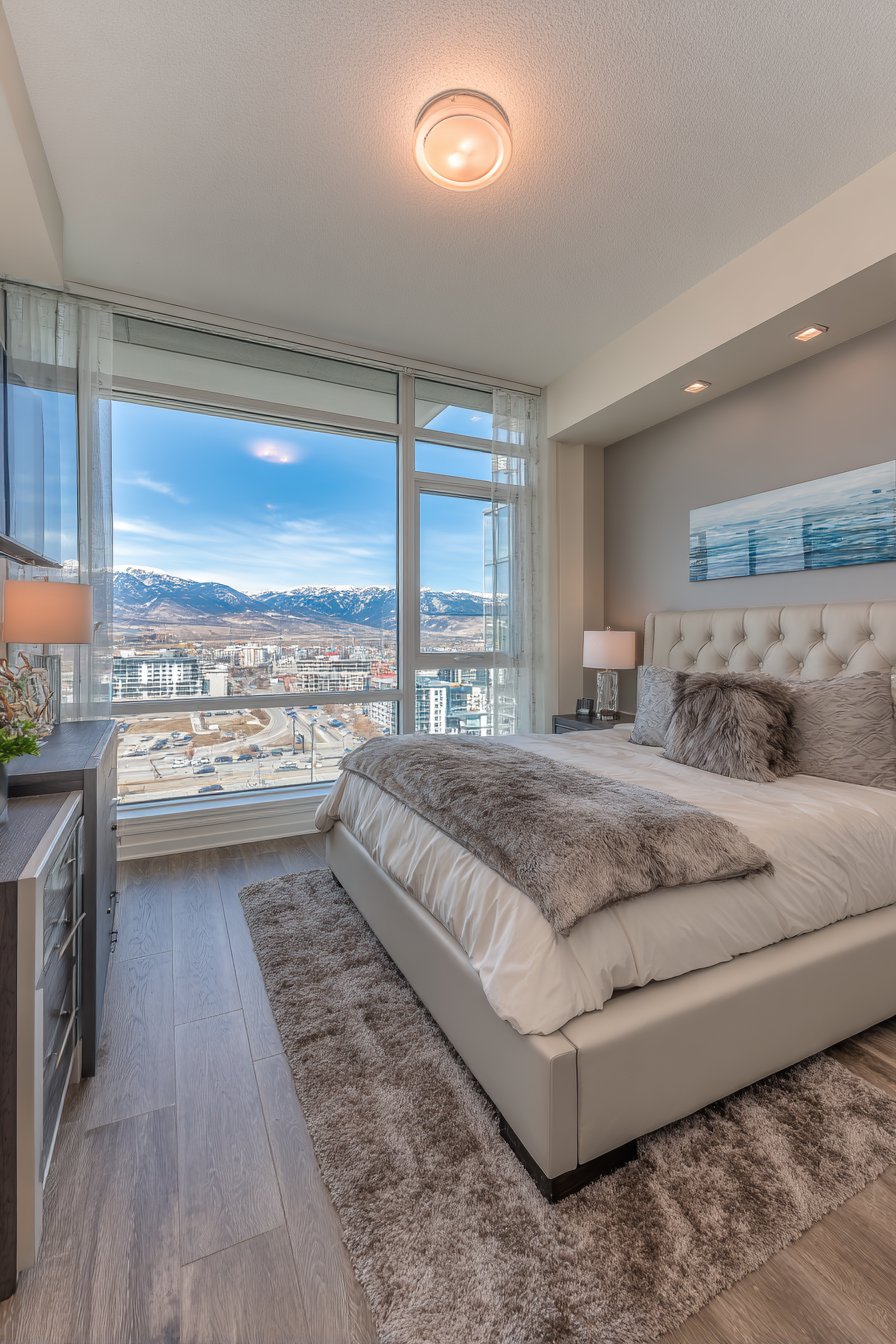
The size and placement of windows further complicates color selection. Rooms with limited natural light benefit from lighter, reflective colors that maximize available illumination. Abundant windows allow for bolder choices since natural light prevents darker shades from feeling oppressive. Consider how curtains and window treatments filter light, as these elements add another layer of color interaction.
- Paint large sample squares (at least 2×2 feet) on different walls to see color variations
- Observe samples for at least 48 hours through different times of day
- Test colors on walls opposite windows and adjacent to them
- Consider how artificial lighting will interact with your color choice
- Account for seasonal light changes, especially in rooms with significant sun exposure
- Use primer to ensure accurate color representation on your test patches
2. Choosing Colors Based Only on Trends
Design trends cycle rapidly, but bedroom paint represents a more permanent commitment than throw pillows or accessories. What dominates design magazines today often feels dated within a few years. Millennial pink, for instance, saturated bedrooms in 2017 but now reads as distinctly of that era. Following trends without considering your personal connection to the color creates spaces that feel borrowed rather than authentic.
Your bedroom serves as your most intimate space, requiring emotional resonance beyond what’s currently fashionable. Trendy colors work better as accent elements you can easily change. Walls should reflect colors that genuinely calm, energize, or comfort you based on your individual psychology. A color you love will serve you far longer than one chosen to match current Instagram aesthetics.
Consider your lifestyle longevity in the space when selecting paint colors. If you plan to stay in your home for many years, timeless neutrals or personally meaningful colors provide better value than trend-driven choices. Homeowners who painted bedrooms in popular but personally unsuitable colors often repaint within two years, doubling their investment unnecessarily.
- Ask yourself if you genuinely love the color or just love seeing it in media
- Consider whether the color aligns with your personality and lifestyle
- Choose trend colors for easily changeable elements like bedding or artwork
- Research color psychology to understand which hues naturally support your needs
- Create a mood board with the color integrated into various bedroom contexts
- Wait at least one month after discovering a trendy color before committing
3. Overlooking the Impact on Room Size Perception
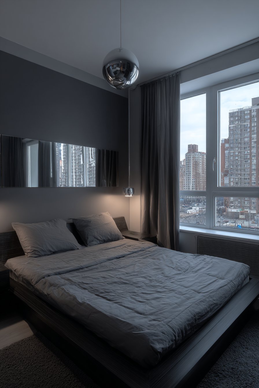
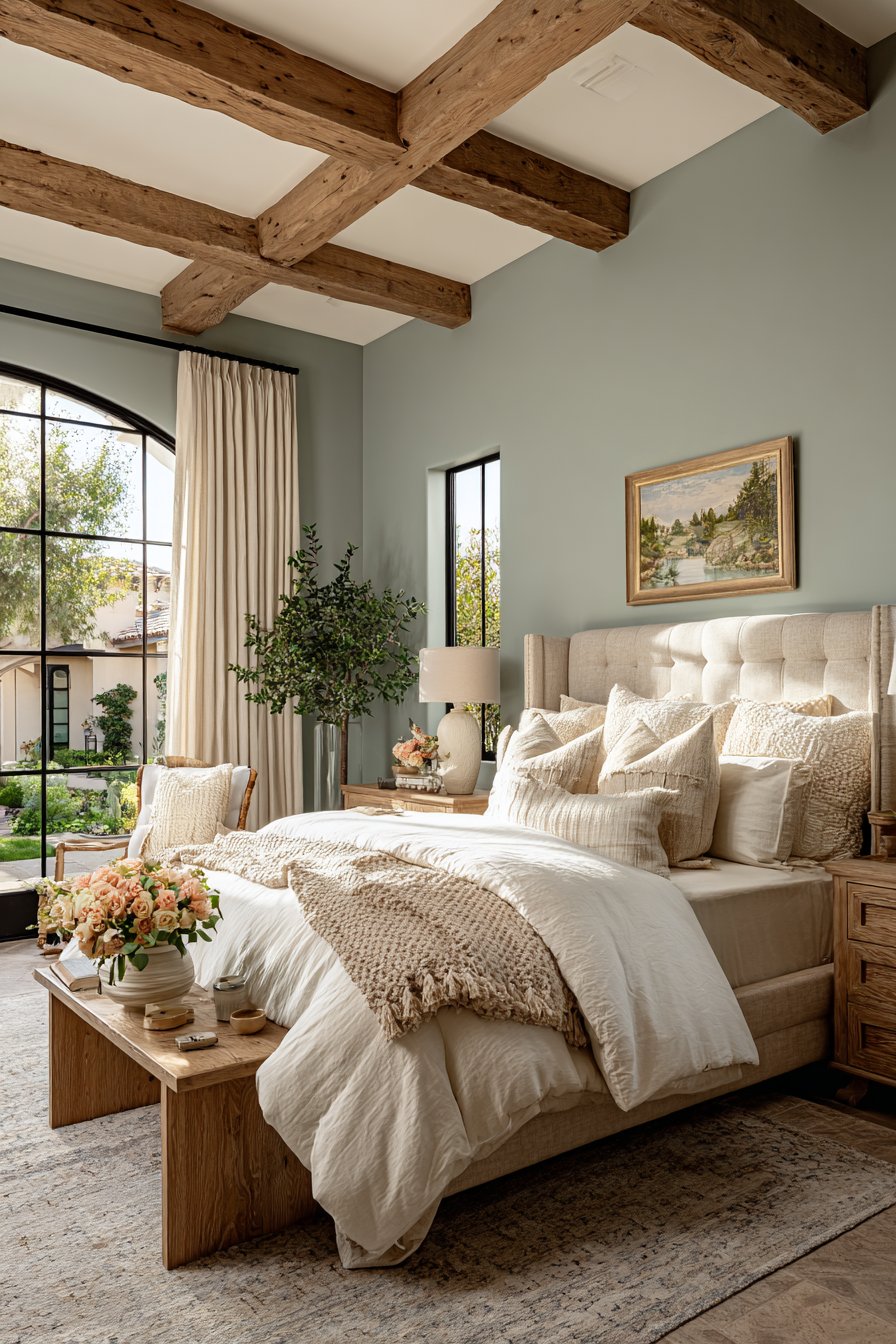
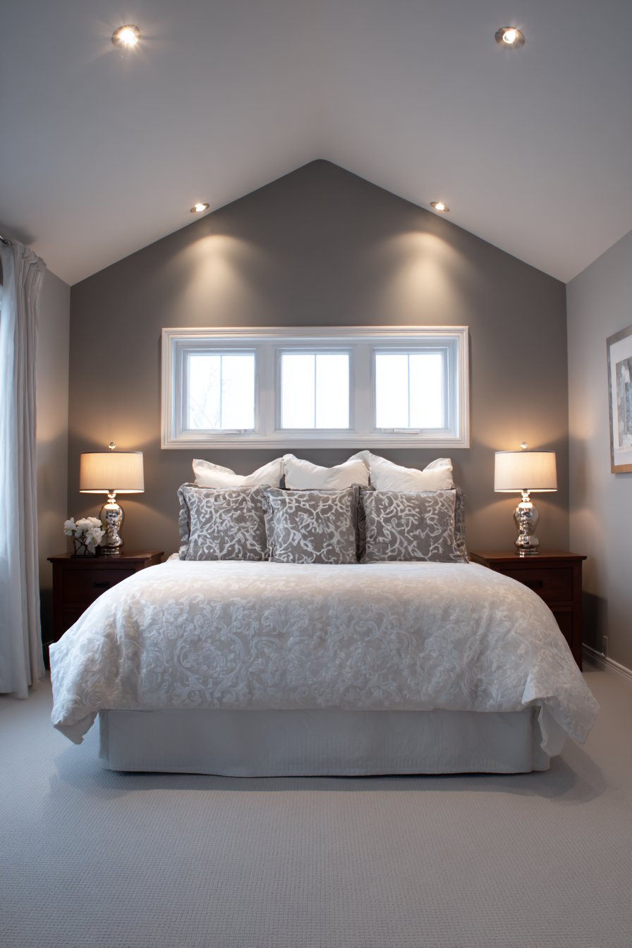
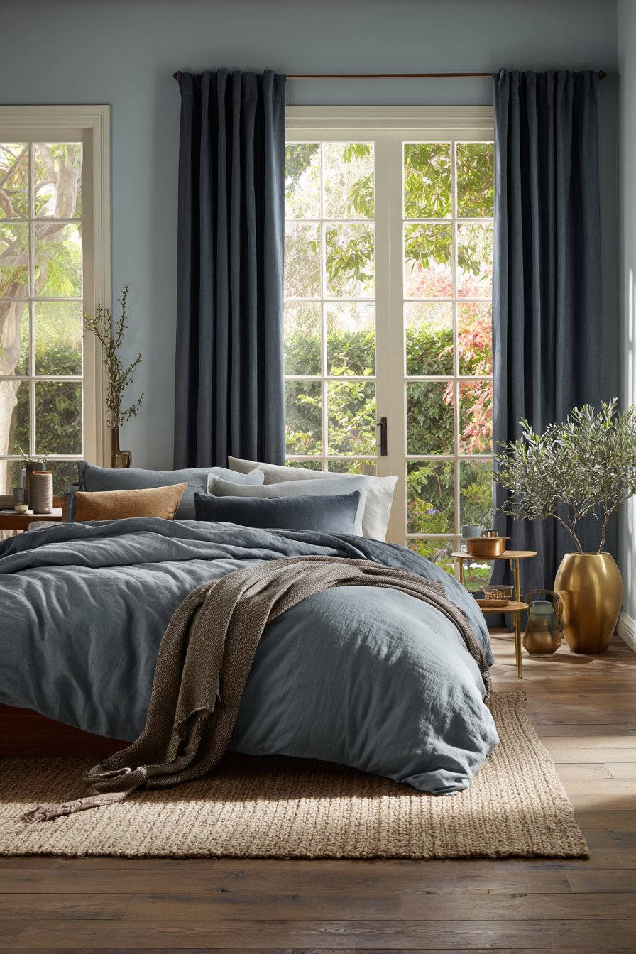
Color powerfully influences spatial perception, making rooms feel larger, smaller, taller, or more confined. Dark colors absorb light and visually advance, making walls feel closer and rooms more intimate. While this creates cozy atmospheres in spacious bedrooms, it can make small rooms feel claustrophobic. Light colors reflect illumination and recede visually, expanding perceived boundaries and creating airiness.
The relationship between ceiling and wall colors further affects room proportions. Painting ceilings darker than walls lowers visual height, appropriate for overly tall rooms but problematic for standard ceiling heights. White or lighter ceilings lift spaces and prevent the cave-like feeling that results from wrapping dark colors overhead. Many homeowners paint entire rooms in trending dark colors without considering their room’s actual dimensions.
Accent walls require careful consideration in small bedrooms. While popular in design content, a single dark or bold wall can fragment small spaces rather than enhance them. Monochromatic approaches often work better in compact rooms, with variation achieved through texture and tone rather than contrasting colors.
- Measure your room before selecting colors—spaces under 120 square feet need lighter tones
- Use lighter colors on the longest wall to maximize the stretching effect
- Paint trim and molding in contrasting lighter shades to define and expand space
- Consider painting the ceiling slightly lighter than walls for optimal height perception
- Test how your chosen color affects the room at night with artificial lighting
- Avoid stark white in small rooms, opting instead for warm off-whites that prevent a boxy feel
4. Neglecting Existing Furniture and Fixtures

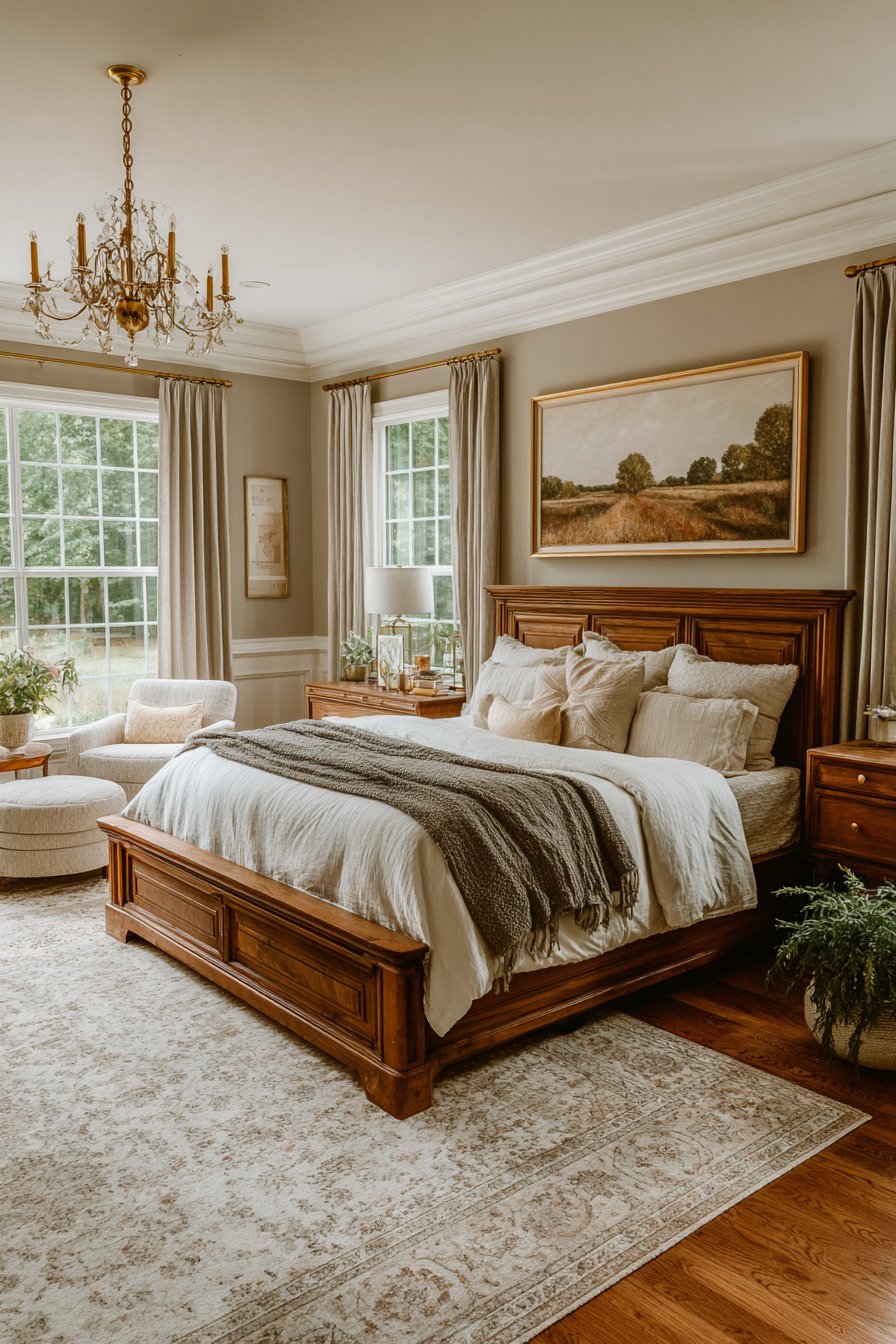
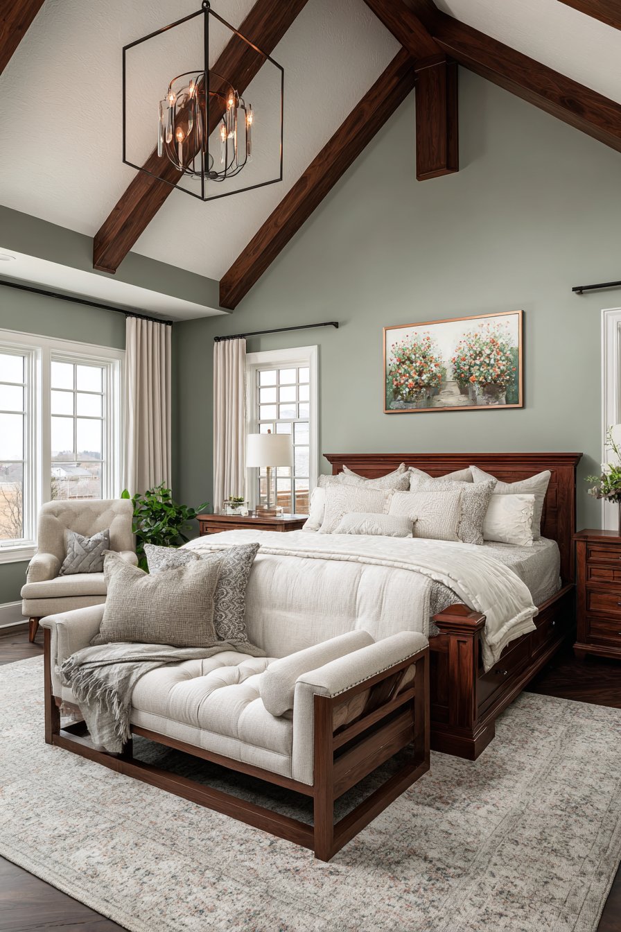
Your bedroom color doesn’t exist in isolation but must harmonize with existing elements like flooring, furniture, and built-in features. Warm-toned wood furniture clashes with cool gray walls, creating visual discord. Red-undertoned hardwood floors fight against pink or purple walls. These conflicts make rooms feel disjointed and prevent cohesive design flow.
Undertones represent the subtle color biases in seemingly neutral paint. Beige might lean pink, yellow, or gray depending on its undertone. These subtle variations determine whether your paint complements or clashes with your room’s existing elements. Homeowners often select colors based on the dominant hue while ignoring undertones that ultimately dictate success or failure.
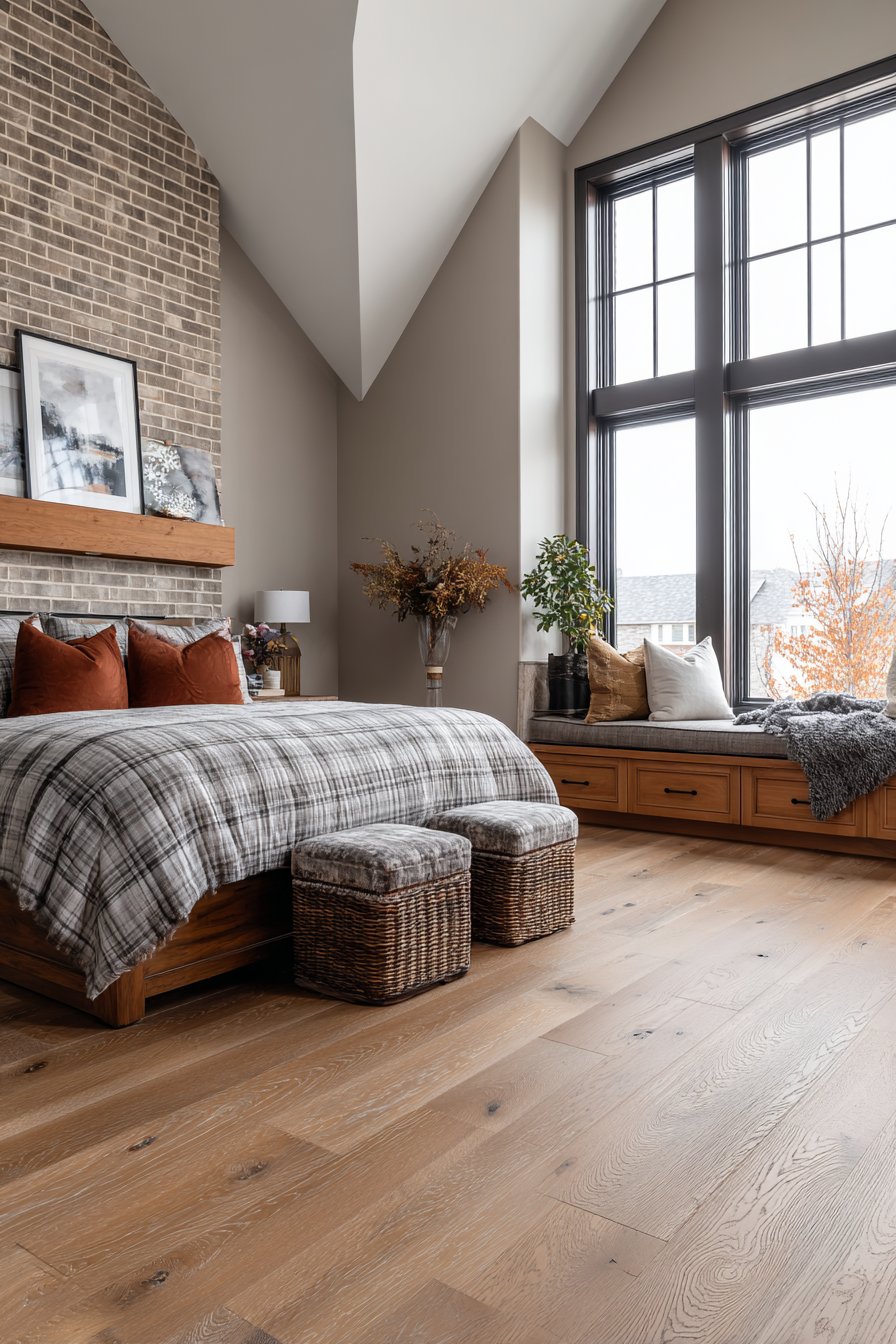
Built-in features like brick fireplaces, wood paneling, or architectural details require color coordination rather than competition. Paint colors should either complement these elements or provide intentional, well-planned contrast. Ignoring permanent fixtures leads to renovation regret when the new paint makes existing features look dated or unattractive.
- Collect samples of your flooring, furniture wood tones, and fabrics before selecting paint
- Hold paint samples directly against existing elements to check compatibility
- Identify whether your existing pieces have warm or cool undertones
- Consider whether you’re willing to replace furniture that clashes with new paint
- Test paint colors in the actual room where existing lighting affects all elements simultaneously
- Photograph paint samples with your furniture to evaluate combinations objectively
5. Painting Without Proper Surface Preparation
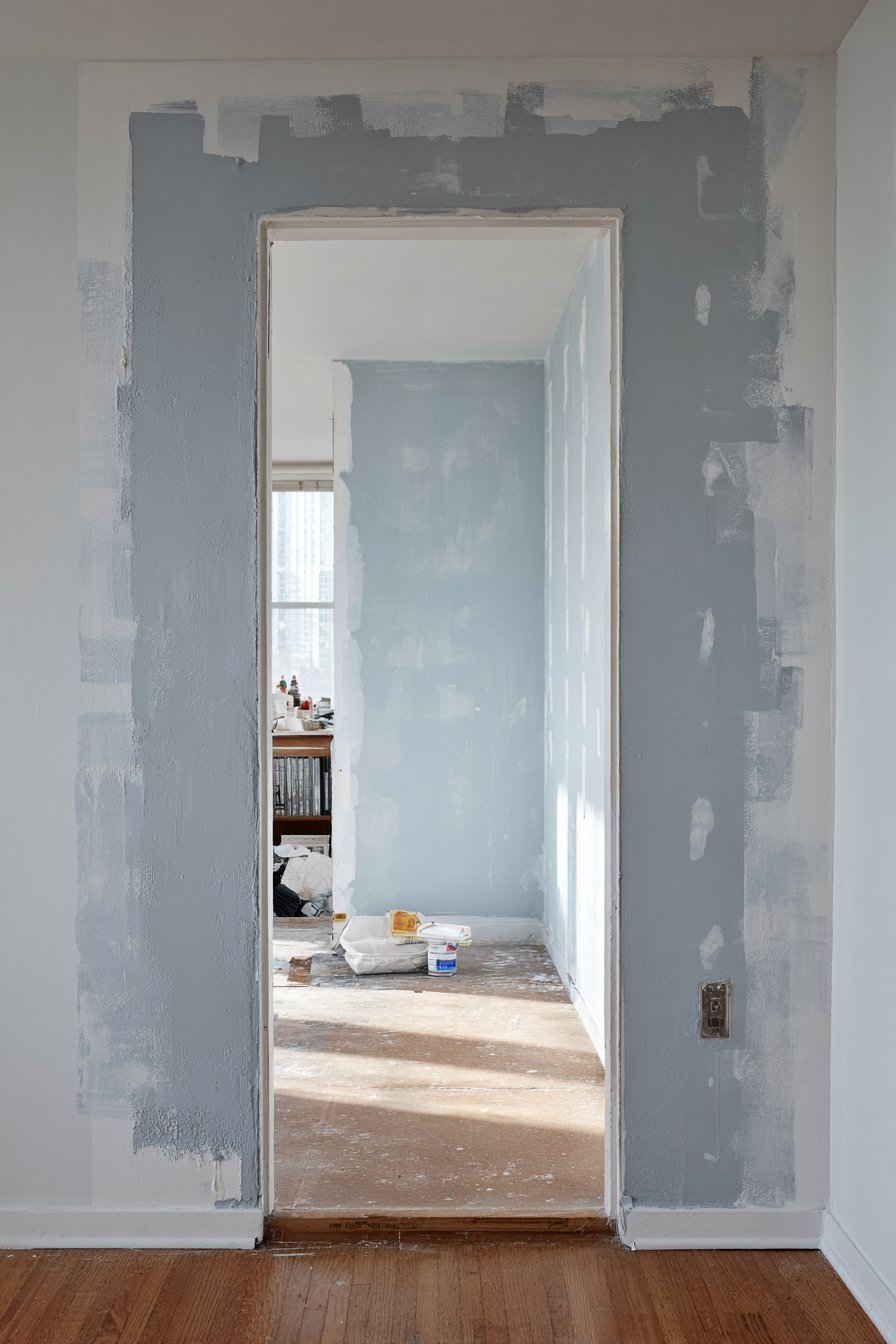
Beautiful color cannot compensate for poor preparation. Walls with cracks, holes, or texture irregularities telegraph through even the highest quality paint. Dark colors especially highlight imperfections that lighter shades might partially conceal. Many enthusiastic DIYers rush to the exciting painting phase without investing time in the tedious but essential preparation work.
Surface texture dramatically affects final appearance. Glossy finishes emphasize every wall imperfection, while flat or matte finishes forgive minor flaws. However, flat paint in bedrooms presents cleaning challenges, especially in children’s rooms or spaces prone to smudges. Eggshell or satin finishes balance forgivingness with practicality for bedroom applications.
Primer serves critical functions beyond just paint adhesion. It blocks stains, evens absorption rates across patched areas, and provides the neutral base necessary for true color representation. Skipping primer on previously dark walls or when painting lighter colors results in streaky, translucent coverage requiring multiple additional coats.
- Fill all holes and cracks with spackling compound and sand smooth
- Clean walls thoroughly to remove dust, grease, and residue that prevents adhesion
- Apply stain-blocking primer over water stains, crayon marks, or previous dark colors
- Sand existing painted surfaces lightly to improve new paint bonding
- Use painter’s tape carefully to protect trim, but remove it while paint is still slightly damp
- Invest time in preparation—it determines final quality more than paint brand
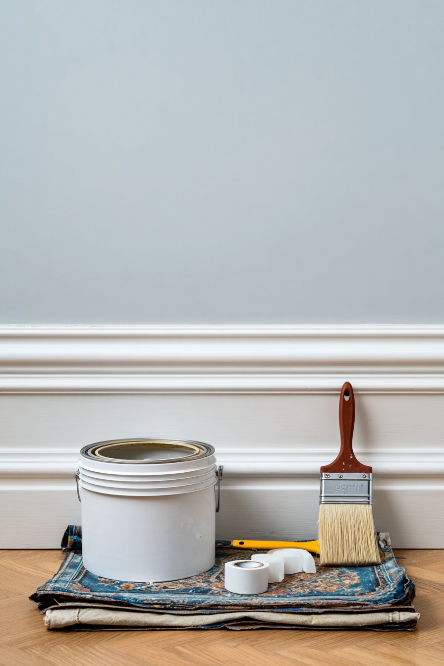
6. Selecting Colors in Isolation Without Samples
Tiny paint chips provide inadequate color representation for large wall surfaces. Colors intensify when applied across entire walls due to the multiplier effect of scale. A gentle blue chip becomes a bold statement color at room scale. Lighting conditions in stores differ dramatically from your bedroom, making in-store selection unreliable without home testing.
Digital screens add another complication, as monitor calibration varies significantly. The color displayed on your phone or computer never matches physical paint exactly. RGB digital colors and physical paint pigments operate on different color systems. Relying solely on digital representations leads to disappointing results when the actual paint goes on your walls.
Color context changes perception dramatically. The same paint appears different against white trim versus wood, beside different flooring materials, or when surrounded by your specific furnishings. Professional designers always test colors in the actual environment rather than trusting abstract samples.
- Purchase sample pots of your top three to five color choices
- Paint large sections (minimum 2×2 feet) rather than small squares
- Apply two coats to samples to see the true finished appearance
- View samples at different times of day and under various lighting conditions
- Photograph samples with your phone to see how they translate digitally
- Live with samples for at least three days before making final decisions
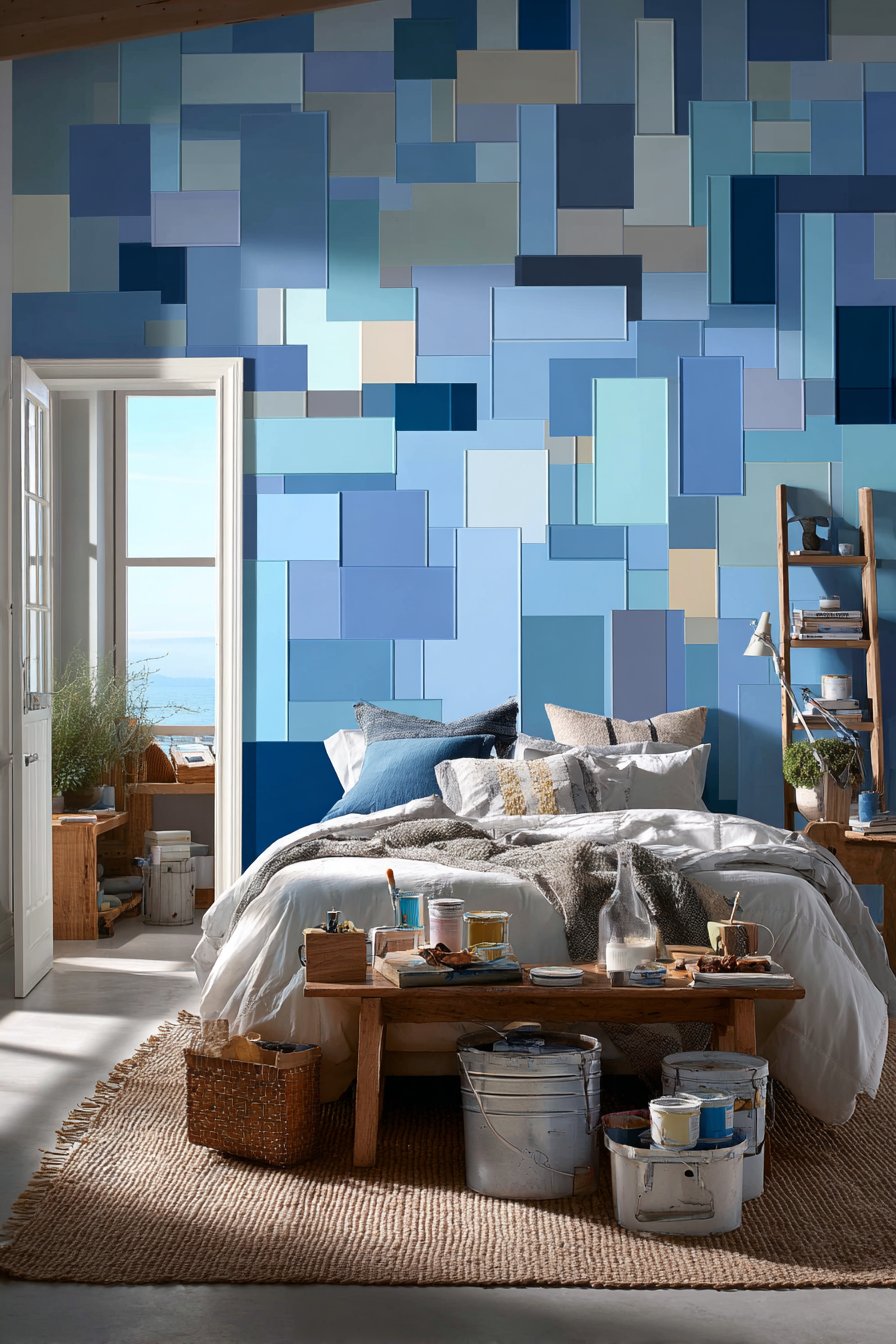
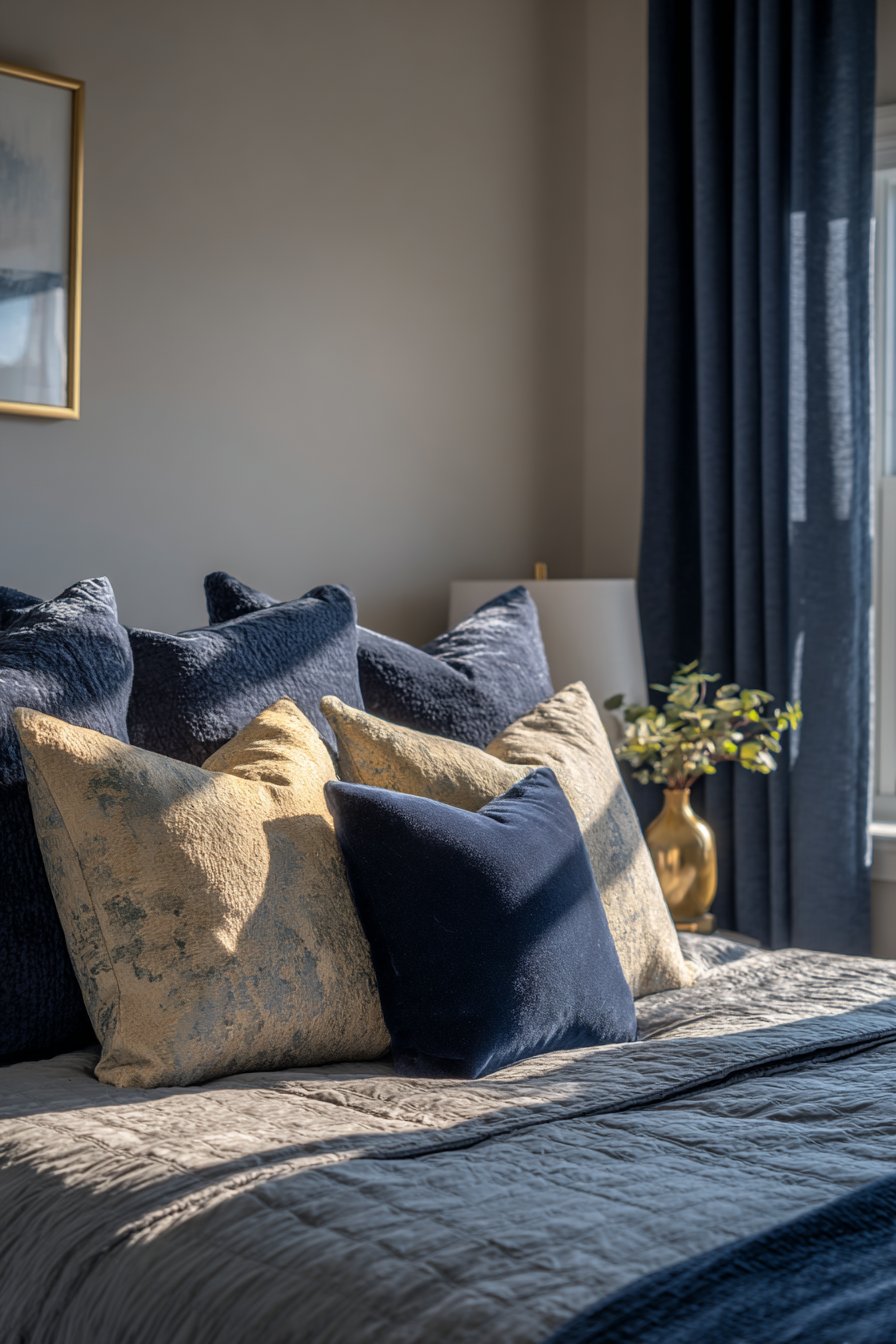
7. Using Too Many Colors or Complex Schemes
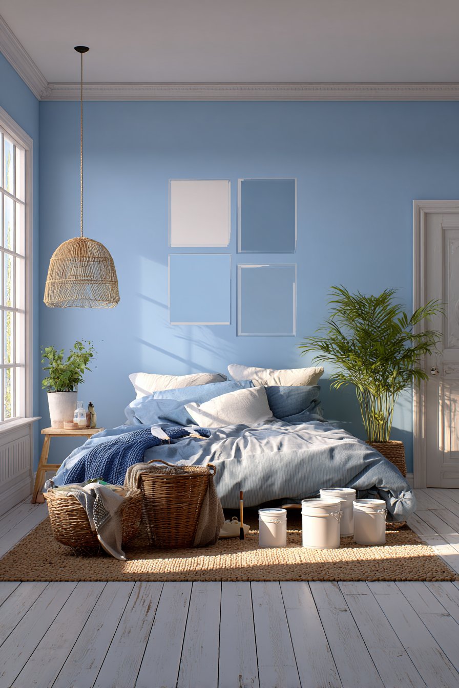
Bedrooms function best as restful retreats rather than stimulating showcases. Multiple competing colors create visual chaos that disrupts the calm atmosphere essential for quality sleep. Feature walls in contrasting colors, patterned accent walls, or elaborate multi-color schemes often overwhelm rather than enhance bedroom spaces. The best bedroom color schemes typically employ one to three related colors maximum.
Color relationships matter more than individual color appeal. Successful schemes use analogous colors (adjacent on the color wheel) or monochromatic variations (different tones of one color). These approaches create sophistication without complexity. Complementary colors (opposite on the wheel) provide high contrast that works better in active spaces than bedrooms.
The 60-30-10 rule provides helpful guidance: 60% dominant color (walls), 30% secondary color (furniture, curtains), and 10% accent color (accessories, artwork). This proportion creates visual balance without monotony. Bedrooms that violate this rule by introducing equal amounts of multiple colors feel scattered and unsettled.
- Limit your palette to one main wall color plus one or two accent colors
- Use different shades of the same color for depth without complexity
- Introduce pattern through textiles rather than painted wall treatments
- Consider white or neutral ceiling and trim as part of your color count
- Test color combinations together rather than selecting colors independently
- Remember that busy color schemes compete with rest rather than promoting it
Conclusion
Avoiding these seven bedroom color mistakes positions you for painting success that enhances your daily life. Thoughtful color selection considers lighting, longevity, spatial effects, and existing elements rather than impulse or trend-following. The preparation and testing investment pays dividends in results you’ll love for years rather than regret within months.
Your bedroom deserves the same design consideration as public spaces, perhaps more since you experience it during your most vulnerable rest hours. Take time to understand how color psychology affects your specific needs. Trust the process of proper sampling and evaluation. The right bedroom color creates a foundation for better sleep, improved mood, and a space that genuinely feels like your personal sanctuary.
"As an Amazon Associate, I earn from qualifying purchases."